Activity Feed › Forums › Sign Making Discussions › Graphic Design Help › design suggestions please for this gardening sign?
-
design suggestions please for this gardening sign?
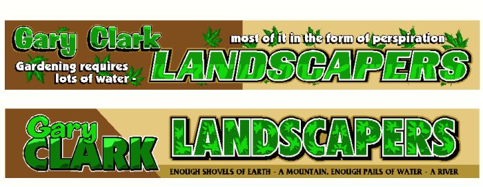
Posted by Steve Broughton on August 20, 2003 at 5:45 pmJust designed this, its for a Transit Pick Up, to be made from dibond and riveted to the sides and the back, sizes 8ft x 14 in sides and 6ft x 14 in rear, the phone no.s are going on the passenger doors and the rear panel, I’m fairly happy with these two designs but want you guys to have a look and have a few opinions, fire away.
Attachments:
 Lee Attewell replied 20 years, 7 months ago 10 Members · 13 Replies
 -
13 Replies
-

You should be ‘fairly happy with them’ Steve, they look great!
John
-

Hi Steve,
Opened the post and the top one looks abit “busy” the lower one is easier to read.
One thing I would change on the lower one is the outer outline, I would set that colour as a “true” shadow, leaving the black around the top of the letters, making the definition a little sharper, but still making it stand out from the background.
Just my opinion, it looks abit fuzzy on the edges.
-
I just wanted to qualify my comments from yesterday 🙂
I opened the post and looked quickly and then minimised it, that’s abit like how you would react seeing something driveby.
I liked what you have done in both but thought the lower one would work better on a passing vehicle, the top one maybe on a premises. It maybe the resolution of the pic or the fact I don’t have my glasses at work 🙂 but I thought the outline on Landscapers would be sharper using the darker tan outline as a drop shadow instead leaving the top part of the letter abit sharper.
I like the work you do Steve, and you asked for comments, and as the typefaces are quite “lively” with effects, those would have been the changes I would have made. Maybe on a truck at 6-8ft long they would both be OK, I have a 21″ monitor here and walked back across the office and thought about the shadow/outline thing.
-

Top one for me but I agree the flow of the text is difficult to follow. Why not move ‘Gary Clark to the bottom and Text to the top?
-
Oh Yeah!
Which one? Didn’t say did I.Difficult!
Bottom one in the end
-
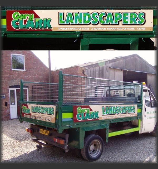
Right here’s a couple of pics of the finished job, happy customer he went off grinning like a cheshire cat, me too as I was £400 better off.
Attachments:
-

Excellent Steve. They look even better “in the flesh”. Did they take you long to put together?
-

Nice work Steve,
It a shame that the drawings don’t always give the full picture of how the colours will look together once the job is done.
-
very nice ‘ar Steve… 😉 especially the halo around ‘landscapers’
more soon
mikethesign
Log in to reply.
