Activity Feed › Forums › Sign Making Discussions › Graphic Design Help › Design help with Smart Car
-
Design help with Smart Car
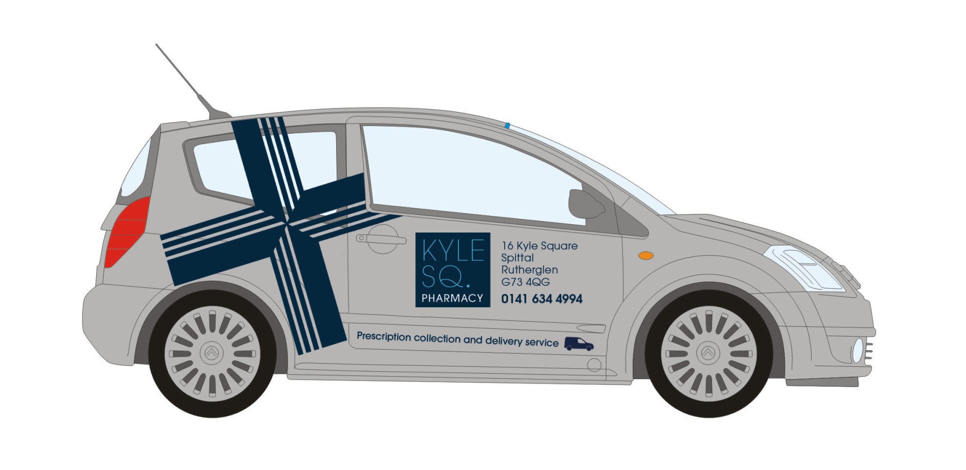
Posted by Marcella Ross on September 14, 2010 at 1:42 pmI’m having trouble getting this to look right. This pic shows the previous car, a citreon but now the customer has a Smart car and wants the same design on the Smart. But I can’t seem to lay it out in any way that I like 😕
Can anyone assist? I’ve also attached a pdf of the Smart and the logo etc.
Mx
Jan Storgaard replied 13 years, 7 months ago 8 Members · 17 Replies -
17 Replies
-
Better than anything I got… my suggestion was them buying a new car!
-
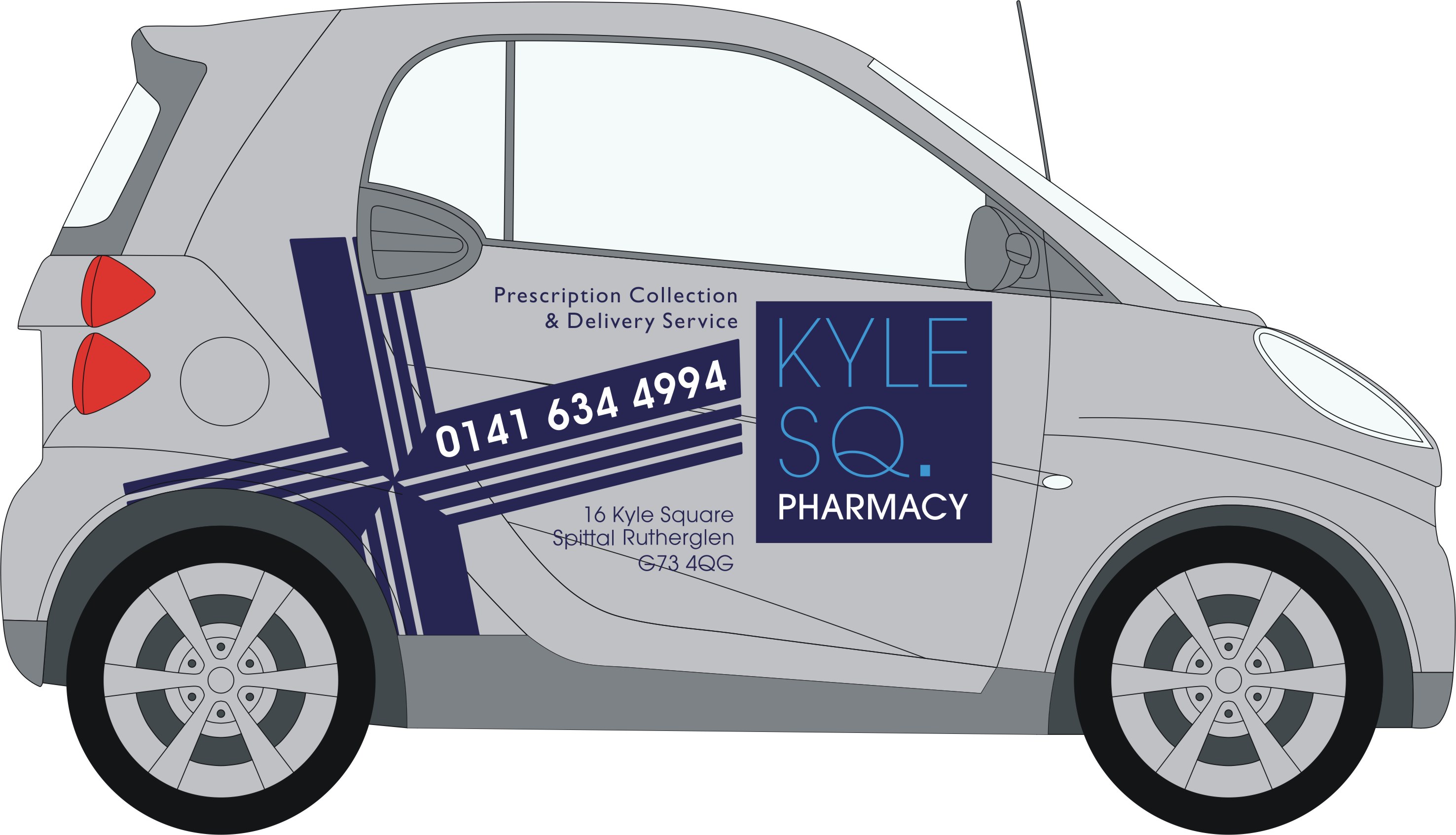
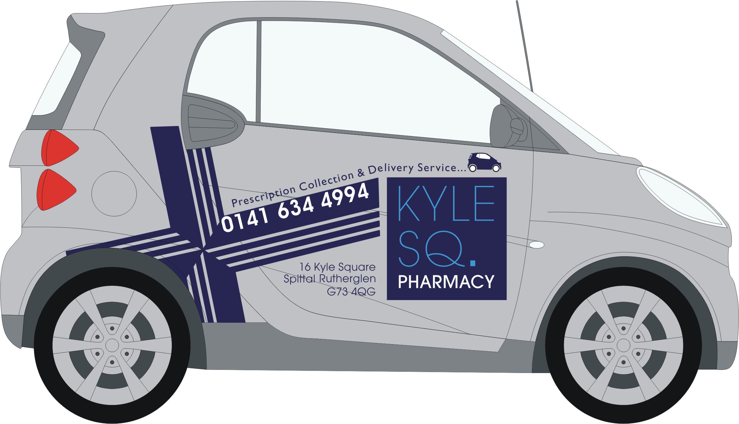
That layout would be about as good as you’d get it. If they want it too look like the old one, that’s achieved. It will always look a little untidy, reckon if you spend hours on it you won’t get much better though.
-
-
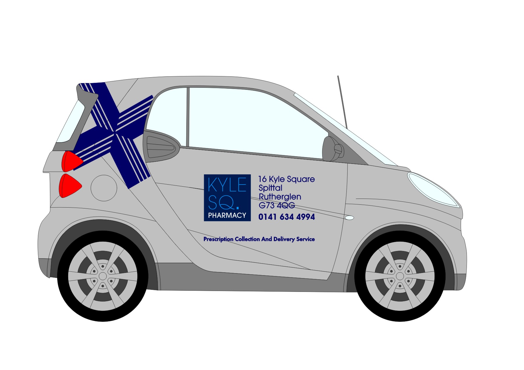
Not got time to draw it but could you not turn the cross clockwise between approx 45-90 degrees as looking at drivers side, this would allow 3 long legs and a short one going backwards.
Kind regards
Russell.
-
quote Bob Clarkson:It will always look a little untidy, reckon if you spend hours on it you won’t get much better though.
that’s exactly the problem I was finding, untidy! and yes Jan 2 dominant logos on a small car!
Tim that looks better than anything I came up with thanks!
Russell, I’ll have a go at turning the cross a bit and see how it goes
thanks x
-
Tim’s got it right, it’s as good as it’s going to get, copy that or you’ll play about with this for hours, confuse yourself, and then nothing you do will seem right. If it’s any help, it’s a lot better than the Citroen, so unless they came to you because they hated how that looked, your laughing.
-
-
Ok, now it’ll get confusing. I acknowledge the collection of text as you put it, but the fact the tip of the cross lined up with the top of the square justified doing it. To me the your first one is styled, the second one, although more than usable is just a job.
-
Point taken Bob.
I’ve changed my mind and am with you on this now… 🙄
-
can’t save this as a jpeg for some reason it keeps telling me the file is corrupt 😕 Anyway, I’ve done this, rotated the cross.
Any better?
-
The short answer would be no, trust me you’ll give yourself a headache on this one. I’ve been doing signs for over 25yrs, and I’d be quite happy to put my name to Tim’s design, that seldom happens, I can usually pull most things apart. I honestly think it’s right, and I don’t think I could get it any better. We do all see things differently, and opinions will always vary, but I’d be stunned if your customer isn’t over the moon with it once it’s done.
-
much better madge, i like it, the cross is better bigger 😀
nik
-
-
I thought that, but you’re braver than me to actually say it 🙄 I’d pictured some form of Monty python/ Little Britain character driving it dressed as a bishop. Only said in fun, please don’t be offended.
-
-
quote Glenn Sharp:A quick attempt from me……..a bit of a compromise on the cross but for me it’s less important than the logo
I agree to that – but the blue cross does add some recognition when seen again and again.
It is a tough one with smart car – little and not so smart ;o)
Log in to reply.


