Activity Feed › Forums › Sign Making Discussions › Graphic Design Help › design help with new shop sign please?
-
design help with new shop sign please?
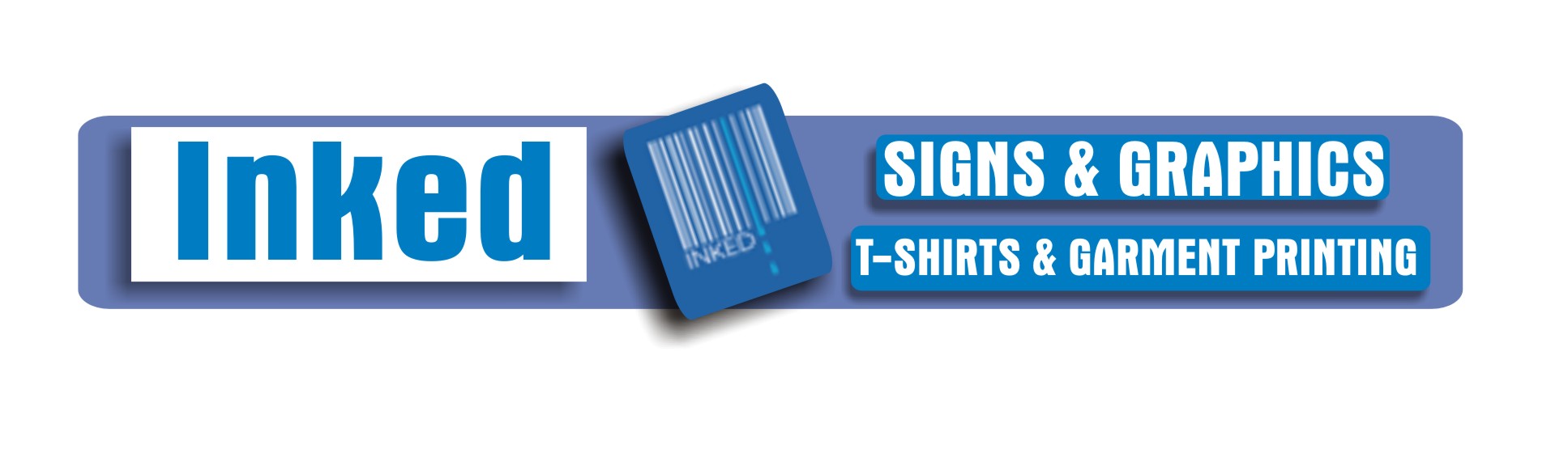
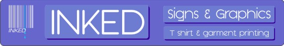
Posted by Steve Underhill on November 26, 2007 at 9:31 pmHeres what I have come up with for my new shop sign, its only going to be temporary as in maybe 6 to 10 months.
Its Blue dibond 3050x500mm, with blue oracal 651 in 2 different shades one for the boxes one for the shadows, and 10mm versalite for the letters to give it a bit of depth.
The logo on the end will just be cut vinyl,
I am just using what I have in hand at the shop at the moment rather than buying stuff in especially so that explains the white and blue colour choices.
Logo can be made smaller at the minute it is just for illustration.
I want it on there though as its what we put on all of our clothing.
Feel free to critique but bear in mind its temporary, (unless it grows on me)
using what I have in stock from leftovers and I have had to design it this evening hour ready to be put on the CNC router I have booked for tomorrow.
It is also designed to fit in with all the other signs on the Quay, which seem to be blue and white also.
 Steve Underhill replied 16 years, 5 months ago 9 Members · 42 Replies
 -
42 Replies
-

sorry steve like the idea and layout just think you could find a better font.
if all the other signs around are blue i would have a pink one 😉
chris
-

Quite like it…grows on you.
Only critique is the (smaller) text not being vertically centred in the boxes. It IS technically centred, but (to me) visually it’s ‘wrong’ as the descenders on the ‘g’ &’p’s are artificially pushing it up. I’d rather see the actual text line centred.
Dave
Attachments:

-

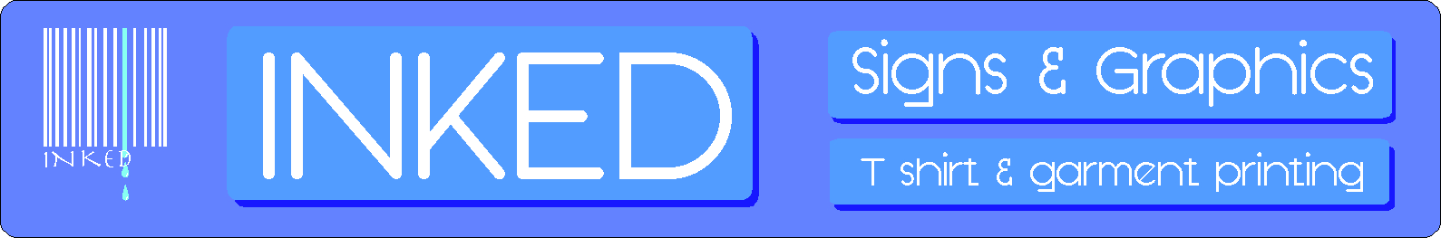
Oh yea thats ok, I may not even go with that font yet, it was just a general "do you like the idea" sort of post.
Its avante garde ITC, but I have load smore to choose from so will have a play, to be honest I wasnt sure about it I like kubra medium myself as it looks modern, (to me anwyay)
Keep em coming i have all night to change it.
Ill go play with the font now I forgot to say font can also be changed. -

I would put the logo after the main name on the same depth of panel and move the secondary text over to the other end. I would also make the secondary text in all caps and thicken it up. Might make that main name font look a bit better. I also dont like it 😀 just my tuppence worth.
-
Theres a reason that the logo isnt next to the main name, it has the company name in the logo, so it says inked twice next to each other which would look wrong.
Dont like what, the whole sign or the logo or what, what did you mean -
I meant the font Steve…..just makes the whole sign look unresolved and not good for a sign shop.
I know the name is repeated in the logo but on a separate panel I think it is justified to use it again. It looks ‘tacked on’ where it is on the end…….maybe there is a better way to incorporate it into the sign. -
Thats what were here for.
The font to be honest was the first one I came put on, and I just posted it with that there.
I didnt think it looked too bad, but was going to have a play while everyone was commenting.
Bear in mind this is 10mm versalite cut on a CNC so no fancy flicks or tiny serifs , I have to have a relatively sturdy font I guess. -
I would have posted more images with different fonts but corel wont export what i see on screen, it goes bright blue and blocky now
-

Steve when exporting to jpeg/bitmap, you need to tick the apply icc profile. I think…on the compresion dialoque
Peter
-
Ive tried it with both Peter, its getting really annoying, I know it has to be something simple (ie me!)
-
Steve email me the corel file or post it, then we can have a look
Peter
-
Ok thanks will do.
Ill post it here, I can get it good enough resolution wise but it all changes colour in photoshop.The font that is in there at the minute you may or may not have it was just the latest I was playing with
Steve -
Just a quick idea Steve….I was trying for something more dynamic, with the same components. Blues are all wrong btw.
Attachments:
-
Like the idea harry, however, the letters have to be white as they are being cut from 10mm versalite so have to be white and not negative like you have. the actual letters are to stand off the dibond, I like the rotated bit with the logo on, thats something to think about, I do have spare offcuts I can use for that. and the logo will be in cut vinyl anyway.
Dont like the fonts much though and seem to be taking up too much space, ie no negative space especially on the bits I was trying to create the drop shadow effect on.
nice idea on the logo though I like it. -
steve
I get the wrong colours when exporting as a jpeg, more like Harry’s.
My own files I dont have a problem with so maybe the pallette you are using, sorry cant be any help just now.
but interesting, and no doubt a corel guru will find two simple faults, me and you…..Peter
-
Its no major problem, its dibond and cut vinyl so no printing, but jjust a bit frustrating as Im using the standard corel palette.
and especially as the one I did upload there was the right colours.
Do you have any different font suggestions?
I kind of liked that last one even though I know many wouldnt.
Harry, I have taken the rotated logo and put it on the end, looks good. -

harry love the wee twirly bit in the middle.. 😉
steve the negative space is a bigger issue on your original design…. 😕
have to agree with the colour…need something more dynamic…and the word ‘inked’….looks like ‘Linked’ to the eye when looked at very quickly 😀nik
-
Steve that file is exporting fine for me in Corel x3…..wrong fonts but the colour seems fine. Tell us what you are selecting as you export.
And I knew ‘Inked’ annoyed me in lower case and Nik has just said why 😀
-
There was negative space all the way round in the original one 😮
or am I looking at something different?
Colour is irrelevant, its dark blue dibond and white, corel is messing up all the colours anyway, it was fonts and layout I was more interested in, cant see linked no matter how hard I look and never had anyone else mention it, maybe its the font.
the first design was a quick mock up, hadnt spent any tie on it. I spent all my night messing with corel so have done nothing as yet. -
Im just selecting export, then jpeg, was 300 dpi tried 400 as suggested then even 600, no optimisation as that made it pixellated, then just exported it
I only use corel for cutting not image editing so its new to me. -
quote Harry Cleary:Steve that file is exporting fine for me in Corel x3…..wrong fonts but the colour seems fine. Tell us what you are selecting as you export.
And I knew ‘Inked’ annoyed me in lower case and Nik has just said why 😀
Just as an an experiment Harry, this is the jpeg I get from steves file(wrong fonts) no compression and @ 200dpi
can you post yours?
Attachments:
-
quote Steve Underhill:There was negative space all the way round in the original one 😮
or am I looking at something different?
.i meant the words within the boxes…no space what so ever…..(signs & graphics), t-shirt & garment printing) 😉
nik
-
I didnt mess about with the font or spacing on that etc as i was hoping for some suggestions, and I was getting tired of corel at the time, that font was avant garde, it was just about the first one that caught my eye from the default font in alphabetical order from arial, i didnt mess with it just uploaded it, for people to look at.
Like I said its no way finished but Im way behind now because of corel.
I dont have as many fonts on this pc as I do at work im a little limited. -
This is the one I got……..peculiar!! It looks completely different when I open the file on my computer.
Attachments:
-
Thats the one i uploaded witht the changed font, but the font on the logo is wrong (but the colours are totally wrong, same as mine
help…… -
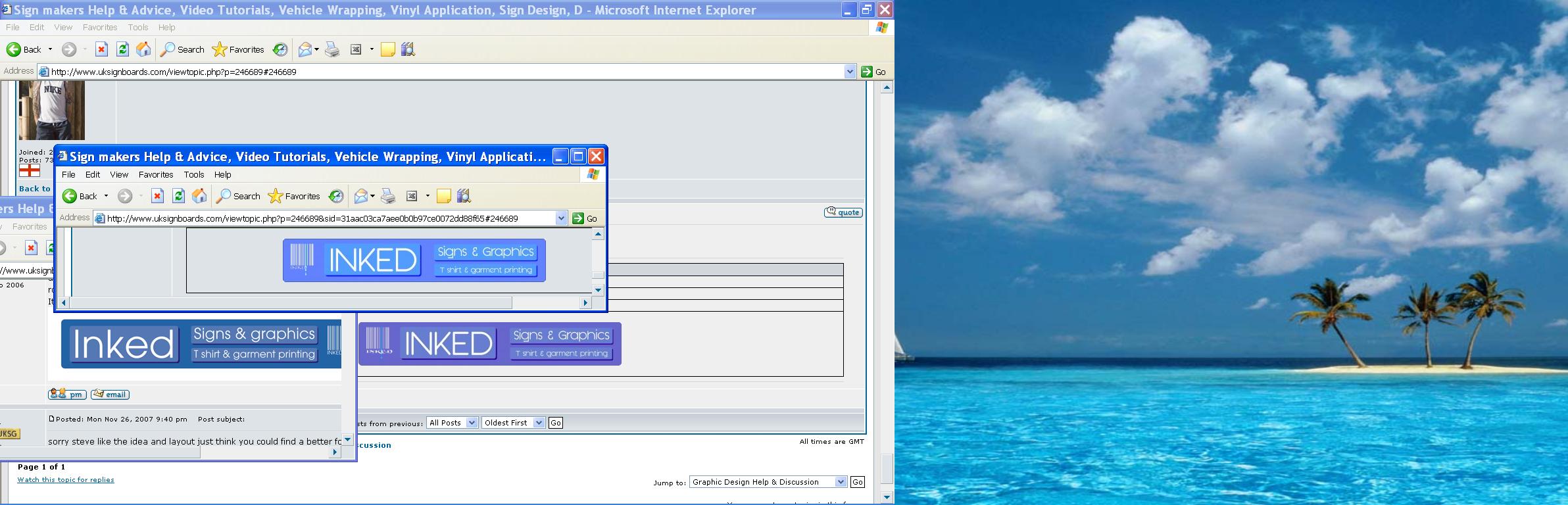
Well this colour thing does my head in,
here’s all three together for comparisonin theory they should all look the same??
Peter
Sorry about the dessert Island, screen capture gets both my monitors.
Attachments:
-
Its the one on the bottom left thats closest, i was trying to remember how dark blue dibond was.
its a bizarre problem thats for sure, -
bottom left is yours steve, but thats a gif from ps
I have been recently having a few colour issues with signlab, but found that printing direct from illustrator seems to be the way to go, anyway thats another subject.Peter
-
Guess im gonna have to pick a font and go with it, everyones in bed.
by now i bet -

Whatever you do, watch your capitalization.
Should it not be "Signs & Graphics"
and "T-Shirt & Garment Printing"?
Love….Jill -
Not always no.
I purposely didnt capitalise every letter.
Sometimes it looks better sometimes not, until I decide on a font theres no real need. -
Colours are still wrong, 🙁
It has to be a setting in my corel thats transferring to yours I guess.
Anyway thats not the important bit, I just need a few font suggestionsa s like they say, doing a sign for yourself is always the hardest.
It is only a temp one but even a temp one has to look nice.
Still like harrys separate bit for the logo, going to go with that somewhere on the sign I think if I have an offcut the right size. -
I have the layout pretty much sorted, does anyone else have any font suggestions?
I have a few i like but like to hear others opinions. -
Steve, it seems to me that every time you post something for yourself, that no matter the suggestions given, you pretty much do your own thing anyway.
So do whatever you choose, I am sure it will be just excellent and above any well-intentioned critique.
Love….Jill -
I didnt mean it in the way you seem to have read it,
I have taken advice on board and am going to use the idea Harry gave me.
Where I have said "colour is wrong" I mean Corel is doing it not anyone posting help.
Im not ignoring advice Im taking it, I cant see why you say that.
Where I said theres no need to capitalise the letters its because I just typed it out hoping for font suggestions, not for any other reason It may look better capitalised or all lower case depending on the font.
not everyone likes the same thing do they, if they did there would be a lot of similar looking signs about. -
do you think the rectangle with the logo on would look better in the middle if I make the lettering on the right a bit smaller?
Also how far away from the main sign do you think it should stand off?
I was thinking about 25mm.
Also having trouble choosing a suitable font.
As mentioned its dark blue dibond and white cut out letters, on blue/dark blue vinyl so limited colour choice.I know its hard but ignore the colours in the sign as thats a different problem corel is posing
-

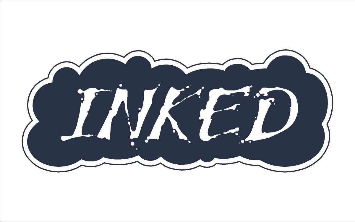
I’ve just had this idea in my head for a while since you posted about this the first time a few months ago. Although it’s pretty impractical, I still just can’t get it out of my head. You can see my intention with my quick sketch of the octopus that I did (that’s the impractical part). Anyway the other drawing I did didn’t have your bar code to put in, because I don’t have Corel. I would also add a little bit more detail to the edge of the ink cloud if I had some time. Anyway, these were done just for fun. 😀
Attachments:

-
He he I like it.
Goes well with our seaside location too.
Could have something there. -
Would just like to thank everyone for their suggestions
Going to have this routed now, Harry your idea is going on there,
I liked it a lot.
Thanks all -
I didnt have much time to mess about with the font, but I have chosen Kubra medium as I use it on the bar code logo and it s one I like, & modern looking not sure who else likes it but Im going with it as Ive no time for anything else, can always be changed if enough of you say you hate it lol
:lol1:Will post pics once its in progress.
Log in to reply.
