Activity Feed › Forums › Sign Making Discussions › Graphic Design Help › Design help please? – JC Autos
-
Design help please? – JC Autos
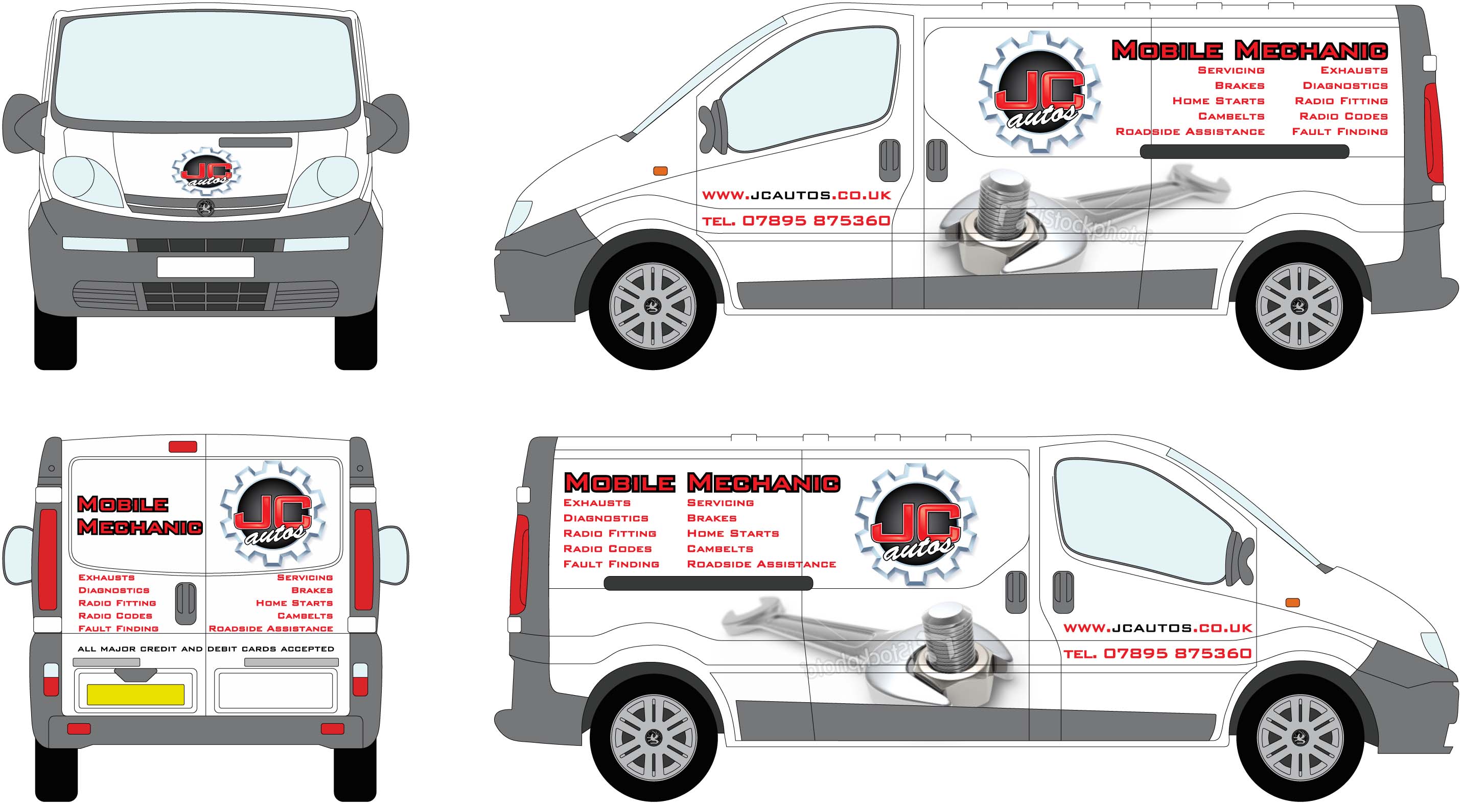
Posted by BenRead on January 14, 2009 at 6:26 pmHi all,
Any suggestions and thoughts on the layout of this van?
All help would be appreciated.
Thanks Ben
Attachments:
 Terry Bull replied 15 years, 4 months ago 4 Members · 4 Replies
 -
4 Replies
-

Keep the laundry list on the back doors.
Lose it on the sides.
Make the logo bigger on the sides.
And get rid of the Brush Script.
(hot)
hahaha
Love….Jill
PS
Get rid of the "TEL:"
and make a white pinline outline around the red letters on the mechanic part, between the red text and the black outline. -

Design looks good but I would move the phone number to under the sliding door runner and towards the rear of the van. Ive done loads of Vivaros and the Impact outline emphasises the swage line a little more than it actually is.
I think the back doors look a little cluttered with all the services too.
-

love the logo and the spanner shame its a left hand thread
sorry not keen on the fonts or big list 😉
bit tricky deciding where to cut the spanner because of the drop shadow.
as jill says separate the red from the black like in the logo. see how the red pops.got real potential this one
chris
-

Firstly never use red text with a black outline they are both dominant colours and do not contrast with each other why not leave a gap between the text and the outline if you have to use these colours
secondly a bold typeface with a thick outline closes the negative space up around the shapes and makes it harder to read at a distant
thirdly if you use a bold font for the title then use a lighter version for laundry lists as jill calls them
l
these lists sre fine if the space between the lines is not too great .these need to be tighter
loose the list on the side, make the logo and mechanics etc biggeron the back use a nice light version of euro / microgrammer font whatever its called
tighten the gaps between the lines and it should be good to go
i would sooner leave stuff off if i thought it looked too busy
These are my favourite vans and they have some good panels but you need to work with them
Terry
Sign and Custom
Log in to reply.
