Activity Feed › Forums › Sign Making Discussions › Graphic Design Help › design help needed please with this logo?
-
design help needed please with this logo?
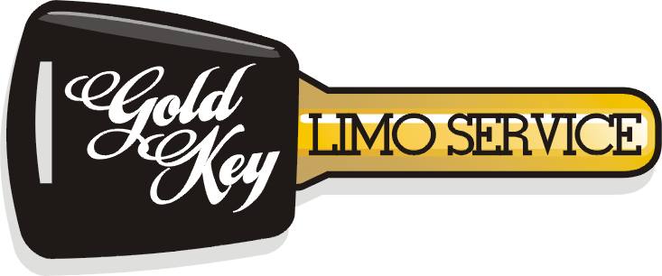
Posted by squareone on March 30, 2007 at 11:11 pmAny advice on this design would be greatly appreciated?
Thanks in advance
-Rich
Attachments:
 squareone replied 17 years, 1 month ago 13 Members · 41 Replies
 -
41 Replies
-

I think the idea is good ………. I’m just not keen on the font (limo service). But that’s personal preference. But the concept is good! 😀
-

I agree I think you need a differant font for limo service the rest is bolder.
Lynn
-

Thanks, my wife just told me the same thing. the biggest problem I have with elegant fonts is the s never looks like an s. Do you know a good script font
Thanks
-Rich -
Sarah Script is a nice font. 😀 But it is sometimes difficult to get the right script where all the letters (leading caps especially) look just as you want.
-
I wouldn’t really use a script font as such don’t really like many of them, but there are many nice font’s you can use,
Lynn
-

I’m sorry, not too keen on it as there are too many special effects and not enough concentration on what it says.
Seems disjointed, like 2 separate layouts.
Colors look a bit poopy rather than classy and clean.
A nice roman serif font might have more impact than that wedding-invite script, too.
Love….JillPS
having peeked at your site I would advise you to buy the book "Mastering Layout" by Mike Stevens. I see a lot of newbie mistakes, like arching a script, Brush Script, and the lack of negative space on your work. But we all start somewhere and one can improve with the proper knowledge. -

hhmm…. not too sure I like it either….
I’d be using a stronger font for limo service for sure…. even using the same font in the ‘key’ logo.
I guess it is too logoee (is that a word?) for me. You seem to have two logos in the one logo if that makes sense.
I’d make the Gold Key as the logo, and have the limo service in a block text or something.
Not fussed on all the fades either. Just my personal choice though. I just find it too ‘confusing’ for the eye to focus on one aspect on the sign. If a client can’t get the idea in a few seconds… they’ll move on.
-
Shane you hit the nail on the head. The client want his old look combined with a new name and elegant look. here’s the old sign.
Thanks to all who have given advice
😀
-Rich
Attachments:

-
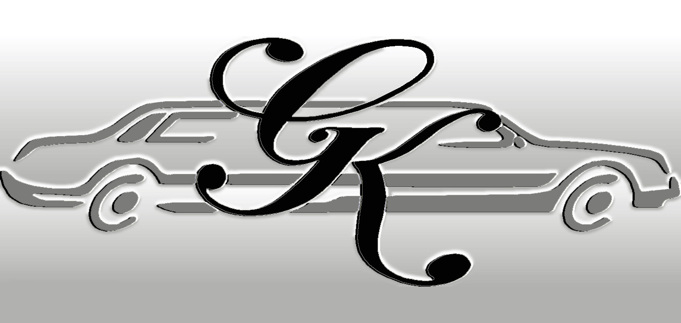
quote gordon bradshaw:thats sharp shane
thanks mate,
on reflection, I’d probably do the letters G,o,K, and the part of the e in a solid colour. Not fussed on the perception that its cut out 😕 if that makes sense..
-
I’m sorry but I don’t think his old look is worth saving.
Here is a quick example of a more unified, clean logo.
Love….Jill
Attachments:
-
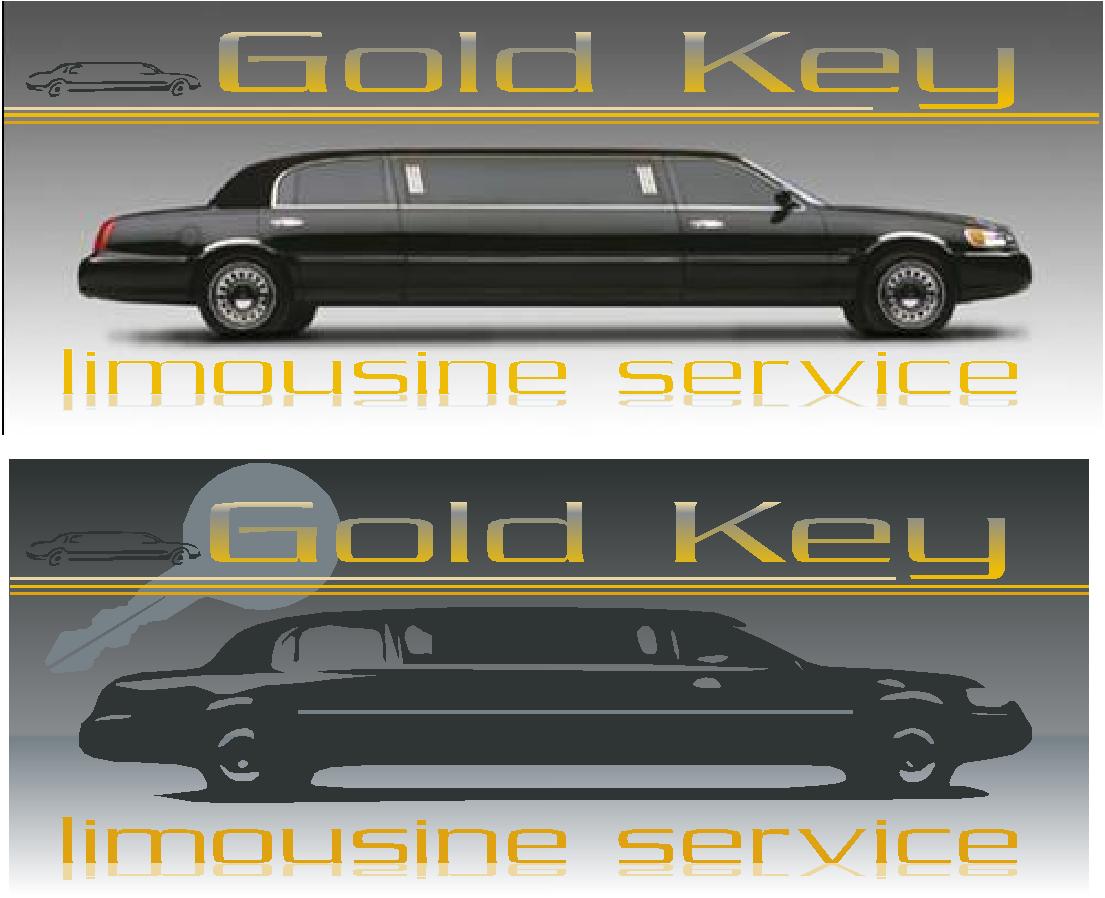
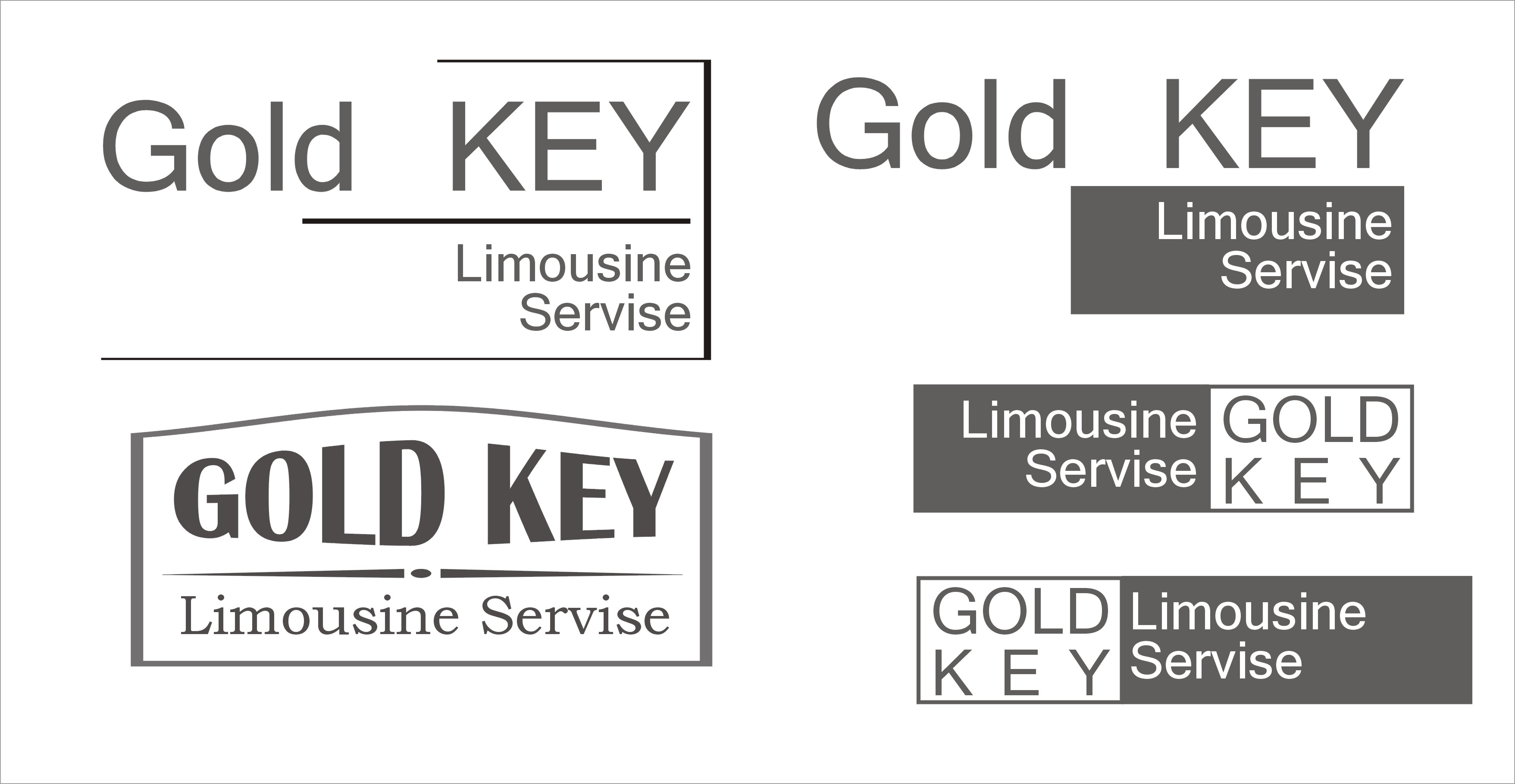
I like the key Jill but he like his limo image. My motto is the customer is always right. Here is the latest revision
Thanks again
-Rich
Attachments:

-
quote squareone:I like the key Jill but he like his limo image. My motto is the customer is always right. Here is the latest revision
Thanks again
-RichMy first impression… Gold Key what? 😛 Is he a locksmith? He could sell cars maybe….
I’m not fussed on script that does not join up either…. 😳 sorry to be so negative 😕
-

It’s always better imho to keep the weight to the bottom of a design like this, in this instance the Gold Key is screaming out to be at the bottom. I also agree with Shane, script like that should be joined up, looks like a mistake if it isn’t. Just my tuppence worth, but already it is looking twenty times better thatn the first one.
-

Sorry Rich – but everything is fighting for attention. There is no priority given to any of this.
Maybe the limo image could be done in a very pale grey (so it is in the background) then the main message can be overlaid over the top, this way there is some priority text and main message that isn’t competing with everything else for attention.
Why not post an .eps of your work so other can have a go with it 😀
Finally – Please listen to what Jill has said and get yourself a copy of Mastering Layout by Mike Stevens – he was a "Yank" too and knew what he was talking about 😉
-
There is nothing negative about constructive criticisms, thanks for the input. I am very new to the business and I am always open to suggestions. One problem I have is that the font I used in my LXI software does not show up in Photoshop. LXI is what I have used for years and I like to drawing in it and save them as a picture. (It’s kind of like adobe illustrator)
Thanks Shane for posting this as a topic. I could not post a new topic so I posted on the bottom of that old one.
-
 quote squareone:I like the key Jill but he like his limo image. My motto is the customer is always right. Here is the latest revision
Thanks again
-RichGood to see you having a go and at ‘tweaking’ his (customers) images. After a while you may adopt more of a "the customer doesn’t know any better" philosophy and start offering them ‘their version’ and also what you may recommend. It’s a compromise, and lets them feel like they are still making the decisions…if all else fails and they still want their design, treat it as practice / portfolio…and sell it to somebody else!
I may have a wee play with this one later on…
Dave
-
quote squareone:Thanks Shane for posting this as a topic. I could not post a new topic so I posted on the bottom of that old one.
I was not me that made it a topic mate, it was one of the moderators. I thought it was a good idea tho. Unfortunately they ‘lost’ my post with my design idea 😥
Can’t find it on this PC now either. I must have deleted it …..
-
sorry an eps. file is to large for me to post
I usually do single color overlays because I do not have the expensive printing equipment . I choose an air brush for any fades or artwork. This is why I don’t have much experience with Photoshop.
Thanks
-Rich -
quote squareone:sorry an eps. file is to large for me to post
I usually do single color overlays because I do not have the expensive printing equipment . I choose an air brush for any fades or artwork. This is why I don’t have much experience with Photoshop.
Thanks
-Richtry exporting to eps without the header. That adds heaps to the size of the file.. Failing that, remove the fade from the file as well….
-
OK – something a bit different….well it is 1.00am…#
Dave
Attachments:
-
I think the gray is looks a lot better… what do ya’ll think
Oh and I’m no yank 🙄 Im a Texan 😀
Thanks
-Rich
Attachments:
-
Dave what program did you use to convert that limo to a Silhouette?
-
Oh…a Texan huh?
That explains being stubborn and not listening to women!
😉Sometimes the customer is all wrong.
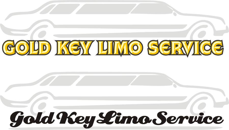
Here are two ideas using his icky car.
I tried to make the company name more streamlined and not all over the place. With the overly distorted odd script initial combo you’ve used, it only muddied things up. Note on the second one I did not even use the gold color.As has been pointed out, a script needs to be connected/welded. You wouldn’t write out your name in handwriting but not connect the letters, would you?
And unless a layout can stand on its own…as what you’ve shown us can’t do yet…no amount of tarting it up will save it.
Love….Jill
Attachments:
-
quote Jillbeans:Oh…a Texan huh?
That explains being stubborn and not listening to women!
😉Sometimes the customer is all wrong.
Here are two ideas using his icky car.
I tried to make the company name more streamlined and not all over the place. With the overly distorted odd script initial combo you’ve used, it only muddied things up. Note on the second one I did not even use the gold color.As has been pointed out, a script needs to be connected/welded. You wouldn’t write out your name in handwriting but not connect the letters, would you?
And unless a layout can stand on its own…as what you’ve shown us can’t do yet…no amount of tarting it up will save it.
Love….Jill
come on Jill, get to the point… tell us what you think :lol1:
Like the bottom one too 😉
-
I’m a Yankee, Shane, I try to tell it like it is.
When people post designs for advice, I think they must have a question about their work, that it’s not sitting right.
I couldn’t go to bed at night with a clean conscience if I had simply said "Atta Boy" to him.Another thing that bugs me is why there is a grey gradient in the background. Should not the design be more important than the background?
Love….Jill
😀 -
quote Jillbeans:I’m a Yankee, Shane, I try to tell it like it is.
When people post designs for advice, I think they must have a question about their work, that it’s not sitting right.
I couldn’t go to bed at night with a clean conscience if I had simply said “Atta Boy” to him.Another thing that bugs me is why there is a grey gradient in the background. Should not the design be more important than the background?
Love….Jill
😀You inspire me all the time Jill. I’m sure Rich will take the advise as one coming from experience, and not just a yankee trouble maker :lol1:
-
quote :I’m a Yankee, Shane, I try to tell it like it is.quote :glad to hear you proud of being a yankquote :When people post designs for advice
I did come here for advice and have got a lot of good advice. I hope you have noticed that I have changed the image several time to the advice that was given to me.
quote :I think they must have a question about their workA wise person should alway take constructive criticisms, sorry but you seem to get mad that I feel the customer is right. This has been the image that he has used for years and while he may change the name, people still know this image… make sense
I’m not making any money of this design, i was just trying to help a longtime friend. In the end i’ll make some magnet signs for him and a couple buck over cost. I said below..
quote :I usually do single color overlays because I do not have the expensive printing equipment . I choose an air brush for any fades or artwork. This is why I don’t have much experience with Photoshop.I take it you do not like the signs on our website either?
Thanks
-Rich 😕 -
Actually I think you have lots of potential…
you just need to learn more about layout and letterforms.
We all start somewhere.
Until I read Mike Steven’s book, even though I had attended art school, all my signs looked like crap.
If you can airbrush, you have a one-up on all the licky-stickies out there.
The reason my advice might seem harsh is beacuse I want us all to work to our best potential.
And the customer, while they do need to be listened to, is not always right.
That’s why they come to you for designs.
Love….Jill -
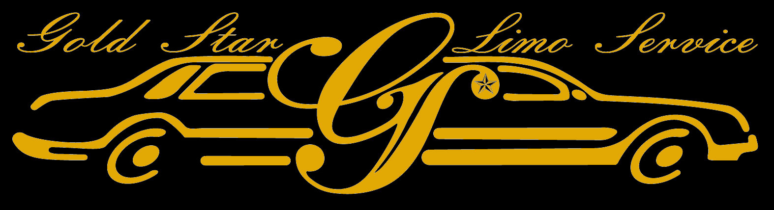
Thanks Jill for the encouragement and thank you everyone for your advice on this posting. He wants to use a different name but love the GK welded lettering and want to stick with that style. Here is the new letters GS Gold star…. If he wasn’t a good friend also (hot) I’d roast him :lol1:
Thanks again this forum is the best thing since slice cheese!!
-Rich
Attachments:

-
No joke 😳 I have changed this thing so many times i think I’m going cross eyed.
Thanks
-Rich -

maybe try something different …. and see how it goes
would be nice if they needed a w as well 😕
bit naff?
Attachments:

-

Reminds me of Average White Band. Good Scottish lads too!
Peter
-
Thanks to all of you for the input and help. He is satisfied with GS that looks like a er:lol1:, and I am leaving it at that way:roll: I have learned a lot from this post, most of all how awesome this forum is.
Thanks
-Rich -
quote squareone:Thanks to all of you for the input and help. He is satisfied with GS that looks like a er :lol1:, and I am leaving it at that way 🙄 I have learned a lot from this post, most of all how awesome this forum is.
Thanks
-Richits gets addictive Rich… you’ve been warned…. :lol1:
-
quote :its gets addictive Rich… you’ve been warned
I know, my wife is already giving me grief over the time I spend in here 😮
Here is the finished design 😛
Thanks again,
-Rich
Attachments:
Log in to reply.
