Activity Feed › Forums › Sign Making Discussions › Graphic Design Help › Design advice on company vehicle needed?
-
Design advice on company vehicle needed?
Posted by Deleted User on August 5, 2004 at 9:57 pmhi everyone please find attached my idea, im pretty set with the ‘logo’ but would appreciate any comments/improvements on the van layout. My only concern is the ‘dt’ part of the URL is on a very curved surface and may make the whole line look wonky! Many thanks to Brian Hays for the outline.
Hope the file is correct size for forum, and before its said the tel no isnt real! still awaiting confirmation of no from BT!!!Mark Shipley replied 19 years, 7 months ago 13 Members · 53 Replies -
53 Replies
-
Deleted User
Deleted UserAugust 5, 2004 at 9:58 pmchrist!!
something is a miss here!! :lol1:
apologies to 56k users! i will try and resize and re-upload!!have resized it now so 8 monitors are not required to view!!
-

Humble opinion, but if you’re big on using your logo, use it big 😀 Why not angle the logo about 15 – 20 degrees and enlarge it to cover more of the van sides, then have it right across the back side of the van. Also, and I apologise for this in advance, but if I was Joe Public, I wouldn’t look to closely as at the moment the van just seems to blend into the background. I see alot of vans passing the shop on a daily basis that I really have to work to see what they’re about. Humble opinion again, but I think if a vehicle is lettered up or wrapped or anything applied to its surface, it should shout at you! Sod subtle, subtle doesn’t sell very well because usually its so subtle, no-one even see’s it! 😕
Hope I haven’t offended, just my opinion 🙄
Cheers, Dewi
-

I can only echo what Dewi has said. There’s nothing wrong with this design, it just isn’t very exciting. It looks like a refrigeration engineer’s van rather than a design based trade. If you are dead set on the logo, then perhaps it could become a secondary element; secondary that is, to a more powerful graphic, such as the phrase “Design” or “graphics” for example.
Just a thought.
-

i would ditch the logo!! 😛
not being picky or horrible, but my thoughts are, ‘everybody’ has the same swirrly circully thinngy 😮 i am on the main a90 to aberdeen, and i’m always looking at vans and lorries!! 🙄 sad i know!! 😀
but the amount of times that same design is being used!!, i would change it!! because everyone knows it now, and they won’t bat an eyelid when they see yours!! it’s all very well having a swirly logo, but the text has to be seen first!! 😀 😀my opinion only remember!! (bully)
nik
-
Wholeheartedly agree in both cases. Sorry to pitch my oar in again, but what Nik says is true, the logo style has been used again and again. It can still be incorporated if you’re set on it, but it needs to look different from the crowd.
Andy has a good one though, why not relegate the logo to the doors, and have a big bold statement on the back panels about design, print or signs? You could go wild with colours, graphics, even a digital print! 😀
I haven’t signwritten my own vehicle yet, but for a good reason. Every signmaker in my local area have signwritten thier vehicles and just to make sure they have done it first, they’ve all done it badly in my opinion bar from one. The one who has had a very strong logo to begin with, so when they stuck it to their van, it looked the part. I’m going to wait til I have a winning idea, something really special to stick on there. I’d rather have a completely bare vehicle than a badly signwritten one. Also, I get alot of van/vehicle work, so you don’t necessarily have to have your own vehicle signwritten to get the work.
Again, apologise for sticking my oar in 😳 As my avatar suggests, my mouth rarely closes! :lol1:
Cheers, Dewi
-

I would nix the website on the side and leave it on the back….
some bored housewife is more likely to jot it down in traffic then.
I think it is crying for COLOR.
I like the blue panel on the side where the list of services is,
but I would continue that onto the back as well.
The logo looks like something our electric company has.
Not trying to be snotty here, but that vehicle is your
way of showing the town what you do.
There IS something to be said for understatement,
but I truly feel that you need a spash of color somewhere,
like a nice orangey yellow.
Maybe the swooshy thing could be a rainbow spectrum of color.
(?)
Wasn’t that nice of Brian to send you an outline?
Love…Jill
PS (edit)
I have just peeked back and realized that you have listed your services TWICE.
That is redundant as well as a waste of space!
If you’re dead-set on a web addy, maybe put it in the blue area, or vice-versa. -
Deleted User
Deleted UserAugust 6, 2004 at 9:22 amhi everyone, think ill find a new profession!! 😳 :lol1:
the reason it is subtle is my father will be using it for the IT side of the business as well, i agree something colourful and in your face is the right thing to go for if you only do signs, however we cant turn up at some of our It clients looking like somethin out of wacky races! One of my other ideas i drew up was the logo large on the side at an angle but others felt this was ott. Jillbeans the info is listed twice cos i thought it was too small in the logo for people to know what we do, so re listed it larger!
I apprecaite all of your comments on the logo and would like suggestions for changes to it, it was originally just the text part however i felt it needed something more to become a ‘logo’ hence the ‘swish’, perhaps i have fallen into a ‘same old same’ design trap. If anyone can suggest a design utilising the existing font in the logo ????many thanks for all your advice, look foward to some ideas to go foward with
Gareth
-

Hey Gareth,
Is there any chance you can upload this as an illustrator file fo we can have a play as well? I’ve got a problem with the swish as well, they’re fine as they go but will tend to date quickly. Stick it back up and I’m sure we’ll all have a bash.
There’s nothing wrong with being a stand out smack in your face graphics Company that also is a coporate look. IT folks are really geeky (I know…I deal with them every day), They need to be led by the hand and guided into the world of good looks and good taste.Failing that… format his drives.
Lee
-
Deleted User
Deleted UserAugust 6, 2004 at 10:00 am*edited* see post below for new AI
-
Deleted User
Deleted UserAugust 6, 2004 at 10:16 amhi just checked and downloaded and opened it ok? Is there any other format i can upload it in that may work for you? I see its been downloaded 11 times have i done something wrong or can others see it ok?
-
Fair do’s, it seems you’re in a bit of a dilemna with the 2 different customer bases. I thought I would point you at this thread from a while back. It is a good example, I think, of a fairly formal layout being made much more interesting by the clever use of materials. Anyway, have a look and see if it inspires you.
-
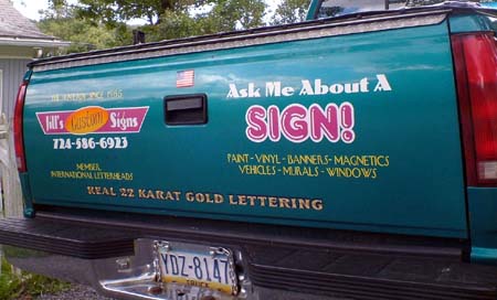
Here is the door and the back side of my pickup.
The only place where I have my phone # is the tailgate.
I re-did the truck last year, but I’m already sick of this.
You asked for it…Love- Jill 😉
Attachments:

-
Deleted User
Deleted UserAugust 8, 2004 at 11:09 pmthanks big G will consider use of some different materials, has anyone had a chance to come up with anythin using the AI i posted??
Jillbeans many thanks for posting your vehicle pic anyone else got a pic of there company van to post?
-

i tried the download mate but i get a blank white page opening. .ai. files are normaly perfect, not sure why this isnt loading for me.. 🙄
-
Deleted User
Deleted UserAugust 8, 2004 at 11:32 pmoh i will try and post it up again 2moro
cheers
-
Deleted User
Deleted UserAugust 9, 2004 at 2:54 pmfingers crossed people can download and access this AI ok now, and hopefully come up with some ideas
cheers!
-
Deleted User
Deleted UserAugust 9, 2004 at 8:38 pmis it downloading ok for anyone now?
-
i tried again mate, imported it into signlab and got a blank screen, opened in photoshop and got a white blank…
sorry 😕
-
just tried adobe illustrator, saved file to desk top then double clicked, opened perfectly!! 😀 😀
Nik
-

if you right click & open, you can open straight into Corel Draw. No need to save & import.
Johnny S
-
Deleted User
Deleted UserAugust 10, 2004 at 9:32 amoh good! would appreciate any ideas, having had a re-think about the logo if anyone has any other ideas for it i would appreciate seeing them. I would rather avoid having to have digital printed images due to cost (only starting up). thanks.
-
works a treat johnny!! 😛 😛
another short cut added to my corel draw memory cheers 😛
Nik
-

Rob could be that its saved in a later version of Illustrator If its after vers 7 I think your signlab will struggle with it only an opinion of course opened in Illustrator no probs for me
Goop
Mmmm says its a version 7 or earlier sounds like I’m speaking thru a hoop again lol
-
Deleted User
Deleted UserAugust 11, 2004 at 9:36 amit was exported from corel, may explain some of the difficulties
That aside has anyone got any further ideas design wise??
-
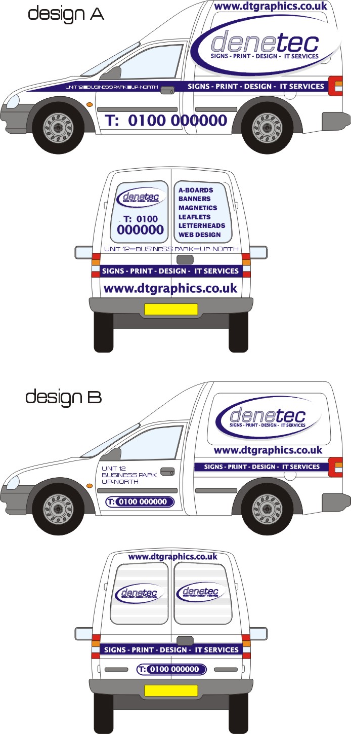
couple of quick designs, we’ve used robs striping technique to blank out the back windows, if you want the ai file just ask.
Attachments:
-
Deleted User
Deleted UserAugust 12, 2004 at 10:56 amhi jonny,
brilliant thanks, yes would appreciate it if you could post up the AI, what font did you use for the unit 12 business park part?
cheers
Gareth
-
Deleted User
Deleted UserAugust 13, 2004 at 4:08 pmcheers jonny, much appreciated will hopefully post up a pic of the finished van soon!!
-
heres a quick one!
Probably to late but what the heck, i was bored!
Cheers
Blue Cow
Attachments:

-
extra hoop on logo and text along sill should be in class 2 white reflective!
in case you were wondering!
cheers
-
Is that allowed: white reflective on the sides of a vehicle?
-
i dont know if it IS allowed, but i know it does get used mate.. the BT trumpet guy on the light grey vans all were reflective white and ther was thousands of those on the road. 😕
-

Hi Guys
Is there a web site that outlines what you can and can’t do with regards to reflective and the like as we want to do some reflective work on our own car.
Cheers me ansums
Paul R(mackerelbus Design)
-
Reflective should be treated as a lamp and therefore indicates the direction of travel. ie. No white on rear. White on the sides is a bit awkward but I know the old bill use white on the sides of cars so I s’pose it must be alright.
-
quote big G:Is that allowed: white reflective on the sides of a vehicle?
i do not know about that!! i have it on my vehicles, it’s only nikkalite but there’s not too much of it 😛 be interesting to see if anyone else has had any run in’s with the authorities over reflective!! 😀
nik
Attachments:

-
that looks pretty nifty nik….
can i give constructive citisism om iT 😉
a wee bit more space each side of r & s so as more black..maybe .5 inch at max
anyway.. still looks great! -
fire away rob i dont mind!! 😛 😛
but i designed it too look like that 😀 you can’t really see the effect of the design on the truck i will post the outside sign to show you what i mean!! 😛
will need to do it tomorrow though……..bloody freezin out there!! 😮
thanks Nik
-
Nik, I like it!
Did you buy “nikkalite” on purpose? :lol1:
As far as I know,
you can stick reflective just about anywhere on a vehicle
in my neck of the woods.
Love…..Jill -
quote Jillbeans:Did you buy “nikkalite” on purpose? :lol1:
no i did’nt jill bought some from cox plastics oh.. years ago, then thought they were too expensive, so changed to europoint, funny thing was when i read the back ‘ i shouted to ed.. ha-ha it’s called nikkalite’ 😮
yes i am as mad as i look 🙄 😉 (ed thinks so)
Nik
-
of all the low cost reflectives the best all round i find on the go, is lucky lite… think its about £10 – £12 a metre
nikkalite from europoint is a good reflective,,, best of many actualy lower costing reflectives actualy…
-
actually…where do you get the lucky lite…actually 😛 only kidding..
i hate nikkalite it so easy to muck up a sign with it.. tears so bloody easily!! and i refuse to take it off a van or sign 😮
Nik
-
:lol1: :lol1:
you must be using the OLD nikkalite NIK…
the new stuff has (in my opinion) a polyester film over it.. this film holds the whole thing together. (doesnt perfect it) but makes it the best of the low costing reflecxtives on the go.. most reflectives tear very easy, weed crap and are murder when striping. the new polyester film on top helps it heeps… 😉 -
bloody @~@~*+…i wondered how it was so cheap £5 odds a metre…colin is going to get his fingers wrapped..next time he is in on his visits!! 👿
cheers rob i did not know that, i will check it out tomorrow!! just to make sure. 😉 i just bought a roll a few months back!! 🙄
nik
-

we use nikkalite ……. sticks very well ……. I know this from experience of getting it stuck on places it shouldnt 😮
Use of reflective seems to be a bit of a sinking sand pit area?? we have used it on sides aswell ….. would be good to actually know the exact do’s and dont’s of this area but we never seem to be able to find any set in stone info on it??
Carrie 😀
-
quote Carrie:we use nikkalite ……. sticks very well ……. I know this from experience of getting it stuck on places it shouldn’t 😮
now now carrie.. we don’t want explicit details on a family forum now do we :rofl: :rofl:
Nik 😉
-
:point: now now Nik, your clearly showing who has a dirty mind around here 😉 :lol1:
Carrie (angel)
-
mua….i’ve learnt from all you guys on the board!! :you:
Nik 😉
-
Hi all, just my 2p’s worth on reflective 😀
Grafityp sell ‘LG’ Luckylite at £7.27 p/m @ 610mm it’s great for signs because of its high gloss finish.
But for vehicles I use Hexis engineering reflective £12.48 p/m @ 610mm – its very supple and contours really well.
Both are great products that cut and weed really easily.
Mark
Log in to reply.
