Activity Feed › Forums › Sign Making Discussions › Graphic Design Help › Desgin a logo help
-
Desgin a logo help
Posted by Richard Urquhart on January 28, 2010 at 8:10 pmHi all I’m really banging my head against a wall. I said I would help a mate who has packed his job in and wants to start his own business, doing decking and kitchens and a bit of electrical, he doing the correct courses etc and money is tight and as times are hard I said I would help come up with some ideas and ask you guys for help. The brief is anything goes just need some help please, thanks Rich
Attachments:
 Richard Urquhart replied 14 years, 3 months ago 12 Members · 36 Replies
 -
36 Replies
-

Whats wrong with/what dont you like with what youve put up??
Looks good to me 😕
-

Hi Richard
personally as designer myself, the right justified text in the top one doesn’t ‘read’ right.
I like the second one but maybe change ‘painting’ to ‘decorating’?
Also I’d make phone number bigger to justify left and right to name.Just my opinion…. 😀
-

I would avoid using the graduated tints while finalising the design. Make sure it looks good in black and white first so that it can be used on stationary. Once you’re happy with the layout, then add the graduated tints for use on signs and full colour prints.
-

The font choices all look wimpy.
Try C&C in a bolder font.
Make it lower in the house not floating by the roof.
Make the home and gardens in a reverse panel.
Make phone # smaller.
(I don’t add those as part of a logo)
Love….Jill -

Hi thanks for looking. Its not that I’m happy or unhappy just want to create a nice logo for a mate and wanted your ideas, as I said I have nothing really to go on and may be you guys had some suggestions. Thanks for looking Rich 😕
-
 quote Phill:I would avoid using the graduated tints while finalising the design. Make sure it looks good in black and white first so that it can be used on stationary. Once you’re happy with the layout, then add the graduated tints for use on signs and full colour prints.
Phill
this is a point that is quite often put forward about designs.
why would anyone want black and white stationary?
I thought that was a thing of the past,Peter
-
If you design your logo in full colour it means all your stationery has to be printed in full colour which can be more expensive
Design your logo so it can translate to a range of different media.
Simples.
-
but isnt stationary just as important as any other media at promoting your company image? why would you need to have a black and white image when a full colour logo would be better, and I am not talking about cost,
nowadays it is insignificant, cost wise, to add a colour logo to a thousand letterheads.Phill, I am only asking the question as I think it comes from traditional views,
and apart from cost, is there another valid reason to design first in bw?Peter
-
Yes there is, Peter.
If a design works well (squint test) and looks good in B&W it will also work in color. This is what I have been taught my whole career.
All the colors and effects in the world cannot save a poor layout, generally speaking.
Design first in black and white. -
 quote Jillbeans:If a design works well (squint test) and looks good in B&W it will also work in color. This is what I have been taught my whole career.
All the colors and effects in the world cannot save a poor layout, generally speaking.
Design first in black and white.thats what ive been taught too and still do the squint test have tried telling college buddies…but they cant grasp it, must be their young age 😀
nik
-
I no longer apply the squint test – I just take my glasses off and see if I can make head or tail of it. If I can, it passes my squint test :lol1:
-
quote Jillbeans:Yes there is, Peter.
If a design works well (squint test) and looks good in B&W it will also work in color. This is what I have been taught my whole career.
All the colors and effects in the world cannot save a poor layout, generally speaking.
Design first in black and white.Jill, A lot of corporates now go for full colour, for example Virgin, their logo is full colour because modern media does not need a black and white alternative, I respect the traditional methods of design, but dont agree that today it has to be done in black and white first, just my opinion,
Peter -
quote Peter Normington:just my opinion,
Wrong as usual 😕
-

Most good corporate image manuals that I get to see have a monochrome option.
If only to engrave on the brass plate outside their registered office. 😀
-
quote Phill:quote Peter Normington:just my opinion,
Wrong as usual 😕
well, between us we are right 50% of the time.
😀
Peter
-
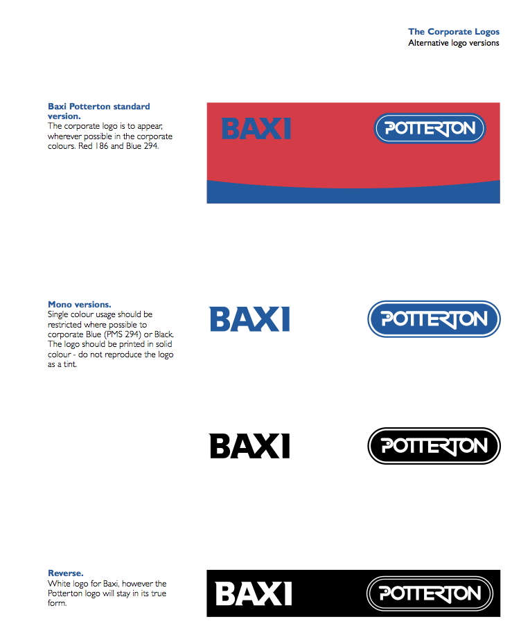
quote John Childs:Most good corporate image manuals that I get to see have a monochrome option.
I can’t lay my hands on the Virgin Media manual this morning, but here’s one example……..
Attachments:
-

I can see where Peter is coming from……..
Now that we have all this modern technology at our finger tips……fills, fades, bevels, almost limitless effects…surely making it look right in black and white first goes out of the window?
I can see how the theory will work for spot colour designs but if the finished logo is going to have ‘photoshopped’ effects I can’t see why it should be needed
Taking the uksignboards logo for example…..I can’t see how laying that out in black and white first would prove anything as to whether the finished design was going to work or not…..now Rob will come on and tell me that’s exactly what he did 😳
Horses for courses I reckon….it’s a proven technique that works but not a necessity in every design is my opinion
-
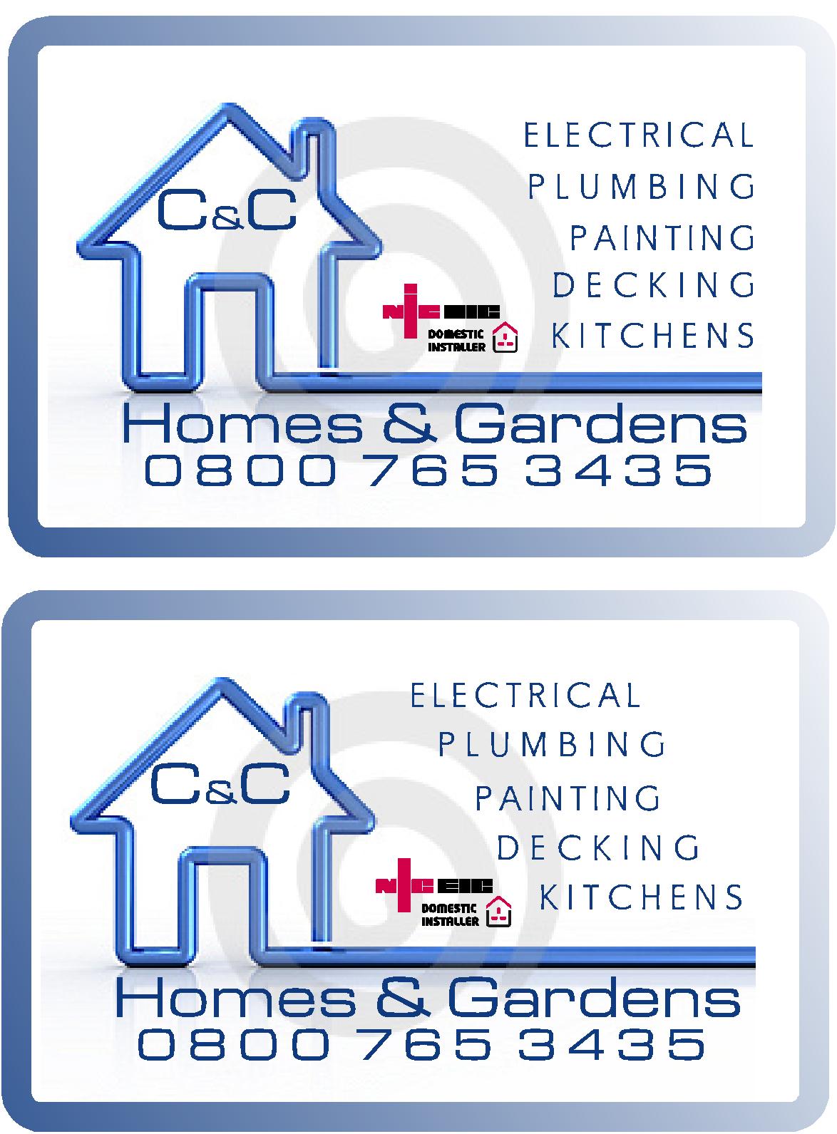
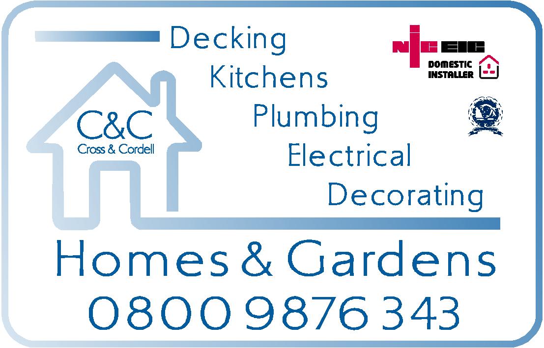
Any improvements in these ? Thanks for looking
Attachments:
-
Top right out of those ones for me Rich
Personally I would drop the bottom two lines of text off the logo a bit and increase the spacing between the each line……the ‘0’ of the phone number just needs squaring up with the leg of the ‘H’…..I would also tweak all the text on the diagonal so it ends up square with the end of the logo like you have with the one underneath
-
I see your point Glen yes I should have seen that before posting there’s a bit of space for the name and number to move down thanks mate. Any other ideas any one. Rich
-
I don’t see to much wrong with that Rich…….I would still make ‘decorating’ line up with the edge of the logo but that might just be me..
Have you tried flipping the border so the darker side is on the right?
-
ah I see what you mean. I took a guide line from the roof but will have a look. Thanks its all these little bits that help.
-

When doing a logo work in black and white first to test the relationship of the shapes to each other is what I was taught and that is what is wrong here. The shapes bear no relationship to each other.
I like the layout but it is far too busy. I would lose the shadow and background and the fade on the border….or fade it top to bottom if you must imo.
It looks more like a web graphic than a business logo.
Just my tuppence worth 😀 -
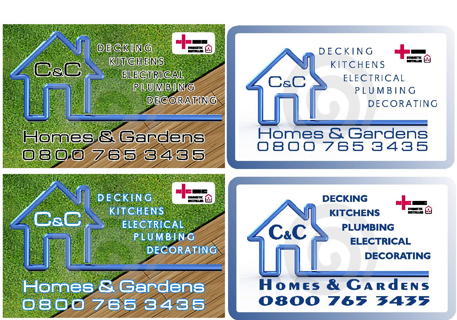
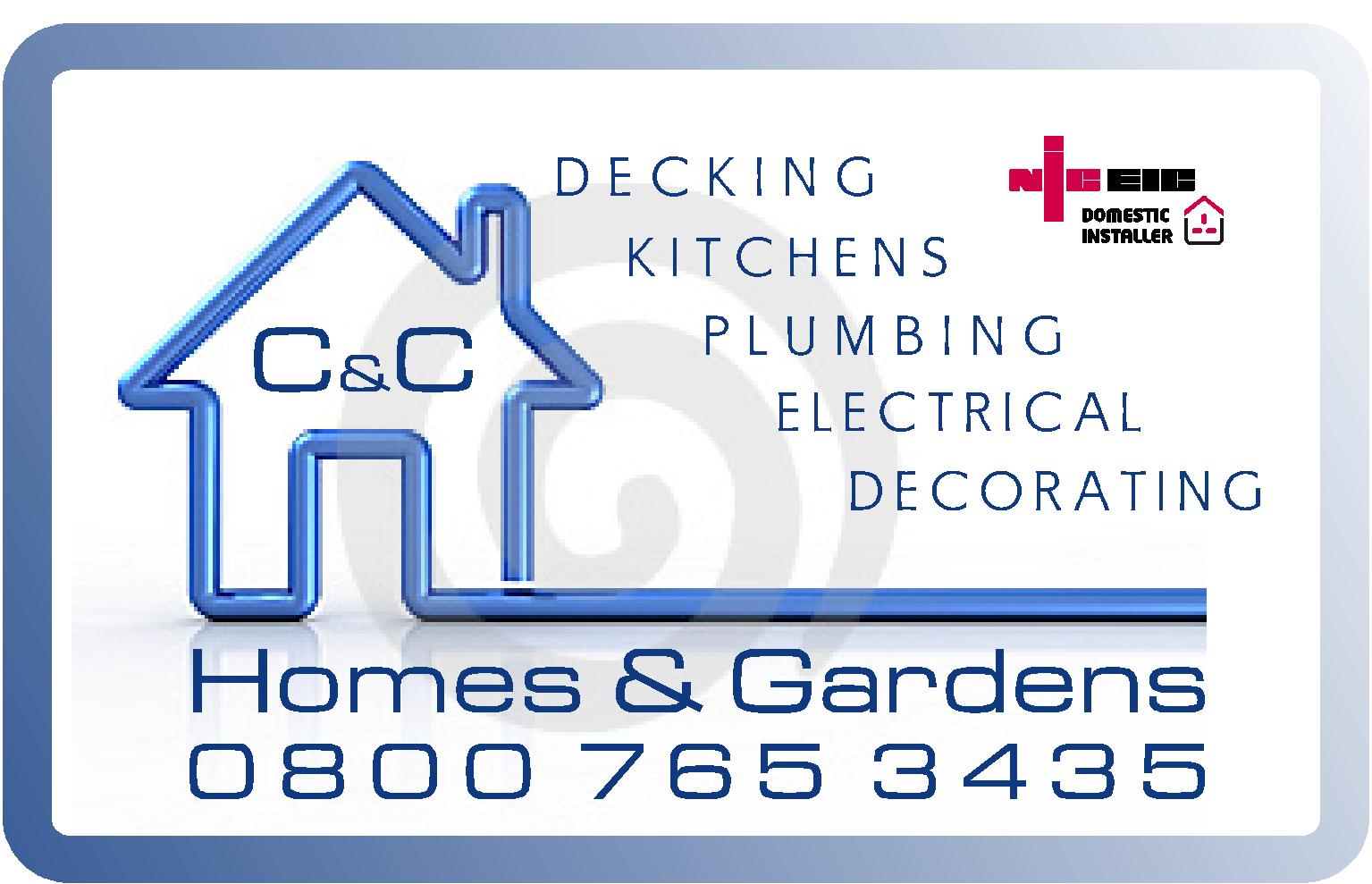
Would have to re do the house logo so the bar at the bottom lines up with the decorating, but here’s a quick mock up.
Attachments:
-
please note the swirl in the background is a water mark on the image, this will not be there if we go ahead and buy this image !
When doing his van I will only use the house logo itself, this is really just to contain things like a business card . Rich -
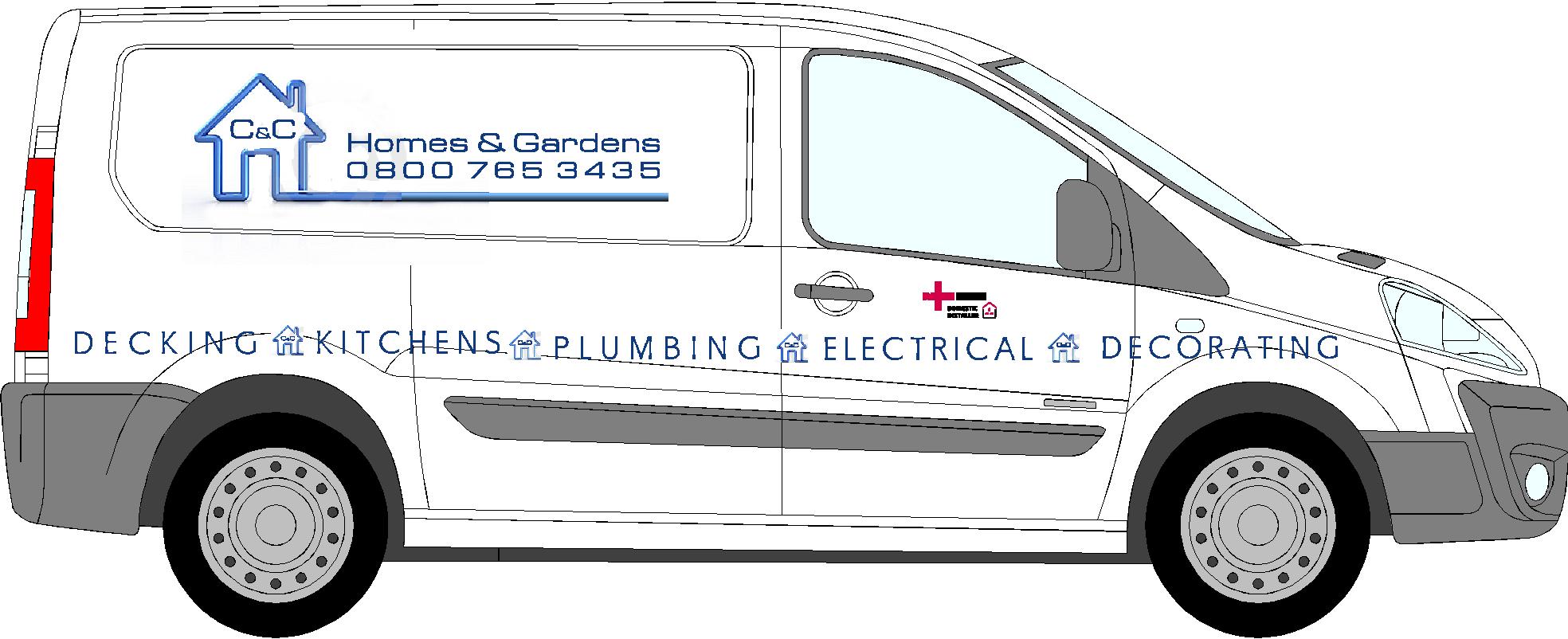
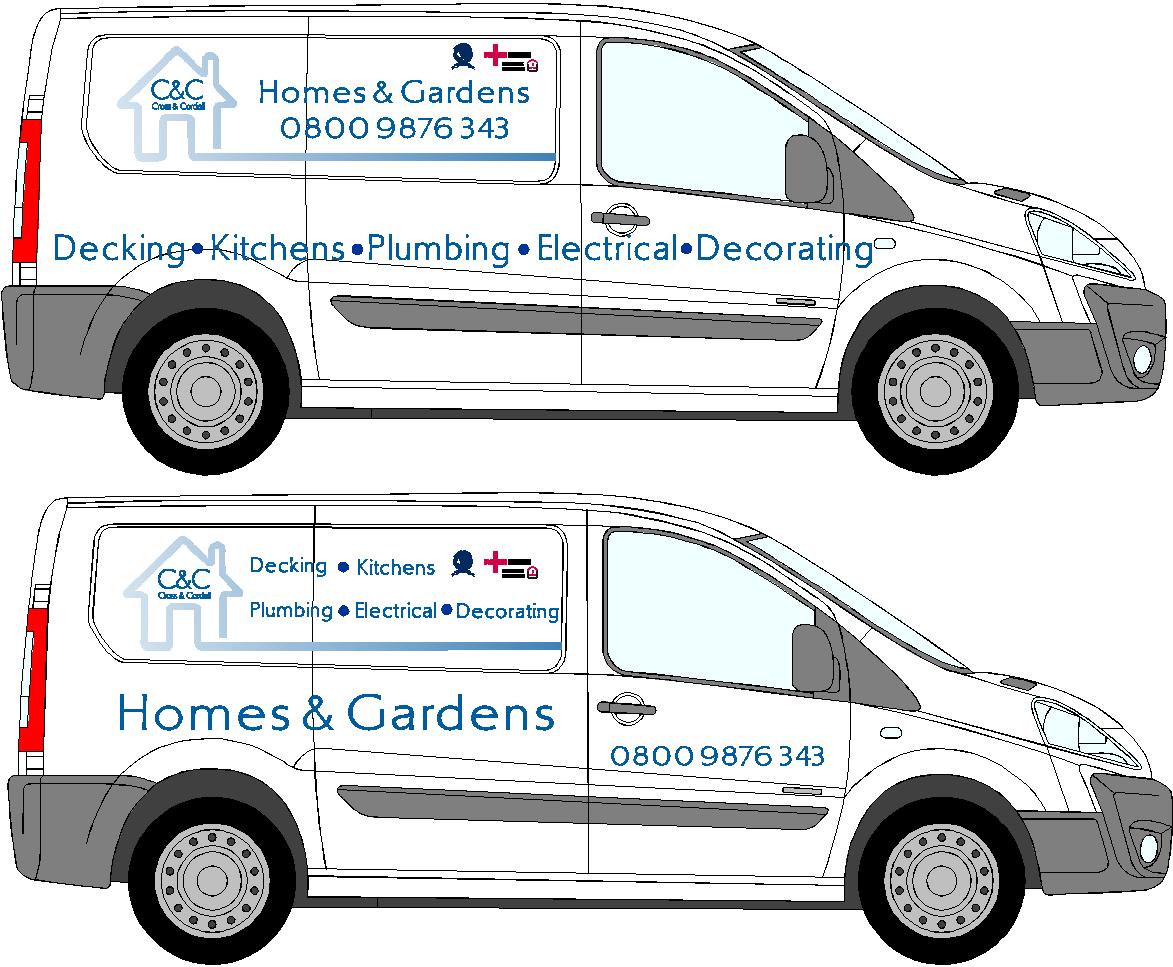
Now hes not got a van yet but this is a very quick idea just to see how the logo will be used from the card. I have done this as its been said to start with some ideas and members will help and come up with some ideas. As I said I’m open to ideas and really just playing around to get things going, Rich
Attachments:
-
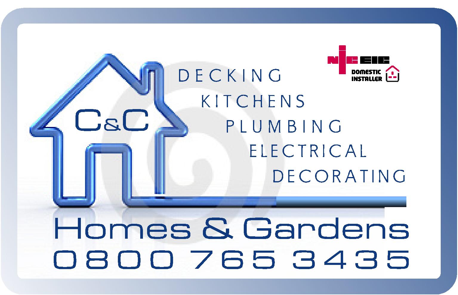
It’s looking better but I still feel the logo has a really weak look.
Definitely beef up the C&C. -

To be honest I prefer the phone number like it was and not the same width as the name 😕
but that’s just me 🙄
Otherwise I think it looks nice and clean, a slight beefing up as suggested wouldn’t hurt but overall it looks :nice"
cheers
Warren
-
quote Warren Beard:To be honest I prefer the phone number like it was and not the same width as the name 😕
but that’s just me 🙄
Otherwise I think it looks nice and clean, a slight beefing up as suggested wouldn’t hurt but overall it looks :nice”
cheers
Warren
not being funny Warren but what makes the phone number look better by hanging over the left hand edge than it does being square?
-
quote Glenn Sharp:quote Warren Beard:To be honest I prefer the phone number like it was and not the same width as the name 😕
but that’s just me 🙄
Otherwise I think it looks nice and clean, a slight beefing up as suggested wouldn’t hurt but overall it looks :nice”
cheers
Warren
not being funny Warren but what makes the phone number look better by hanging over the left hand edge than it does being square?
Not sure I understand Glenn 😕 I just think the phone number looks better and reads better being centered under the name than it does being justified to the same width as the name, it’s just my opinion after all, if would be a dull world if we all liked the same thing 😉 😛
-
In which option was the phone number centered Warren?…..in the version I was commenting on it was right adjusted but sticking over on the left hand side
-
Services looked better all-caps, and really check that kerning.
Do something with the end of the tubular house graphic (far right) to make it look finished.
Adding the lighter gradient further weakened it.
I think the phone number should be smaller.
Sorry to be picking at this, but it still seems very lightweight to me.
(but you know I love ya Rich) -

Hi Rich, I haven’t read all the Post so hope this isn’t covered already and its not to do with he design.
I just don’t get why your mate who is well qualified ie with NICEE why is he ‘watering’ down his services with decking. decorating etc? A well qualified sparky can earn quite a bit but it seems suspicious that he is doing odd jobs.
If I saw this van – I wouldn’t call him im afraid no matter how good the design was because I wouldn’t believe he was a qualified sparky, if he was and was good then why is he doing decking etc? and if he is lying about his qualifications then can he be trusted? – Just a thought – but that would be my thought process.
Would anyone here add decking and decorating to their signmaking services or get someone to fix their computer that also did decorating etc.
Just a thought!
Nigel
-
Nigel I agree mate,he’s coming from the mortgage world,he’s done a few houses up and has taken the domestic nic eic course. I see what you mean and I don’t like using all these services, but this really needs to be used a an add, if he’s doing a job on one house some one may read what he does and go from there.
Good points though
Log in to reply.
