Activity Feed Forums Sign Making Discussions Graphic Design Help could do with some design advice on layout please?

  • could do with some design advice on layout please?

    Posted by Angelique Muller on July 28, 2007 at 2:19 pm

    Hi All,
    I am really struggling with the following:
    I have been asked to come up with ‘something’ for the new local community sports centre. For their official opening they would like the a sign by the entrance…. They have given me no idea as to what they want.. they have left it to me.
    I think it probably should be something that should appeal to younger people but will also reflect the people that made this building/field happen (there was a lot of fundraising in the community + lottery money). So something that works for young and old…
    I played around with a lot of sport images (mainly gaelic football, hurling), but I am worried that any reference to specific sports would exclude others…. So therefore I thought I should just use text instead of images…..

    So does anyone have any suggestions for me how to design something that refers to sport (but none specific) and will appeal to young and old?
    Suggestions for colours/shapes?!?
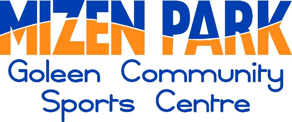
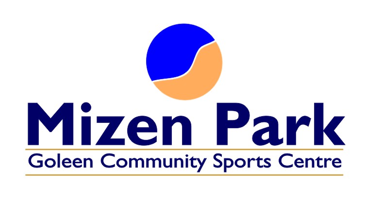
    This place being a coastal village with great scenery and beaches I tried to reflect sand dunes and water in the attached design attempt…. but I think its pretty boring altogether….


    Attachments:

    Angelique Muller replied 16 years, 10 months ago 3 Members · 6 Replies
  • 6 Replies
  • Jill Marie Welsh

    Member
    July 29, 2007 at 11:08 am

    Hi.
    I agree that it is a bit non-exciting.
    Think about various sports jersies or team colors
    (I realize you can’t choose one certain team)
    With what you have I think the wave in the lettering is distracting, and I think I would have reversed the colors.
    Try not to squish your lettering to fit a space, choose a typestyle that will fill the bill.
    I think the Goleen part may have looked more concise in one line.
    Here are a few quick ideas.
    I tried a kid-friendly one, a sporty one, a traditional one, and so forth.
    Without really knowing exactly what this type of place is/does, this is the best I could come up with.
    Love….Jill


    Attachments:

  • Angelique Muller

    Member
    July 29, 2007 at 1:46 pm

    THANK YOU so much for your tips/advice Jill!!
    I tried to come up with some more things yesterday and one is quite similar to your first design…..I was going to attach it but I just realised I only have the printed version left: computer crashed during work and I lost the file…….)
    I think I will go back to the guy who asked me and give him the few designs I have done.
    Would it be okay with you if I included your suggestions aswell?
    They can discuss them and then let me know what would suit them best. I can then re-work the chosen design….. rather than spending a lot of time now on something that I am happy with but might not suit them at all. (The worry is that it is a committee with a lot of members that have to decide… they might all want to have their say… and it’s hard to please everyone).

    Re typefonts: I just got 650 fonts with my software package and my problem is I CAN’T CHOOSE. There are just to many options now….
    I can spend hours in Fontscape Navigator looking at them trying to make a choice.

  • Glenn Sharp

    Member
    July 29, 2007 at 4:17 pm

    Angelique,

    Here’s my tuppence worth…..I’ve borrowed your idea of the sea & the beach but putting in it in a circle could represent the many different balls they might use in the centre

    I’m not sure of my colour scheme but it was just a quick attempt to show you my idea


    Attachments:

  • Angelique Muller

    Member
    July 29, 2007 at 4:45 pm

    Thanks Glenn,

    I like that!!
    I think my colours are not right either…. I wanted a sand-colour, but the one I used is to ‘peachy/orange’.
    But that’s something to worry about later….
    Your concept is good!
    I tried some stuff with circles aswell, but had not thought of using the sand/water idea in them…..
    Thank you 😀

  • Jill Marie Welsh

    Member
    July 29, 2007 at 6:54 pm

    Angelique…glad I could be of help.
    Feel free to use my ideas, that’s why I suggested ’em.
    One more thought would be to take Glenn’s and make the dot of the i in Mizen be a beach ball.
    But that may be too "seaside"?
    As for having too many fonts, I tend to choose from just a few trusted faves.
    Love….Jill

  • Angelique Muller

    Member
    July 29, 2007 at 10:31 pm

    Jill,
    Thanks again. It is great to be able to get other peoples suggestions. Working on my own I sometimes get completely ‘stuck’ and another opinion or suggestion can really move things along….
    I will keep you posted on the progress.

    By-the-way: Why is your picture upside down?

Log in to reply.