Activity Feed › Forums › Sign Making Discussions › Graphic Design Help › constructive comments on van layout please?
-
constructive comments on van layout please?
Posted by Carrie Brown on June 1, 2004 at 10:10 amHi all,
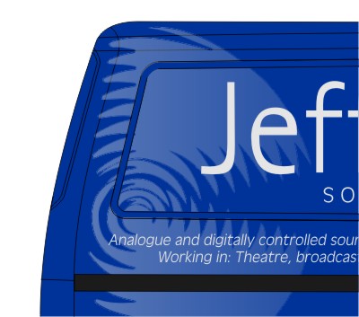
In reference the post about crystal etch vinyl on a van in the vinyl discussion forum here is the design.
Logo will be crystal etch vinyl, text in silver vinyl oracle 751.
Constructive comments welcome.
Thanks !!!! 😀 😀 😀
Stephen
Attachments:
 evox replied 19 years, 3 months ago 17 Members · 25 Replies
 -
25 Replies
-

Looks real nice but I would be concerned about fitting it in the recess. I think it will lift and once etch gets dirt behind it, it looks bad.
Best of luck with it though
Ian
-

Thanks Higgi, 😀
we are not applying into the recess as I done a test peice and found the etch goes a milky colour when stretched. so what we are doing is trimming it off around the each recess.
~if someone could make an etch vinyl that does not do this I could use this in more of my designs~
😀Lopoking forward to fitting it now!
Stephen
Attachments:
-
Hi Jon, Thanks for your comment.
The text on the van is at the request of the client. The text has to go somewhere?? The text can not be reduced, this was stated to us in the original design breif with our client. However we have excluded some of the text in the other designs, but we have to produce a design that contains the text as shown on the van.
😀 -

If the vans dark blue you’d be better using white, silver won’t stand out.
unless large or highlighted/ shadowed with another colour.
It will look very understated and may be readable from a very small distance, but not afar, which is the whole idea of van advertisement. -

There is a lot of small text but I think the layout is very nice and will project a smart professional image for your customer. Of course, vans aren’t only seen on the road, loads of work comes from people seeing vans in car parks etc. and “asking driver for details”. I know, it’s happened to me. Sometimes it can be worthwhile putting a snippet of intended colours against vehicles to see how they look. Silver can look really smart, but can also appear a bit grey sometimes.
-
Thank you for your comments, the main reason I have used silver, apposed to white is to make it different and modern. I feel white is a boring colour to use on any van. But i do see your point, it is the colour that will stand out most. In reference to shadows i believe they do not belong on this design. shadows always remind me of fairground signage, pub signs etc… However i have used outlined text before on signage which looks really good but not it was something i believe the client wouldn’t want.
The silver we are using looks good and as you said big G we matched it on to a mock navy blue test piece and it stood out very well. I am glad you liked it and the words professional came out as that is the main thing our client wanted. I do see your point on the smaller text but he wants this to be read when he is parked not when he is driving.
Thanks again
Stephen
-
Seems like you have all the bases covered 😀 Very smart design, and I like the way you’ve got around the problem with the recesses.
I know this may sound a little bizarre, but what gave you the idea to use the etch in the way you’re using it? I know it’ll look smart and professional, just wondered what gave you the initial idea as apposed to say a grey vinyl or the silver.
Blimey, a sensible question, it must be way past my bedtime! 😉
Cheers, Dewi
-
Well Dewi …….. It was me causing all the trouble with using the crystal etch vinyl & silver 😛 ……. Steve created the design but we felt something wasn’t quite right. The van is a really deep dark blue – quite a nice colour not a yucky blue. Originally Steve was going to use light grey or silver with white text, which to be honest I felt looked ok but a bit basic & boring & just didnt ding my bell 😆 white tends to be the colour that most people will stick on a blue van ……. so I wanted the logo to be more a shadow or watermark effect and so thats where the idea of using etch came in as its a bit transparent …… decided to apply a few different effect/colour vinyls onto the blue matched vinyl & it looked great …….. the customer loves the idea, design & the colours.
So will post pics once job completed 😀
Carrie 😀
Thanks for everyones comments always nice to know other peeps views 😀
-
Look foward to seeing the pics, I think it looks realy classy. I have fairly small lettering on my car ( Mrs Austin told me I wasnt allowed to go over the top), but I’m quite often stopped whilst getting out/in the car regarding signs, obviously it doesnt realy stand out whilst I’m on the road, but i think a great deal of the advertising comes from when vehicles are parked up! …….. ohh, please keep my opinions top secret, I still have plans on plastering the Austin Mobile yet 😮
Lawrence
-

great van stephen carrie!! 😛
i think it looks very clean & proffesional, layout is fine!!
i would stick with the colours your going to use, i personaly don’t like white on a dark blue van (i think it looks cheesy) 😀 😀look forward to the piccies!! 😛 😛
Nik
-

Dont want to start a fight with anyone but I would go a bit further than nick and say that not only does white look cheesy I feel in most cases it actually looks cheep.
I dont want to tar all signmakers with the same brush but I think far to many automatically go for the white with a coloured van for maximum impact, this often isnt the case as a lot of other colours will work much better and be almost as easy to read.As for the van, looking forward to seeing the job completed.
-

I’d be pleased with a layout like that
It does look professional indeed
John
-

Yup, looks fine to me – looking forward to seeing the pictures. 😀
-
🙄 outline, I’ll start with you 😀 Jpeg posted with white as there is no silver … just greys/blacks. Rest what case ….?? You seem to want to turn most discussions into a heated event (hot) Thanks for your comments anyway! Im not going to get into the whole white silver comparison thing again as I already stated why choices were made in posts above, white tends to get ignored its around that often 😀
Thanks everyone else, the van is being done on Wednesday, will post pics once all sorted. The client came in today to finalise a few things and we applied large areas of the vinyl to be used onto the van & he loves it ….. he was so glad we were able to give more than just white 😀 😉
Carrie 😀
-

Silver doesn’t always look good on a navy blue, but I suspect this van is dark blue so it would look ok. I often use a lighter blue on dark blue vehicles which looks good too.
-

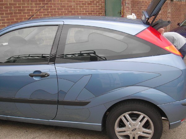
heres a pic of metamark frost on a car with a reflective blak pinline..
how did the job turn out in the end??
Attachments:
-

What’s the life expectancy on the jobs?
BTW I really like the effect & finish.
-
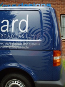
Ian, the job turned out great thanks 😀 Customer was over the moon with it. The etch gave the watermark effect just as he wanted.
Pics are not great sorry …. it was such a sunny day and the van was sooooooooooo clean …. really really clean …. you could see your reflection in it …… hence the reflection of trees, cars and just about everything :lol1:
Magpie, Its been on since June and as far as I know is still fine. We did advise him that there was no guarantee on the life expectancy of the etch and it could last 6 months, 12 months .. we were not 100% sure? Maybe someone else here knows?
Carrie 😀
Attachments:

-

They both look great Carrie and Ian 😀 I think you should be ok for 2-3 years outdoor life with the etch film Carrie.
Ian, how did you deal with the registration of sucha thin outline with the frosted film by the way ? Are the two butted up and the reflective applied as a roll stripe ? Well done both give nice effects :lol1:Nigel
-
that looks great…gives that matt look, i love that.
yes the black was a pinline hand applied on top on the frost.
good call
ian
-
I read on another forum that it is not advisiable to use etch on vehicles as it has a ‘permanent’ adhesive that bonds with the paint rather than being a layer on top of the paint.
Any truth in this?
-
I was going to say something similar to autosign about the adhesive, would it be an alternative to do it similar to applying reflective, applying it on top of another vinyl for ease of removal ?
-

I doubt it would have the same effect if etch was laid on another vinyl, other than maybe clear.
Log in to reply.
