Activity Feed › Forums › Sign Making Discussions › Graphic Design Help › colours for a silver van?
-
colours for a silver van?
Posted by John McNickle on May 5, 2010 at 7:28 amHi i have a Silver van to design for a kitchen and bedroom fitter, its a silver vauxhall vivaro, he has no corp. colours and just wants it standing out, what colours do you think stand out on silver?
Thanks
JohnShane O Grady replied 13 years, 11 months ago 14 Members · 21 Replies -
21 Replies
-

I think silver is a better base colour than white! I did a silver van last week and the 2 main colours were dark navy and orange.
But almost anything goes, have a play around with designs and you’ll see. 😀you can always upload your design here after you’ve done one and have further input. 😀
-

At least some people give sensible answers around here 😀
Agree about the base colour Marcella, I always think silver looks much more classy.
or as one of my (Recovery Truck) customers recently put it – it’s going to be Silver, NOT Pikey white…………lol
-

cheers guys and gals 🙂 , i also like working on any base colour rather than white, its just that he has left this one to me and i had a bit of brain freeze on it
-
how about keeping in monotone so different colors of grey to build up an image.
I have often done parts of a company logo as a ‘ghosted’ image in the background of a design in the same color as the van or as a mat or gloss clear so its subtle but when the light hits it at different angles or times of the day then it appears – its fun to experiment too !
Attachments:

-

A popular one I’ve done several times in gunmetal / very dark blue & grass green or another vibrant colour.
-

I agree with Phil. I think matte black, anthracite etc can be used for a subtle effect then highlight with one or two very bold colours, doesn’t really matter much what colours as long as they go together if using more than one. Sometimes chrome effect vinyl looks good when used as part of a more subtle design. Silver is always a good background colour to work with. White is boring.
John
-

Frosted on silver gives the effect its almost sprayed on.
-
I have Golf in soon which is black and I’m putting black vinyl on it !!!!
again it will give the …’what the … is that…" feel that the customer wants.
I also have a project where we have a very nice airbrushed image all 4 color that is going onto a metallic brown car so I’m printing onto clear vinyl so it only appears as you walk around it and the metallic brown paint will make the color in the graphic metallic 🙂
subtle and cool at the same time 😉
-

A nice strong blue looks great with a flat grey used for some shadowing.
-
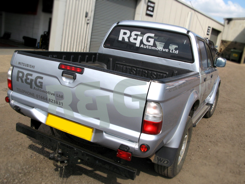
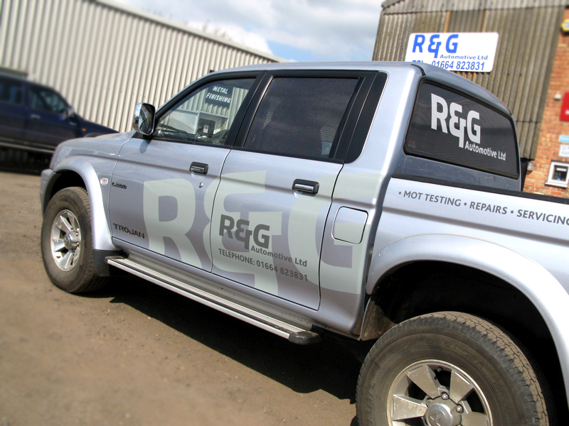
Like what you’ve done on the pick up there Phil, simple but effective. You can see how it looks in different lights in the pictures. Thanks for posting.
Liam
-
quote Phil Craddock:cheers Liam
see us designers aren’t all bad 🙂
What material did you use for the large ‘R & G’ at an angle, if you can remember and don’t mind telling?
Thanks
Liam
-
it was some Image Perfect 5700 range from Spandex – just had some in the studio that fitted the bill when the truck was here.
-

On silver, I like to sometimes even use just plain black.
But navy looks good on silver, especially metallic navy, burgundy looks good too. Like others have said, darker tones of grey metallic look nice as well. Even deep purple. Not the metal band.
Love….Jill -
Thanks for explaining that phil, I used the charcoal colour on silver recently to replace black for all the lettering, looked quite subtle but effective. I like that colour as it’s very metalic looking. Mactac 9800 series.
Liam
-
Yeh Liam that 9800 Charcoal is nice – looks smart on silver.
-

Just did a silver Pajaro, using the Oracal Anthracite, its a very nice classy mix as the the vinyl also has a slight metallic look to it.
But as most have said, silver is a nice base colour to work with.
-

I agree Graeme…Anthracite, petrol and that very pale grey almost white…olive instead of petrol 😀
-
 quote Andrew Boyle:I agree Graeme…Anthracite, petrol and that very pale grey almost white…olive instead of petrol 😀
funnily enough, i’ve used oracles 751 anthracite & petrol with some coburn 5yr chrome before, but, on a white van!
Log in to reply.
