Activity Feed › Forums › Sign Making Discussions › General Sign Topics › Colour Management for printing large format graphics
-
Colour Management for printing large format graphics
Posted by Daniel Evans on August 24, 2017 at 12:27 pmHi
What colour space does everyone design in?
Do you use RGB or CMYK? Do use design in fogra39 of sRGB2.1?
Interested to know how everyone is getting consistent colours.
David Hammond replied 6 years, 8 months ago 7 Members · 17 Replies -
17 Replies
-

I use Corel..
I’ll use RGB when customers are here and I’m doing cut vinyl stuff as it better matched the vinyl colours, for print work I always design in CMYK, I know what the colours will print like.. most can’t comprehend why colours look wrong when using cmyk on screen so I’ve now printed a large cmyk wall chart and let them pick the colours from it, makes much more sense to them then.
-

Thank Hugh
I’ve always designed in CMYK, I understand you can’t get the vibrant colour on screen to represent the vinyl colours but I just explain that to the customer.
Over the last week, I have been trying a few prints with a custom profile in RGB and they look fantastic, I think too much ink is being laid down but the colours pop. The issue is consistency and being able to match what I have on screen, their website and business stationery.
A tough order I think.
-
I may see if there’s a printable rgb – cmyk chart and do a test print for the wall, so hard to get vibrant blues & greens!
-
 quote Daniel Evans:Hi
What colour space does everyone design in?
Do you use RGB or CMYK? Do use design in fogra39 of sRGB2.1?
Interested to know how everyone is getting consistent colours.
I do quite a lot of colour management interventions at signshops and there is a basic set of rules that apply universally to this particular part of the colour workflow which should set you on the right road.
1.Design in RGB colour spaces unless you will be sending the file to a press (or trying to mimic a press)
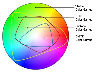
CMYK colour spaces are otherwise not very useful in our wide format inkjet industry – everyone uses them as that’s how they were trained so its a hard slog to convince people to go over to RGB.
2.Select the RGB colour space for the job you need to do – there isn’t a single one that’s "correct". If you want to mimic the web then yes, use sRGB as this small gamut space is used by the web so that the pages look as intended on all sorts of dodgy monitors. But don’t use this for everyday print as the small gamut will limit your output. Generally it’s best to use Adobe1998 as this is a bigger gamut more suited to printers. ProPhoto is too big etc etc. they are all different.
3.Use a monitor that can actually show the colours you are using. A good IPS monitor will be able to show 99% of the Adobe1998 gamut – most cheap monitors can’t show you the full spread colours you are using in your design so there’s no way you will get a screen to print match (also calibrate the monitor of course)
4.Embed this colour space into the file when saving and make sure the rip picks it up and doesn’t change it.
5.Build a good custom profile for your printer with as much ink as you can put down & dry – recalibrate the profile regularly.Then you should have full control over your colour gamut – the only caveat being the colours you can see on your monitor but can’t print due to a gamut limitation at the print stage. Here a good rip will be able to show you this before you print anything (e.g Job Editor & Gamut Report in Onyx)
There’s lots more to it of course but with regard to colour spaces in the design app, use Adobe1998 for general work and avoid CMYK unless sending to, or trying to mimic, a press.
Andrew
-

But surely you’ll loose acuracy coverting RGB to CMYK, as regardless if its a press, digital or largeformat machine, most print CMYK. A bright lime green in RGB, just wont be achievable with a CMYK colour set.
Attachments:
-
Hi
If I’ve misunderstood I apologise you are asking if using an RGB space will be less accurate as it will have a bigger gamut than a CMYK space or CMYK printer?
The aim in your design application is for most general work to use a large, device-independant colour space such as Adobe1998 so that you can accurately assess with your own eyes all the colours in the file regardless of what the printer may do to it. If you use one of the CMYK presets (Fogra, Matchprint, SWOP etc etc) these will give you the reduced gamut of a press – not your inkjet printer – and you will never see (or print!) all the colours your file may contain.
If your CMYK printer profile can’t hit all those bright RGB colours on your monitor then that’s fine – its a physical limitation you can’t solve assuming a good printer profile exists already. Your job is to understand this limitation, check it using a soft-proof in the rip or design application – and relay the info back to the client (or choose a different printer / media with a bigger gamut) so that you can do something about it before wasting any ink/media/time.
The CMYK colourspace pre-sets should not be used in the design app for wide format inkjet as a way of reducing the visible gamut to match a reduced printer gamut. This is what a soft proof is for – You can use the printer icc in the design app (eg "View" – "Proof Setup" in Photoshop for example) or use a proper WYSIWYG soft proof in your rip (like Job Editor in Onyx) to see what your file will look like printed.
But your file should always be viewed and worked on using a large device-independant RGB colourspace so that you at least can see all the colour that exists and are in control – if you want to see what your printer will do to that file then select a soft-proof printer icc in your design app to temporarily see what will happen to it – treat them like swapping filters in & out of a camera lens so you can see what each printer profile will do to the file – but the fundamental RGB colourspace remains as the main working space in the design app.
By selecting a CMYK press colourspace as your working space because its inherent small gamut might be near the reduced gamut of a particular inkjet printer profile gives you no solid understanding of the colours contained in the file or a good screen to print match.
On top of this most modern CMYK inkjet printers have a bigger gamut than the CMYK press colourspaces in the design app so if you shackle your file with these you will never be able to utilise all the gamut of your printer – in reality most printer CMYK gamuts sit somewhere between RGB and CMYK colour space gamut sizes (your graphic doesn’t distinguish between inkjet CMYK and press CMYK gamut sizes)
It’s best to use RGB and maximise your understanding of the file and the potential of your printer but to be aware of a gamut reduction using soft-proofing, rather than to select a generic CMYK press gamut and thus unnecessarily limit your printer output.
But if I’ve misunderstood your question I apologise.
Andrew
-
You cannot physically reproduce the full range RGB colours, with CMYK inks.
A bright RGB lime green on screen, will not print anywhere near the same, as the CMYK inks in the printer just cannot get near it. That is a limitation of using CMYK ink in print, rather than RGB light.
Adding all RGB together creates white, where adding CMY together makes black. They work completely different.
Correct me if I am wrong, by my entire understanding is, that you cannot accurately print RGB colours on a CMYK machine.
Exporting a file as a PDF X1a (the standard for most commercial print) converts everything to CMYK.
-
quote David Hammond:You cannot physically reproduce the full range RGB colours, with CMYK inks.
A bright RGB lime green on screen, will not print anywhere near the same, as the CMYK inks in the printer just cannot get near it. That is a limitation of using CMYK ink in print, rather than RGB light.
Adding all RGB together creates white, where adding CMY together makes black. They work completely different.
Correct me if I am wrong, by my entire understanding is, that you cannot accurately print RGB colours on a CMYK machine.
Exporting a file as a PDF X1a (the standard for most commercial print) converts everything to CMYK.
The original question is about selecting a good colour space in the design app – your POV seems to be involving the printer gamut. There aren’t different RGB or CMYK colours – there are no inherent differences between them. There is just LAB which is in essence all colour (that our eyes/brains can conceive).
By deciding to use RGB or CMYK in the design app all we are doing is ‘lassoing’ a different amount of those available colours – using an RGB colourspace simply captures more for us to see, use and print.
Yes a lime green on your screen will not print on a CMYK inkjet but that’s no reason to use a Press CMYK colour space for the reasons above. If your file has a bright colour in it (like lime green) its best you can see that and use a soft-proof to understand what the printer will do to that colour.
If you use a CMYK colourspace you are not using "different" colours that are the same as the ones the printer uses – you are just seeing less colour from the same palette – and often less than the printer would otherwise have used in an RGB workflow. Your issue seems to be getting the colours on screen to match the print and this is what soft-proofing is for?
Andrew
PS Let’s go!
-
I’m on my way!
But as you say, if your designing for onscreen display, RGB, print CMYK. 😉
-

In my very limited knowledge, I’ve found if you want colour to pop like rgb on screen, design in rgb, print with max impact profile & it’s not a bad attempt
-

Just my quick tuppence worth.
I believe the RGB colour gamut (range of colours) is representative of the light spectrum, whereas the CMYK represents the pigment based spectrum. Hence, RGB is a lot lighter and has a wider gamut.
That isn’t to say that you can’t print RGB image files to a CMYK printer. The resulting printed image looks significantly more vibrant.
As a quick test, the next time you export an image from your design software (AI, CorelDRAW etc) export the same image with all of the same settings (image size, resolution) in both RGB and CMYK and then test print them both and compare the difference. Noticeably different.But David is correct. As he says, to try and reproduce the brightest colour in the RGB gamut on a CMYK printer is near on impossible.
-
:blushing: Sorry Mark, I think in trying to clear it up I just made it more difficult.
Gonna have one more go.
Imagine RGB colours are produced using transparent coloured window film, whereas CMYK is produced using paint. The number of colours in the RGB spectrum is approx 16.8 million because so much light can go through, where in CMYK there are only 1 million because it’s gloopy stuff.
So, if you export an image in RGB, there are not enough colours available to a CMYK printing device to reproduce all of those colours. So the finished print looks less vibrant and darker.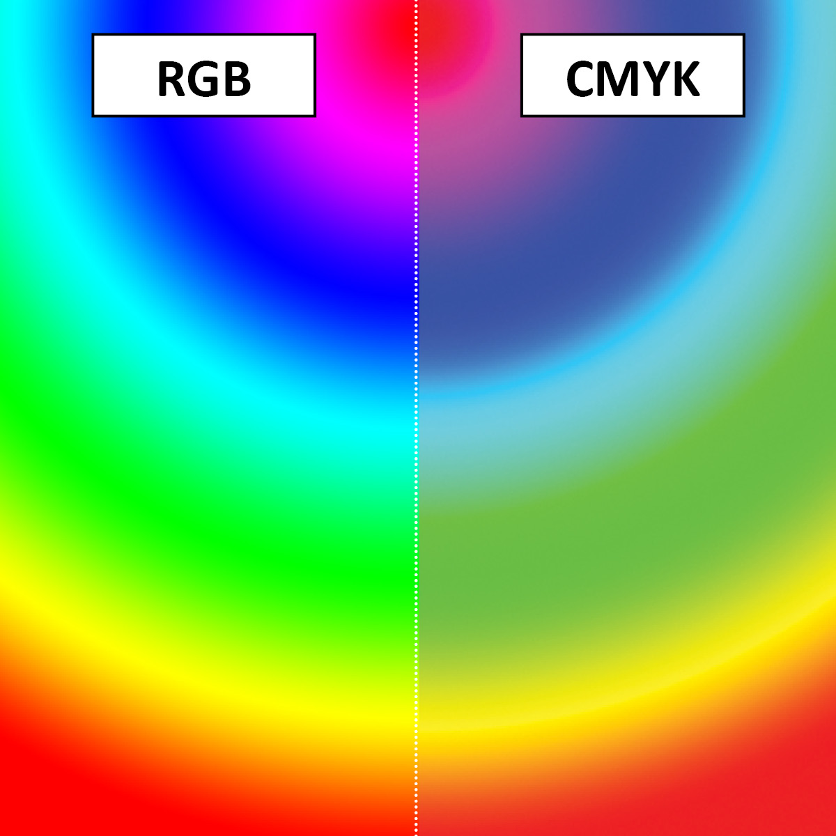
I have also attached a photo of a test print I did earlier today. Both prints are excatly the same image printed on the same media at the same time. However, the one on the left was exported from my graphics package into CMYK format and the one on the right was in RGB.

You should see that the left image is darker, in the wolf’s fur and in the picture frame.
Because of this, when I design an image for a customer, I show them the finished thing in CMYK as this is what they will get. But is it’s a design of my own, or I’m left to design it as I see fit, I use RGB. Just have to remember what format I used in case they want additional at a later date.
Hope that made more sense.
EDIT: It’s swapped the 2 images around, but I hope you get the point.
-
Hi
I think we are confusing actual, real things (RGB light and CMYK ink) with colour space gamuts as per the original posters question.Think of LAB as a large bucket of water – RGB and CMYK colour spaces are just various sized cups that can hold different volumes of water taken from this bucket – they are both similar vessels that hold water. It’s up to you which one you choose that’s all the original poster was trying to ask.
Now imagine pouring either cup of water back into a new, smaller bucket (this is your printer)
You may have too much water in your cup (probably an RGB colour space) and the new bucket overflows, or you may not have enough water in your cup to fill the new bucket (probably a CMYK colour space)This is why you should avoid using a CMYK workflow if possible – every CMYK colour space is designed for a press and is small whereas your inkjet printer (the new bucket) is likely to have a bigger capacity and you simply are not using it to its fullest capability by using a CMYK workflow, so you miss Pantones, have flat-looking prints etc, etc.
Yes an RGB workflow may show you on screen more colour than your printer can cope with (overflows the bucket in this metaphor) but we can easily handle this with soft proofing on screen in the app or the rip.
At least you are maximising the output from your printer and can see & work on all the colours the file may contain & have full control over what happens to it.
Andrew
-
well I still don’t get it… If I print rgb blue R0 G0 B255, it prints purple!!
I get the customer to choose cmyk colours from the large wall chart I printed and just make sure they understand that what they see on the screen is just a representation.
-
Press, Digital Printer, Wide Format, they’re all CMYK. The correct printer profile for the media should maximise the printers capabilities.
I’m no expert in colour management, but if what you say is correct, for consistent colours are you not better designing in CMYK, and being sure you’re within the printers colour ranger, rather than designing in RGB, and inadvertently using colours your printer cannot reproduce?
Your RIP is going to convert RGB to CMYK for print. Saving as a PDF X1a, converts RGB to CMYK.
Perhaps RGB might give you a few brighter colours, but it also gives you a few unreachable colours, CMYK is ‘safer’, and I’ve never had a problem with dull prints.
Log in to reply.
