• Colour Context

    Posted by Phill Fenton on August 10, 2011 at 8:13 am

    I tried to post this comment in another thread but was unable to upload the picture that I was referring to

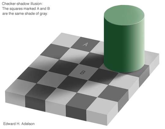
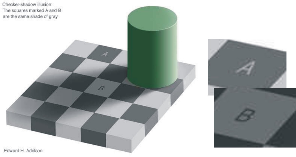
    There was an interesting program on TV a few nights ago about colour perception. One of the messages that came across was the importance of context in the placing of colours. In this black and white example we have two identical shades that look different to us because of their context and our brains interpretation of reality.


    Attachments:

    Robert Walker replied 12 years, 9 months ago 4 Members · 4 Replies
  • 4 Replies
  • Phill Fenton

    Member
    August 10, 2011 at 11:55 am

    I know you don’t believe me so I have cropped the two squares and placed them alongside each other to prove it.

    If you still don’t believe me try it for yourself 😕


    Attachments:

  • Stephen Morriss

    Member
    August 10, 2011 at 1:17 pm

    I didn’t and so I did and now I’m a believer 🙂

    Quite Amazing isn’t it.

    Steve

  • John Gregson

    Member
    August 10, 2011 at 1:38 pm

    :lol1: had to try it aswell – I thought it was a wind up. Very interesting

  • Robert Walker

    Member
    August 10, 2011 at 2:04 pm

    I was show this by a guy at Roland

    loads of examples

    http://www.purveslab.net/seeforyourself/

Log in to reply.