Activity Feed › Forums › Sign Making Discussions › Off Topic Chat › Cha-Ching
-
Cha-Ching
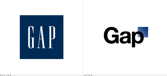
Posted by Harry Cleary on October 8, 2010 at 6:40 pmHelvetica and a square 😮 😮 I thought it was one of the best, simplest and most recognisable logos on the High Street. That’s what you get for having managements with nothing to do and too much money to spend!
http://www.underconsideration.com/brand … square.php
John Singh replied 13 years, 7 months ago 10 Members · 25 Replies -
25 Replies
-
 quote Harry Cleary:Helvetica and a square 😮 😮 I thought it was one of the best, simplest and most recognisable logos on the High Street. That’s what you get for having managements with nothing to do and too much money to spend!
I agree 1000% Harry,
tut tut in this day and age to spend money on a rebrand is questionable but something as bad as that is a crime.
On a similar note I was in ‘Comet’Electrical today, their instore promotional material is shockingly bad…they are going for the in vogue children’s writing look but fails miserably 😕
I still find it incredible that these ideas are pitched to a board of Directors presumably and then given the go ahead.
-

huh…. that’s pure crap! 😕
there was a large company i was thinking about the other days brand… (im sad i know) but it was just garbage for the size of company and image.
we have a company we have dealt with for 20 years… large nationwide company. i remember them wanting to modernizse / update their logo.
i put together about 15-20 alterations on a design i had come up with.
their in-house marketing team thanked me, but no thanks rob… they then employed a large london based firm to design their new logo. 2 months later the company owner comes back to me saying… they had spent thousands on designers etc but wanted to go ahead with what "he already said from the start" was a good design… mine! 😀
we still do everything for this company even today… the length and breadth of the UK. everything from flexface signs to vehicles and exhibition stands.needless to say… "i wish" they would give me another go because i think its about 5 years behind the times nowadays. but still a distinctive brand.
sorry… not one im wanting to show /chat in depth about on the web.
good big company, business friend etc im sure you understand… :lol1: -
 quote Martin Cole:tut tut in this day and age to spend money on a rebrand is questionable but something as bad as that is a crime.
Spot on Martin….I’d imagine this wasn’t done for a few 100 squid with a disc in a clear plastic holder 😀
-
yeh know… i remember we did similar with the olympics logo… by that i mean tons of folk, worldwide all having a pop at redoing the logo.
i bet of there was a good prize and the competition run via the net. there would be so much interest and so many options.
prize £20,000 or something like that…you just have to look at that link. some real naff stuff but some very good efforts. many better than what they have paid for. 😀
-
quote Harry Cleary:They are having some fun with it here
http://99designs.com/logo-design/contes … ject-54693Blimey 😮 a few suggestions there and the pages I flicked through, most better than the chosen one.
I agree with Rob, rather than pay a ridiculous amount of money to an agency they should run serious web competition with a descent prize which would encourage quality entrants.
Probably my fav below although I still like the original.
Attachments:

-

oh my goodness that has to be the worst logo change ive seen…. 😮
spotted the new comet logo yesterday, thats terrible too, the gap logo IS the brand and they should never have changed it, world is going potty 😕nik
-

are any of you members/entrants on that 99designs site?
-
I’m going for it…..as soon as my registration is accepted I’m going for it.
I’ve spent minutes making sure I got the circle just the right shape, I also struggled to get just the right shade of white for the text but I think I got there in the end
*plans what to spend prize money on*
Attachments:

-
😀 😀 😀
Gonna have a go myself Glenn. I think I have you beat! 😀

-
That’s genius Harry……where did you get the inspiration? 😀
-
After much thought, perspiration, research, brainstorming and consultation I hit on the idea of opening up the kerning a bit to signify GAPS. Revolutionary eh?
That’ll be £106,354.64 and half pence please. Thanks.
Cappuccino or Mocha darling?
😀 -
I’ve entered mine #2051 with the comment that I had purposely gone for the ‘Simple and memorable’ look as mentioned in the design brief and that I felt the circular background represented the ‘global’ brand better than a square
sure fire winner I reckon 😀
-
Glenn and Harry, your creative juices obviously flow better on the weekends, just superb efforts although Glenn, I can’t believe you came up with that on your own 😕 there must have been a team of you working on that……
Here’s my predictable take on it
Attachments:

-
well I suppose I should thank the wife for making me a cuppa and the dog for staying quiet just long enough for me to concentrate 😛
-
 quote Martin Cole:Here’s my predictable take on it
I wonder if changing the font from Helvetica (Neue?) to Arial might be seen as step too far.
Otherwise, a good effort.
Richard
-

I think the gas safe logo is terrible
they’ve recently added a black square behind to ‘enhance’ it
-

Interesting update : Gap have announced on their Facebook Page that they’re considering the idea of ‘crowd sourcing’ logo ideas as a result of the backlash their new logo design has received this week.
-
quote Richard:I wonder if changing the font from Helvetica (Neue?) to Arial might be seen as step too far.
Otherwise, a good effort.
Well spotted Richard, done it quickly in Corel with no Helvetica hence Aerial….although it makes not a blind bit of difference,
I just wanted to portray how crap, pants, awfull the new logo is..In fact the more I look at it the more it annoys me that someone had the front to pitch such an awfull effort in the first place….shame on them
Interesting Shane,,,does that mean it could be withdrawn 😕
-
there are all sorts of complaints on that 99designs site about how the competition is being judged but one woman makes the point that there are rumours that GAP purposely came up with the logo they did knowing it would provoke a reaction and then go to ‘crowd sourcing’ in order to get it on the cheap
who knows?
-

For whats its worth my girlfriend bought a pair of gap jeans yesterday.
Don’t know if it was the result of any clever branding/advertising ploys mind you.
-
 quote James Martin:For whats its worth my girlfriend bought a pair of gap jeans yesterday.
Don’t know if it was the result of any clever branding/advertising ploys mind you.
You cynic you :lol1: :lol1:
-
Just shows that there’s a gap in the market for great designs
Log in to reply.
