Activity Feed › Forums › Sign Making Discussions › Graphic Design Help › Caravan Doctor
-
Caravan Doctor
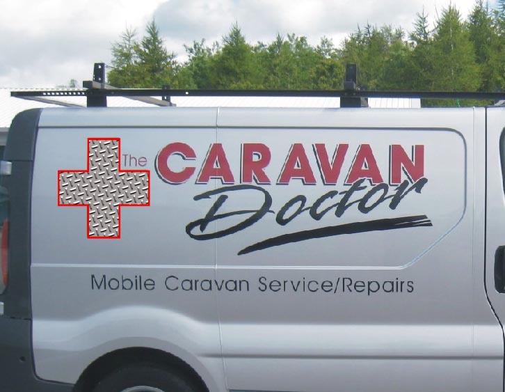
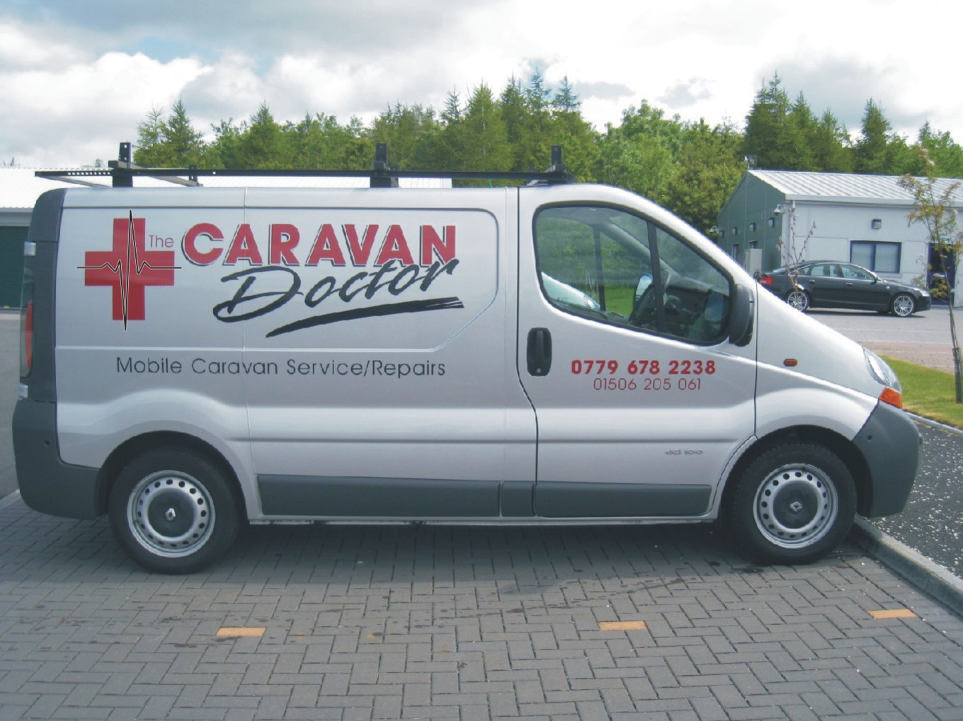
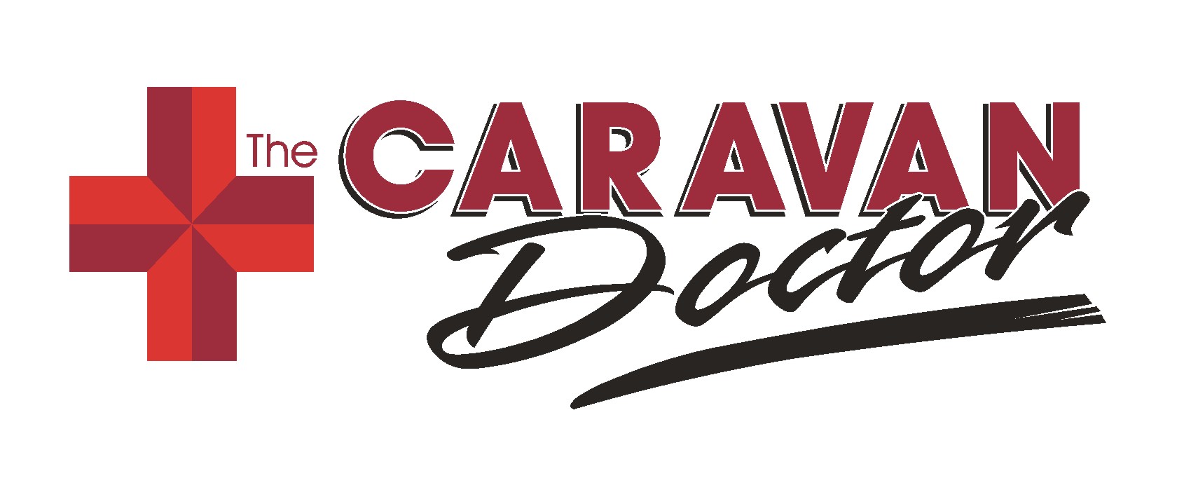
Posted by Phill Fenton on August 12, 2010 at 8:29 amWe designed and did this van last year.
I just had a phonecall this morning from the client saying he had received a letter from the red cross telling him they owned the right to the red cross symbol and he should remove this from his vehicle.
Apart from the fact I would have thought the red cross had better things to do with their time and money than to go persecuting small businesses, I am looking to provide a quick fix that doesn’t destroy the impact of the original design.
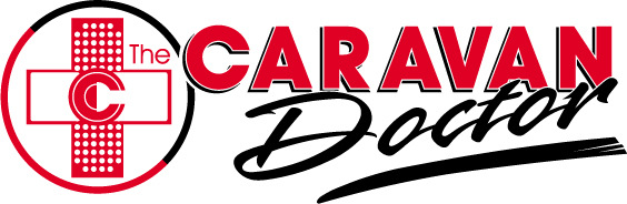
Was thinking of changing the cross to 4 squares as shown. Or what would you suggest?
Attachments:

 Bob Clarkson replied 13 years, 8 months ago 17 Members · 26 Replies
 -
26 Replies
-

Here is an .eps of the original for anyone that wants to have a play with it
-

Phil
does that mean that all the english flags will have to be changed?
Are you sure someone is not on a wind up?Peter
-
I thought the same Peter – But I’m assured it’s genuine
-

Phill, can you not just add a blue drop shadow as you have on the word CARAVAN then its not "the" red cross
G
-

what about a cut out cross in the middle, effectively showing the van colour (can’t tell if it is white or silver)
Cheers
Dave
-

Overlay it to a printed ‘chequer plate’ with a red border…
means no stripping.
Attachments:
-

Change it into a couple of plasters.
Regards
Russell.
-

In the red cross I think you have hit on one of the few symbols that is heavily protected, more so than large brand names. The red cross (and a few other logos) is a symbol of protection for certain organisations working in disputed/war zones and is enshrined in articles of the Geneva convention.
Although I assume the area in which Phil operates is not a designated war zone, you can appreciate that the red cross and other recognised protection markings cannot be used randomly or legally to adorn things.The ‘cross of St. George is not a red cross but two red bands across a flag, the red cross would be just that, a red cross in the middle of a flag.
Got that from a guy who happened to work in that field.
John
-

I like harrys idea!! 😀 😀
To be honest all you have to do is make one side of the cross very slightly smaller: (or a very fine outline/Inline would do the trick!)
Check this out:
http://www.brandweeknrx.com/2007/08/red … sued-.html
Summary:
J&J claims the company has been using the red cross since 1887, before the chartering of the Red Cross. J&J trademarked the design consisting of two intersecting red lines of equal length at least "as early as 1906," according to the suit. J&J also claims that the Red Cross only has the right to use the trademark "in connection with nonprofit relief services."
-

I’ve done work for the red cross, and they are very specific on how they want things done. I made a batch of signs for them and the layout was rubbish, but as that was approved there was no option to tweak it to a nice sign.
Anyway, getting back to you cross. If you imagine dividing the cross into 4 doing a diagonal "X" in the centre, then divide each of the 4 section into 2 through it’s longest plain. You will now have eight portions. Options now are to hatch alternate portions through shortest plain either keeping the same colour, or transferring to the black for contrast. You could of course remove and replace 4 alternate sections in black instead, it’s only a ten minute job that way. I promise it’ll work 😉 -

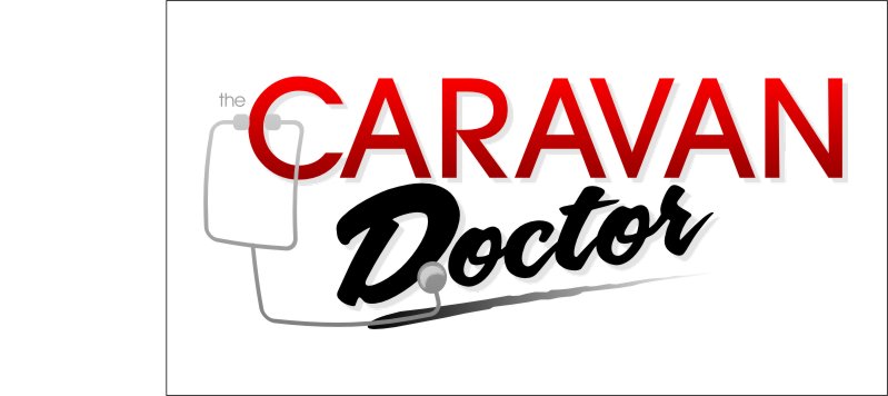
Just a quick idea, heartbeat over the cross.
Attachments:
-

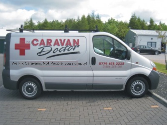
Does he make house calls here?
http://www.youtube.com/watch?v=VEOApUuQhJg
I like the heartbeat idea.
Kerning on CARAVAN is bothersome.
Love….Jill -

I like Russells idea, simply remove the cross and replace with a couple of crossed (red if need be) elastoplast plasters!
-

Think Bobsy’s idea works pretty well and would be easy to change without altering the rest of the design, in fact I think it looks better than the original so maybe your customer should thank the red cross.
If they keep a look out for this sort of thing and chase anyone who they feel is using their branding I can understand why reportedly only 3% of the money they raise actually goes to helping those that need it.
-
quote Martin:Think Bobsy’s idea works pretty well and would be easy to change without altering the rest of the design, in fact I think it looks better than the original
And while I’m at it I might as well fix the kerning like (Jill has said) at the same time? Is that what you’re saying? Huh? Huh? :baby:
-
not sure i like the revamped, it’s gone from a red cross which suggests "we’ll fix you" to "pharmacy"!
-
Now did I mention the kerning Phill ???
No I didn’t because I don’t have a trained eye for that sort of thing like Jill does.
I just think the option Bobsy gave you was easy to change and won’t take a lot of time.
Now, keep your dummy in or I will have to come and sort you out 😉
-
 quote Jillbeans:Kerning on CARAVAN is bothersome.l
Have to agree with my mate Jill, Phill kerning’s a bit hmmm 😉
anyway heres another idea although still may be like the red cross too much.
Attachments:

-
Make sure to consider your light source when using a prismatic element with shadow on the text, too.
:lol1: -
The 2 crossed plasters is used by E-Med rescue in Namibia.
They are in other countries in Southern Africa as well, so its propably registered…..
I doubt if they would be so @nal as to sue a small business owner in the UK.
BTW, tell the red cross my "philanthropy money" is now going to the SPCA….
-

personally i’d take the risk and just ignore them, but i like the idea of the band aid so here is a quick mock up you could just cut the white and overlay it onto the existing.
Good luck
-
Here’s a quickie suggestion with dubious kerning and a really sh!tty stethoscope I drew from shapes.
Attachments:
-
I do like how James has done it. Wish I had the same sort of software so I could post what I can draw. That’s another point, what’s the best software! I have only come across copyright once, and that was on a prestige cars sales. I was asked to do an 8ft Rolls Royce grill with the RR in it. I said at the time I figured we’d get some comeback, but like most car dealers he wasn’t troubled by litttle things like legal issues.:wink: About 3 months later he’d got a warning and asked me to alter it. I changed the RR into an RPC monogram. The change was a lot of hassle, for a little money, you may find this guy expects you to alter it for a thank-you. So quick fix for a couple of quid or if it’s a diplomatic move do mine, if he’s happy to put his hand in his pocket or you feel like doing some PR, Jame’s.

Log in to reply.
