Activity Feed › Forums › Sign Making Discussions › Graphic Design Help › can someone help please with wrap design?
-
can someone help please with wrap design?
Posted by Jason Xuereb on October 28, 2007 at 11:30 amHey guys,
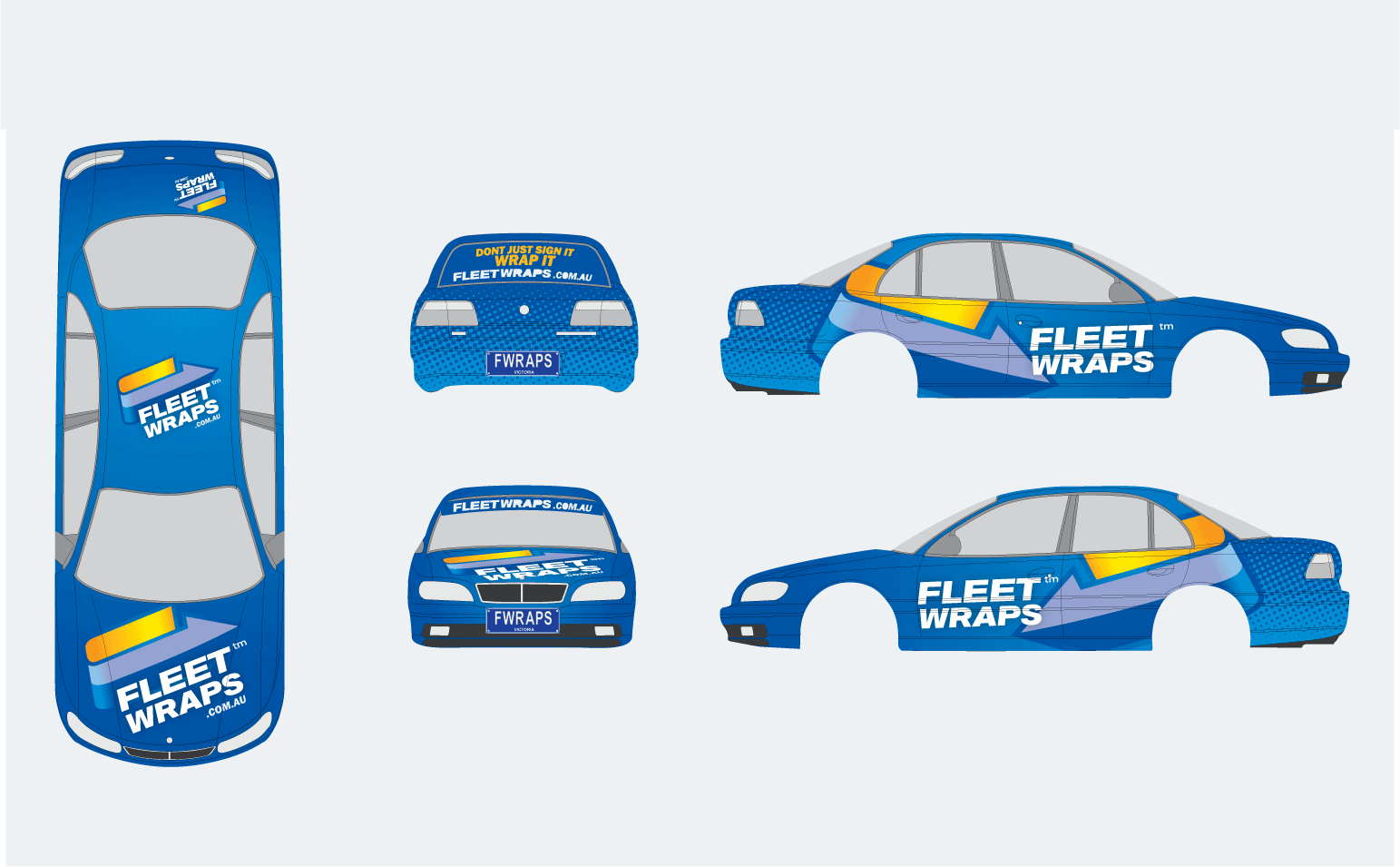
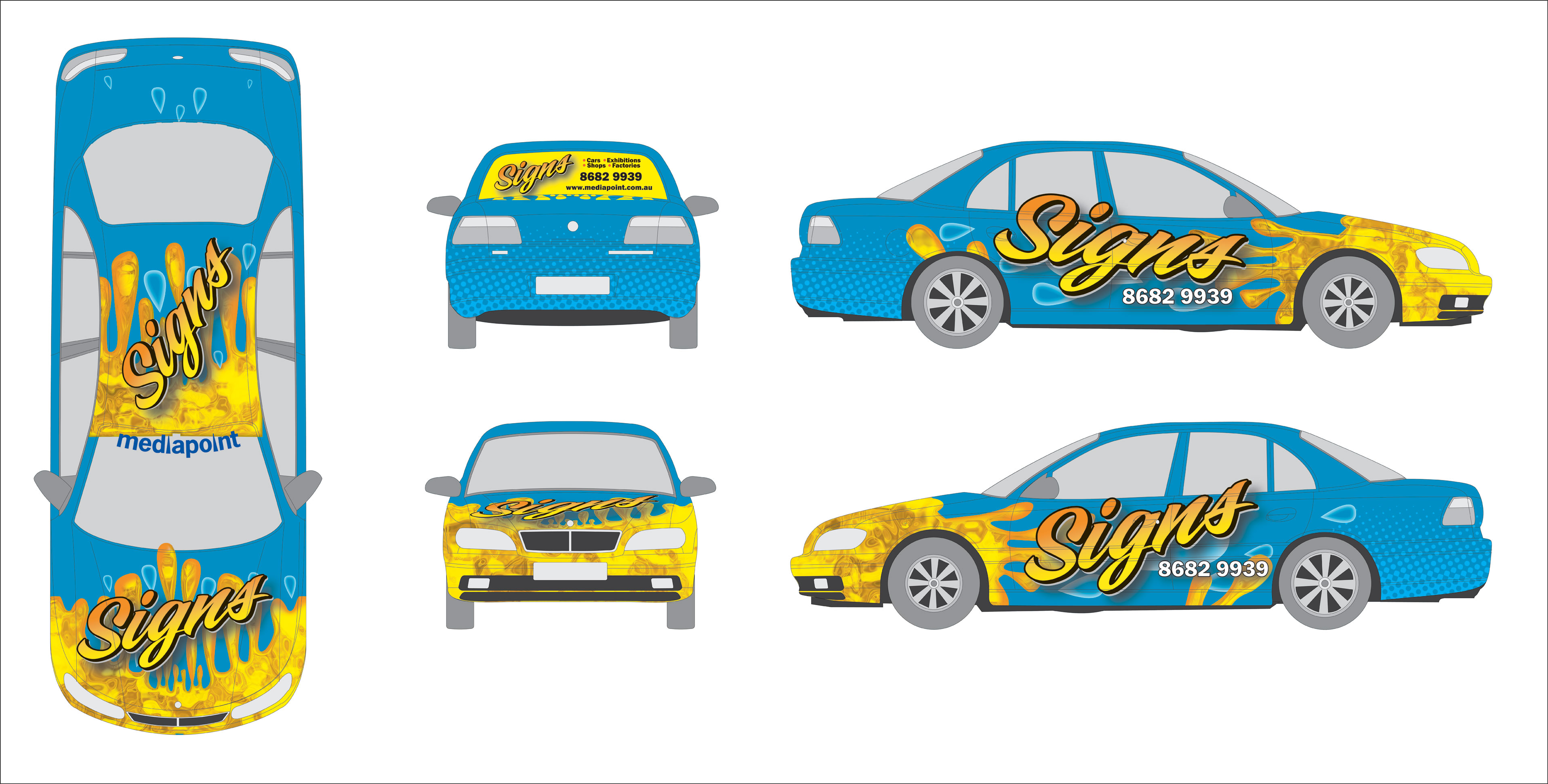
Can you provide some critique on my design. I know it isn’t overly out there but I wanted a design I wouldn’t have major trouble applying over the curves of the car. I know the halftone pattern will distort a bit but I don’t mind if they turn into ovals.
The rear window wont be that design maybe I will do something colorful in there.
Also I will fill the side windows with window perf where it gets cut off.
Georgy if your around what do you think?
Jason
Attachments:
 Jason Xuereb replied 16 years, 4 months ago 10 Members · 21 Replies
 -
21 Replies
-

Hi Jason,
I don’t do any vehicles at all so I can’t offer you any advice there…
IT was just that the first thing that struck me about the whole design was that the "Fleet Wraps" Text was a bit of a let down….something not quite right about it.
I like the idea of the halftone pattern & the arrow but i think the text could do with some effect on it or something
You may well be working to an existing logo but It was what struck me on the first look
-

Hey Glenn,
That is infact our logo. I guess I can add a drop shadow or some effect to it on the car or give it a reflective outline to make it stand out more.
The wrapped arrow is part of the logo also.
Jason
-
yeah…sorry Jason….I wasn’t wanting to put the logo down
I think it’s just that it looks a little flat against what is going on in the background….I think it just needs a bit of punch to lift it out a touch
-

It’s going to be difficult to make the half tone bit match up on the rear and sides.
-
Glenn no offence taken I want peoples critique.
Jon I don’t really mind if it i’snt perfect the pattern should hide the difference a bit.
-

Hi Jason, i think you should angle the "FLEET WRAPS" text on the sides the same as the arrow part of your logo. I think your logo as viewed from the top of the car is punchy but splitting it up on the side isn’t working for me. Try not to split up your corporate id. Logo on bonnet is far to big, creating some breathing space will portray a sense of quality, to big is like cheap after shave mate, overpowering and never helps you pull! Try offsetting it like the rear logo.
Rotating your logo like this is creating a positive dynamic energy that suggests progression and upwardness, this is being lost on the sides. Start playing with the layout on the sides and get the arrow pointing upwards and get that tag-line working on the sides.
The halftone effect on the rear is fine.
All the best with it mate.
-
Thanks Chris,
I will play with the design in a few days. Abit hectic around here at the moment.
-

Jason, I think the fleet wraps part needs to be bigger and more dynamic.
I can’t believe I am saying that, but you need to tart it up with more fills and special effects.
I realllllly dislike wraps, but the ones here can be pretty wild and busy looking. It needs to be more eye-catching.
The legibility is good, don’t lose that.
Love…..Jill -
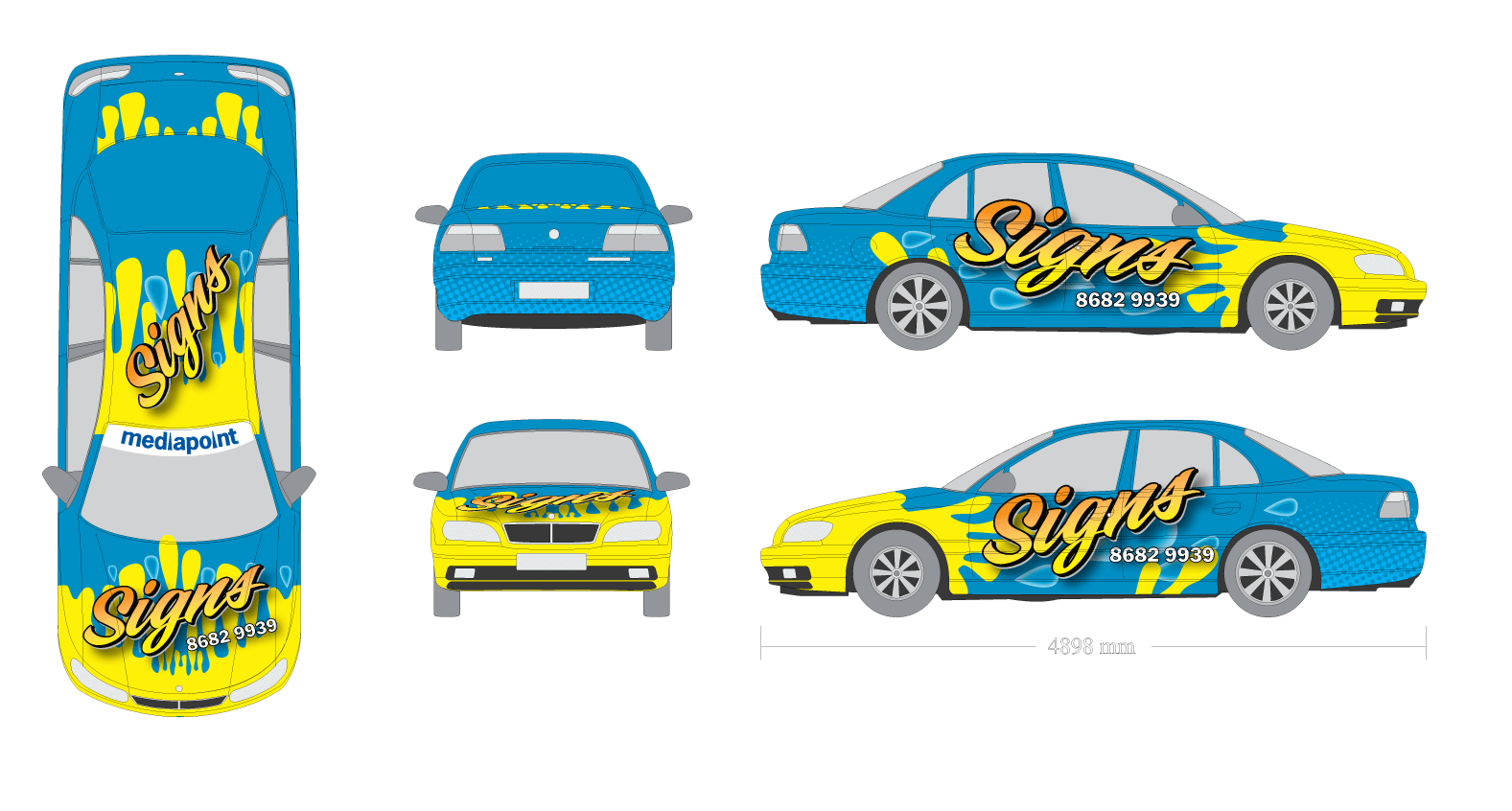
Hey guys,
Talked with my brother and were holding off using that name and concentrating on the sign part. Not alot of people know what wraps actually are down here yet.
I’ve gone for my dynamic eye catching.
This isn’t finished. I’m going to airbrush highlights etc. But this is what I’ve done in illustrator so far.
The back window isn’t finished either.
Attachments:
-
Hello Jason
For what its worth ,I like it .(But what do I know)
Graham -

Hi Jason
I like the colour scheme and the overall layout, the only thinkg I don’t really like is the splash or running paint effect in yellow, I think it would work much better and be way more effective if it was a 3D effect and not just a flat yellow if you know what I mean. Remember that this is an advert and over the top might be better to get more attention and show more of what you can do. Flat yellow could be done with normal cut vinyl so it is not really all that much different is it 😕
Just a thought.
Cheers
Warren
-

hi jason, that does look eye catching, i painted my crash helmet just like that, but i would agree it does need to look 3d.
cheers
stephen -
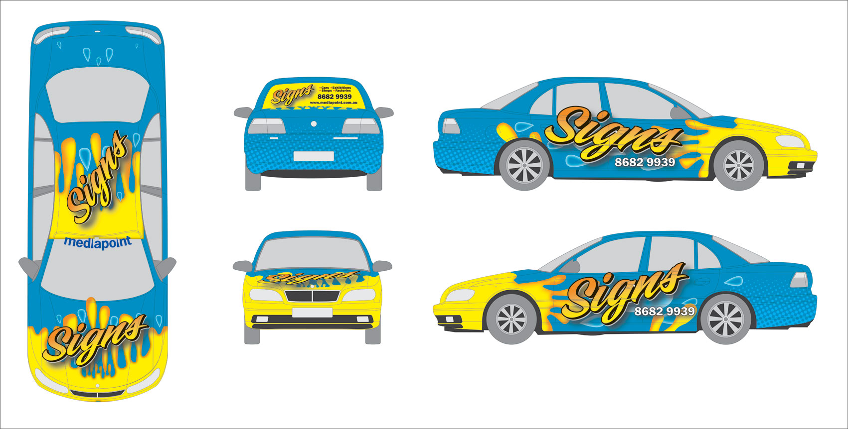
Hey Warren and Stephen,
I’m going to achieve that in photoshop. I’m going to airbrush darker orange highlights to add depth. Don’t know how to achieve this in illustrator.
I’m just installing xp on my new machine. Hopefully that will cope with 1-2 gb files a lot better.
-
Love this new computer. 4gb ram quad core processor. yummy.
here are the highlights added in photoshop. I gotta fix the rear ‘trunk’ (we call it a boot down here).
Attachments:
-
Hi Jason
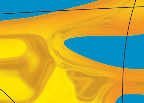
That’s better but not quiet what I was thinking of, I think it still needs to be more "Digital" and 3D looking to really attract attention. I tried to find something similar to what I was thinking but this was the best I could find to try describe what’s in my mind. more sort of liquid looking 😉
otherwise I do like the whole concept but remember this needs to have the wow factor.
Warren
-
Cheers Warren,
I totally agree with you. I want this to stand out so people take notice.
I will see what cool filters I’ve got and get back on it.
-
ok I’m finally happy with this effect.
What do you guys think?
I still need to redo the back part of the vehicle but this takes a while to render this effect so don’t want to waste my time if people don’t like it.
Attachments:
-

The last one looks fantastic, isn’t it funny , if you compare this one with the first one, this one wins hands down. P.S. Since i’m on the other side of town why don’t we do my car as well and kill 2 birds with the one rock, could work well for both of us.
-
Cheers greg,
If you want some help wrapping your car let me know. I’m going to print this tonight and fit it thursday or friday. Needs to be ready by sunday we have a show to goto.
Jason
-

i dont do wraps, but just from my own point of view, I like the design, but i think the yellow splashes would look better in a different shade of blues rather than yellow. I think only because the effect you have achieved is excellent, but the yellow/orange and the effect remind me of fire, but the shapes of the the splash are more like liquid. I think you should either make the shape of the design more like flicking fire, or change the colours to make it "liquid" like. Just my opinion,
-
I was going for a molten lava liquid look.
I’ve got the digital firestorm CD and didn’t want to overlay it with flames.
This is going off to print. Thanks everyone for your help.
Will show the results later in the week.
Log in to reply.
