Activity Feed › Forums › Sign Making Discussions › Graphic Design Help › can l have your opinions on my two ideas for van layout?
-
can l have your opinions on my two ideas for van layout?
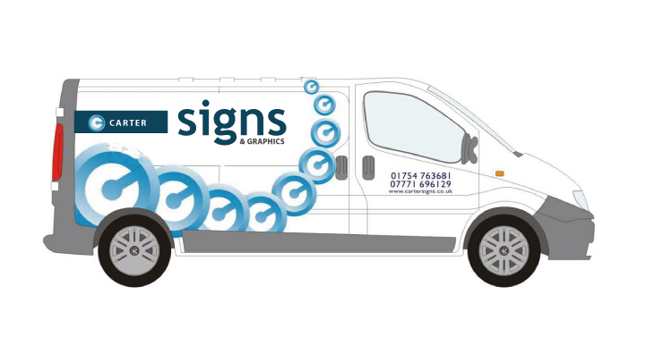
Posted by Pryam Carter on March 9, 2006 at 9:15 pmI’ve just got a new Vivaro LWB and l’m in need of getting the graphics sorted some time this year.
I have two designs for you, can l have your opinions my two ideas.
Cheers all.
Attachments:
 Leigh replied 18 years, 2 months ago 19 Members · 40 Replies
 -
40 Replies
-

Hi billy will this be printed ?? and what is the significance of the blue circle things!!
Lynn
-

It took me a few moments to figure out what the “speedometer dials” were for. Now that I figured out that it is “C” for Carter,….. I like the bottom one best.
Adrian
-
 quote :Hi billy will this be printed ?? and what is the significance of the blue circle things!!
The C in the circle is the logo i use.
It will be printed.Are these better?
I need to sleep, this is doing my head in!!
Attachments:

-

Yer Billy I prefer that last one but don’t know how you will manage to get the last small one to stay on the roof :lol1:
Like it better since the text size was increased
Certainly eyecatching, and I think joe public don’t need to understand the C logo, it gets them talking, and thats good.
Dave.com.com.com
-

i would go with the bottom one, but change the carter to the dark blue, will stand out a bit more, and so you only see the ‘signs’ in the orange, and line up the web address and phone numbers 😀
i like it 😉
nik
-
Yer thought about that first Nik but decided it would miss the point of the company name which is Carter Signs, not Signs.
Dave.com.com.com
-
quote DaveBruce:Yer thought about that first Nik but decided it would miss the point of the company name which is Carter Signs, not Signs.
true, but its signs hes selling…the name will come after 😉
nik
-

Are you familiar with the “Quicktime” Logo?
not trying to throw a spanner in the works but a hell of alot of people will see it as that, I did.
It does look very nice though I like it.
-

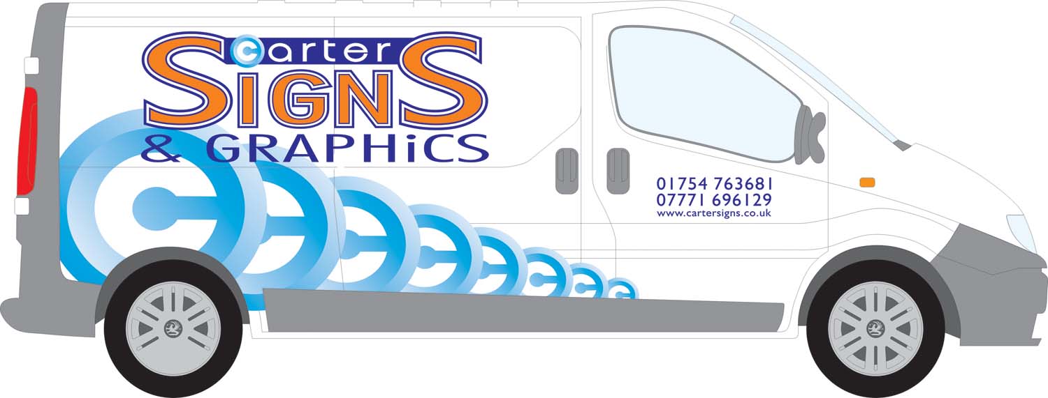
Billy, I would maybe put the CARTER horizontal and use one of the “speedo Cs” for the first letter, it may give an idea of the log. But I think you have created one of those illusion things without realising it!
Peter
-

I couldn’t realy see the C at the beginning.
Maybe you could include it somewhere small in the design.Also would maybe use some flat colour.
Just an idea
Cheers
Andrew
Attachments:
-

I’m sorry, and I don’t mean to be negative, but all I see are the c’s.
And they distract me from the main message.
I can “c” the sense in trying to get “carter” across,
but there has to be a better way.
Steve is right about the Quicktime thing too.
If you must use a “C” I would suggest just using one,
maybe a loose, free-form style one behind the name.
Maybe make “Carter” big and “signs” less bolder underneath?
Just my 2¢.
Love….Jill -

I am not fussed on all the logos personally. I’d like to see a big one on the rear or in the middle, the text over the top.
The quicktime thing is another issue. I first saw it I must confess I couldn’t work out what it was, but seeing the quicktime logo hit te nail on the head.
Sorry to be so negative.
edit: just read Jills post… 😳 .. I agree with what Jill said…
-

im the same on logo, thought it was quicktime ata glance… didnt see the “c” etc
if you are to go ahead with the “C’s” etc ide go along the route of what andrew has done. i like that layout using the logo. -

First tought:
What the hell does quicktime as to do with signs?I would suggest something like Andrew showed but i’d try to keep original (Blue and Orange colors), and about the C as said already i would try to darken (Royal Blue seems good) it a bit to run away from quicktime tought and would try only 1 big C like Shane and Jill jut said, i would like to see those C’s in Orange aswell but maybe that’s to agressive,Mainly it seems i toke a piece of each and everyone’s idea. 😳
As always on your own designs trial and error till you’re comfortable with it, mostly you’ll end up printing something you’d change minutes later, but don’t have we all been there?
-
I know it’s nothing like what you want,
but maybe a square approach?
(I’m in an Easter mood, hence the colors)
Love….Jill
Attachments:
-
quote :First tought:
What the hell does quicktime as to do with signs?Well for a start the C in the sign looks just like the quicktime logo, thats the first thing i noticed, evidently you havent seen thequicktime logo yet.
wasnt a criticism, just thought Id point it out. -
as has been said mate, it does throw the impression “quicktime” as quick time is a registered trademark you could be opening yourself a can of worms, problem wise. i know its not the exact same, or your intensions for that matter, but it only has to give the impression of a logo or name and your deemed as “passing off” on someone elses popularity, which can carry a heavy fine.
sorry, i know thats not much help but thought ide mention it, as i have been there, both sides of the fence. 😀
-

i didnt see the C as a quicktime logo at all, but i must admit not not knowing what it was until it was pointed out that there was a C in the middle of it, even now i know, i cant see the C, just what looks like a type of speedo, sorry to be neg, is there some way fo keeping the C’s but maybe done differently ?
i’ve got all this to look forward to soon !!
-
This may be of interest to you, Its quicktimes trademark and patent description of goods and services, and graphics is on the list, seeing as you mention graphics on your sign they could well say youre trying to trade off the back of their logo etc, its unlikely and would be petty but its happened plenty of times before to the smallest of traders with a similar name or logo of the big corporates.
-
Looks nothing like the quicktime logo to me. There logo is much softer and the last time l looked “Quicktime” begins with a “Q”!!!
Thanks for all your input everyone, you’ve given me a lot to think about (too much!).
🙁 i’ll probably get round to making a decision sometime in the distant future. -
quote billywifta:Looks nothing like the quicktime logo to me. There logo is much softer and the last time l looked “Quicktime” begins with a “Q”!!!
Thanks for all your input everyone, you’ve given me a lot to think about (too much!).
🙁 i’ll probably get round to making a decision sometime in the distant future.Doesnt matter what you think Billy, Its what their lawers think!
I know a couple of one man bands in my area that had to change their name and logos because Stelios’s lawers thought they resembled easysomething. If quick time notice your log, could you afford to fight them?I didnt see Quicktime in your logo, but if others did, perhaps it does look a bit like it….
Peter
-
I know quicktime starts with a Q, and its got a little stick pointing down like a Q as well but the point is it also looks a lot like your logo whether you see it yourself or not.
thats all i was saying, it wasnt criticism, i liked your logo, I was trying to be helpful and maybe save you a headache rather than get sued. -
change the 7.5 minutes past the hour and the colour[slightly] no problem
………….my new name is Earl 😀
-
I normally have the logo straight Earl. 😀
I’ve stared at the Quicktime logo for a bit and l suppose i do see it a little bit Steve, wasn’t been funny with you.
The whole “get your van looking good” thing is doing my fu**ing head in!! -
I know what you mean mate, I have 2 companies to design signs for, I have one on the shop front but now need one for the van Ill be buying and know exactly what you mean, Ill be doing them for ages till theyre right, its one thing doing a job for a customer you know theyll be pleased with but doing your own is a nightmare.
-
Billy,
I’m sure you’ll get it right
[My Name is Earl was great tonight……………..Wakey, Wakey, Hands off Snakey]
http://www.myipod.co.uk/illusion.html
will take your mind of the van -
It’s easy to do a customers van but when it’s your own it is the hardest thing to do it is agonizing.
I’m sure you will get it right for you Billy 🙄Lynn
-
quote Lynn:It’s easy to do a customers van but when it’s your own it is the hardest thing to do it is agonizing.
I’m sure you will get it right for you Billy 🙄
Lynnyep spot on lynn……….ive been meaning to do mine for over a year know….. 😉
nik
-
were getting our new one in about 2 weeks we have known for ages we are getting it no designs or thoughts !!!
sorry Billy hi-jackLynn
-
I totally agree with trying to include the logo with the name, this has been the biggest challenge for me.
To be honest it is doing my head in and taking up too much time. 🙁When you design customers vans it’s no problems, totally agree with you all on that score.
This is the latest offering.
Any better all?
Attachments:
-

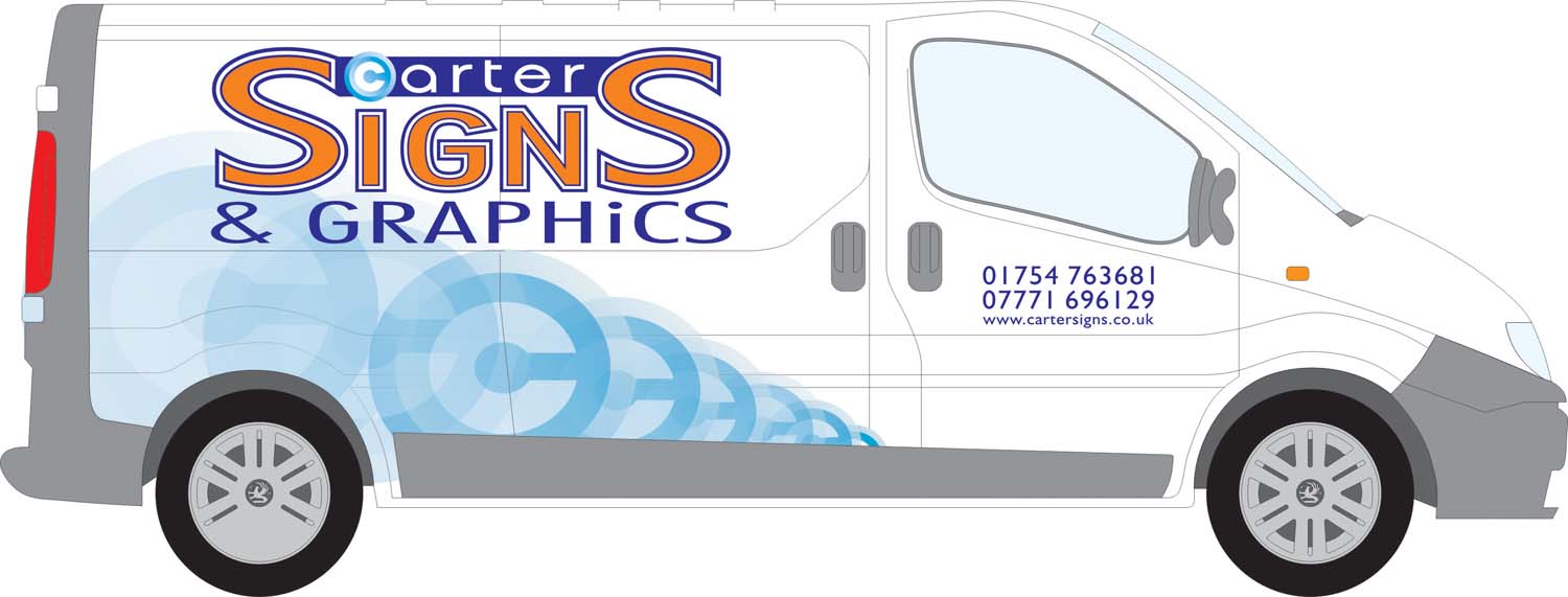
I personally would like to see the logo the “c” thingy logo in a much lighter shade …. a watermark effect …. very very light blues … so the logo is there but just a very subtle watermark-ish effect. At the moment it is very dominating as it is.
😀
-
I hear ya Carrie.
I think it’s gettin much closer now. 😀
Attachments:
-

all looking good, a wee bit off topic here, I too am going to brand up a small van I just bought, whats the best oracal vinyl to use? is 751 good enough for a few years? cheers
ps: this is not my usual area of business but is straight forward for what I need.
-
quote smedia:all looking good, a wee bit off topic here, I too am going to brand up a small van I just bought, whats the best oracal vinyl to use? is 751 good enough for a few years? cheers
ps: this is not my usual area of business but is straight forward for what I need.
751 will be fine…
Billy, do you really need the logo going off into a fade? I like the concept of the watermark as carrie suggested, still not sold on the duplication tho.
-

Billy, I much prefered your last non-fade out version. Now it’s getting a bit too fiddly for my eyes – even a fade out into the distance (reverse what you have) may be better. (Carrie’s watermark sounds good too.) I just think it’s in the process of losing some of its impact. It needs to be remembered as not just another white van with writing on the side.
Just be glad you don’t have a van in my corporate colours & to parent company spec., flippin’ ‘eck does it get noticed 😉 – instant association with the company. (You can’t give anyone the finger within 75 miles of Dundee when driving sort of recognisable.)
-
I think I would just do one large “c” thingy behind the text.
As big as the whole side of the van, maybe even bigger and cropped.
In a watermark like Carrie suggested.
Maybe even in a silver metallic.
The fade thing just made it look messy.
It does look better not slanted, but now it reminds me more of a sore throat lozenge.
I do like the re-working of the text loads better than the original.
Love….Jill -
how about making the c in the circle another colour than the van, i first saw it as the quiktime logo, mabey if you use another color in the c the first glance would be a c in a circle and not a quiktime logo
for example take orange (the opposit of blue) or yellow, or even better yet make it yellow with a radiant gradiant to orange: yellow inside orange outside
just a thougt
-

I like Jill and Carrie’s idea of making it just one big C behind your text.
Watermarked
For me personally, it doesn’t remind me of the quicktime logo at all,,,but
bubbles 😮 yep bubbles. I don’t know why but it’s the first thing I saw. (?)
Log in to reply.
