Activity Feed › Forums › Sign Making Discussions › Graphic Design Help › Can I have your opinions for our factory signage?
-
Can I have your opinions for our factory signage?
Posted by Jason Xuereb on November 26, 2007 at 10:29 amHey guys,
We officially received the keys last Friday.
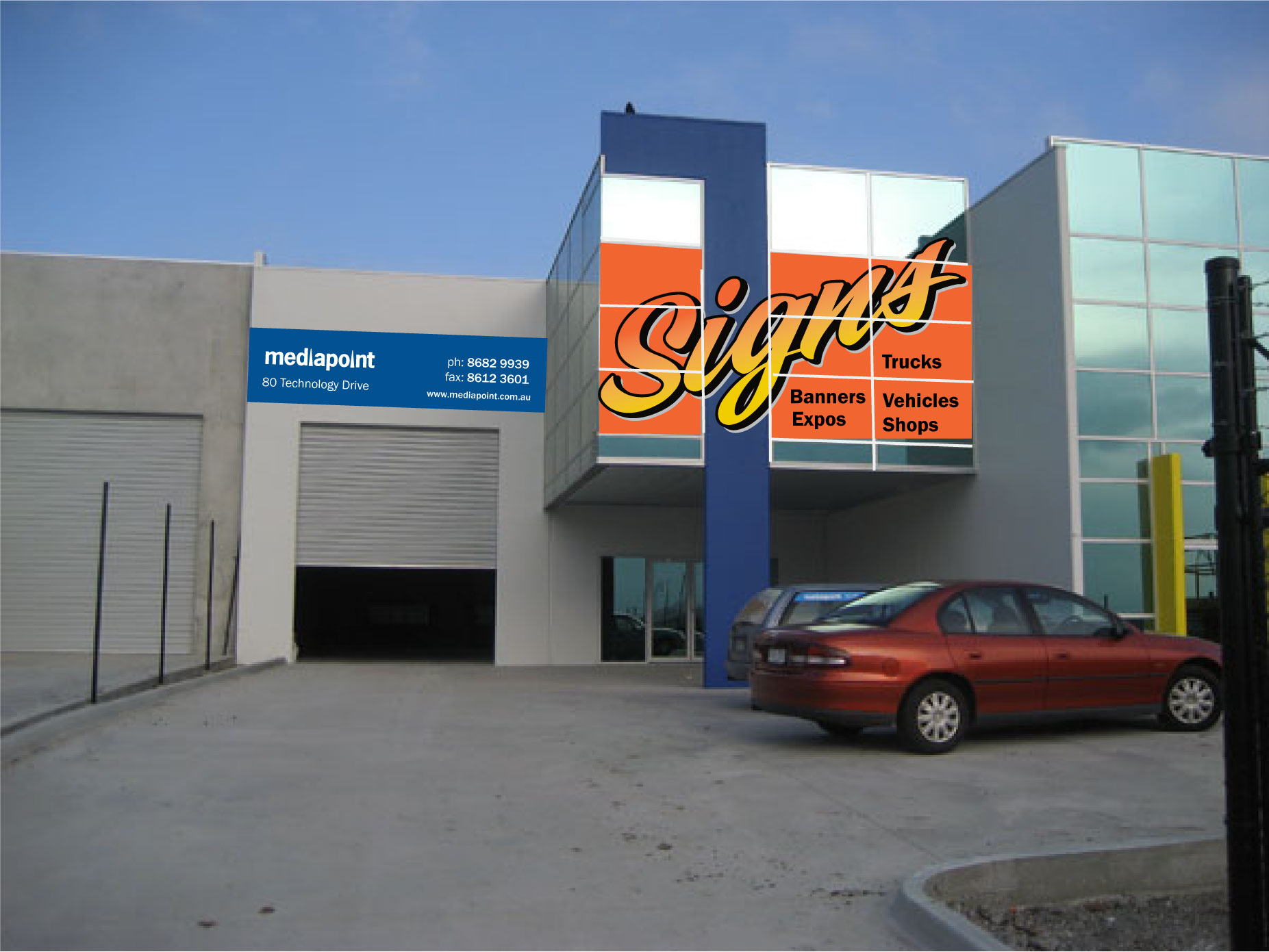
Our company name is Mediapoint. It doesn’t say what we do so I basically want to eliminate for people driving past. I’ve carried on the theme from my brothers window perf for his wagon.
The ‘Signs’ on the window will be a mix of window perf and hopefully Calon DPF 8000.
The sign on the garage door with be a 6 metre by 1.5metre dibond tray in two halves.
The dibond tray background images will be changed to different jobs. Atm I’ve just replicated the one job.
Can I have your opinions etc?
quote :
Attachments:
 Peter Dee replied 16 years, 5 months ago 9 Members · 17 Replies
 -
17 Replies
-

Jason,
I think I would move the list of services to the front window, and keep the blue mediapoint part and contact info on the back sign.
Maybe put one word in each of the windows under the highest portion of "Signs".
In other words, you don’t need to have "Signs" on there twice, thus making the blue sign bigger.
Love….Jill -

Hey Jill,
I didn’t really want to have the mediapoint and contact info any bigger. It’s already on a 3m by 1.5 metre panel.
Do you think I should drop the other signs and put an image or something to show were capable of doing photo printing etc?
Thanks always for your critique its always spot on.
-
Heres a mockup on what you said Jill. I added a background colour to give it some contrast against the glass.
Attachments:
-

Seems a shame to cover the nice shiny windows up.
I like those.
So far looks good to me. -

looks good Jason, but I don’t see you mentioning print.
(I basically want to eliminate for people driving past. ) from your first post, seems a bit drastic 🙄
Lynn
-
Jason, I wouldn’t block out the windows, just list the services in white or yellow.
Love….Jill -

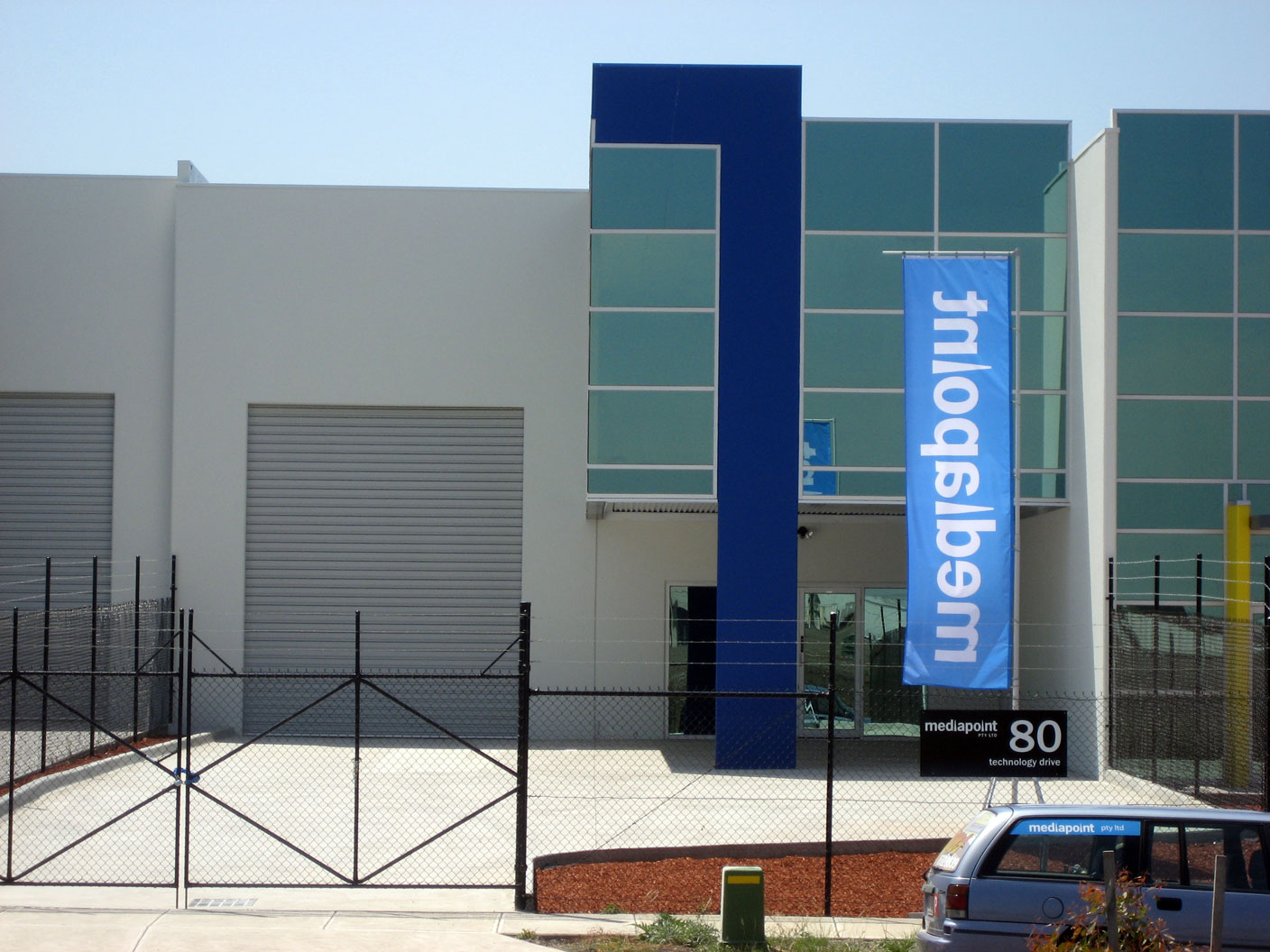
is the glass front building on the far right belong to your company also jason? i.e. the one with the yellow pillar in front of it?
-
Sorry Lynn it was very late when I posted that. I wanted to say when people drove past I didn’t want them not know what we did.
Hey Rob,
The yellow pillar is next door. So it doesn’t belong to us. I will take better photos today and you will see where the fence is actually up.Thanks again Jill. I didn’t want to block out the windows either.
I will design a few more things later tonight when I get a minute.
Thanks again
-
sorry for all the questions mate…
what is the blue sorta number "7" pillar made from jason?
-
Concrete painted. That’s why I mentioned the Calon DPF 8000. If that doesn’t work up will go a dibond or colorbond sheet colour matched to that pillar and the signage over the top of that.
-

Jason – I think the building looks great and these initial designs may be a missed opportunity to do something exciting…would be interested to see the new pics of building.
Cheers
Andrew
-
I’ll take them later today. Also an extended shot to show where our place sits near the others.
-
 quote Andrew Boyle:Jason – I think the building looks great and these initial designs may be a missed opportunity to do something exciting…would be interested to see the new pics of building.
Cheers
Andrewwhat andrew has said……. 😀
nik
-
Hey guys,
Here his the building as of today. You can see the fences so our boundaries. Factory width is 12m. So on top of the roller door I have 6m and the windows are 6m wide.
Technically I’m only meant to have 6 square metre of signage. But rules are meant to be broken 😛
Using lightboxes etc for night time won’t be effective. Were in an industrial area and not on the main road. I doubt there will be any traffic at night time.
Attachments:
-

you just like showing pics of your lovely new building dont you. 😉
chris
-

I feel that the script for "signs" is very dated – straight out of the Mike Stevens period.
It just doesn’t go with the modern building to me.

Log in to reply.
