Activity Feed › Forums › Sign Making Discussions › Graphic Design Help › can anyone throw some ideas for a better logo?
-
can anyone throw some ideas for a better logo?
Posted by Lorraine Clinch on September 18, 2006 at 2:30 pmI am fast running out of business cards, and as I really really dislike my logo, I want to change it to something more legible and eye-catching. Trouble is in coming up with ideas-same as has been said before, it’s easier by far to come up with ideas for other people.
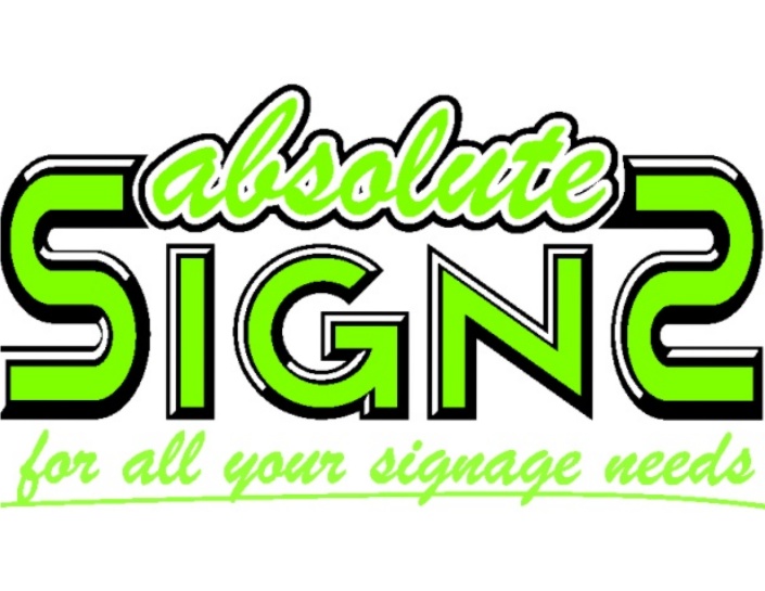
So, what I’m asking is, would you kind people give me some help please?This is the existing one….
Lorraine Clinch replied 17 years, 7 months ago 9 Members · 25 Replies -
25 Replies
-

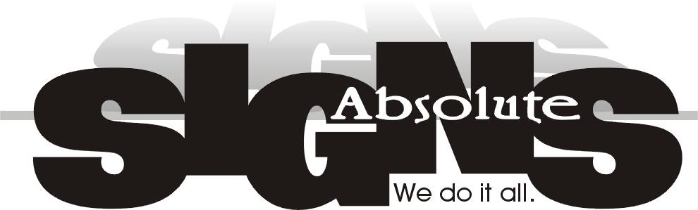
Just a quickie Lorraine, while I was having my coffee.
-

hey! Not bad Harry
Like that layout
How many cups of coffee do you have in a day? 😀 -
Just one John, but you should see the size of my cup!! 😀 😀 😀
-
 quote John Singh:How many cups of coffee do you have in a day?
About 5 or 6 I would say thanks for asking John 😀
Harry that aint half bad :thumbsup:
It is difficult Lorraine, you become very self critical when designing your own stuff, often thought of farming mine out to someone else, just can’t muster up 40k at the moment.
Bit busy, but if I get half hour I’ll have a go…………………………………for 20k.. that includes 50 free business cards!!
Martin
-
quote John Singh:Would they be laminated Martin?
:lol1: :lol1:
Your taking the p1ss now John!
I’ve got a wife and 2 kids to feed.
I seem to offer something for a good rate, and you lot always want that little bit extra.
-
quote :I seem to offer something for a good rate, and you lot always want that little bit extra.
All I want for my Graphic Design is 15k and Brian Little’s head on a platter!!!!! 😀 😀
-

I’d try to help you, girlfriend, but I can’t download the darn thing?
Can you please post it as a .jpg or something?
love….Jill -
this is Lorraine’s one, Jill, she doesnt seem to be around.
Attachments:
-
P;lease doint mention the B/S word Jill, Lorraine couldn’t help it.
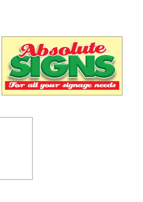
Heres a go from me
Attachments:
-
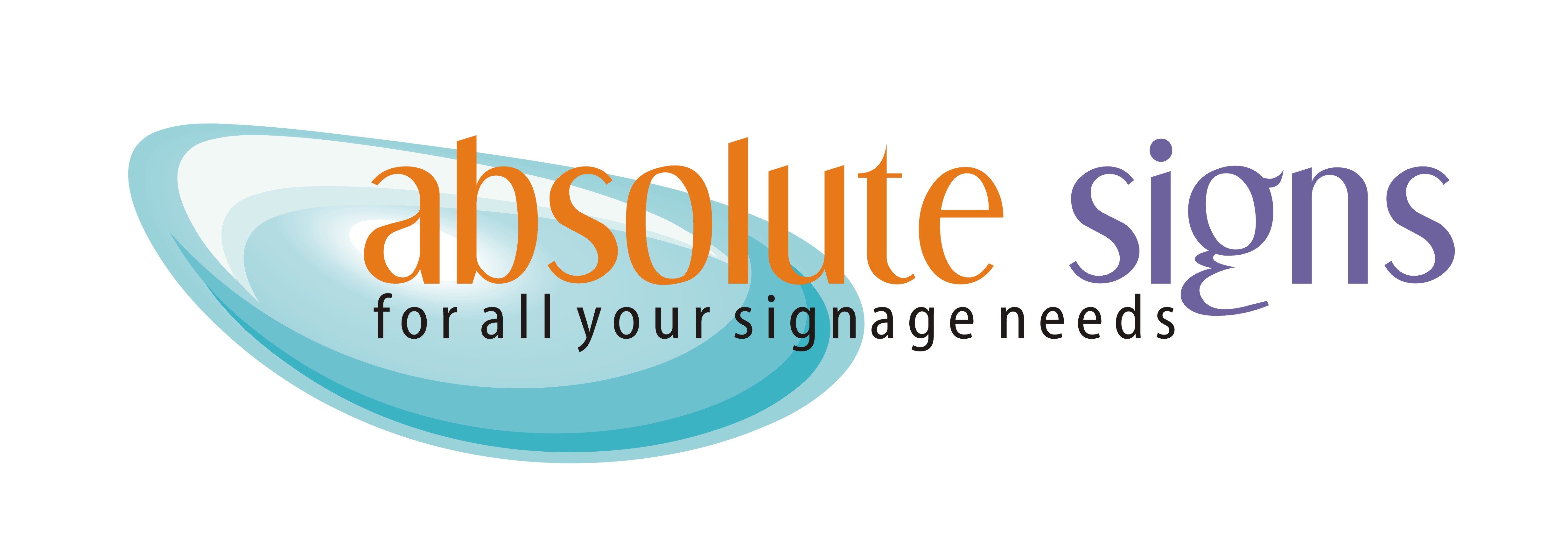
quote Harry Cleary:Martin. whats that font?
Cheers Harry, the font is called ”Dream Orphans” 🙄
I would also put yours up as J-Peg Harry.
-
That’s pretty cute Martin
(over how many coffees was this design done?) 😀
-
I think Harry is pretty much on the ball with this one.
The warm vintage colors have a bright friendly appeal.
Lorraine…darlin…
WHY would you use Brush Script?
Ugh…it’s so dated. If using yours, please consider more current fonts for both words.
And the reversal of the S might seem fun…
But would you want to buy a sign from someone with a backwards "S"?
Another word many of us do not like is signage…
one guy I know says it sounds like a disease!
To me, rather than seeming professional it cries Yuppie.
So I changed your byline.
This is the best I could do…having a rough day.
Martin’s is nice too but it reminds me of the UK signboards logo.
love….Jill
Attachments:
-
Or you could try this…talk about appealing!
😉
Attachments:

-
 quote Jill Marie Welsh:Or you could try this…talk about appealing!
😉nice one jill……….is that an alcopop size :lol1:
nik
-

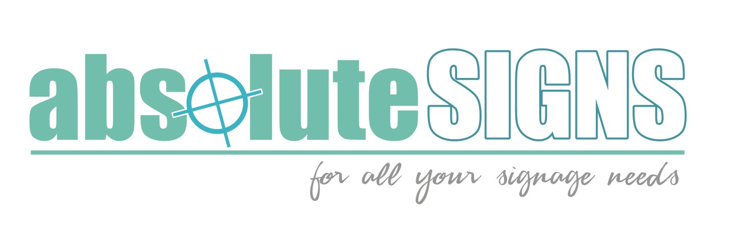
Some good ones there. (Not sure about the naked bloke though.)
Here’s one…..I’m not real good at this sort of thing.
Attachments:
-
‘I think Harry is pretty much on the ball with this one.’
Were did you get that photo of me Jill 😀 😳 😳
-
Andy
That’s a clever use of the icon for the ‘o’ which incorporates the ‘absolute’
factorDidn’t know you had it in you 😀
-
 quote Harry Cleary:ok, heres the JPeg version
That reminds me of Krispy Kreme’s, mmMMmm donuts. :lol1:
-

OK, I’m back now. Blimey, you lot have been busy overnight! I logged on half expecting to get blasted for asking – I should have had more faith.
Where do I start……
Jill – logo was designed by a printer. I knew no better at the time, but now that I do 😮 😮 😮
I like the Hunk, but he would be an Absolut pig to make in cut vinyl :lol1:I take on board what you say about the strap-line, and I rather like ‘We do it all’, and may well keep that.
Martin, you are definitely along the right lines with your design. I like the font and the swirly bit. I wanted something I could get printed, and to me this does look clean and modern.
I just wish I had half as much talent as you all have, thank you all. I shall now have a play about with your ideas…..
-
Lorraine, as it is you I am qiite willing to give the file for it, to use or to play around with and the the font if you require it.
Done it at home last night so will have to wait till this evening.
let me know and I’ll sort it out for you.
Martin
Log in to reply.
