Activity Feed › Forums › Sign Making Discussions › Graphic Design Help › can anyone throw some design ideas for own company van?
-
can anyone throw some design ideas for own company van?
Posted by WP_Graphics on October 27, 2002 at 10:16 pmRight,
My Van is going in over December to get stripped and re-painted white (basically ’cause the guy’s before me did a crap job and some of the paint is now coming off!)
Here it is as it stands, side, front, rear and side with a flash on it to show the reflective vinyl.
As you may have noticed, I actually specialise in performance car accessories but moved into vinyl graphics and digital printing over the last year.
I was thinking in doing one side of the van to do with performance car accessories and the other to do with Vinyl Graphics, Stickers, full colour prints, T-shirts….usual stuff.
Any ideas guys, I need something real flash but looking for inspiration!!
Van is a Fiat Ducato High Top Long Wheel Base 1995.


CheersGav
Robert Lambie replied 21 years, 6 months ago 7 Members · 12 Replies -
12 Replies
-

ok… ill think this one over mate.. post later on.. first thing though. dont do the one side this the other side that… its frowned upon…. 🙁
just my opinion mate 😉 😀
-
Ok gav looking at your van I see problems..
In your design I mean. What ill do is point out where you have went wrong. Well some areas anyway.
This should help you when designing your new layout.Big is not always better! Your lines of text seem to be so crammed and tight its hurting my eyes.
A big problem with your van, and something I think you should start to think about is fonts!
Fonts are very important. Fonts can make a design…I remember after we got rid of our old spandex machine and bought signlab it came with a 5000-font list… bloody hell I thought it was amazing. Then i remember saying we have been had… there’s about 15 fonts all in the Helvetica family alone and the same in Arial etc… daft git I was. 😡 😕
Nowadays, When I design a sign with lots of info I straightaway go to a large font family and start my design. Bold, narrow, light etc all in proportion and all same font family. That’s what you want. Don’t squeeze to fit. That’s not designing. Don’t stretch to get noticed. It doesn’t… It just makes it harder to read. Practice kerning / spacing.
All these factors lead to better designs I promise, & you haven’t even started creating your graphics yet….
Colour is another important factor… balance the colours. Get them right and the signs/graphics will become much better. Don’t use colours that don’t compliment each other. It’s hard on the eyes.
Making something noticeable and easy read is what you’re aiming for.Design a logo and stick to it. That’s colours, shape & design. Don’t alter in anyway other than to scale up or down.
ill reply again to this post at a later time mate.. but these are issues in your design i feel you need to address.
just my opion mate… thats all. constructive critisism… 😉 -

Hi Gav and welcome aboard mate!
You’ve got a nice big moblie billboard there mate and it could become a powerful sales tool if done properly. I don’t want to sound like an advert for Mike , but the best thing you could do is shell out £99 for the secrets of design CD from Mike the sign on these boards. It’s not just fancy lettering and effects, but also goes into great depth on design and layout etc.
It’ll cut YEARS off your learning curve – I’ve been in the biz for a few years but I wish I’d bought it when I started.
I know I sound like an ad for Mike’s CD but it really is that good!
You’ll be amazed.
Hope this helps
Joe -
hi gav
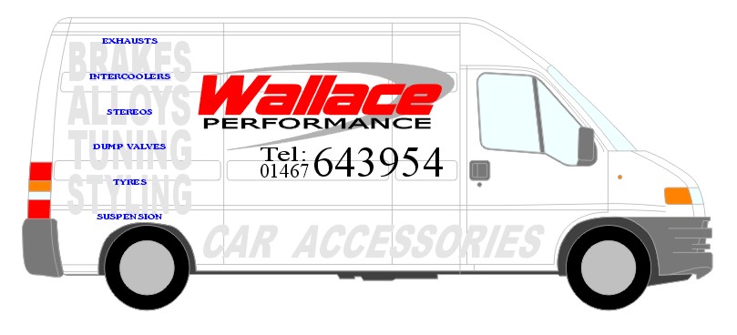
just to try and explain what i mean by the usage of fonts, using light and bold of the same family of fonts etc etc ive made up this mock-up sign with your details.
ive deliberatly used plain fonts and bland colouring. that way if you think anything of this sign you will know what i mean by proper font usage… 😀judged by your own design, i dont think this is the kind of logo/layout you will be looking for. but thought i would try & show as expalining aint my good point… 🙁
once the image loads scroll up take a look at your van then scroll down and look here. yeh, yours is colourful big and bold but is it really clearer because of this? its hard on the eyes..
getting the fonts the layout and the colours right can lead to an excellent, professional, eyecatching design 😉one last thing… when you look at a vehicle yuo have designed. you must be able to instantly tell what they promote, sell whatever…
remeber vehicles are on the move. you only get a glance! 😉
Attachments:

-

Hi Gav’…had a go at this myself 😕
see: https://www.uksignboards.com/phpBB/viewtopic.php?t=1665
more soon
-

Here’s my latest attempt, which TBH, is a blatent copy of one of mikes layout’s, sorry but cheers Mike! 😆
Crit please!
Attachments:
-

Well done!….your getting there, and seem to be learning loads along the way
-

That’s brilliant Gavin – I really like it.
If I was to pick up on anything it would be the blue lettering at the back -a bit of tweaking there and then you would have the perfect van livery 😀
-
hi gav
i like the ideas behind the graphics in each area of the van..
i realy do think the new look logo is much better and i see vast improvment in your work daily. well done mate… first class.looking at the design as a whole.. i think it all needs tweaked here and there. the design works but you need to space, balance and tie it all together.. without going into a big speal about it, take a look again and dont be afraid to reduce size here and there… move things apart.
the design is good, so it will work regardless to what you do..a tip! dont reduce or enlarge text other than to scale it.. condensing and squashing text is frowned upon. its all to easy to just grab it and crush it up to fit.. try using a condensed font in the same family or an elongated version of the font. looks better in the long run…
oh yeh did i mention kerning… 😆 😆 😆
-
cheers guys,
I feel things are starting to come together also!
I’m going to tidy and jazz things up a wee bit on this so I’ll keep you posted…
I’ve still to get this bloody thing painted though!!
Gav
-
gav! …. & anyone else that may read this. if you are wanting advice or help of any kind with graphics. why not upload the artwork along with the post. it means that people that may knock somthing out for you to try/veiw can do so without having to start from scratch…
what do you think? i know ide make more effort if the file was there to tinker about with if i have the time…
i dont mean the vehicle outline, by the way… you will get me shot by our friends at impact signs, vehicle outlines… 😆 😆 😉 just a wee joke brian 😉
anyway just thought ide mention it for future reference…
Log in to reply.