Activity Feed Forums Sign Making Discussions Graphic Design Help can anyone suggest what i can add onto this logo?

  • can anyone suggest what i can add onto this logo?

    Posted by Ramj on May 2, 2005 at 9:43 pm

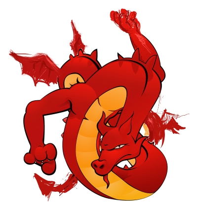
    attached is a design that I’m currently working on which will hopefully be used on our van. We’re welsh, so it’s a classic image (hopefully I’ve made it unique enough not to be clichรฉd). It was originally designed to be cut, but then I’m adding more gradients/details because it’s going to be printed.

    The left hand will eventually grab a dot from an "i" in my company’s name.

    few things I’m having trouble with though:

    a) the body twists rather awkwardly near the bottom right, I’m not sure how to correct it.

    b) I was originally going to place large spread wings on the dragon, however I may now choose little stubby ones instead, I’m not sure which is the one which most goes against tradition.

    c) some ambiguity with the source or light + shadows, but I should be able to sort this out.

    I don’t really want to make it look "boy-racery" as we rely more on large companies for our main supply of work, but we’re trying to be more personable.

    Any general opinions would be great, and before anyone asks, Yes it is going to have another hand, grabbing onto the first part of our name.


    Attachments:

    red dragon replied 19 years ago 8 Members · 11 Replies
  • 11 Replies
  • Robert Lambie

    Member
    May 2, 2005 at 9:49 pm

    i like it mate, just had a squint at it there but i think i see were your going… would be great once all complete printed and wraped!
    just watch not to let the dragon overpower all else as people will not think “signs!” once they see it…

  • Ramj

    Member
    May 2, 2005 at 9:51 pm

    IT’s only going to be a small image in proportion to the van, and the text will overlap it to a large degree but yeah, still going to have to do alot to stop it being … OTT

    Thanks for the fast response, I should have expected nothing less ๐Ÿ˜€

  • Marekdlux

    Member
    May 2, 2005 at 10:08 pm

    I think it looks awesome. Is that the left arm up in the top right corner? I couldn’t quite tell what was going on there.
    -Marek

  • Nicola McIntosh

    Member
    May 2, 2005 at 10:12 pm

    nice one ramj…great idea look forward to seeing the finished results!! ๐Ÿ˜›
    nice new piccie too!! ๐Ÿ˜‰

    Nik

  • Ramj

    Member
    May 2, 2005 at 10:13 pm

    yeah, the top right is the arm, and the body curves around up to the top-left… and then back around and will eventually meet up wiith the tail at the bottom.
    … I think

    I was lucky to get away with such a simple design, when it was first suggested that I make a dragon my boss wanted something like off an old heavy metal album cover, with flames, chains and scantily clad heroines, I quickly disuaded him.

  • Marekdlux

    Member
    May 2, 2005 at 10:19 pm

    I still love the classic Welsh dragon, but since I am over here in the states I don’t see it everyday like I am sure you do. It is cool to see a variation of it though. Definately keep us updated with its progress.
    -Marek

  • Ramj

    Member
    May 2, 2005 at 10:27 pm

    a quick ‘painter’ visualisation of what I want it to look like… it looks kinda unbalanced… ๐Ÿ˜•

    as for the ‘ seeing it everyday ‘ thing, it is kinda true, I love the welsh dragon, but it would be the same as placing the USA flag on everything, or the English St George’s cross or whatever it’s called.


    Attachments:

  • Iain Gordon

    Member
    May 2, 2005 at 10:42 pm

    I like the character, but for me it says serpent not dragon. Mabe it’s just my preconceptions of what a dragon looks like….

    Cant wait to see the finished product,

    Cheers
    Iain

  • Andrew Boyle

    Member
    May 2, 2005 at 10:57 pm

    Ramj

    I like the way the tail and wing are in silhouette now against the white

    it might look good if you can take the head to the left to work the same way and have it surrounded by white space…….

  • magpie

    Member
    May 3, 2005 at 6:15 am

    It’s looking great Ramj, only quibble is the placement of the wings, they should
    be up around the shoulder area.
    Hopefully Beej will see this and and offer some feedback.

    Keep up the good work, oh yeah you could do worse than to do a web search
    for images of a fantasy artist called Brom.

    Cheers, Peter

  • red dragon

    Member
    May 3, 2005 at 8:22 am

    Look closer at the Flag, it needs the tongue, and maybe an image of legs somewhere. At the moment it looks to oriental and not a representation of the true Ddraig.

Log in to reply.