Activity Feed › Forums › Sign Making Discussions › Graphic Design Help › can anyone suggest layouts for an ‘a’ board?
-
can anyone suggest layouts for an ‘a’ board?
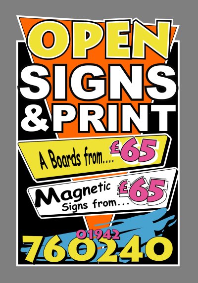
Posted by Bill Dewison on February 25, 2004 at 9:15 pmNow that my window splash is complete on the shop, I thought I’d turn my attention to an eye-catching A board. Hopefully I’ve learnt a little from the transformation from my original window splash ideas to the one Terry designed.
The board idea I have posted below would be made from 10-18mm foam board, cut to the outside of the white outline. The oblongy-shape panels at the bottom are removable, so I can advertise different offers on different days and everything else is just cut vinyl, welded shapes mainly to cut down on vinyl (I’ve used nearly £100 worth this last week alone). I’ve considered that the weight of this may be a problem ie too light, so I’ve factored to weld foam board to the base, making it a rigid structure, then whizz one of the weights from my multigym (around 10lbs) onto the base board. I have about 120lbs on the gym, so I can increase it to whatever is necessary to keep it in place (and stop the council nicking it 😉 )
So, good board – bad board? Any suggestions, advice or critiques welcome as always and very much appreciated 😀
Cheers, Dewi
Attachments:
 Lorraine Buchan replied 20 years, 2 months ago 13 Members · 23 Replies
 -
23 Replies
-

Hi Dewi…..
Well my friend you are NEVER boring and obviously never bored.
I like it….looks kinda Las Vegas-like.
The only problem I have is with the copy in the panels about the A-Boards & Mags. A wee bit distortion-happy….and I dunno pounds from pizza, but here an A-Board is worth more than a set of magnetics.
I charge $120 for an A-Board & $79.95 for (2) 1’x2′ magnetic signs. Maybe up the price of the A-Board just so it does not seem redundant.
Just my two cents. I am always hollered at on another site for being too cheap. As for the construction of the board, I haven’t a clue! haha
Love- JILL 😉 -

Looks really eye catching Dewi, I would agree with Jill though – £65 for an a-board sounds a little too cheap to me (you gotta get your £100 of vinyl paid for remember 😉 ) You can get away with advertising magnetics cheaper than this too – cos you can always say thats for a pair of 2’x1′ signs of whatever size you can afford to do at the cost you choose.
On the design itself I think it looks possibly a little too crowded, maybe lose the blue splash behind the phone no. and just shrink the content a little ?? Just my opinion and I’m no design wiz !
Also not sure what you mean about welding the board to a base ? but it sounds like it my cause prolems to me – why not either make the whole board from wood (foam this thick is pretty costlyto get a whole sheet of) and then screw some support legs to stop it blowing away. Or get on of those metal frames that were mentioned by somebody (sorry can’t remember who it was) recently for exactly this purpose.
Just sounds a little like it might not look an ideal advert for your a-boards if you have your own weighed down with dumbells 😀Like the idea of changable offers area on the sign – but why not just do these using a removable vinyl area instead of going to the trouble of cutting & mounting separate slats ?
just some thoughts anyway…..
Nigel
-

😆 I should’ve explained those prices, sorry. I just whizzed them in, not giving much thought. Thats not what I’ll be charging 😀 I tend to do that alot when I’m putting stuff together, but the price info is much appreciated all the same 😀
Sounds like its a positive A board though. Las Vegas-style 😎 I like that! Manufacture wise I already have the metal A boards, its just I want the shaped top and I’m too lazy to cut wood 😉 Some good ideas there Nigel, the only one I don’t understand is the removable vinyl?? Valid point over it not being a good advert with the whole weights thing, I hadn’t looked at it from that point of view. The way I was going to attach the slats was to use raised locators and take some time getting each slat identical. I can have about 8 or 9 of them, and interchange them by simply popping them on and off. Just a thought and for the amount in materials, it’ll only really cost me time. I have so much to advertise at the front, but again, I don’t want it too fussy. I still have the telephone number to add to the shop front when Cable finally install me a line (I have a reserved number, but if I put it on the front and ppl ring it, bad impression to get a dead tone 😕 )
I agree with you both on the design elements you’ve mentioned. My only excuse for the distortion happy stuff is the speed at which I threw that in 😉 I quite like the little blue splashy thing though Nigel 😕 But I see what you’re saying. I don’t want it to be overly fussy, just bright and bold, just like Jill 😉
Cheers, Dewi
-

Your designs are certainly very eye catching and bold. I predict a very bright and successfull future ahead as a signmaker 😀
-

Thank goodness there not the real prices!!!
Hate to see you shut shop next month!!! 😆 😆Agree with a couple of points already made by Nigel and Jill
The design is striking to the eye of the general public
Enough for the joe bloggs to say ‘I want a striking sign like that outside my premises’In your case Dewi because you can design, why don’t you sell that?
I wouldn’t even mention any prices, your sign is enough for the discerning customer to want to do business with you
John
-

Nice job Dewi,
i agree with John though, i’d leave off the prices as there are so many different A boards out there, customers sometimes price match against completely different boards.
Get them in the shop, then sell them your design expertise!
you’ll win every time.johnny S 🙂
-
Dewi, just to fill you in on the removable vinyl – you can get films which are short term life but have an adhesive which is a bit like the kind on post-it notes but stronger. It allows your graphics to be cleanly removed leaving little or no residue even after several months.
So just thought this might be a possible way for you to do your panels on the board – you might even get away with re-using them a few times if you stick them back on some silicon paper for storage.
Your blue splash looks fine to me, it was just I was trying to think of de cluttering the design a little to make it less crowded 😉Nigel
-
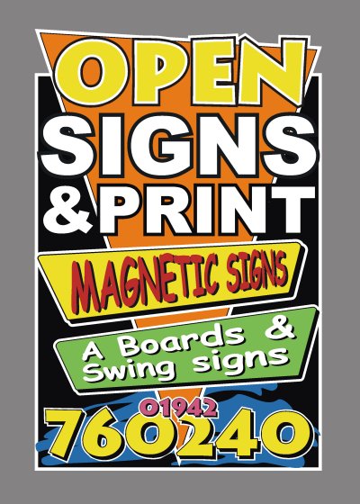
I’ve rejigged this a little at the shop today but then went and forgot the file when I came home. D’oh! 😳 Anyway, I’ve tried to do everything I did at the shop. This good for go then? 😀
Cheers, Dewi
Attachments:
-
tsk tsk tsk
If I was a nun I’d smack your fingers with a ruler
for using that casual font on the mags & swings bit.
hahaha
love…JILL
(I like the 1st one!)
But I do like the idea of not bothering with prices!
Always remember the K.I.S.S. Principle. -

I’m going to be real picky….the perspective on the A boards section is correct. However, on the magnetic section it looks wrong. The drop shadows for both the yellow panel and the text don’t look right. Should they be on the other end, as it were? Also the black shadow on the red text is a bit fuggy (Real word, probably), that is to say, it lessens legibility somewhat. How about a deep yellow shadow?
I said I was being picky……Other than that it’s top banana.
-

Hi Dewi, if you went with Mr. Bulls excellent window splash idea I’d be wary of straying
to far off that theme. Personally I’d try to make sure that the two work together through
either a shared colour scheme or graphic style. I’m not talking about slavish adherence
to the splash, but I’d worry about the A board conflicting rather than complementing.
I’m sure we’ve all driven past ‘multi coloured yawn’ (spew) sign shop fronts that are just an
eyesore and illustrate that the bod inside knows nowt about presentation.As others have said, you have design skills and awarness and this is your USP/added value
and should be as much your business as rolls of vinyl.Hope this comes across as I intend, but I’m rushing a tad before starting work.
Catch you later.
-
Thanks John 😀
Big G, not being picky, thats a really good point. The drop shadow does look better on the the other side. Only one problem 🙁 I cut all this today, and not having net access at the shop, this is the first I’ve seen of it! 🙁 Ahh well, its only vinyl, I’ll cut some more in the morning. Humble opinion, but the dark yellow I’d still keep in black, it’ll be seen better froma distance I think, but I’m making them interchangable anyway, so I’ll make-up both and post you some piccies.. its a good excerise for future referencing at the very least.
Pete, I know we’ve discussed this on the phone, but I hadn’t read this thread at that point 🙂 I know what you’re saying, but I’m not going for the whole corporate image thing, I want to attract attention (hence the bright blue shop front 😉 ) The more ppl that look at my shop, even if they hurl at the sight of it, the better. I know it’s crazy, I just think that even negative attention can be turned to positive with a little thought. Once they get inside my shop I’d hope they’d see the variety of work I can produce and order something. After saying that, even without the A board I’m snowed under with work! 😮
I tend to disagree that I’ve strayed from the elements in Terry’s design though. The triangle is still present, which is a large section of the window splash, and the backsplash is influenced by Terry again. Jillbeans influenced me with the cross-banners and the outlines are just there to force the whole text and shapes forward, increase the impact.
Remember though Pete, this is being made out of foam board. Its essentially a temporary sign to test the market, and obviously if it was successful I’d keep it, but if not, strip off or get a new chuck of PVC 😉 I just hope the locals like it as it’ll be on the pavement tomorrow 😮
Cheers, Dewi
-
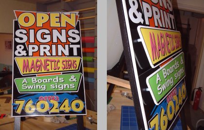
I’ve been cutting and applying this inbetween jobs so its taken me a couple of days to get it finished. I still have to paint the support strut and make some more mini-banners with stuff other than A Boards and Magnetic Signs, but at least I can plonk it on the pavement and let ppl know I’m open 😀
The frame is made out of 2″ x 1″ planed, undercoated then painted black. The board is 5mm foam board, attached to the frame using small locators, then the banners are attached via locators with 1 1/2″ screws going through the signboard and into the frame. Took a while to line everything up, but its reasonable now I think.
Anyway, just thought I’d show you the finished product 🙂
Cheers, Dewi
Attachments:
-

Nice one Dewi, that should get their attention.
You have done a grand job, it looks great.
Dave
-
As usual another one that looks better in real life than the original drawing. Brillo mate. I like the stand off sections, they make it a lot more interesting and unusual. You learn fast boy….too fast.
-
Thanks Dave 😀
Thanks Big G 😀 Only learning as quickly as I’m taught though, I spend half my life reading the demos, posts and looking at how things are designed for signage. 😉 My next learning curve comes tomorrow as I attempt to paint my first sign (its going to be a sample for the shop :D). If it turn out good, I’ll post it, if it turns out bad, I’m burning it! 😉
Cheers, Dewi
-
Yup! Jobs done it’s a good yin. Well done Mr Dewi – You’re a real professional 😀 😀
-

looks great mate.. i think your learning damn fast dewi.. thinking outside the box at every turn. like the others have said the raised bits make the sign that bit more interesting. thanks for sharing mate… 😉
-
Good luck on the painting, Dewi.
You know, one of the sure signs
of being a good sign painter is saying
“I MEANT TO DO THAT”
and starting a trend.
If you get a drip…turn it into a star!
(that’s what I do)
The board is anything but boring.
Love…JILL 😉 -
Yes great a board Dewi, with the painting too, irrelivant stars are never irrelivant nore are splodges, blobs or spraying 🙂
-

well done i like your style starting to teach an old dog new tricks love it
-

Fantastic work Dewi, I’m loving being able to watch all this unfold it’s fantastic!
Log in to reply.
