Activity Feed › Forums › Sign Making Discussions › Graphic Design Help › can anyone suggest a different layout for florist signage?
-
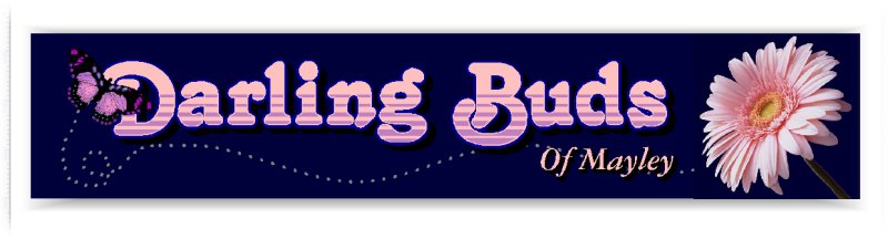
can anyone suggest a different layout for florist signage?
Posted by Neil Kelly on June 5, 2003 at 8:25 pmthis is a layout im working on for a local florist
any feed back would be appreciatedNeil………
ps there surname is Mayley
Attachments:
 Neil Kelly replied 20 years, 10 months ago 9 Members · 14 Replies
 -
14 Replies
-

I really like the way that this has been done – it is an eyecatching design. Are the flower and butterfly images going to be printed digitally?
-

Nice layout. Are the butterfly and backround a very dark colour as they blend in together a bit so the butterfly outline isn’t so visible?…..
Timmy…
-

great design neil..
how are you planning on making it?
is it all digi print or persex fascia with raised butterfly etc?just being nosey 😉
-

Not shure how im going to make it yet I like your idea of a raised butterfly Robert I might digi print the flower or try and do a Mike on it and recreate it it vinyl, the client has asked for it to be illuminated but hasnt specified front or back any more ideas would be appreciated.
do you think the fonts work its my first attempt at a custom text infill.Thanks Neil……..
-
Nice design Neil, the only things I would change are as Tim says maybe a different colour out line on the butterfly and maybe a thicker glow line around the text, also I never like to see the word “of” with a capital O it gives the word too much prominence when its not important, I would change it to lowercase, nice flower pic where is it from, is it a digi photo of a flower from the shop ?
-
quote Neil:Not shure how im going to make it yet I like your idea of a raised butterfly Robert I might digi print the flower or try and do a Mike on it and recreate it it vinyl, the client has asked for it to be illuminated but hasnt specified front or back any more ideas would be appreciated.
do you think the fonts work its my first attempt at a custom text infill.Thanks Neil……..
you mastered corel then neil nice work i agree the ‘o’ should be L/C though
Dave (hot) -
Neil I would do external illumination, not a lover of lightboxes, makes everything look like a kebab shop 😆
-
The L/C O does look better thanks for that Steve
quote :you mastered corel thenthis is created in 100% Signlab mate
Neil……….
-

like it
would make a very nice digi print on back lit material (like the menu boxes in burger chains) -
Thanks Gray & Bob, I was thinking of a print on to flexi but I liked Robs idea of a cut out Butterfly hovering just off the face. has anyone got any ideas on how you could fix that to a flex face sign. also can anyone help with a good place to locate some high res artwork for butterflies.
Steve I agree that a front lit sign would add to the character of this piece but before I created the design id shown them a back lit digi print job and they have come back and asked for it in that style.
Neil….
-
-
Neil…Have you done this Job yet…I would like to the finished product…to see if you changed/developed anything from your original..how did you finally make it & what sort of size is it..because if this is a shop front the flower will look amazing… and would like to see how you progressed the butterfly..
-

i’m with Mark on this one, would be good to see the finished article.
Cheers
Danny 😛 -
Thanks for the interest, its in progress I wil post some pictures when i get it finished
Neil………..
Log in to reply.
