Activity Feed › Forums › Sign Making Discussions › Graphic Design Help › can anyone suggest a design for my business card please?
-
can anyone suggest a design for my business card please?
Posted by Marekdlux on March 12, 2005 at 6:40 pmHi everyone,
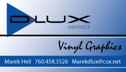
Any suggestions/comments on my business card?
Since the 9th grade my email has always been Marekdlux, so I figured to use the D-lux as part of my name. What do you think? What do you think of the design? I styled it after Leighs’ design on Iains’ business card.
https://www.uksignboards.com/viewtopic.php?p=72422&highlight=business+card#72422
Thanks in advance.
-MarekMarekdlux replied 19 years, 1 month ago 9 Members · 14 Replies -
14 Replies
-
Generally I like it Marek :lol1: I personally would change the “vinyl graphics” wording to something else because it reads a little odd the have two words the same “graphics” 😕 Maybe the “D” over the blue might benefit from a thin white outline ??
But on the whole it looks nice 😎Nigel
-
Hi Marek,
agree with Nigel, the “D” needs a thin white outline to stop it merging with the black background.
don’t agree with using the word graphics twice either, but cannot think of an alternative.
This card would look good on a 400 gsm silk card.
L J -
Marek
I like it ,my only comment would be to change font in ‘graphics’ to the same as you have used in your name ,though still keeping it smallthat word currently doesnt tie in with anything
Terry
-
yes i think what Terry has just suggested should finish it off nicely.
L J -
-
Marek, generally I like the card, but I’d change the vinyl graphics to vinyl designs. That way it removes the second graphic word, but does not change what you do…. does that make sense?
I’d also have the line go under the triangle not over it
cheers
Shane -
Good ideas Shane. thanks! I went to my local print place and they don’t have Illustrator CS and of course that is how I saved it so I’ll have to go back down with a new version. I’ll sleep on this design for a couple of days. Any more suggestions are welcome.
-Marek -
Looks good !
My opinion: keep the first triangles, they’re simple but much more efective, but keep the white outline.
Change the vinyl graphics to Vinyl design like Shane said, and try to find a font that can be read easily.
I would try to add a bit more red not sure if in 1st graphics or in one of the underlines.
I hope this makes sense to you.Always good with this kind of stuff to add an AI or CDR file, soo people can try themselves before spiting in the air.:wink:
Cheers
Britchenko -
Hi, all fine apart from the triangle protruding beyond the midline, make this smaller and central to the midline and top, bring the red point to the the edge of your triangle, align Marek with the triangle, align ‘graphics’ to the width of the ‘X’ , reverse the white fades on the horizontal white lines to give them some meaning and lose that script font completely to a arial narrow or something as it looks unprofessional 😉
Arial narrow is the new god! -
I am definately going to change it from “Vinyl Graphics” to “Vinyl Designs”. (Thanks dsi 😀 )I’m not sure which triangles I like better. Sorry I didn’t include the .ai file. I was having a hard time saving it in a size small enough to upload. I will post the .ai file when I return to work on Tuesday. I don’t know about changing the script font. Don’t you think it breaks-up the corporate look of the card? I’m not sure what you mean by reversing the white fade on the horizontal lines Outline. They are just a plain white line, should I do the blue to white fade on them from the opposite direction? Definately happy to get everyones opinion. Thanks everyone. I’ll post the new changes when I do them.
-Marek -
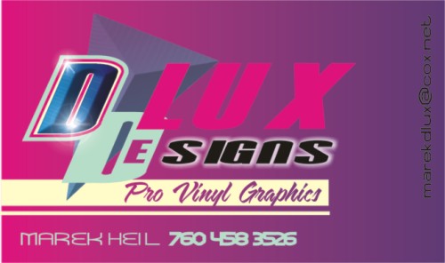
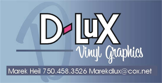
Hi Marek, Hows this then, what I’ve done here is kept your basics of design, its good to soften things up a little with some script, but you better off using more of a free style script as I’ve done in your 2nd copy, i think it takes the sharpness off sharp letter styles, I’ve added the double “d” as it compliments the word signs as appose to repeating graphics & ties “dlux” together, i’ve rotated & beveled the triangle panel a few outlines, plenty of negative space to breath & a complementary color to the blue.. you probably hate magenta-purple blend, but this could be changed to Grey black 3 fonts have been used with a few contours here & their. hope you like. could be easily reproduced in vinyl with some simple airbrush blends or digitally output. cheers. flyingsplash (:)
-
-
Wow! Those are both awesome. Thanks for all the input. Off snowboarding tomorrow, but I will get back on the design computer on Tuesday and let you know how it is coming along.
-Marek
Log in to reply.


