Activity Feed › Forums › Sign Making Discussions › Graphic Design Help › can anyone help with van layout please?
-
can anyone help with van layout please?
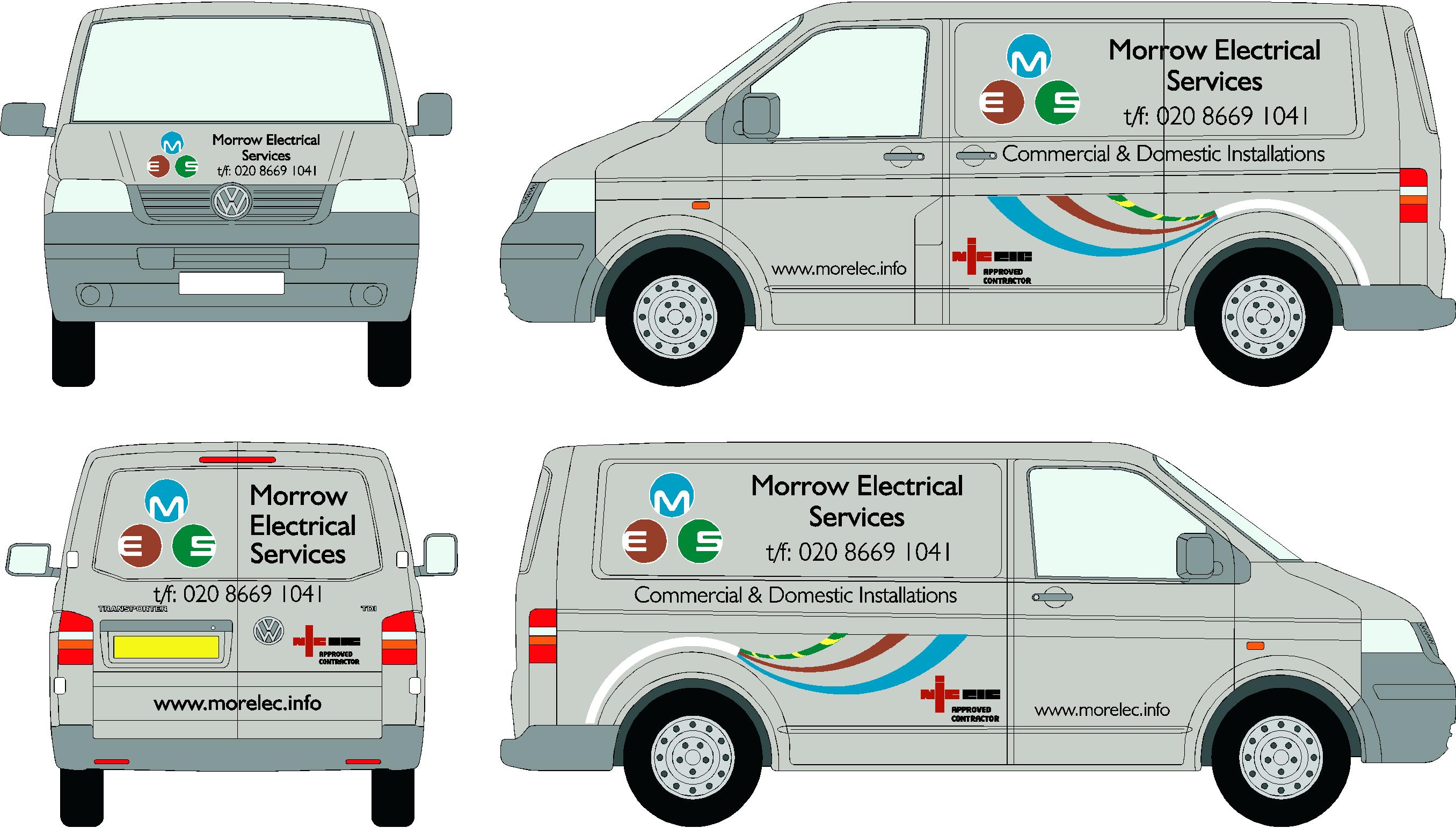
Posted by Richard Urquhart on April 18, 2007 at 6:42 pmHi all whats your thoughts on this this is the first design I,m sending to my customer i have done some work for him on his last vehicles but he wanted a little more
what do you think
richJohn Thomas replied 17 years, 1 month ago 6 Members · 14 Replies -
14 Replies
-
I think it’s OK but really don’t like the t/f before the number IMHO
otherwise good. 🙂
-
it all needs tightened up…and more emphesis on the company name, its too drawn in with the large telephone number 😀
nik
-
just OK !
yes i think i will change the t/f thing they have used it for a while now !
thanks mate
rich -
Rich
too much going on with the cable & the circle logo (plug pins) colors are also not in correct order should be GR top, BL left & BR right. Maybe place phone number on the door & increase company name etc. Obviously if the circles aren’t plug pins just ignore this post 😕Kev
-
Kev you know what mate i have been doing this company for may be 2 -3 years and i have always thought about the pins and colours
green- earth should be up the top
let hope he wires things up correctly !!!!!
this wont look good pulling up outside the job will it
thanks mate will see if he changes -
rich
now i am no sparky but are the colours for plug the right way round long time since i wired a plug up red- brown and blue btm green top.or have i just blown my self up or is it supposed to be like that.
any way some thing needs to be bolder in the design and where is your mars bar for measuring with gone.chris
-
The mars bar melted and is only half the size it used to be, oh yes if any one gives me a mars bar @ sign UK their going to get it !!!!
i think the colours have nothing to do with what were all thinking what a crap idea !! -
reminds me of the person who got the sack from the M & M factory.
they were throwing out all the W s.
let me see hat coat keys bye
-
It looks much better without the t/f
not that I think I could do much better but still OK for me 🙂
Warren
Log in to reply.


