Activity Feed › Forums › Sign Making Discussions › Graphic Design Help › can anyone help with van layout please?
-
can anyone help with van layout please?
Posted by Richard Urquhart on April 23, 2007 at 8:29 pmhi all
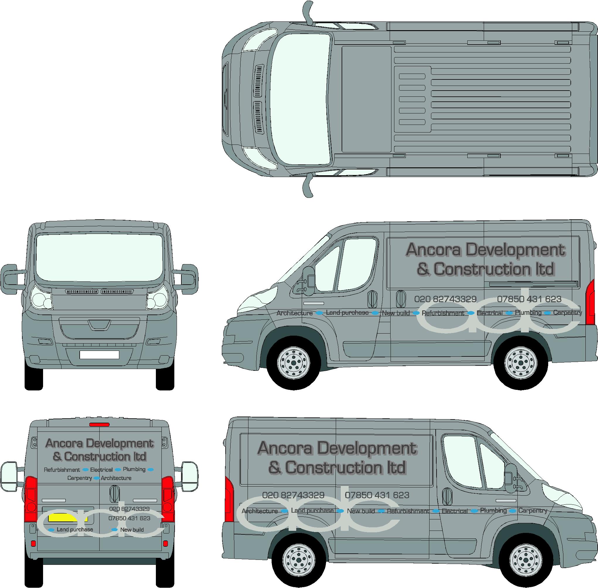
another tricky one, well it is for me. I have had a play about with this as you can see the vehicle is metallic silver. I have used their logo and it will be cut with parts missing as shown ??
the rest is an idea. I would like some ideas please guys
thanks richLeeMorris replied 16 years, 11 months ago 9 Members · 16 Replies -
16 Replies
-

I have used the adc logo as its on their business cards , this will be very close to the van colour !
??????????????????????????
Attachments:

-

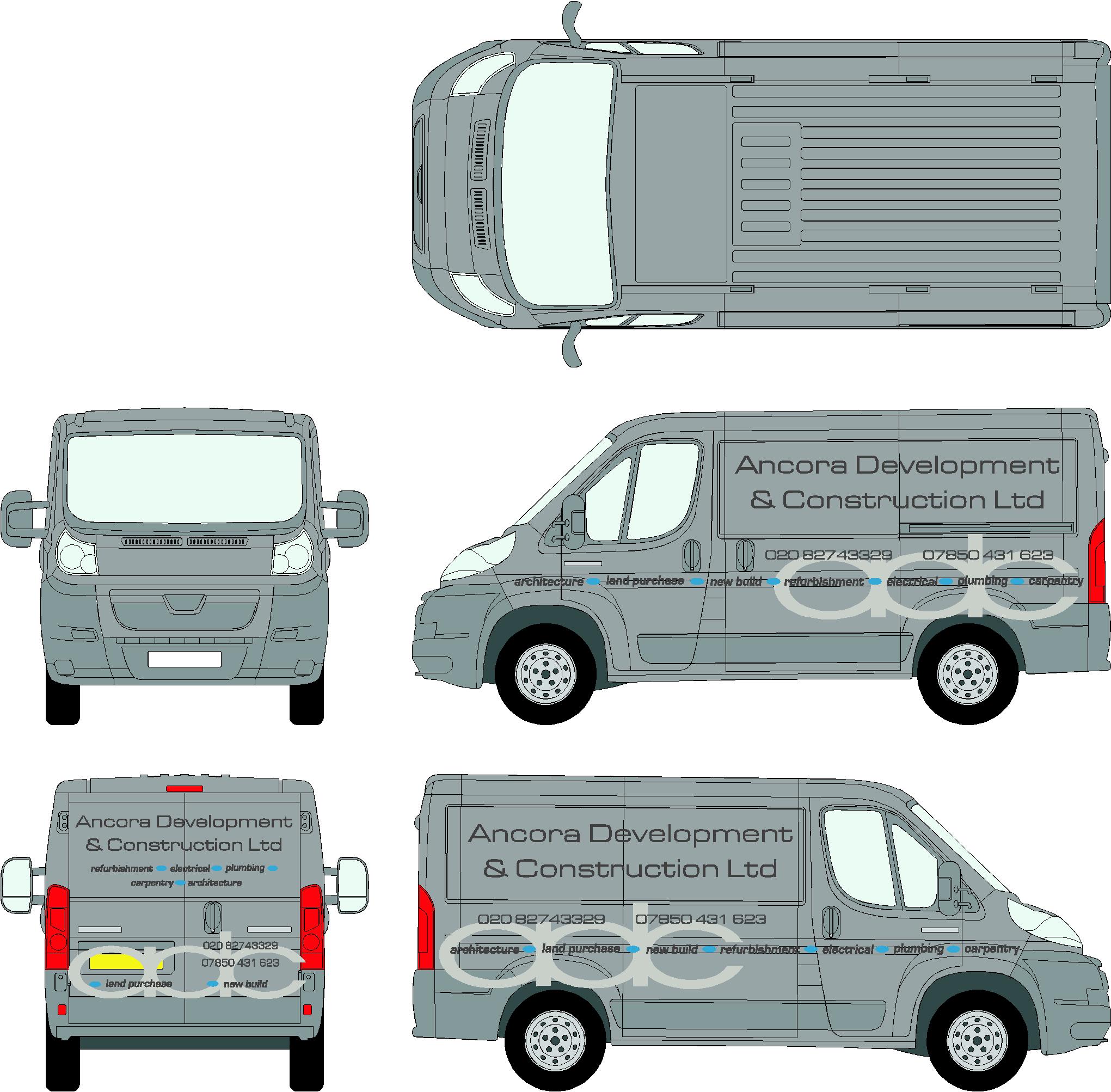
Rich I think both those layouts are not bad. If the ADC is closer to the colour of the van than it appears here, then I think that would look a wee bit better. I also prefer the secondary text in the bolder italic font 😀
I’d just reduce the telephone numbers a wee bit. -

had a quick mess around with this one… just an option for you…
[c]
 [/c]
[/c].
-

I definitely think Rob is on the right track. Make the logo the main feature rather than the name in text.
-
I work out of photoshop for just about every thing…But recently I had to use illustrator for the vehicle outlines to create a wrap …My question is is there a way to apply an image to an area that has been selected….so that it only shows in that area with the cuts applied and not overlap for example the wheels or any areas outside that selection…..Would be a great help…..I usually use 3d max to render 3d wraps for presentation images….
Thanks
MediaKliQ
-

Can we see the card? If continuity is important.
I prefer design2. In the smaller van it doesnt look so good having the logo so central on the side panel though for me
-
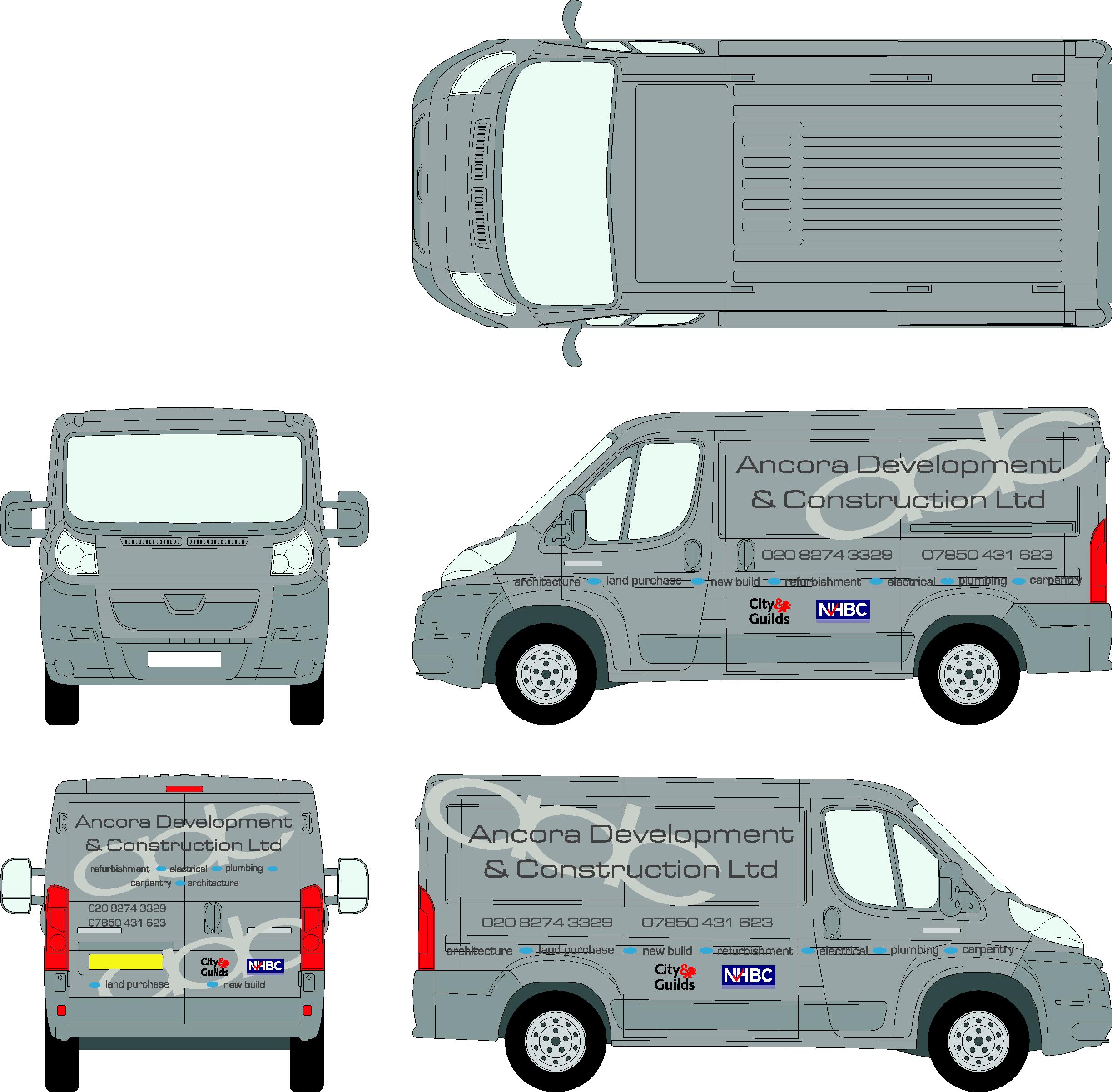
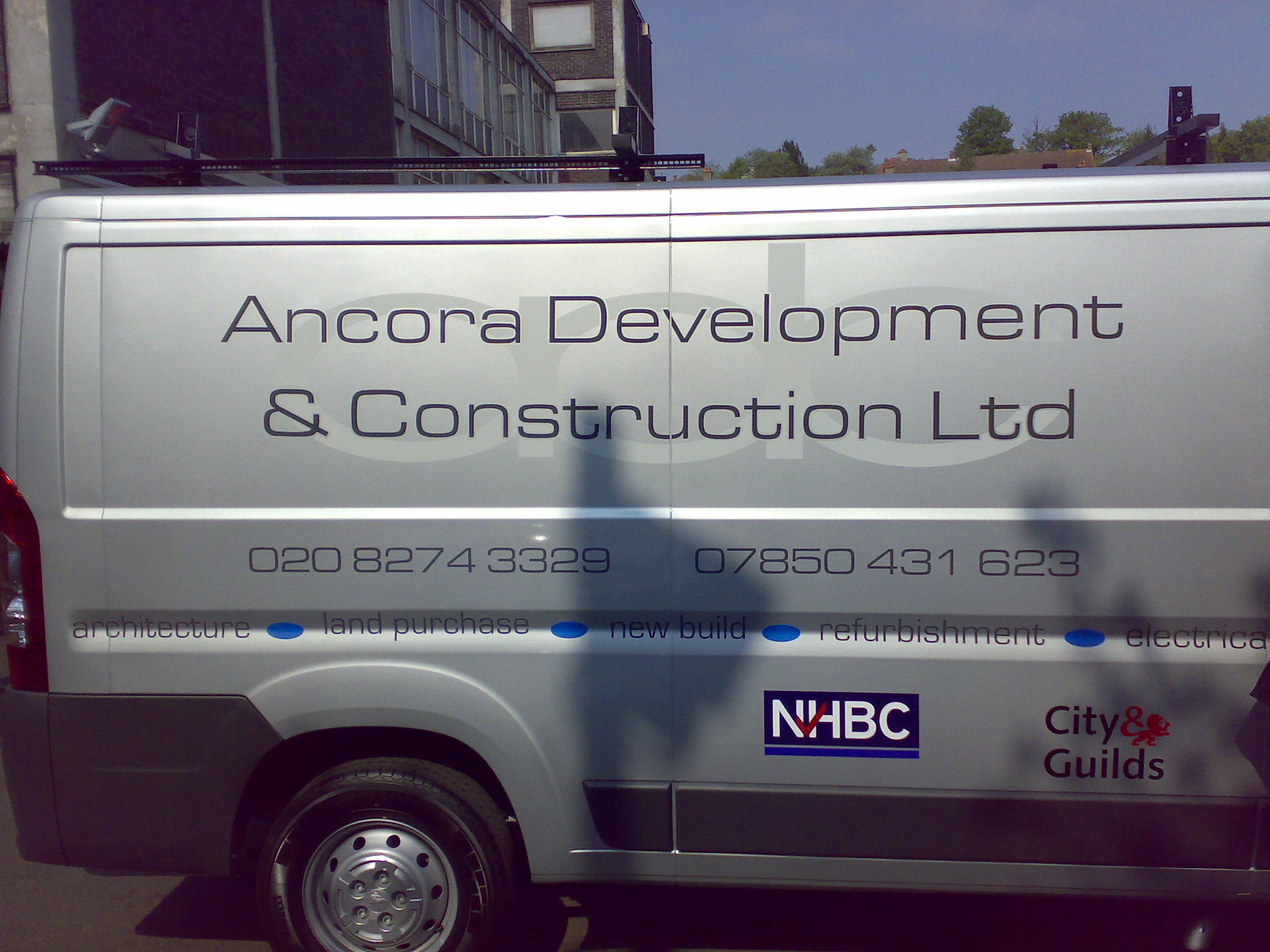
Thanks all on this one customer wanted this one in the end
rich
spot the mistake game for saturday night
rich
Attachments:

-
………. well I’ve not spotted it Rich …….. maybe the 4 v&t’s have something to do with that though! 😳 😀
-

back door two at the very bottom not aligned central to each other 🙄
also the trade logos city & guilds first on the back second on the side 🙄
meant to say Rich nice job.Lynn ?
-

the row of text in the side crease ops.
c
personally i dont go behind the ladder.
nice anyway
-

Land Purchase on side looks higher than other text, Thats my guess
Nice job anyway Rich
Lee
-
Lee you win when in flexi sign i aligned centre of text doh !!!
customer had never noticed -
quote :the row of text in the side crease ops.
rich i was first :nag2: 😕 😉
-
Chris sorry YOU are the winner
The winner is Chris 😳 😳
-
thank you
i would like to thank my mom dad sister and all that helped me to aspire to these dizzy heights.
i would like to dedicate this win to lee who fought so hard, congratulations lee.
c 😀
-
I don’t mind second price what ever that is
Well done Chris!Lee
Log in to reply.
