Activity Feed › Forums › Sign Making Discussions › Graphic Design Help › can anyone help with this vehicle design please?
-
can anyone help with this vehicle design please?
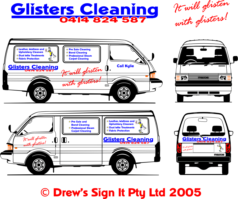
Posted by Shane Drew on February 19, 2005 at 12:23 pmI am stumped on this one.
I have talked the woman out of goudy with a shadow, but am not sure if I like this design either. 😥 I mean, I like it, but not sure if it fits the brief
The brief is that she wants to stand out in a crowd, but not look overdone and ugly.
Overdone may be a bit hard because she insists on covering all her services. This is what I have come up with so far.
The slogan is mine because she has nothing yet. Sounds a bit cheesy but it seems to fit. What do you people think? I have included two designs here.
Attachments:
 Carrie Brown replied 19 years, 1 month ago 14 Members · 26 Replies
 -
26 Replies
-

add a few of Stevos sparklies to the logo lettering and a bevel giving it
a bit of a lift may do the trick -
 quote :Overdone may be a bit hard because she insists on covering all her services
YEP THAT IS THE PROBLEM
glisons cleaning across door and rr panel to ballance up with all the oifferings it will glison on the ft doors as before a bit of stevo on the main name and the dots of the i s is crying out for attention – mt cents worth
chris
-

Hiya
In terms of the design , perhaps some spakling charcoal black with lettering in matt silver/gold with some mirror silver/gold accents would convey the sparkling shiny cleanliness.
I find the slogan a tounge twister.
Something like Glister’s Cleaning – Putting the sparkle back… might fit in well with the aformentioned colour scheme and is pretty simple and self explantory. I would also rather use digital images for the services than simple lettering as folk can absorb the pics in an instant when on the move and wont read a whole love story. It will also fit into the stand out brief and be an easier application.
I really think love stories and a zillion services on a vehicle is a waste and is counterproductive as vehicle livery like that doesnt really inspire confidence , it never works as the customer expects it to – but often they feel that got to wring the max value for money and cover all the space they got , sometimes simple is most effective… but try convincing them of that. -

Hiya. Anychance of an AI. file of the vehicle and the design so I could have a play?
-

DSi,
I prefer the bottom one, I think you need to change the colour of the bullet points and her apron to red also the shape to round, that will tie the colours in more and enlarge up the logo/ phone number to cover the empty space to the leftSimon
-

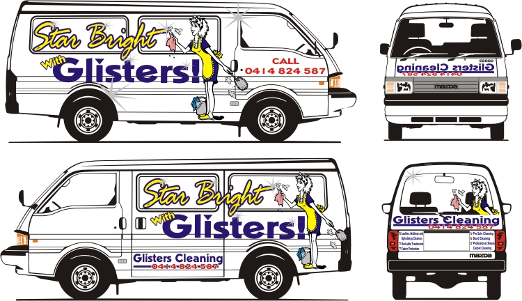
Shane….I have a client like this as well, everything but the kitchen sink on his stuff.
Panelization could break up some of the business.
Here is my slogan suggestion:STAR-BRIGHT WITH GLISTERS
Then you could add some celestial things like stars with smiley faces?
Nice new pic BTW.
Love…..Jill -

eeek i seem to have missed this one mate.. have you got a cut file for this one?
if you have, would it be possible to click edit on your initial post and upload the cut file too?
this way it helps just just tweak it here and there and reload.if you dont have now.. its fine. just thought ide say 😉
-

Thanks for all the comments here. I forgot to mention that she does not want digital printing and her corporate colour is blue. I’ve tried to convince her to go with a second colour, but decided to push the envelope with red and yellow.
Thanks again.
Cheers
-

I liked Jill’s idea!
This ismy own with Jill slogan.
About covering all services, hmmm! Cheat! And tell her that they would do much more of there job if she put’s it in the back where people in cars following have much more time for reading than those staying on the sidewalk, well maybe you don’t need to cheat it’s true!!And those small grey stars made in chrome would look …outstanding!
Hope this helps one way or the other!
Cya
Britchenko
Attachments:
-
Thanks Britchenko
I did a design that went much like this, but the window blanks have black rubber inserts, and she does not want anything to go over them 😥
Thus why I have a problem with the design.
Thanks for the effort and time tho mate
-
Heres My attempt, got vector if needed
Simon
Attachments:
-
Thanks Chris and Simon,
I wouldn’t mind the vector of yours simon if you don’t mind. I’ll give here the option at least. I do like the polished look on the lettering too
Cheers, and thanks again for both of you for the help.
Shane
-

Hi –
I saw this post and wanted to play too 😛
although I see I did something very similar to anothers.hmmm hope this works, I don’t think I’ve ever even posted yet alone uploaded something.
oh and “HELLO” :wave:
off to introduce myself now
Attachments:

-
quote Ovrcafnatd:Hi –
I saw this post and wanted to play too 😛
although I see I did something very similar to anothers.hmmm hope this works, I don’t think I’ve ever even posted yet alone uploaded something.
oh and “HELLO” :wave:
off to introduce myself nowHey, Hi, and welcome to the boards.
Thanks for the suggestion. It is really spooky cause I submitted a design almaost exactly like this one.
I have submitted a few, and now all I need is for her to give me some feedback.
Welcome again, and thanks again for your time in doing this design :welcome: .
Shane
-
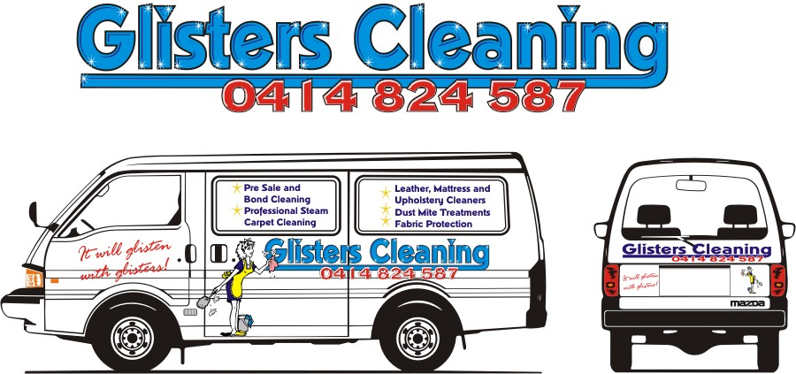
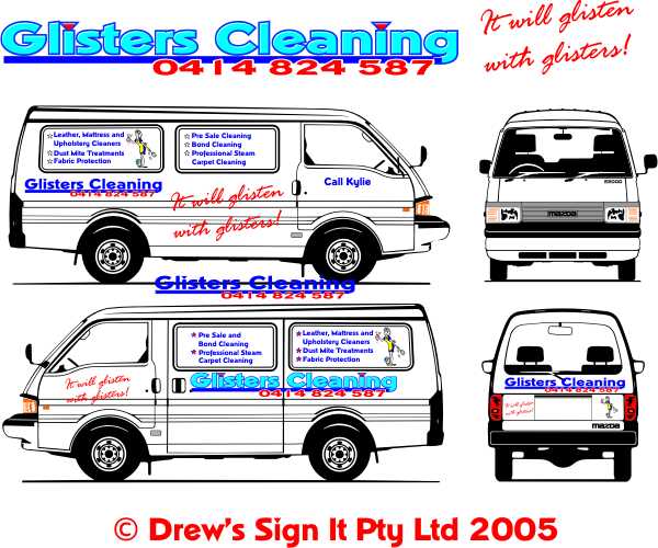
Just thought I’d post the finished design.
She didn’t like the graphic at all, and liked the concept of Simon C’s stars although she thought it was a bit too much.
Reduced the amount of stars, dropped the graphic, and tweaked the sizes, and she was over the moon.
Gave me the job to design her business cards, yellow pages and local paper advertising too.
She went ape over the ‘it will glisten with glisters!’ but I changed the font to brush script because the rage font was a little jaggered.
Thanks for everyones help here. I appreciate all the input.
Attachments:

-

Shane did you copy write the jingle? (only kidding) nice work :lol1:
Lynn
-
Great Job!
:appl:It’s always good to play a bit with something and then see the final job.
Cheers
Britchenko -
Nice work mate, I find that the design on screen and on paper never does the finshed job justice.
Always nice to see a good end result on something that seems to be a problem.
p.s a local signwriter has stickered his van and I was sure I had seen his designs before.
On one rear window he had SIGN IT written in very much the same style as you had in a post a while ago.
His slogan was…wait for it……DESIGNS BY MOUSE NOT BY BRUSH coupled with a small mouse like character….the same as yours come to think of it!!
It’s a poor do working in a design industry with no imagination..never mind.
Nice work anyway, keep it up!!
Aaron.
-
quote arch-digital:p.s a local signwriter has stickered his van and I was sure I had seen his designs before.
On one rear window he had SIGN IT written in very much the same style as you had in a post a while ago.
His slogan was…wait for it……DESIGNS BY MOUSE NOT BY BRUSH coupled with a small mouse like character….the same as yours come to think of it!!
It’s a poor do working in a design industry with no imagination..never mind.
Aaron.
Thank Aaron. Disappointing that someone has copied my idea, but imitation they say is the greatest form of flattery 😥 . I had a similar thing with my last company. We called ourselves ‘Signs that Stick’. In an age when vinyl was not as popular as paint. Got the message across rather well. Someone else tho thought the name was so good, they actually registered it as a trade mark. Then they would not let me use it. Finally won that one when I proved I had the name 1st, and that they were not using it since they registered it.
Cheers, and thanks again for your comments
-
That came out really very nice Shane….and it didn’t even need the cartoony woman graphic.
Nice jobLeigh
-

Nice job Shane 😀
Sounds a bit cheeky if someone has possibly copied your company slogan/design from here ….. its one thing people getting design ideas from peeps who post work etc on here …. but another to copy it almost exactly ….. but then again obviously goes to show you must have done a great job for someone else to want it aswell 😉
😀
Log in to reply.
