Activity Feed › Forums › Sign Making Discussions › Graphic Design Help › can anyone help with this logo please?
-
can anyone help with this logo please?
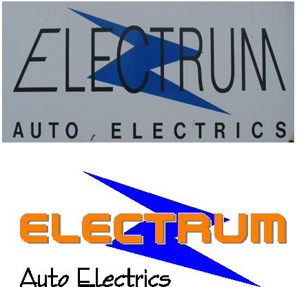
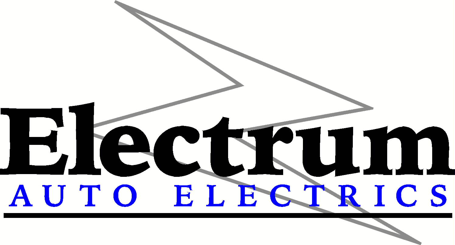
Posted by John Harding on September 27, 2007 at 6:01 pmA pal of mine wants to update his logo without totally reinventing it
Here’s a pic of the existing one and my attempt to make it 21st century, but I’m hoping someone else has a better take on it.Thanks in advance for looking 😀
Want to keep it vector based to avoid print work
John
Attachments:
 Simon Strom replied 16 years, 7 months ago 9 Members · 16 Replies
 -
16 Replies
-

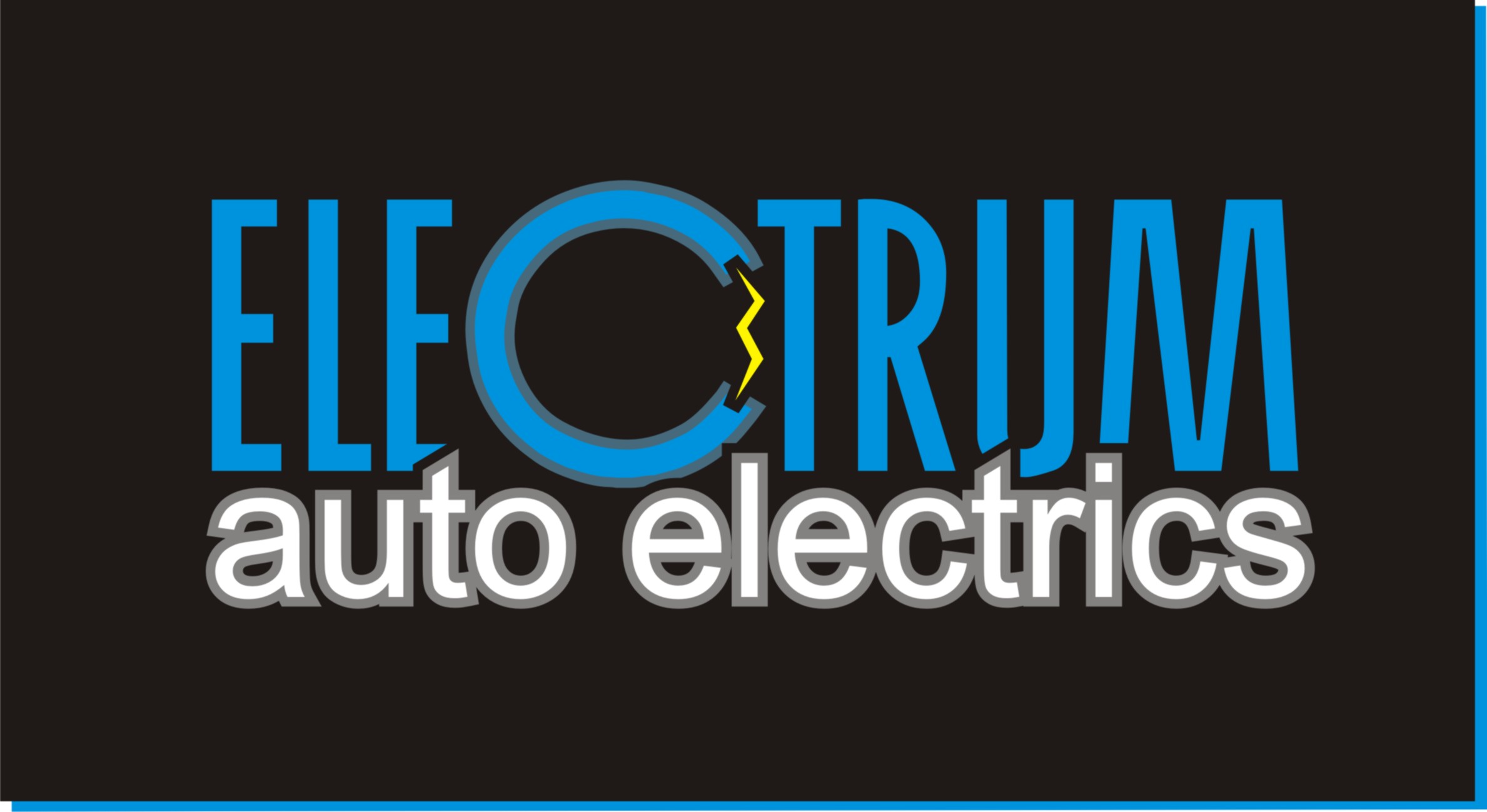
Possibly too many changes but thought I’d give it a go anyway :lol1:
Attachments:
-

Thanks guys – kenny I suspect your right probably loosing too much of the original theme – good though
anyone else?
John
-

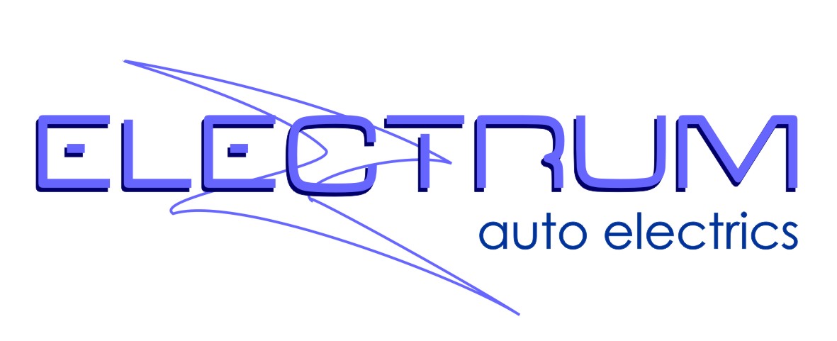
i think glenns is a good example of reinventing the logo from the first picture mate. not sure on the font for the name though… but still a massive improvement.
personally, i think he needs to loose the zorro flash… its very dated looking… maybe starting a fresh isnt a bad idea. i sometimes give customers a half baked redraw of what they want, then give them what i "think" they need and 9/10 times they see the light. if they are thinking they need an upgrade, now is the time to push for something a bit more upto date. -

I think turning that "Z" lightning bolt thingie into an outline is a huge improvement.
Send it to the back…it’s a secondary element.
Love….Jill -
Hi All
Thanks for the input, like others I think Glenn has somthing with that design, not sure about the font for the main but liking the auto electrics bit.
Any chance of posting text as an ai file Glenn
thanks to all for your input 😀
John
-

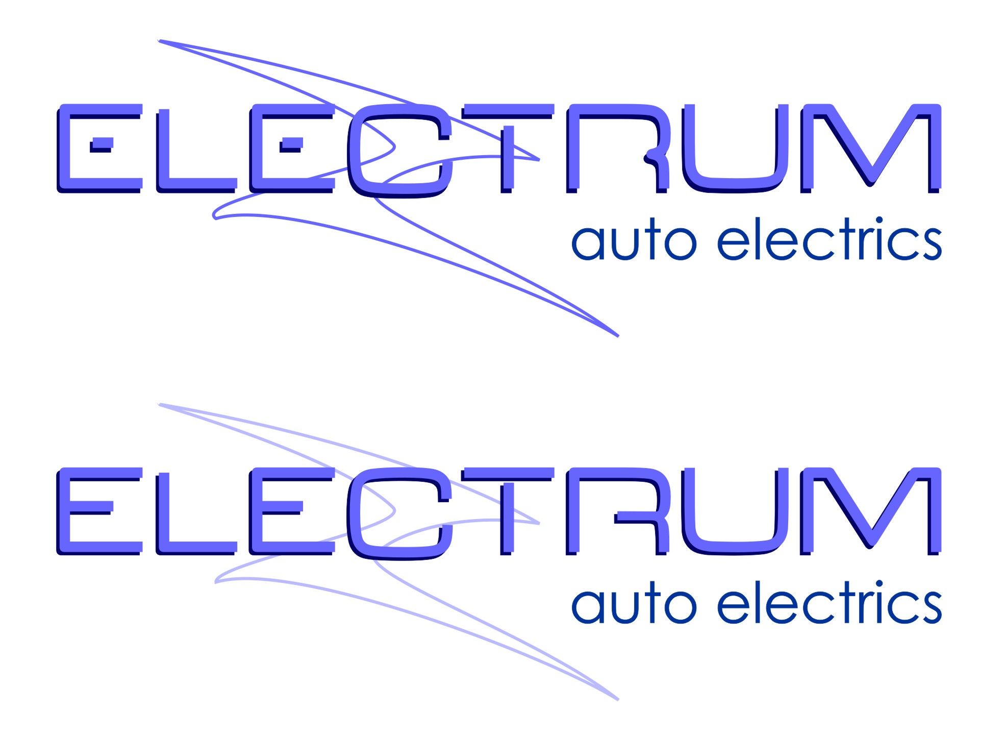
Sorry John…I did the layout at home last night……I can post it tonight for you no problems but in the mean time if you wanted to redraw it yourself the font was just a free download from 1001 free fonts…called V Dub….the auto electrics is just Century Gothic
-

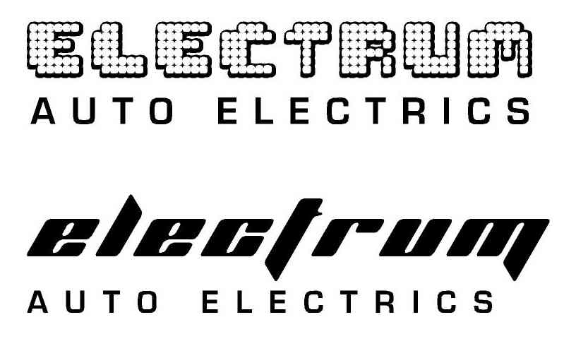
Sorry so late for replying as I’m across the pond and I don’t get to play around to much until I take my lunch break. Anyway, here is my 2 cent (er… I guess that’s 1p when converted for the exchange rate 😀 ) Anyway, I just did some quick sketches. I don’t know if you plan on doing any raster output or not, but I did one version anyway. I used the free fonts Tivoli (top) & Planet Kosmos (bottom) for the headline and Eurostile bold for the tagline.
Attachments:

-

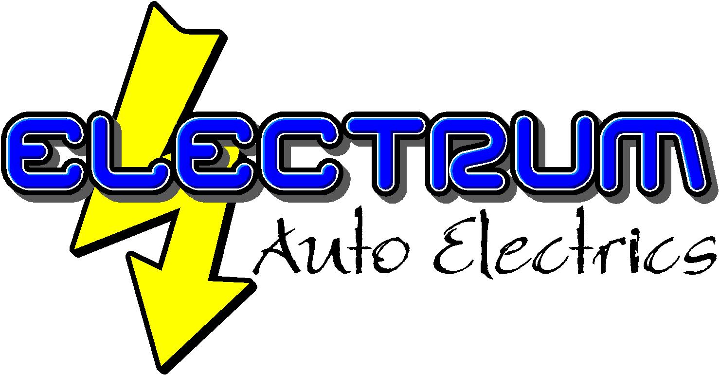
bit late, but another take on it John.
Attachments:
-
John…heres the eps versions aswell….I’ve tweaked the the main text in the bottom one…I don’t know if it works any better for you
-
Nice work guys, thanks all for the input really appreciate it, simon as mentioned trying to stay with vectors but liking your stuff including the one you posted for angelique I think?
John
-
Thanks, It’s always more fun to play around with other peoples stuff for some reason. I’d like to see the finished product when you do sort it out.
Log in to reply.
