Activity Feed › Forums › Sign Making Discussions › Graphic Design Help › can anyone help with this logo please?
-
can anyone help with this logo please?
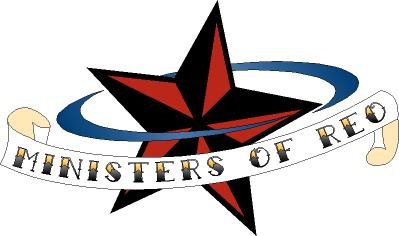
Posted by Matt Hards on September 6, 2007 at 12:34 pmHi there, I am doing a design for a logo for a small indie/funk band that my mate is in. I have come up with this, which they like, we are gonna add some colour into it. Just wondered what you think on the design really, anything you would improve etc. Gotta be cuttable for vinyl, i.e stickers, clothing etc etc.
Attachments:
 Matt Hards replied 16 years, 7 months ago 3 Members · 5 Replies
 -
5 Replies
-

although I like the idea of it Matt…the first two things to hit me were the word ‘ministers’ gets a little lost in the background but adding a 2nd colour could help that…..& I personally don’t like the stars you’ve used…for a modern looking design they look a bit dated…a bit like Christmas deccies if you get my meaning
I do think it’s a good concept though
-

the reason i used these stars are because the are very much a rock/tattoo type of star, and this fits the bill for the band, i see what you mean about losing the ministers , i will try some colours out on it i think.
-

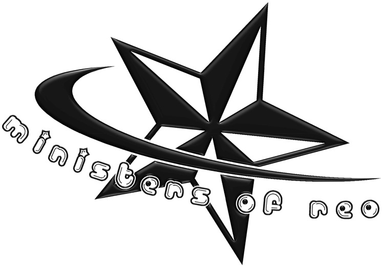
Here’s my input, if you’re going for more of a tattoo look. I wish I had more time to work on this, but I’m at work. It looks really fun to play with. This is a sketch I did in about 15 minutes on the computer, so it’s definitely not done. It would be better to have sketched this out by hand first. The banner is a bit wonky on the right side. It’s hard to do nice smooth curves quickly with a pen tool (I wish I had a Graphics Tablet). I use to work in a tattoo shop for a few years. I have the nautical stars and some swallows tattooed on my chest. Definitely classic tattoo material. Do some searches on "Sailor Jerry" or "Don Ed Hardy" for some old school tattoo designs by these guys.
Attachments:
-
I meant to write something here sooner. I went to the Ministers of Reo MySpace page just to see what they were about. I don’t think going with more of a tattoo theme really fits them well. I think going back to your original idea might be suited a little better. The copy just seems a little hard to read right now. If you could integrate the copy a little bit more into one of the swooshes, it might read better. Here’s another thumbnail. I used a free font called Billo Dream.
Attachments:
-
hey thanks for the design ideas, i like your style, very cool. I think i will incorporate some of your ideas and play around with mine a little more. It looks wicked though. I like these kind of jobs, nothing serious, no timescale, just playing around til its right.
Log in to reply.
