Activity Feed › Forums › Sign Making Discussions › Graphic Design Help › can anyone help with this logo please?
-
can anyone help with this logo please?
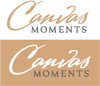
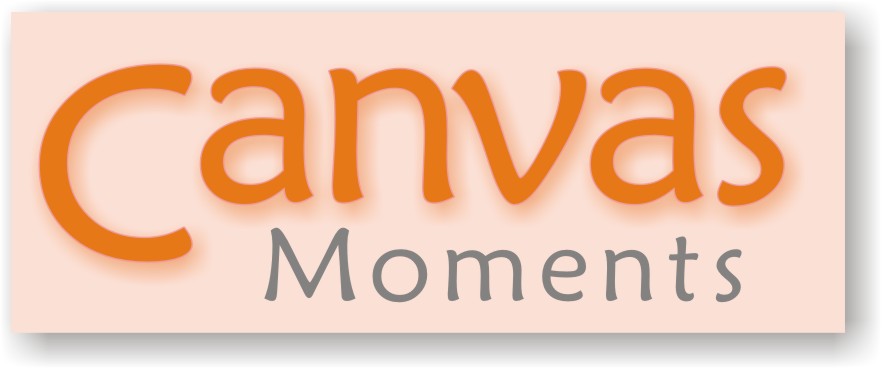
Posted by Jason Xuereb on August 11, 2007 at 1:36 pmHey guys,
Just wanted your thoughts on this logo. I’m not 100% on the color as of yet but I’m pretty happy with the font selection and layout.
Critique please.
Attachments:
 Jason Xuereb replied 16 years, 9 months ago 9 Members · 24 Replies
 -
24 Replies
-

I felt it was a bit plain so I added a slight drop shadow behind the canvas. Gives it a bit more depth.
Attachments:
-

hi
visually very appealing but not a easy read.
as i did not know what it said found it quite difficult, then i do most thingschris
-

I agree with Chris….not that easy to read
I see the "n" as an "r"….but I would try dropping the right leg of the "n" rather than changing the font
-

I do like the colour choices ………. I also agree with Glenn and Chris, I’d try what Glenn has suggested and drop the leg of the ‘n’ I think that would make a difference. I don’t like the drop shadow on the bottom layout though …………. with the coloured background I don’t think it needs. Looks ok on the white background though.
-

I like the font, but agree that the ‘n’ and ‘v’ are hard to read.
I like it though……… 😀 -

i like it…..but would change the word ‘moment’ from a serif to a block letter into lower-case, it clashes with the script lettering 😀
nik
-

I really like it a lot.
I prefer the first version (no drop shadow)
I could read it just fine.
The script has a good bounce.
One thing I noticed is that the "a’ needs to be nudged over a bit into the "n".
If I were painting that word the a would flow, you know what I mean?
Love….Jill -
quote Jillbeans:One thing I noticed is that the “a’ needs to be nudged over a bit into the “n”l
an optical illusion jill? 😉 the one on the darker background looks thicker than the one on the white………… 😉 😉
nik
-
Yup, the white looks thicker…but the tail on the a on both is just "there", like a stop right at the top of the "n’ stroke.
Love….Jill
(The drop shadow on the tannish one looks like it’s an odd grey on my monitor too, whereas it should really be just a hint darker than the background.
That’s why I said to nix the shadow!
🙂 -
i know….the blob bit 😉 jill i respect your comments…you know me..its saturday night 😉
nik
-
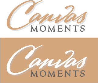
Hey guys,
Really appreciate all your feedback. I’ve been working on this logo for a little way so its a lot harder for me to see the little things wrong with it.
In this version I made three changes. Where the C meets the a is a little higher. With Jills point I wanted it easer to read. I made the a closer to the n as Jill pointed out also. With the N and the V being hard to read I made them closer instead of dropping the tail of the N as Glenn and the others pointed out.
If this is still hard to read I think I will move the leg of the N further down but then I am really messing with the font and how it flows.
The reason I have two colored versions is in the event we need to use the logo on a non white background. Example is shipping boxes and the like where white is too white.
But from letter heads to website etc the white background logo will be used. The shadowed on the color background has been removed also.
PS: I haven’t given it that brush calligraphy outline yet. I’m working with the layout first then will add the final touches.
Attachments:

-
sorry but for me the changes haven’t it improved much
The tweak with the ‘a’ has helped it flow a bit better but for me the main sticking point is the ‘n’….it just seems way too lop sided compared to the other letters.
This again is just my personal preference but I always prefer the dropped shadow on the left of the text…..I just think because we read from left to right..if the shadow is on the left then the main name is the last thing you read rather than the slight interference from the shadow
-
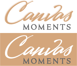
thanks again Glenn,
Logo tweaked again. I think if I try to tweak the N even further I’m going to distort the whole text a lot. I had to adjust the tail of the A as well because it looked funny with the tail of the N being brought down so far. The shadow now is the same color as the logo at 30% opacity to give it some depth. I think the plain versions look to plain. Also placed top left as you suggest Glenn.
Attachments:
-
I think the A between the C and N needs to be bigger now. It looks a tad smaller with the adjustment of the N now.
-
I prefer that one ….except now you have made the change a ‘u’ has appeared from the stem of the n & the u…….nipping up the kerning between these two letters would get rid of that………sorry 😳
-
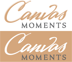
N and V closer together. A between C and N is also bigger.
It seems I’ve distorted the font a fair bit now. I kinda like the original one even though its a bit harder to read? Opinions please.
Attachments:
-
I know what you mean….when you fiddle on too much you get a bit frustrated with it…..but for what it’s worth I think it reads much easier now
I like it
-

I would drop the the lower curve of the C again and use a font without such a heavy serif 😀 😀 😀 looks good though
-

Jason, I find it a little hard to read. It just doesn’t jump out at me as "Canvas" and I get hung up with interpreting the detail of the letters rather than getting the message. Some really nice fonts just don’t always lend themselves to certain text – maybe you could try a different script?
-
I like it. I like the earliest today version where you fixed the "a’.
Why do I like the script so much?
It reminds me of a watercolor brush dragged across canvas.
It’s freeform and attractive.
I can read it easily.
Love…..Jill -
quote Jillbeans:It reminds me of a watercolor brush dragged across canvas.
It’s freeform and attractive.yes ……….. it’s appropriate to the name of the company. With the ‘n’ adjusted I personally think it’s better. I like it too.
-
Thanks a lot guys. I’m going to sit on it for a day or two then come back to it a bit fresh. I have a few focus groups coming up next week for the products of this company and I’ll throw in the logo and see what customers in the target market think of the logo from a preference and legibility point of view.
I think once we start using the logo with canvas images and so forth it will become easier to read. We’ll see.
Thanks again and I’ll keep you posted on the final version.
Log in to reply.
