Activity Feed › Forums › Sign Making Discussions › Graphic Design Help › can anyone help with this logo please?
-
can anyone help with this logo please?
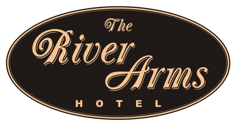
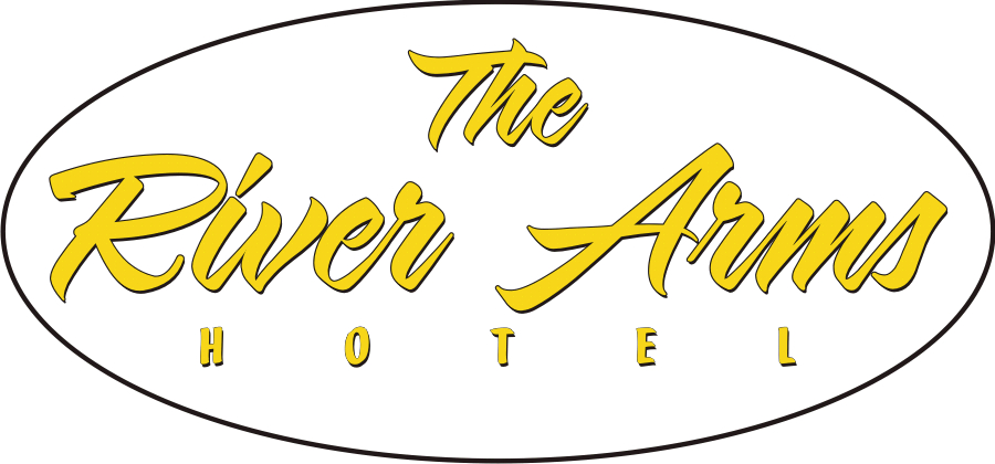
Posted by Bill McMurtry on July 17, 2007 at 6:53 amI’m trying to sort out the name design for a Hotel revamp – "The River Arms Hotel". I’ve presented the client with several basic ideas and he has chosen this one as his preferred option, but he thinks it might look a little too old fashioned – particularly for their trendy new bar area called "The Arms". He’s asked to see a few variations on this theme and my brain has pretty well turned to putty at the moment.
I’m under the pump with other jobs and setting up my new printer so I thought I might ask for some opinions and input. The client says he likes black and gold, but I think he’s still open to ideas.
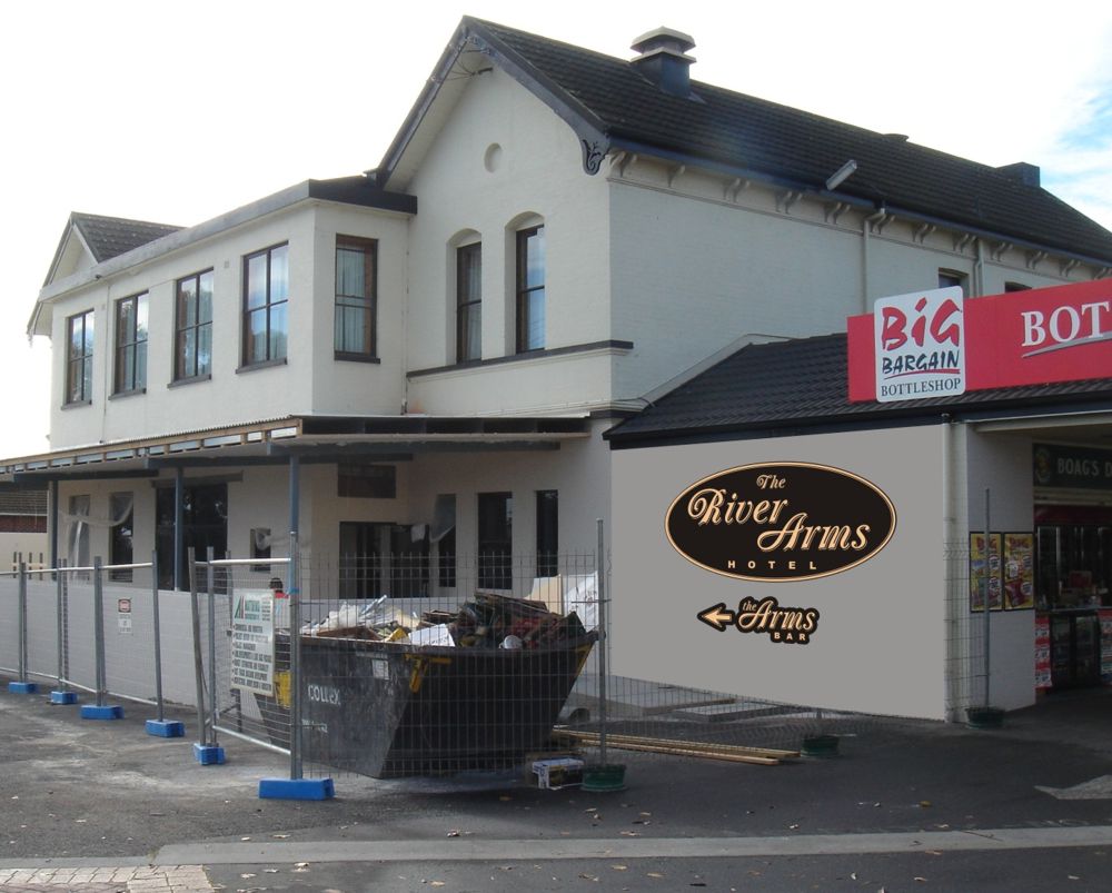
I’ve included a shot of the Hotel front, still under construction, with a mock-up sketch of the sign space. I have a day or two to get back to him so any help would be very appreciated 😀
Attachments:
 Dave Bruce replied 16 years, 9 months ago 6 Members · 22 Replies
 -
22 Replies
-

Bill
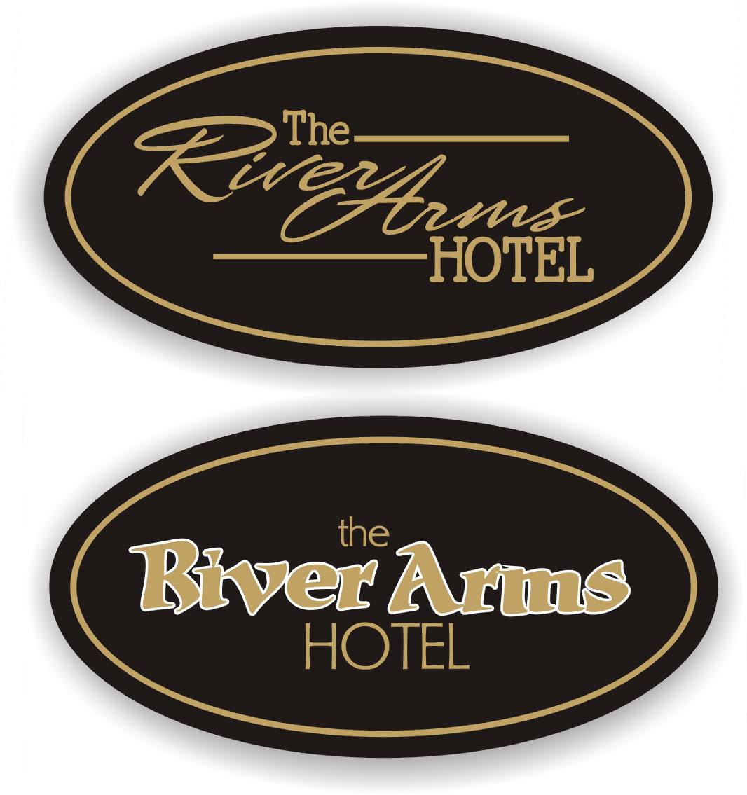
Cant beat a nice letterhead font ..this is Scriptana
though i have tweeked it in placesTerry
Sign and Custom
Attachments:
-

Terry, I like that. It does give it a more modern look. Thanks mate that’s very helpful, much appreciated – top stuff!
-

under the pump myself Bill.
Actually I like both ideas. Here’s my quick take, Sarah Script.. another Letterheads font… from myfonts.com
Attachments:
-
Thanks Shane, these are excellent suggestions too. I’m tending towards a modern looking script along the lines of your and Terry’s suggestion. I’ll have time later this afternoon to go through it all more carefully. Great to have some objective input – much appreciate the time fellas 😀
EDIT: any chance of getting Scriptana and Sarah Script layouts as an eps – I don’t have either font 😳
-

Buying the script should be factored in to the price of the sign…a mere pittance when you think of the many many times you will use the font on other projects.
If using your layout the "the" needs to come down a bit from the top. Be sure to leave breathing room around your edges, as Terry demonstrates.
Unless the gold is gold leaf you may have issues with contrast/readability.
A white pinline outline is a good idea if using metallic gold.This sign would be gorgeous in 3D with a black smalt background and gilded lettering.
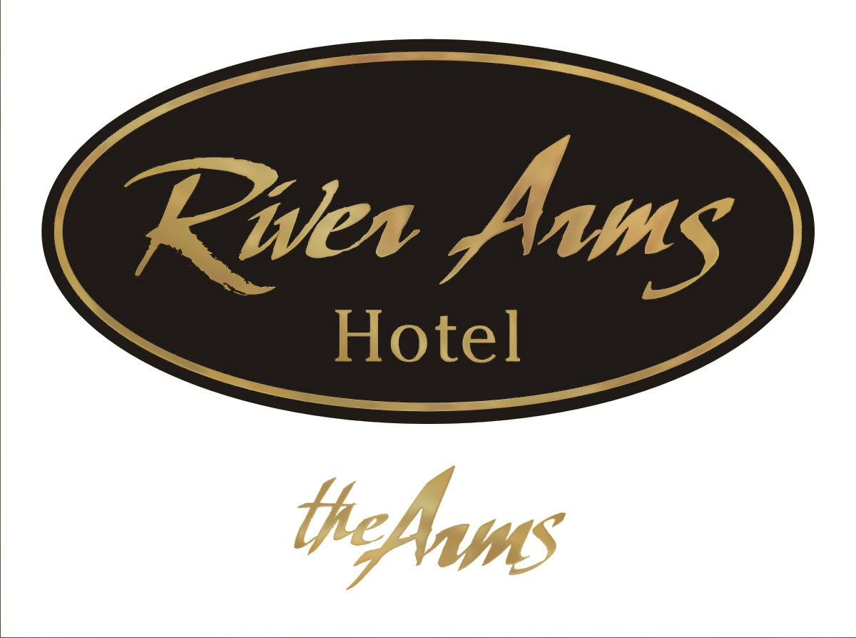
Love….Jill
(the script in my example is my new fave, Valentino from Signfonts.com)
Attachments:
-
Thanks Jill, very nice. I particularly like the Valentino layout.
I rarely buy in a special font for a client rough – particularly when they’re still at the ‘hmmm’ stage, if you know what I mean. I know what you mean about them being useful in the long run though.
I agree, this style would look really nice in 3D with a gilded finish on black. I’d certainly like to steer him that way if at all possible. Black smalt – that’s a pigment containing ground glass? I’ve never used it. Thanks again for your input Jill, very much appreciated 😀
-
Hi Glenn, that’s a nice bold design. I like what you’ve done with the outline, gives it a slightly edgy look. Thanks for taking the time to offer your input on this, another good option.
-
#1 always get a deposit before doing any design work. If the client is serious, this should not be a problem.
Here is a SignCraft article about Smalt. I hate .pdfs but this one is worth the wait. I myself have never tried it, but I have seen the results and they are stunning.
http://www.signcraft.com/smalt.pdf
Article on gilding (incised not raised letters tho)
http://www.signcraft.com/gorsky98.pdfArticle on surface gilding:
http://www.signcraft.com/gild.pdfRemember that you can cut a computer mask for gilding as well, just add an extra outline to the text (a thin one) and don’t weed away. Reverse-weed the lettering, apply your mask, apply the size, and immediately weed off the extra outline.
Supplies may be purchased from:
Wright’s of Lymm
http://www.stonehouses.co.uk/
or
http://www.signcraftersupply.com/And Valentino is just $24.95 from:
http://www.artandsignstudio.com/orderfonts.htmlLove….Jill
-
Good advice Jill.
I must confess I have always done artwork with a quote until recently. Had a quote request for a fair bit of signage, so I decided I’d quote first, design later.
The client wants to see a design before approving the quote. I think she wants to shop me around, so I said I’ll need a deposit before I start designs. Have not heard from her since.
A neighbour has since told me I’m the 2nd or 3rd sign shop that has been called in this month. So I suspect my thought was correct.
I still do designs with a quote for my regulars though.
-
Shane, I don’t even do that anymore.
I recently emailed a design to a client of ten years.
He put it up on his website as an ad and also used it as artwork to sub out one of those cheap "banner" style tarp billboard covers!
No more sketches without deposit and no more emails at high rez without a big-ass watermark across them!
Love….Jill -
Jill, those instructions on smalt and gilding are brilliant – thank you. I think my client would be blown away with such a finish. I also think the prospect of a rich genuine gold finish for the lettering will seal the deal with him, no matter which design we end up going with.
I hear you about getting a deposit for design work. I’ve certainly been burned in the past, as I’m sure many here have too. Fortunately, this particular client is one of my best and we have a great ongoing relationship. Perhaps not so easy to deal with when he’s not sure exactly what he wants, but always straight up with the invoice. Wish they were all like that.
Thanks again for all your great help and advice 😀
-
quote Jillbeans:Shane, I don’t even do that anymore.
I recently emailed a design to a client of ten years.
He put it up on his website as an ad and also used it as artwork to sub out one of those cheap “banner” style tarp billboard covers!
No more sketches without deposit and no more emails at high rez without a big-ass watermark across them!
Love….Jill:lol1: Now that would have been annoying Jill….I used to supply a PDF of the design, but that can be so easily copied or imported, now I use a low quality gif or jpg….
I’ve never experienced someone being so blatant, but I have had other artwork sent to me, only to discover the designer was never paid for it.
Anything decent I ask them straight out who did the design, ask for their number so I can talk to them. Its not uncommon for sign shops to supply artwork with a quote here tho, so to buck the ‘system’ people will often just keep trying sign shops until they find someone that will do the art on a promise.
-
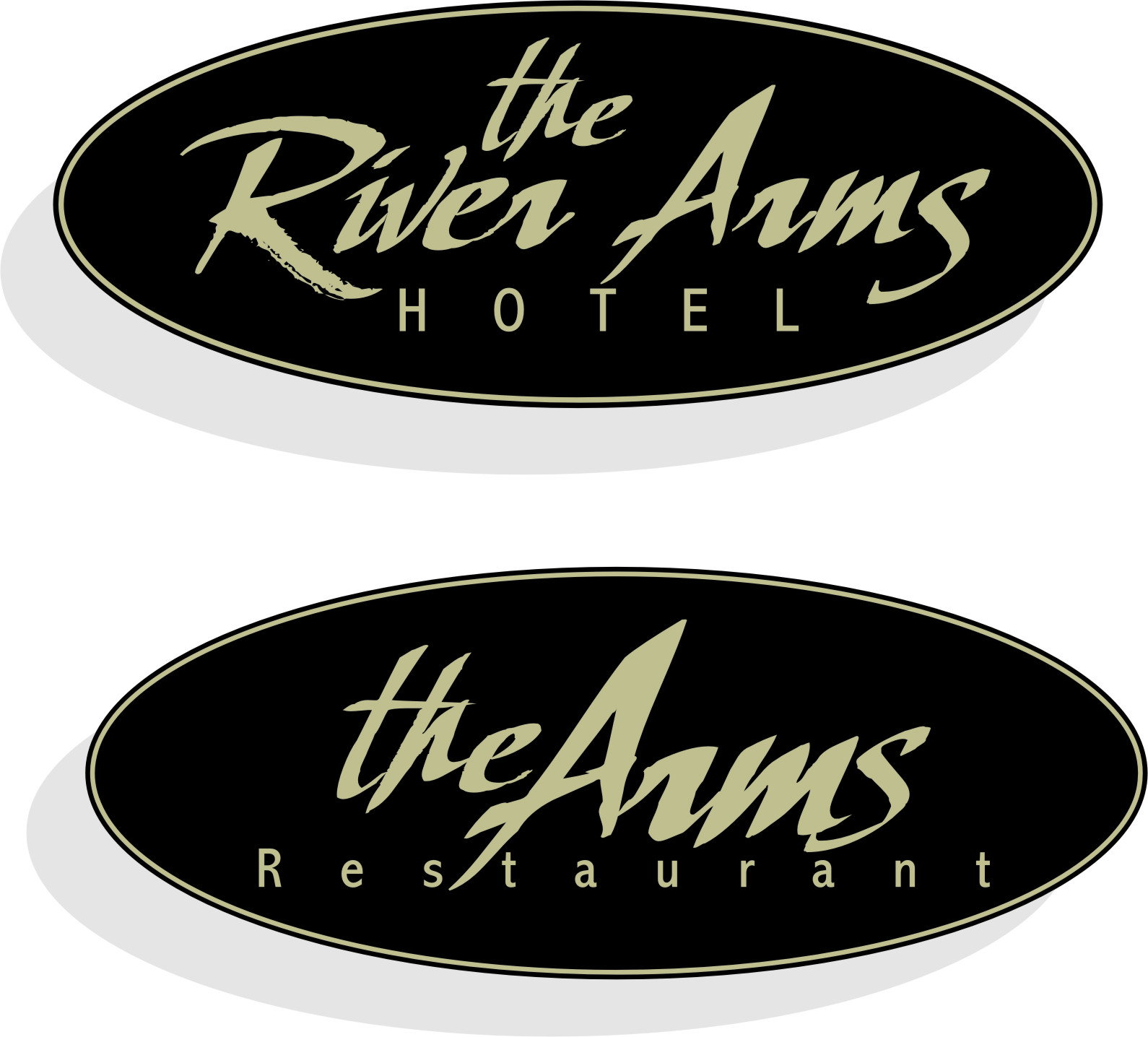
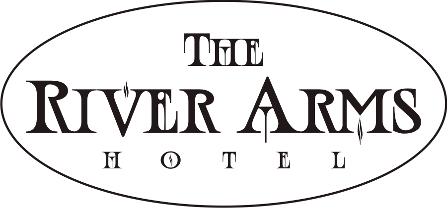
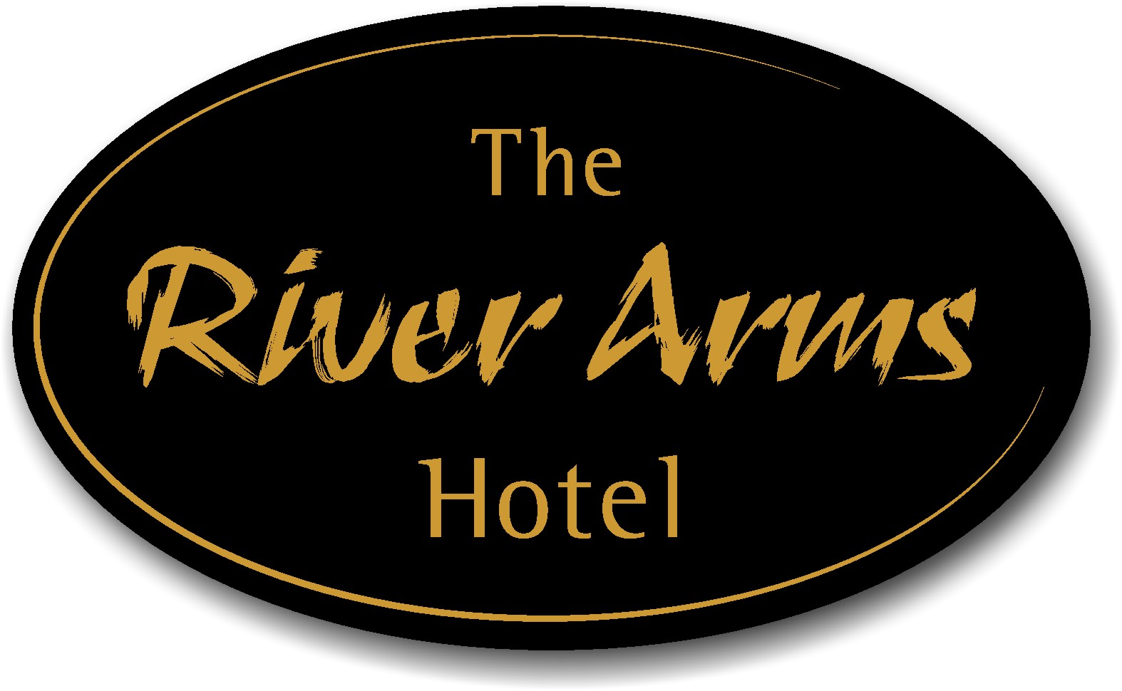
Update on the hotel job: After a couple of minor changes the client settled on a variation of Terry’s layout using Sciptana, which is now a valued addition to my font library.
Thanks so much Terry, I owe you one mate. And thanks to everyone else who chipped in with a hand when I really needed it 😀
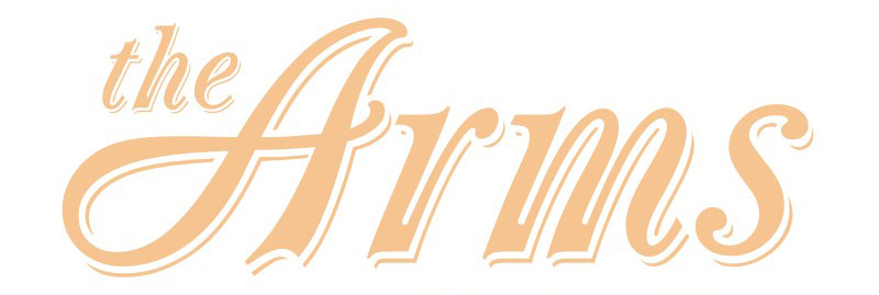
Below is the final client approved sign layout to be rendered in 23 carat gold leaf on black (special thanks to Jill for the gilding info). "The Arms" tag is exactly as Terry’s original layout, which the client just loved and which I just couldn’t better.
Attachments:
-
Bill,
Be sure to make yourself a smaller "practice" piece if you’ve never gilded.
It helps to have something other than the final sign to do your "knuckle test" on the size.
And if it turns out well, the practice piece can be used as a sample in your show room to induce other clients to step up to a real gold sign.
Love….Jill
PS
Good on Terry for helping out and good on you for seeing the value in buying a nice script rather than settling. -
well done Bill. The value of your membership has just been realised.
Getting help on the design is one thing, selling the design with confidence is no small job either. It was a good team effort I’d say.
Well done to all involved.
Jill, your avatar makes me giddy. 😮
-
Advice well taken about a test piece Jill, thanks. BTW, do you think there would be any problems spraying the size, rather than brushing it on? I intend to use a computer cut mask and spray application of the size would seem to be the simple approach.
Shane, not a truer word said about membership here 😀
-
I’m not sure about spraying the size.
You can gild with a mask, just cut an extra thinner outline around your text but don’t weed it off. Apply your size thinly, then remove the outline part of the mask.
This makes the size flow out well.
Love….Jill -

Jill thanks for the info on gilding, I have a memorial plaque to do so will be practising the info from the sites.
Cheers
Dave
Log in to reply.
