Activity Feed Forums Sign Making Discussions Graphic Design Help can anyone help with this logo please?

  • can anyone help with this logo please?

    Posted by Stephen Morriss on October 31, 2005 at 9:22 am

    Hi

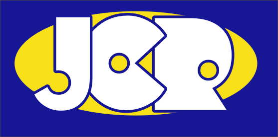
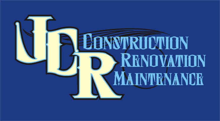
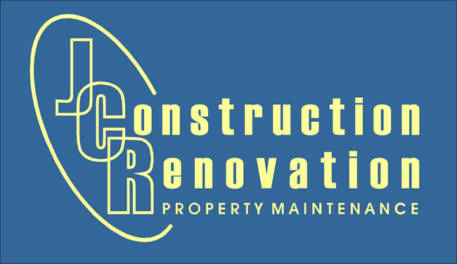
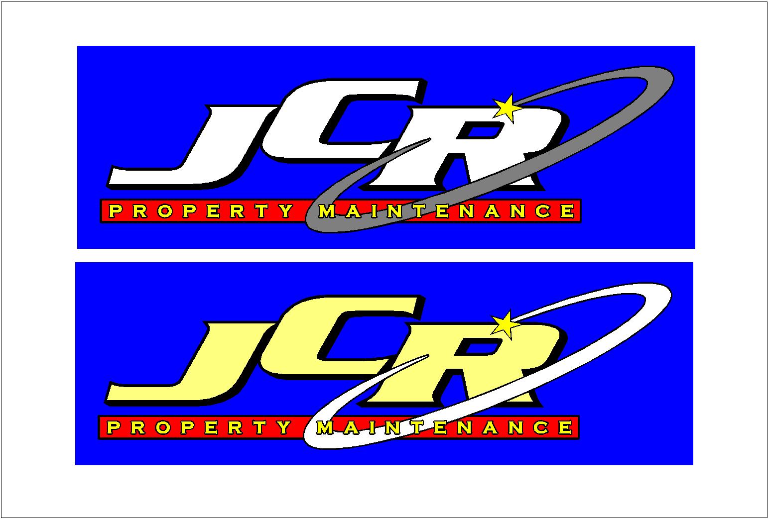
    I’ve been asked by my customer to make him a logo from his three initials
    JCR but I’m drawing a blank.

    He’s also wanting to see the logo with Construction after the C and Renovation after the R with Property Maintenance below

    He’s already looked at my swatches and chosen cream lettering but I’m sure I could persuade him to change that.

    I’ve attached my attempt but I’m having trouble getting it to work so does anyone have any ideas?

    I’ll keep trying but I’ll have to admit my creative design is not very good. I tend to like to keep to simple clear stuff like "Freds building services" and boring things like that 😳 and there some very talented people on here that my be able to point me in the right direction.

    Forgot to say it’s going onto a blue Transit van

    Thanks
    Steve

    Nearly forgot the font I used is Charlesworth, I kind of liked it 😕


    Attachments:

    Stephen Morriss replied 18 years, 5 months ago 8 Members · 13 Replies
  • 13 Replies
  • Robert Lambie

    Member
    November 5, 2005 at 11:52 am

    if i get a bit of time later ill maybe have a go at this one mate.
    you have a nice design there using these letters but it doesnt look like a construction company font/style, if that makes sense?that said, the customer may love it! 😀

  • Shane Drew

    Member
    November 5, 2005 at 12:19 pm

    Just something quickly.

    If they are the conservative type, they will not like it. Just a thought tho


    Attachments:

  • Jill Marie Welsh

    Member
    November 5, 2005 at 1:11 pm

    OOh Shane I like that, punchy and bright.
    Here’s my take, I dislike having to use initials then words, seems redundant,
    but the customer is always right huh.
    Love…..Jill


    Attachments:

  • Mr Bruce

    Member
    November 5, 2005 at 5:32 pm

    Hi there,

    Please don’t laugh too much – this is my first go at posting any of my stuff up here!!

    You said cream on a blue van, I had a quick play and came up with this, although I think the outline initials aren’t bold enough against the solid letters of the ‘onstruction’ etc…(I’d rather tone the lettering down than make the initials bolder though!) Like I said – this is just a quick idea for layout/style…..

    I didn’t know whether the words ‘construction’ had to be separate from the three initials, but I took them off anyway! Hope this is OK?

    I did it more for constructive feedback from all you experts out there?? 😉

    Maybe of some use to you??

    Regards for now,

    Bruce.


    Attachments:

  • Lynn Normington

    Member
    November 5, 2005 at 5:49 pm

    Bruce I like that and think it fits the criteria steve asked for, I would agree with your own crit the initials aren’t bold enough,
    good stuff

    Lynn

  • Jill Marie Welsh

    Member
    November 5, 2005 at 5:54 pm

    I like that Bruce, nice and clean.
    I did use onstruction and esoration on mine too, but changed it after I re-read the initial post.
    I think your initials are just fine actually, and the swoosh ties it all together.
    Love…..Jill

  • Shane Drew

    Member
    November 5, 2005 at 10:00 pm

    I like it too bruce, but the only thing against it in my opinion is that the outlined letters would be ‘lost’ from a distance on the van.

    Well done tho, and thanks for sharing.

    Steve has a few ideas now, from several different ‘concepts’

  • James Smyth

    Member
    November 6, 2005 at 11:24 am

    just modified a logo i done for a client recently


    Attachments:

  • Stephen Morriss

    Member
    November 6, 2005 at 3:34 pm

    Wow I’m stunned.
    I like all them for different reasons, but the main thing is the addition of a shape with each design, I never think of using additional shapes etc with my designs and I think that’s what mainly sets them apart from my boring designs.

    I worked on mine a bit and made it a little more interesting and showed the customer and he seemed happy with the design so I should be doing the van next week, I’ll maybe post a picture if I’m happy with it 🙂

    Many thanks for the ideas as I’ll try some of them in the near future. Or I may add to the existing design.

    Thanks again
    Steve

  • Shane Drew

    Member
    November 6, 2005 at 9:48 pm

    A shape always adds another dimension you can’t get with just text mate, you should give it a try next time 😛

  • John Singh

    Member
    November 7, 2005 at 5:05 pm
    quote :

    A shape always adds another dimension you can’t get with just text mate

    My beer gut always enhances the look of my ‘Nike’ T shirt 😀

  • Stephen Morriss

    Member
    November 7, 2005 at 5:42 pm

    [quote=”John Singh

    My beer gut always enhances the look of my ‘Nike’ T shirt :D[/quote]

    That’ll teach me to use technical words 🙂

    Steve (shapely) Morriss

  • Stephen Morriss

    Member
    November 12, 2005 at 10:39 am

    Well I showed my customer these designs as well and he liked Bruce’s design with a few tweaks.
    Hope you don’t mind Bruce 🙂 I’ll buy you a few pints at the sign show if your going *drink*

    I’ll post some pics when it’s done.

    Steve

Log in to reply.