Activity Feed › Forums › Sign Making Discussions › Graphic Design Help › can anyone help with this logo please?
-
can anyone help with this logo please?
Posted by Steve Sandy on June 15, 2007 at 10:40 amGood Morning all,
I feel really bad about putting these attempts on here after spending the last couple of months seeing everyone elses work on show. They dont really compare but I am still just starting out. I mainly do estate agent boards and car graphics which are only a case of sizing and plucking.
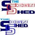
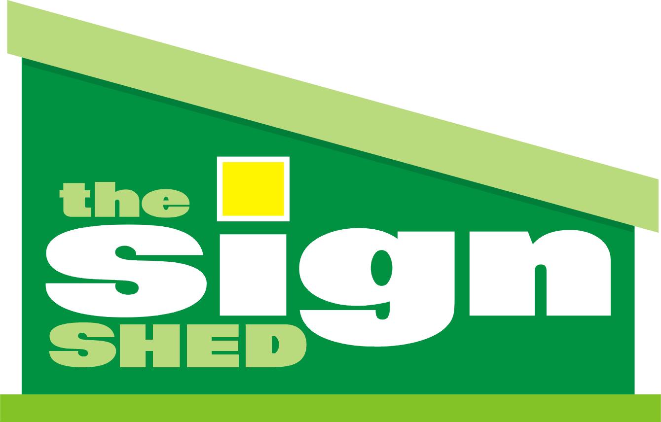
I need to do my van and have always had a problem with my company name " The Sign Shed" trying to fit in "The" has always got me stumped.
Any suggestions on tried and trusted texts, Borders, combining shapes, anything that could help me out would be much appreciated.
Thankyou in advance for any help you can give, Oh I have a 610mm cutter and a T4 transporter van if it helps.
Regards
SteveSteve Sandy replied 16 years, 11 months ago 18 Members · 66 Replies -
66 Replies

-

Hi Steve,
I wouldn’t go for the first one. At a glance it looks like "Sh!t Head. Sorry mate. 😮 -
quote KARL WILLIAMS:Hi Steve,
I wouldn’t go for the first one. At a glance it looks like “Sh!t Head. Sorry mate. 😮Designing your own stuff is always the hardest thing to do.
-

a bit cartoony …but a different slant on it
Attachments:
-

Karl, I agree I dont really want to give that opinion of S*it head it doesnt convey the right message. The name came from doing boat names for a long time from my sailing club i.e. boat shed "sign shed".
Glen I thought along the same lines going with the wood effect too, So I have opened up on here for maybe some other design idea too.
Thankyou both very much for your replies. Keep the ideas comming and critisism too, I’m sure there will be alot of them with my basic designs.
Regards
Steve -

well thank you mr williams its sure to have a slating latter thou 😉
-

Hi Chris, I like the "sign" font, can you tell me what it is please?
-
Now Chris, You certainly wont be getting a slating from me for that one. That is very nice I like it. I like the way that has come out. It is simple but really effective. I have 2 panels on the van one of which sais the sign shed and the other with a list of what I can do. I like having the list as I do boot sales and markets to take the signs to the people sort of thing and some people like to see what you do then ask, Rather than approach you and ask. So I could have something like that covering one panel and also have it as business cards and letterhead logos.
Thankyou Chris that has given me inspiration.Best regards
Steve -

I call it S&M here Andrew….. how many suits can you look at, dear???? Cool logo! 😀 😀
-
Had another play, Text not good on "the" & Shed" but I thought the sign bit would have looked better bigger than the rest. Maybe I should drop the "The" would make it easier. The colours are looking a little like Warrens at the moment, "Sorry mate" Its more the design ideas at the moment not the colour scheme mate 😀
Does this one look better with the "Sign" bigger.
Steve
Attachments:

-

no it doesn’t work ………….. sorry! I don’t like the font or having all of the name in a script either, it’s old fashioned looking.
-

steve, the best bit of advice i think i can give anyone is that you should "never" stretch or condence/squash a font unless you are purposely basterdising/customising a font mate. if you need a narrower font, use a condensed font, if you need to stretch the font, use an elongated font. if that isnt long enough, try opening the kerning/spacing of the letters and so on… i know this seems long winded but from a design point of view it really does give a more appealing layout/design.
ide give this a go myself just now but im having my second beer and trying to chill for a bit :lol1: had a long week and just getting over a couple of weeks of illness 😕 :lol1: :lol1: :lol1:
-
Agreed Marcella, Should stick with the straight font for the blue stuff, But the "Sign" part looks better bigger i think. Sorry for the crappy font did a couple and jpeged the wrong one onto the forum.
Steve
-
😛 ………… try keeping it a bit more simple.
the name also conjures up a kind of earthy feel to me 😳 so I’d go for earthy colours, greens or browns maybe.Or I could be talking rubbish! :lol1:
Attachments:
-
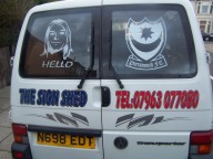
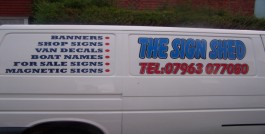
Thought I would add the van as it is at the moment. I did this when I first started and have not had chance to change it so far. I figured it would be a good idea to have a before and after type thing on here. The only thing I like about the van at the moment is the Pompey club logo on the back.
Please dont slate the rest of it as it was the first job I did a week after I got my cutter and since then I have been learning alot from this board and the portfolio section. Got a week off next week to strip it and try again.Steve
Dont know whats up with the camera, But you get a good idea of the help I could do with
Attachments:
-
Rob, Just been watching a demo of kerning, I get the idea. I love the new tricks comming everyday I always used to put spaces in between the letters. (oops is that classed as swearing on here). I like the way your getting over your illness with a few beers thats the way.
Thanks Marcella, I think my problem has been, I have tried playing too much and when I am out and about all the best signs I have seen (on here included) are the simplest ones. I will from now on stick to straight text and bold colours.Well maybe a swirl here and there.
Regards
Steve -

Steve, the best thing you can do if you want to learn more about design is get yourself a copy of Mike Stevens book "Mastering Layout". You won’t be sorry you did that I can assure you.
You can obviously learn a lot from these boards but you will learn so much more from this book. -
Thankyou Martin C too, Not boring gives me more layout ideas, So cant be bad. Thanks for giving me your time on this. Also to everyone who has posted comments so far.
Regards
Steve -
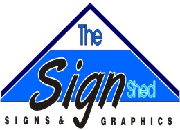
 quote KARL WILLIAMS:Steve, Just an idea mate!
Another good looking design Karl, great work. :thumbsup:
-
yep nice one karl, but only a little but he does not have a printer thats why i stuck to solids.
it would look superb on his paper work.
chris
-
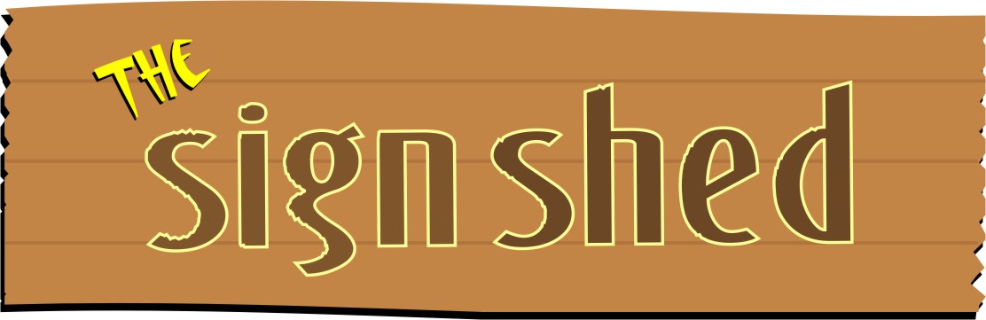
As Steve asked for inspiration I just thought this may give him a little. Like I said though, just an idea. The image of course can be flattend for normal vinyls.
😉
Karl. -
i would be proud to put that up outside the premises.
chris
-
Thank you Karl, As the first attempt it looked great, Nothing short of a great design as I have seen your work before. I am so glad you transferred it to vinyl cut format so it would be in my reach to do it. I think that is where I have been going wrong, Making the 3 words all the same size really. I should have emphasised the "Sign" from the start and made "the" and "shed" fit into the spaces available.
I am glad that you didnt include yourself leaning over the sign as you have in yours though. It is your trait sign now isnt it.
I have just got back from a couple of days work and will put everyones ideas into my own for comments.Thanks again for everyone for their time, I know you are all busy people and I really appreciate your help.
Best regards
Steve -

Steve would I be right in asuming that your from the south coast being a Pompey boy.
Peter
-
Hi Pete, Yes pompey born and bred. Live in Baffins in Copnor. Are you close by.
Regards
Steve -

The distortion issue aside on your second attempt…never use two script fonts in the same layout.
Love….Jill -
Your right Jill, I can see now where it just does not look right with it the same script. I wanted to emphasise the "Sign" but using this word in script does that perfectly without making it bigger alone. Thankyou for your time Jill.
Regards
Steve -

nice idea jill……. 😀
but i would have made ‘the’ and ‘shed’ the same size of font? 😉 they both get lost……. 😕 or reduce the word ‘sign’ or even outlined it 😀
nik
-

Like it Jill.
simple but effective, not pretentious, but conveys the overall message
and within the bounds of inspiring a relatively new guy to produce something on the same lines that he can call his own.
A few others have worked on the same premise, also with good but simple and appropriate designs.Steve has been given some brilliant ideas, and inspiration.
Peter
-
Just down the road Steve, there are a few Pompey boys on here.
Pete
-
Where abouts are you then Pete, I know of two Pompey boys on here Kevin & Chris. Got chatting to Kevin and he only lives about 3 roads away from me, Small world.
Steve
-
Took and idea from Jill with combining a shed like structure to it.
What do you guys think of this one. The only problem I see is using the full panel of my van, I would have the big gaps top right and top left. But I think the help you have all given me this design has got more to it than my first efforts and I can see an improvement to it. I will keep trying.
Regards
Steve
Attachments:
-

that’s more like it steve.
wen i gt a bit of time ill pop you a few of my designs up on here. i took about 2 week designing my logo. i found in the end its best to keep them plane and simple.
-
Maybe the JPEG , but the "shed" needs a bit more high light as it is a part of the name.
The "the" dosnt need much space though,
Peter -
Oooops forgot to add pic. Right hows this Pete
Attachments:

-
Steve, you are almost there,
just my opinion, reduce the underlines by half, and get rid of the outline around the "THE" you may have a resultPeter
-
Like this? Really glad I started this I have 15 different designs now, Each one has a new trick I have learnt in there somewhere. This one is my favourite so far. Thanks for all the advice. Please feel free to comment more if there is anything you can see that would make it better at all.
Attachments:
-
well I like it,
It is very acceptable as an advert for your work,
All things considered, you used input from others to create "your" logowell done
Peter
-
Just a couple of tweaks….I would kern the "the" out a bit…it looks a touch cramped & I would stop the light blue band running into the dark blue outline.
I’m just not sure the colour choice go’s with the "shed" part of your name….browns or greens would look more appropriate
-
i am with peter you are taking it all in and its coming together well,
glenn’s comments are good.well done keep at it.
chris
-

I would also look at removing the white keyline from ‘SHED’, and just
have it white out of the background. At the moment it looks a bit blurry.Cheers,
Jamie. -
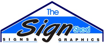
Thanks for the comments Gents, I have made the suggested alterations and I agree it does look better. Hope you all like.
Regards
Steve
Attachments:

-
Hi Steve
I didn’t actually like your design on your first attempt but these last few changes have made a lot of difference to it and now I actually like it.
Well done mate, it is hard work isn’t it? 😕 :lol1:
cheers
Warren
-
F.A.O. Chris Wool, A big thankyou goes to you Chris as it really started out with your design you posted earlier on this thread. I know I have added to it somewhat which is the point of these tips, But it was your original that started me off. Cheers Chris.
Regards
Steve -
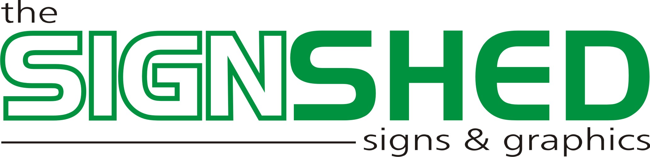
It’s coming along much better.
I think I would make SIGNS and GRAPHICS just a tad bigger, eliminating the ampersand.….and defense of my design, Nik…sometimes things don’t need an outline…I wanted Sign to stand out the most, and it did.
Love….Jill
-
Dear Jill, "Eliminating the ampersand" you will have to help me on this one. I liked your shed building idea and changed it to the design you see now. Thanks for the idea and time you have given me.
Warren, I watched your logo throughout the 150+ replies and it taught me alot, Great help these guys ay. Now I will be going for the follow up with it on the van. How did the move go, Hope your enjoying the lovely southern weather. Summer will be here soon maybe November perhaps.
Regards
Steve -
steve i think we all learn a bit form these. well worth the effort
chris
-
Hi Glenn, Thanks for your tweak comments earlier, You were right about the light blue going into the dark roof frame and it looks alot better. Also after learning kerning a couple of days ago I cant stop it now. I used to stretch everything or add spaces between the letters. (swearing again 😳 ).
I am going to stay with the blue colours for now, Comments appreciated on the "shed" theme being browns, greens and earthy. But this boy loves his blues. Pompey blue. I do like how you put the "signs & graphics" to the right side though, I think it lays better with the whole sign.
Thanks for your time and tips mate, Much appreciated.Cheers Steve
-
no probs Steve…..the more I look at my version I think the words "the" & "shed" are too detached from the word "signs"
I was just enjoying having a play
p.s. I’m a Newcastle fan meself….I hope we beat you to it to Kanoute 😉
-
My second team Newcastle. I was up there for just over a year at the nautical college and went to a few games. Love the people and always like United and their fans (nearly as committed as Pompey fans). I think we may have beaten you to him though, A bid of 8.4million from Harry and the old West Ham links. Still maybe Owen will do it for ya this season. He’s gained some muscle whilst out injured. Good luck for the season, Theres no shame in comming 1 place behind us, It had to be better than the 6 or 8 places this year Lol. Thanks again mate.
Steve


Log in to reply.
