Activity Feed › Forums › Sign Making Discussions › Graphic Design Help › can anyone help with this logo design please?
-
can anyone help with this logo design please?
Posted by Richard Urquhart on April 5, 2006 at 9:51 pmhi all its one of these jobs where i don’t know where to start !!!!
i know how this works i come up with a design and you guys help, well i need somewhere to start and many heads and all thatOK lets begin
name Barry Worth
auto electrician
auto air-conditioningi need to come up with a logo for tee shirts and may be his van
any help would help
thanks rich
forgot to say his company trading name is Barry Worth and this has to stay
Attachments:
 Richard Urquhart replied 18 years ago 15 Members · 50 Replies
 -
50 Replies
-

Rich, how much is the guy prepared to pay for logo design, and will whoever helps you out get a commision?
Peter -

ahhhhhh
peter someone on the boards here did help me with a logo and i did pay in cash !!!!!!!!!!!!!!!!
barry worth is a good mate and i would like to help him out
however if someone comes up with a nice looking logo i would be more than happy to work out a small payment SMALL small -

well ok Rich if that has to stay that’s what you are stuck with !!!!
Lynn
-
there has got to be a way of adding something like an image of a car outline i need something that grabs your attention
-
Sorry Rich, didnt mean to sound fascistious, but at least put your ideas up for improvement, or critism, thats what you normally do, not just ask for ideas from scratch.
Peter
-
nothing like this but with something going on not just text if you get me
(:) (:) (:) (:)
Attachments:
-
Right Rich, now we are rockin an Rollin.
that design has lots going on, not a lot to improve, perhaps a key line around the text, just to separate from the background.Peter
-
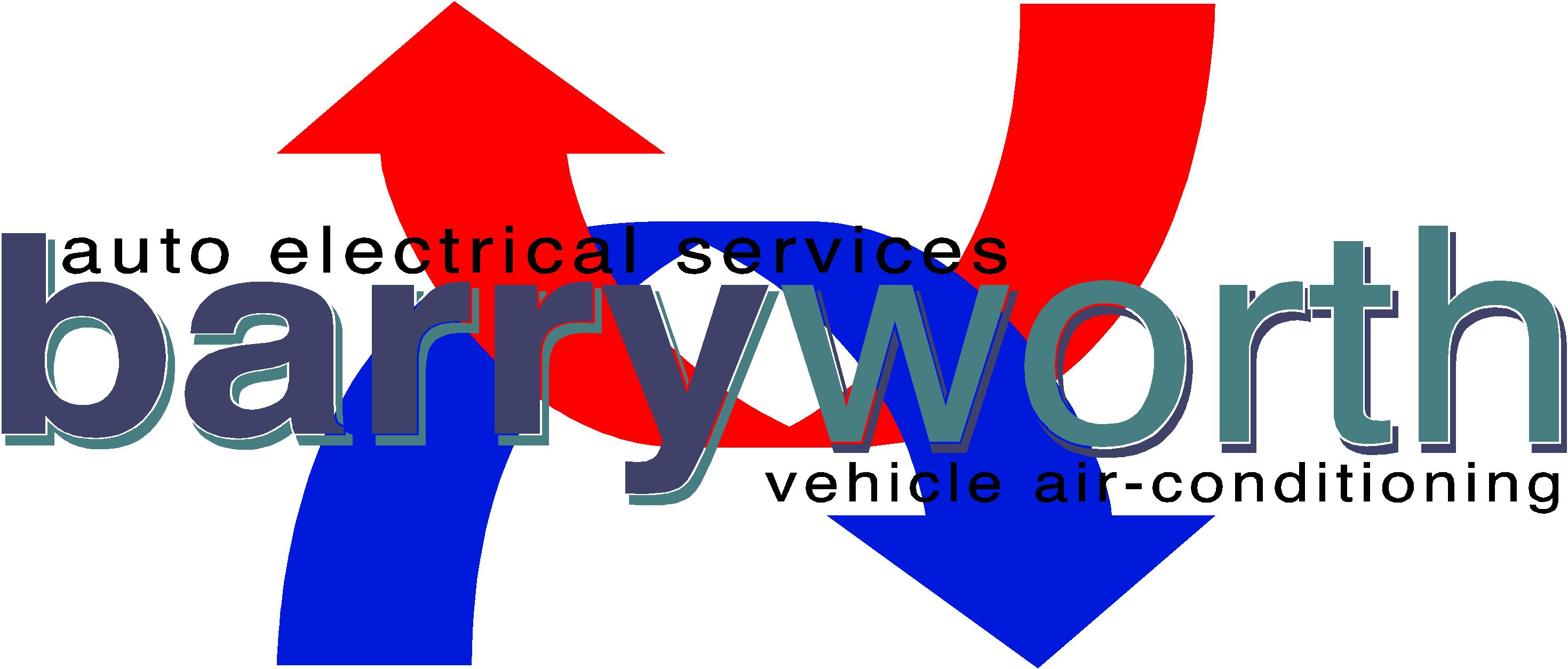
i think i got the arrows from the red and blue pipe when you regas but its not helping
Attachments:

-
i would like to have something going on to show car electrics and air con if it was me doing the car electrics i could just add a small fire to the side or behind the text but hes good very good
im off to bed my eyes are killing me
thanks rich 😉
Attachments:
-

Here Richar , something a little quickly. I hope it helps!
Attachments:
-
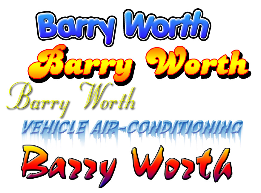
here is something to get you started, i didn’t actually create the logo, i just
tried out some fonts and played with them, i hope this gives you some ideas
Attachments:
-

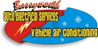
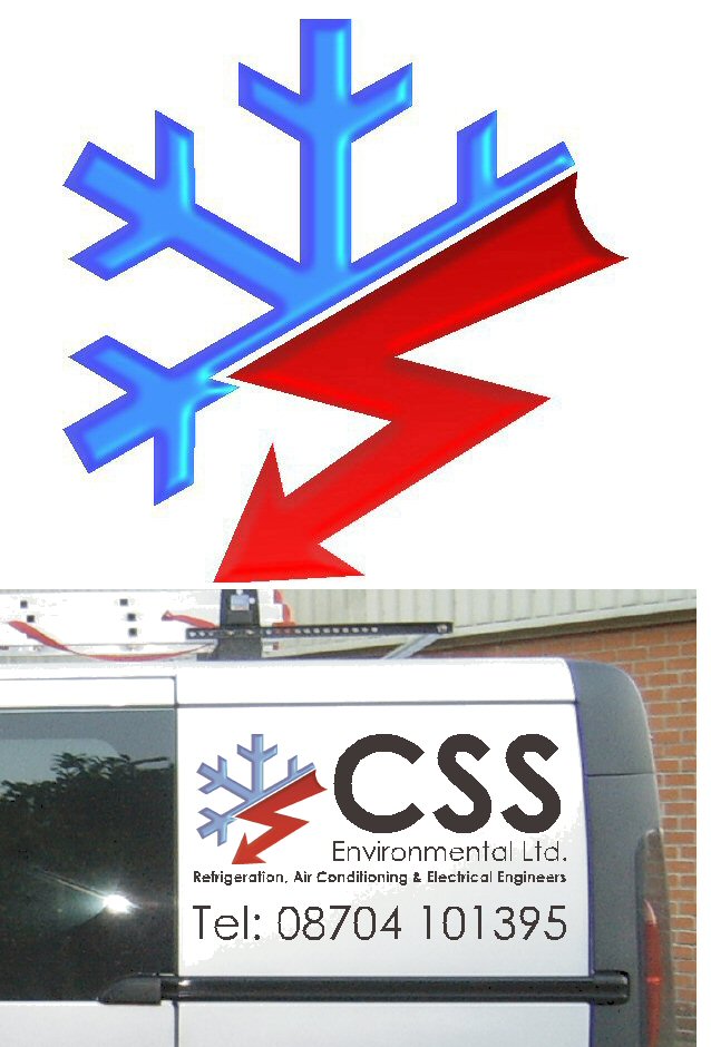
heres one i have just done….6 vehicles to do….graphics sitting here ready for fitting.
might give u some inspiration.
Attachments:
-

Ian, I really like the bevel on the snowflake-how did you create it, and is it print or vinyl?
-
created vector logo in omega exported as an eps into paint shop pro 8 or adobe cs and then colour and apply plugin eye candy bevel boss and mess about with the setiings till it looks good.
export or save as a high re tiff open back up in omega and place the vector line over the image and hey presto i have a image ready print and cut logo for the edge.
does that help?
e
-
how come your story never happens to me? i have the hardest time getting something non-omega in omega, it’s a pain to do, sometimes it imports you eps, most of the time it doesn’t.
kinda gives you that: "i wanna beat the cr@p out of the computer and run it over with a bulldozer a couple a times and knowing you’ll feel better afterwards kinda-feeling
really annoying
once i was so mad i made a sticker that said:
Gerber Sadistical Programs
Cr@p On My Pc and Operating System Every Run -
dont really know what to say to that im afraid, although i have progressed all the way pretty much from the early stages of composer to the almost latest version of omega to date.
i do have to lie to the edge on a regular basis to get the results i require and if some other user of omega picked up my design to reproduce it, they would struggle because of the way i work the software.
manual bleeds and traplines and vinyl colouring being the most confusing..
maybe u could do with some advanced training from me.lol.
yrs ago i approached the rep about using the spandex bonus points for training in bristol since i was self taught and he said not to bother with the results i was already getting as i probabaly could take the training course myself.
-

don’t know…….maybe able to take something outofit (!)
was adapted, then a w, then air, then elec then (!)
Attachments:
-

really like that too andrew….the ‘w’ as the telegraph-pole well thought out 😀 (i would have moved the small lettering down in line with the end of the red) 😉 (but you know thats just a ‘ME’ thing) 😀
nik
-
So my fly inthe ointment is that the text, "vehicle aircon etc" is to small to read at any distance. and just wondered how we got onto telegraph poles?
Peter
-
Peter,
I could of finished it but I was half watching Never Mind The Buzzcocks. 😀
-
quote Peter Normington:and just wondered how we got onto telegraph poles?
sorry peter..i meant to say electricity pole 😳 i said the wrong one 😉
nik
-

Im a bit like that Nik – Sometimes I say "Tent pole" when I really mean "Fish and chips" 😕
-
Sorry Andrew, but I have to say this You may have been subliminally influenced by the Harry Worth sitcom intro, you know, when he stands at the corner of a shop window and raises an arm an a leg?
OK maybe you are not old enough to remember, I’m leaving the room now……
Peter
-

without going into how the design came about, i recon Andrews design is more a type of corporate image than blatant advertising peter. yes it all boils down to same sorta thing i guess…
the small line of text will probably be about .75 inch high on the van, perhaps an inch at most. but still legible. 😕
I think that the overall effect of proper branding can be more advantageous to a company than fluorescent text and huge phone numbers to catch the eye of passers by. -
It’s OK Peter – I remember Harry Worth too 😕 Betcha no one remembers Charlie Drake though 🙁
-
Rob
I was being a bit flippant… .dont suppose you remember Harry Worth either,
Never mind.
Must go to bed now, cant keep up with the pace 😀
Peter
-
quote Phill:It’s OK Peter – I remember Harry Worth too 😕 Betcha no one remembers Charlie Drake though 🙁
Allo My Darlins…
Peter
-
 quote Robert Lambie:I think that the overall effect of proper branding can be more advantageous to a company than fluorescent text and huge phone numbers to catch the eye of passers by.
oh great!, thanks Rob!, you’ve just spoilt the surprise on the new design I was going to put on my van 😕 😉
-
Me and Peter were having a discussion about the works of Charlie Drake and Harry Worth – and you lot have to spoil it with your Hi brow dissection of signs and their deeper meanings… 🙄
-
quote Phill:Me and Peter were having a discussion about the works of Charlie Drake and Harry Worth – and you lot have to spoil it with your Hi brow dissection of signs and their deeper meanings… 🙄
😀 😀 😀 😀 😀
aah Barry Worth the guy with the van, he’ll do your air con stuff (!) 😉
-
Ignore that lot Phil. Whatever happened to Arthur Haynes?
peter
-
hi dennis just imported a eps and since u have so much trouble thought id explain it..
another sign co just sent me an exported a file from signlab as an eps for me, omega could not open it…sooo i opened it on adobe cs 11 and then exported it as an eps but down rated it to a version 8 adobe eps.
result: straight into omega..ta daaa…
hope this helps
-
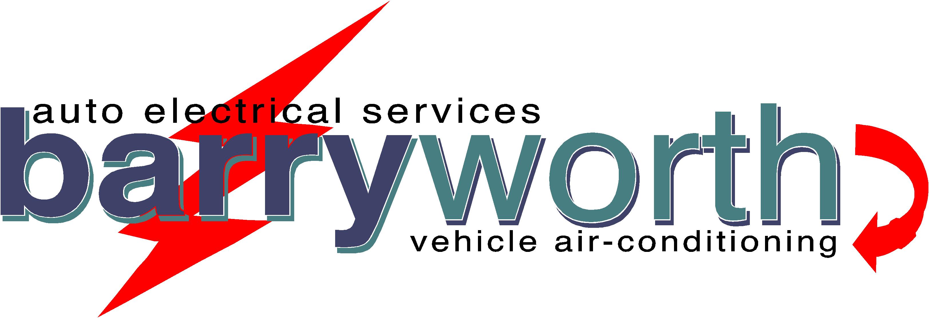
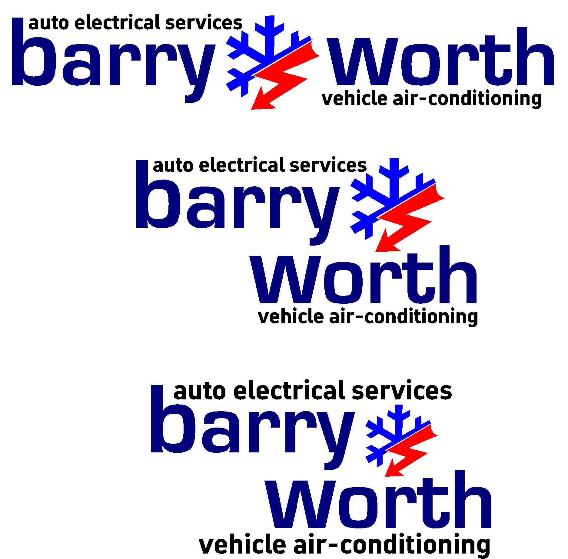
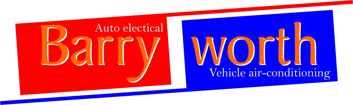
hi all thanks for your help been a bit cheeky and used logo from ian
any comments i like the bottom one due to the fact the text regarding the services is larger and as this will be on tee shirts etc hight of text need to be max
Attachments:
-
quote :heres one i have just done….6 vehicles to do….graphics sitting here ready for fitting.
might give u some inspiration.
erm sorry to burst your bubble, but the pic was to give u inspiration not a blatent copy..LOL
I hope u dont mind but id prefer it if u didnt use that flake/lightening bolt motif i designed…hasnt even been put on the vehicles yet and i have 6 of them to do…and t’s and stationary..
cheers… 😳
-
quote ianahobbs:hi dennis just imported a eps and since u have so much trouble thought id explain it..
another sign co just sent me an exported a file from signlab as an eps for me, omega could not open it…sooo i opened it on adobe cs 11 and then exported it as an eps but down rated it to a version 8 adobe eps.
result: straight into omega..ta daaa…
hope this helps
duely noted 😎
-
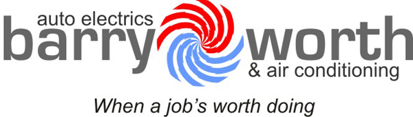
thanks richard, much appreciated.
maybe a different style flake ( not the choc variety ) and a different bolt…of course i could design u something…if there was a prize 😮
-
how about giving it a plug or so, just to throw you off and give something new to think about
Attachments:

-
hi mate thanks but he is a auto electrician so no go with the plug
-
nice work Paul i like it
this is a funny one i have been looking through old designs and the web for days
i will with the help of you guys come up with somethingthanks all for your help on this one
rich
-

[quote="Richard Urquhart"]hi all its one of these jobs where i don’t know where to start !!!!
i know how this works i come up with a design and you guys help, well i need somewhere to start and many heads and all thatOK lets begin
name Barry Worth
auto electrician
auto air-conditioningi need to come up with a logo for tee shirts and may be his van
any help would help
thanks rich
forgot to say his company trading name is Barry Worth and this has to stay[/quote]
Attachments:

-
[quote="mindaugas"][quote="mindaugas"]GG[/quote][/quote]
Attachments:

-
well got to say thanks for all that are helping with this on going task i love the last one !!!!

Log in to reply.
