Activity Feed Forums Sign Making Discussions Graphic Design Help can anyone help with suggestions on my logo please?

  • can anyone help with suggestions on my logo please?

    Posted by Bryan Cabrera on November 20, 2005 at 9:38 pm

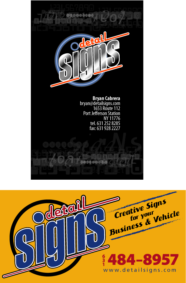
    I have been trying to come up with some logo ideas but not having much luck. Attached is what we are currently using it was designed by a graphic designer at my other job.

    The business cards look great printed (full color glossy stock) but not sure if it really translate well to cut vinyl. In addition the blue circle (on the bus card) has a neon effect and I don’t want to give the impression that we do neon. The second graphic is a magnet sign I had done. I am so used to seeing the logo that I have lost all objective.

    Any suggestions or criticism would be much appreciated.

    Thank you,

    Bryan


    Attachments:

    Shane Drew replied 18 years, 5 months ago 5 Members · 8 Replies
  • 8 Replies
  • Shane Drew

    Member
    November 20, 2005 at 9:45 pm

    Not really sure what you don’t like about these two Mate. I think they project a very professional image myself.

    Not a huge fan of black cards, but having said that, this is really effective.

    As far as the neon goes, I’d tee up a contract sign shop to handle any enquiries. You could make a bit of commission on the side just for taking a phone call.

    Are you looking for a totally new logo, or are you looking to use the same logo better?

  • Simon Kay

    Member
    November 20, 2005 at 10:47 pm

    Yeah, I’d go with the black but the other is easier to digest the contact details.

    Logo’s fine too.

    Somebody did an awsome neon effect in vinyl recently if you remember. Doesn’t mean you have to do neon as Shane says.

    Simon.

  • John Simpson

    Member
    November 20, 2005 at 11:05 pm

    Both look fine Bryan, what happened to your photo m8?

  • Bryan Cabrera

    Member
    November 21, 2005 at 12:15 am

    Thanks all. I am not unhappy with the logo, the designer who did it is very talented. He came up with the idea in minutes after I spent hours on logos I didn’t like. I was concerned about the word detail not standing out but I guess the important thing is the word signs.

    Maybe I am just afraid to commit (my ex girlfriends would agree) to it. I am going to have stationery printed and hopefully finish our website, so I just wanted to be sure.

    In any case it helps to have some reassurance.

    My photo? Trying to find a decent pic. Problem is, none exist.

    Thanks again,

    Bryan

  • Andrew Boyle

    Member
    November 21, 2005 at 12:23 am
    quote :

    Thanks all. I am not unhappy with the logo

    you should be happy……………

    long time. 😀

  • Bryan Cabrera

    Member
    November 21, 2005 at 12:33 am

    :funky: How is that?

  • Andrew Boyle

    Member
    November 21, 2005 at 12:34 am

    that is EXCELLENT :lol1: some mover?

  • Shane Drew

    Member
    November 21, 2005 at 12:39 pm

    You sound like a typical sign guy Bryan.

    You can whip up a brilliant sign and logo for a paying customer, but when it comes to your own, nothing is good enough….

    …. been there… done that….. 🙄

Log in to reply.