Activity Feed › Forums › Sign Making Discussions › Graphic Design Help › can anyone help with suggestions for my own van layout?
-
can anyone help with suggestions for my own van layout?
Posted by Dave Harrison on May 2, 2006 at 7:27 amHi all
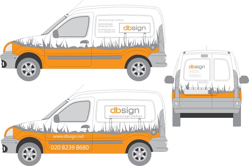
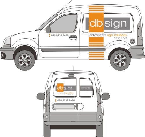
I would really appreciate your thoughts, opinions, tweeks or even re-designs. I’m taking delivery of my new little kangoo this week and need to get some colour onto it ASAP.
I am trying to transfer the layout from my business card / stationary onto the van, but am not sure if I am entirely happy with the results. I do want to keep things simple, just plain colour vinyl. . no printing. The Van is white and I don’t want to paint it so any colours will have to be applied by vinyl.
Many thanks
Dave
Attachments:
 Kevin Flowers replied 17 years, 11 months ago 15 Members · 30 Replies
 -
30 Replies
-

Hi,
i like the colour choice and the simplicity of the design, unfortunatly at first first glance i think people would expect it to be a landscape Gardners van..
Not trying to knock it but just my first thoughts..
Cheers
Ian -

Higgi now you mention it, I think you’re right it does look like a landscapers van. . . eek 🙄
I know I should really come up with something that screams " I MAKE SIGNS " but I’d prefer a subtle livery, something bright that gets noticed without being too loud and in your face. ( if that’s possible )
Thanks for your comments. . keep em coming.
-
 quote Dave Harrison:Higgi now you mention it, I think you’re right it does look like a landscapers van. . . eek 🙄
I know I should really come up with something that screams ” I MAKE SIGNS ” but I’d prefer a subtle livery, something bright that gets noticed without being too loud and in your face. ( if that’s possible )
Thanks for your comments. . keep em coming.
Yeah Dave, I agree.
My 10 yo daughter just walked past my computer as I was looking at the picture and said ‘ is that a landscaping van you are designing?’
I think that probably says how people will ‘see’ it.
I agree with the simplistic style tho, sorry I can’t be more constructive mate 😳
-

Yeh, I thought you attached a landscape gardeners too (sorry). 😕
Looks interesting though!Whatever you do it’s got to be memorable. That’s the whole point of a livery, to identify YOUR company above all the rest.
In-your-face, minimalist or cool memorable, but as you know it’s got to perform at least two basic functions. Who & What.
I had to look for both – the public are harder to get a second look from. Maybe a simple change like making the grass green might help focus the eye on the sign you planted as the colours are making it hard to identify WHERE to look on the van.Dave
ps. I’ll have a wee think on a subtle idea or two later on so it’s not all doom ‘n’ gloom!!
-
How about if I tone down / reduce the size / change the style of the grass effect and put more emphasis on the sign. .
The idea is that I want people to see a posted sign sticking out of grass,
which from everyones comments clearly isn’t happening at the moment.I’ve attached an .ai file please feel free to have a play with it.
Once again thanks for all your comments so far 😀
-

Hi Dave.
Can’t open the file, or I would have helped.
First thing came to mind was the lawn service thing.
Second thought…since when is grass orange?
Thirdly, a layout that applies to a bizcard may not apply as well to a van.
It’s nice and clean, and there’s nothing wrong with subtlety.
But I would completely lose the sign in the grass idea.
Love….Jill -
Hi Jill, thanks for your input.
You are absolutely right when you sayquote :a layout that applies to a bizcard may not apply as well to a van.It is a major challenge designing for cross media, my biggest concern is if I lose the grass and sign identity which is on all my stationary etc, I will end up with just an orange and grey van. I will invest a few more hours tonight and see what happens.
I have attached another .ai file saved as a version 9 file. . . has anyone else had problems opening the previous one ?
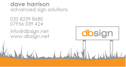
Here is my business card and what I am trying to transfer to the van.
-

sorry dave.. try a second concept then way up which one u like.
landscape with me too.. cant see the sign sadly… needs more rotation or it needs to look more like the best sign u can put up.
Replace the grass with one long curve or something… give u plenty of wrap vinyl practice 😛
another thing… imagine your van parked across the road of a dual carriage way in a city centre, customer is at the other side, what can you see? From the JPEG mini pictures above, I can just see your company name.
-
Hmmm, still can’t import into SignLab. 😕 🙁
Want to try as an EPS?!?!
-
quote Dave Harrison:……I know I should really come up with something that screams ” I MAKE SIGNS ” but I’d prefer a subtle livery, something bright that gets noticed without being too loud and in your face. ( if that’s possible )…….. . keep em coming.
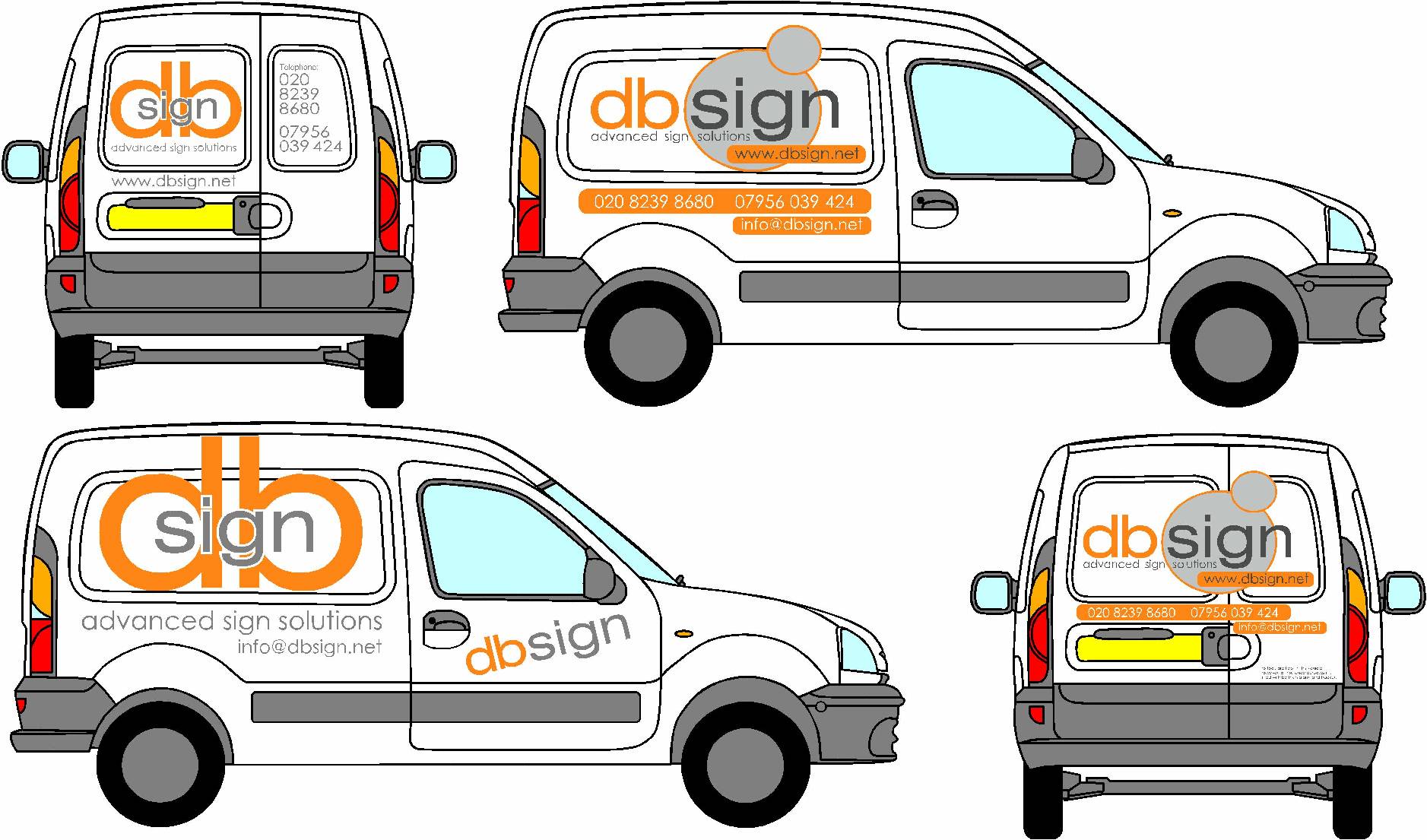
Just a couple of very rough ideas for a minimalist approach – keeps the colour scheme & general feel (I think), without buggering up your logo too much 😕 think that maybe the orange ‘outline’ circles / the db’s as reflective….now for a mad one, (evil laugh).
Dave
Attachments:
-

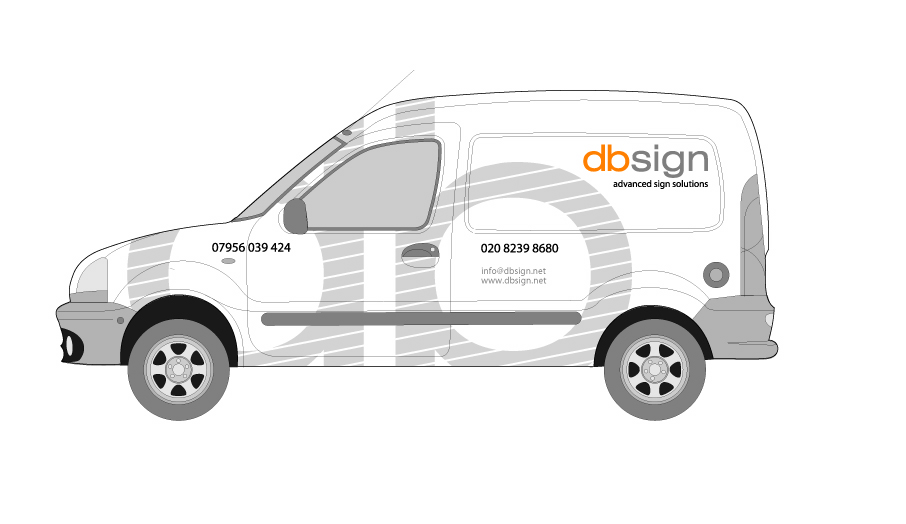
I think if you change the grass/foliage to some sort of jumble of signs (arrows , stops , etc etc) and have your sign overshaddowing em (use the grey for all the other signs , yours will pop) you will have communicated exactly what you want – "Use us if you want YOURS to pop too".
I like your first design – perhaps consider a shade of green for the "foliage" – will kinda be funky and ppl will do a double take "What are those growing out the lawn???! – Oh they signs……." -

another option………. [since I’m hatching] reflective white?
I know the sign text isn’t big ……. but heh! 😉 [Peter will be on my case]
db the letters look together look a bit the "dogs bollocks"
🙂
Cheers
Andrew
Attachments:
-
….I give up.
I can’t open any of ’em.
I might be good at sign painting but I suck at computer stuff.
Running Corel 9 on Win98SE.
I would eliminate the posts and grass.
I do have an idea, but can’t try it.
Love….Jill -
THANK YOU!!!!!!
Back later.
Love….Jill
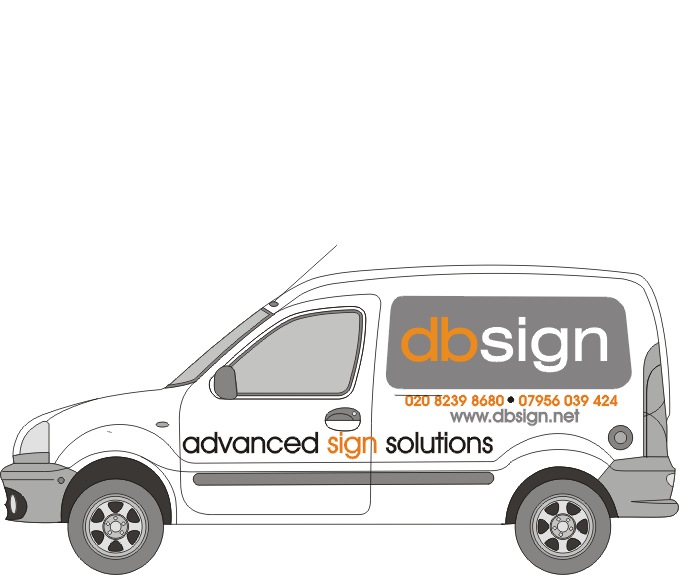
OK here ya go, quick-n-dirty yet very simple.
Love again….Jill
Attachments:
-

couldnt open the first ones and now dont seem to have the fonts 😕
i like jills one or daves one on the bottom left…
both very clear and easy on the eye… -
 quote Andrew Boyle:db the letters look together look a bit the “dogs ( oh i swore )”
…. you’re right … it’s got that kinda phallic look about it 😮 ‘Hey look at my BIG manly signs!’ :lol1: :lol1: :lol1:
-
I like Andrews, perhaps the big db in silver tho, not reflective, the other suggestions are good too.
-
 quote Andrew Boyle:db the letters look together look a bit the “dogs ( oh i swore )”
They even spell out D0gs B0ll0cks….Hey, why don’t you just call yourself D0gs B0ll0cks signs 😀 😉
-
quote Phill:quote Andrew Boyle:db the letters look together look a bit the “dogs ( oh i swore )”
They even spell out D0gs B0ll0cks….Hey, why don’t you just call yourself D0gs B0ll0cks signs 😀 😉
Thats what I like about you Phill, never frightened to offer a constructive comment….. :lol1:
-

I like Andrews idea a lot: simple but effective!
Cheers,
bart (from a sunny belgium 😀 ) -
😮 Not sure if I’d have the balls to turn up to work everyday with D*GS B*****KS written on the side of my van !
however I’m sure it would get noticed !
Anyway thanks for all your suggestions guys. . extra thanks to Andrew, Jill and David for posting concepts.
Unfortunately I’ve had to put my own van on hold this week while I deal with paying customers. However I should get some time at the end of next week after SignUK.
I’ve got some great inspiration and ideas from this thread. I’ll keep you all posted. .thanks again
Dave
-
quote Dave Harrison:😮 Not sure if I’d have the balls to turn up to work everyday with D*GS B*****KS written on the side of my van !
however I’m sure it would get noticed !
Dave
I think they’d certainly talk about you around town Dave… Don’t they say any advertising is good adverstising as long as they spell your name right…. 😉
Don’t you just hate it when people want to pay you money, and you have got other more important things to do …. :lol1:
Decided to wrap my new van last weekend as my phone has not rung much so far this monh, got the back door done, and then customers have started to walk thru the door in a steady flow, the van is on hold to get the work done.
Booked out now for a fortnight, so the van will have to wait 😕 Its murphys law with me, I can plan to take a week off, decide to sign my van, or something like that, and I’ll get run off my feet.
Got a new phone system going in on monday, whats the bet the phones will run hot all day…. 🙄
-

Another idea to add to the mix for you.
I only used one of the numbers you provided (since I don’t even know how UK numbers run – I hope it’s a correct one and not the Fax machine or something 😉 to simplify things a bit.
and
I shortened your website,,,,,since I kinda’ personally think everybody knows it is www. ( I try to use this reasoning on my customers…hmmm..doesn’t always work though 😎 )
and figured on your website you probably have ‘contact’ info.and I like the dog balls :lol1:
Attachments:
-
got my vote Leigh. :thumbsup:
I’d lose the silver colour between the orange verticle band lines personally, but thats only my opinion….
I agree with dropping the www to.
-

i think rodney has come up with a pretty good concept, using all the ‘grey’ (‘gray’ for the tanks) signs beneath your own, instead of grass, nice idea ! think i’ll nab it if you don’t 😉
-

Leigh,
i like the design if you don’t mine i wouldn’t mine using some of the design concept on my own vanKev
Log in to reply.
