Activity Feed Forums Sign Making Discussions Graphic Design Help can anyone help with shop front layouts please?

  • can anyone help with shop front layouts please?

    Posted by Cheryl Tissington on August 22, 2006 at 11:30 am

    Hi Guys,

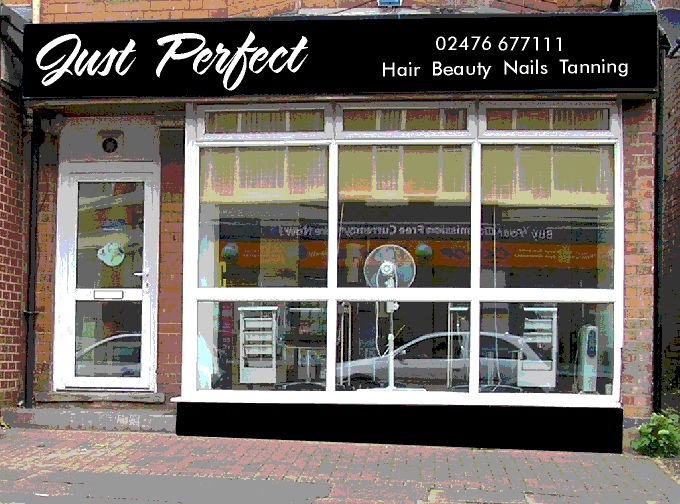
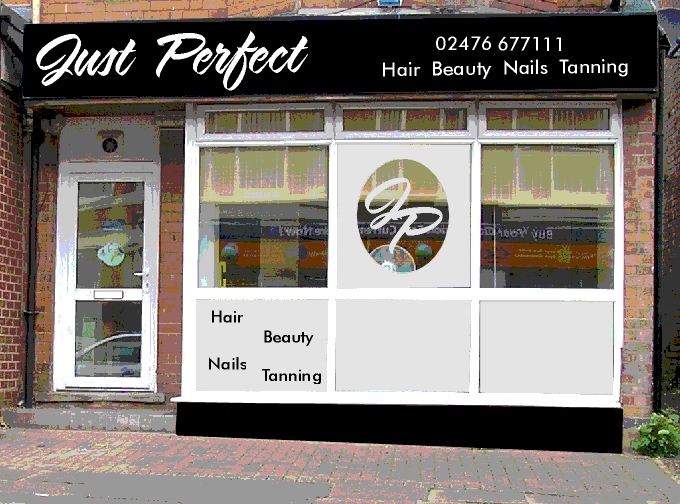
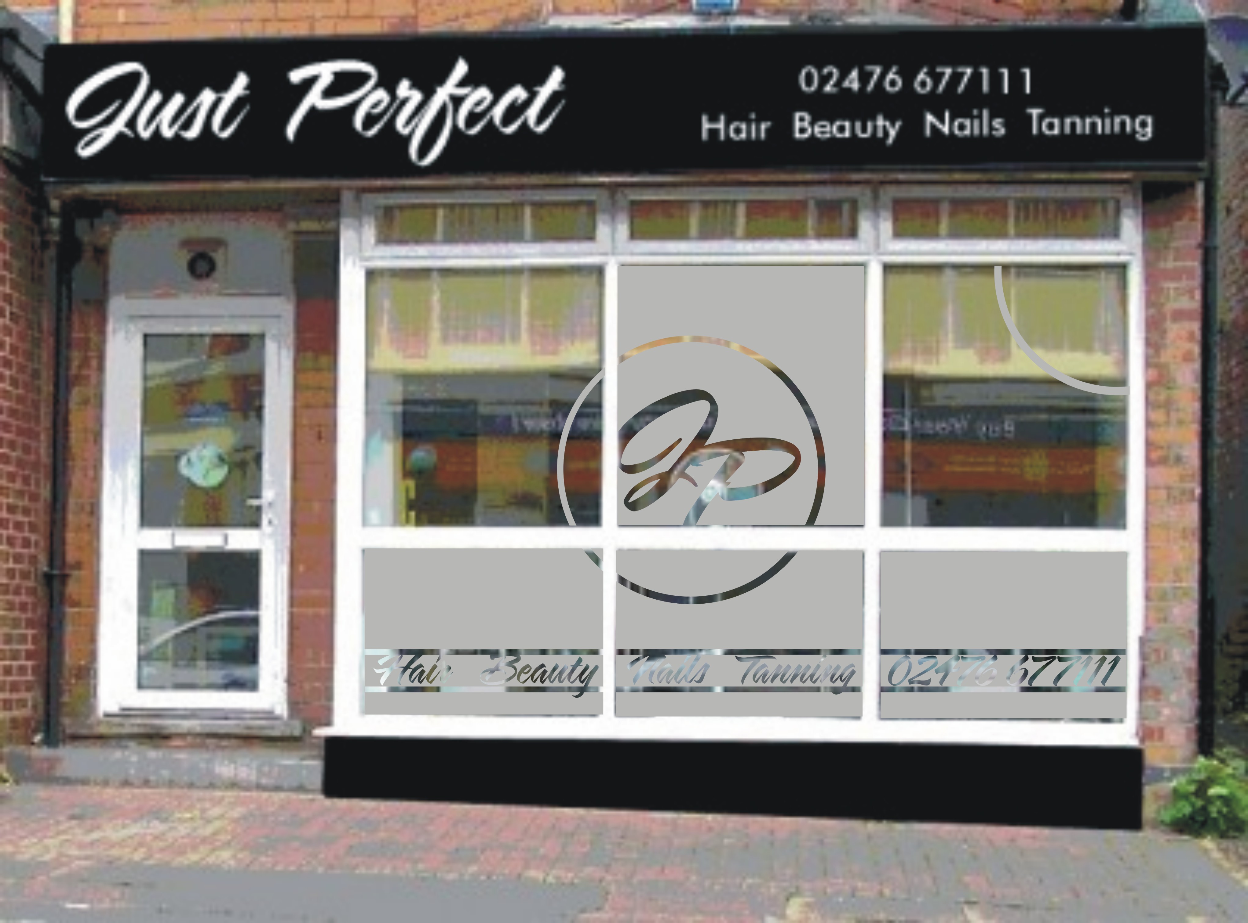
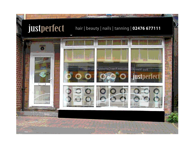
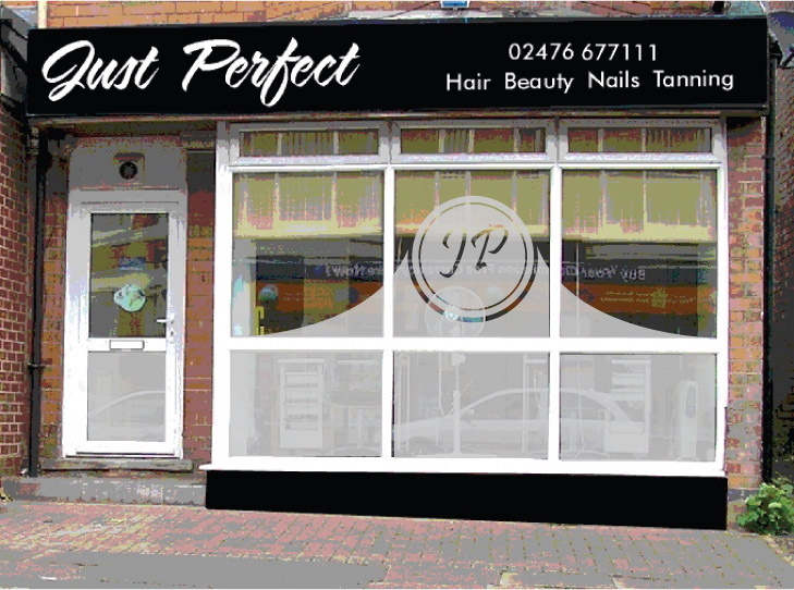
    I’ve been looking at this job for days now and just can’t get excited about it !

    The brief is to frost out the top/middle and all 3 bottom windows of this hairdressers. The client would like a large J P in a circle in the middle window 🙄

    They may also want the bottom of the door frosted too.

    I’ve considered maybe some bubbles cut into the frosting or wording to match the sign above.

    The font used is Sarah.

    Any help really appreciated if you can spare a couple of minutes.

    Cheers,
    Cheryl 😀


    Attachments:

    Dave Harrison replied 17 years, 8 months ago 9 Members · 12 Replies
  • 12 Replies
  • Martin Cole

    Member
    August 22, 2006 at 12:36 pm

    A quick lunchtime effort from me Cheryl, while chomping on my pot noodle. 🙂


    Attachments:

  • Cheryl Tissington

    Member
    August 22, 2006 at 12:42 pm

    Hi Martin,
    thanks for that. I love the idea of the off set circle.

    Regards,
    Cheryl

    P.S. what flavour is it ? 😀

  • Jill Marie Welsh

    Member
    August 22, 2006 at 3:16 pm

    Martin, that looks fab!
    Very classy and not the typical look for such a place.
    love….Jill
    PS
    Are pot noodles like Ramen noodles?
    We love those.
    My kids even eat them raw! (minus the flavor pack)

  • Marcella Ross

    Member
    August 22, 2006 at 3:26 pm

    Great design Martin!!!! I really like that!!!! 😀

  • Martin Cole

    Member
    August 22, 2006 at 4:51 pm
    quote Cheryl Tissington:

    P.S. what flavour is it ? 😀

    Chicken with sweetcorn and very nice it was too thanks Cheryl 😀

    Thanks Jill & Marcella.

    Jill I don’t know what Ramen noodles are, probably the same thing just add water give it 5 mins and down they go, can’t imagine eating them raw though 🙁

  • Lynn Normington

    Member
    August 22, 2006 at 7:08 pm

    a bit crunchy raw I would think 🙄 nice idea Martin I like that (window not the pot noodles !!)

    Lynn

  • Andrew Boyle

    Member
    August 22, 2006 at 8:58 pm

    I would probably just do something she wasn’t asking for (?) 😀

    Cheers


    Attachments:

  • Harry Cleary

    Member
    August 22, 2006 at 11:35 pm

    I like that Andrew, classy!

  • Cheryl Tissington

    Member
    August 23, 2006 at 8:25 am

    Andrew,
    thanks for that. I like that idea too.

    Unfortunately, the client has gone for the sarah font and still wants a sort of circle with JP in the middle. 🙄

    I’d appreciate any more thoughts and ideas folks. 😀

    Cheers,
    Cheryl

  • Richard Urquhart

    Member
    August 23, 2006 at 6:41 pm

    Andrew i love your look on designs
    you always come up with something different and fresh looking

    love it
    rich

  • Marcella Ross

    Member
    August 23, 2006 at 8:34 pm
    quote Harry Cleary:

    I like that Andrew, classy!

    I have to agree, it’s got a very professional look about it. Makes the shop look more upmarket.

  • Dave Harrison

    Member
    September 2, 2006 at 10:35 am

    Here is my 5mins worth, I don’t have the correct font but you get the idea.

    If it were my customer I would show them a layout including new fascia sign as Andrew has done. For the sake of half an hour messing about in illustrator you might end up with more work from the job.


    Attachments:

Log in to reply.