Activity Feed Forums Sign Making Discussions Graphic Design Help can anyone help with my van layout please?

  • can anyone help with my van layout please?

    Posted by Adrian Yeo on September 3, 2008 at 5:32 pm

    Hi all

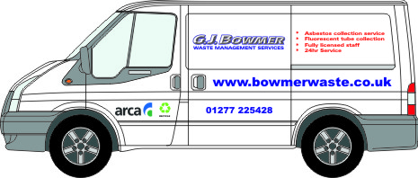
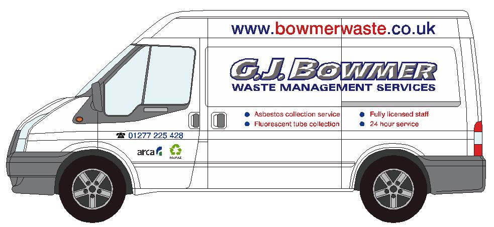
    Been tasked with doing this job for a potential new customer. Its a replacement for the one shown in one of the photo’s on the website. The original artwork looked a bit lost so rather than do a straight copy (what I think is what they actually want), thought I would have a go at changing things a bit.

    The main logo has been a real headache, they don’t have the font and the only text I could get looking close to their existing logo was that supplied by Jill. Looks good, but no lower case as such is available 🙁

    My question is…. Would you put the logo on the top or in the middle? I prefer the middle look with the long web address across the top, but what do I know!! lol

    The actual transit is a high top, hence the artwork being a bit out of place, but only had an outline for the standard tranny thanks to the Impact site samples 😀 Promise to buy the disc if I start doing a few more standard vehicles!!

    I have attached drawings below. Any advice/crits gratefully received.

    Thanks in advance

    Adrian


    Attachments:

    Peter Dee replied 15 years, 8 months ago 5 Members · 18 Replies
  • 18 Replies
  • Adrian Yeo

    Member
    September 3, 2008 at 5:47 pm

    heres the drawing


    Attachments:

  • Jill Marie Welsh

    Member
    September 3, 2008 at 6:08 pm

    You definitely need to give the name a nice punchy outline. Otherwise there is not enough contrast.
    Love….Jill

  • Peter Dee

    Member
    September 4, 2008 at 7:29 am

    I think that before anything else you should give it all some room to breathe – more white space.

  • Adrian Yeo

    Member
    September 4, 2008 at 7:32 am

    Hmmmm, looking at that now. Might shrink down a bit! Does seem very cluttered. Might cut the text down and take it from there. cheers

  • Adrian Yeo

    Member
    September 4, 2008 at 7:58 am

    Think that looks less cluttered. Do you think the rear is OTT too?


    Attachments:

  • Adrian Yeo

    Member
    September 4, 2008 at 8:10 am

    or a slight variation…


    Attachments:

  • Peter Dee

    Member
    September 4, 2008 at 8:12 am

    Better from the white space point of view but there is no design here, just bits of text plonked on the van where they might fit IMHO.
    I couldn’t open the ai file in CS2 plus fonts would need to be outlines.
    I would like to see more prominence to the name and strapline to provide the "who – what – where" information clearly and logically.
    Edit: 2nd one is better

  • Adrian Yeo

    Member
    September 4, 2008 at 8:19 am

    Thanks for the honest opinion 😀

    File saved as version 10 try that


    Attachments:

  • Peter Dee

    Member
    September 4, 2008 at 8:22 am

    Nope, file is empty

  • Jason Xuereb

    Member
    September 4, 2008 at 8:28 am

    File isnt empty. Zoom out.

  • Adrian Yeo

    Member
    September 4, 2008 at 8:29 am

    beat me to it! lol

  • Jason Xuereb

    Member
    September 4, 2008 at 8:33 am

    My take.

    Design reasons. The name is number 1. People will remember it. Website is next it incorporates the name.

    No one is going to remember a phone number from the side of the van. If someone wants it they’ll write it down. The laundry list is only useful if your stationary or parked. People will look for it if interested.

    I’d ditch that contact us line though.


    Attachments:

  • Matt Hards

    Member
    September 4, 2008 at 8:40 am

    thats nice jason, i like that more

  • Adrian Yeo

    Member
    September 4, 2008 at 8:47 am

    That looks so much better! Contact us bit was on the previous, so I would go with that.

    Best get the mastering layout book out again and read again!

    Thanks for your time guys. :thumbsup:

  • Peter Dee

    Member
    September 4, 2008 at 9:05 am

    Here’s a quick paste up.


    Attachments:

  • Adrian Yeo

    Member
    September 4, 2008 at 9:20 am

    Ohhh Buggar!! lol Like that too!

    What’s the consensus on the phone symbol before numbers? Never sure to go with it or not.

  • Jason Xuereb

    Member
    September 4, 2008 at 9:23 am

    Ask Jill 😛

  • Peter Dee

    Member
    September 4, 2008 at 9:24 am

    I hate Tel & Fax but symbols are passable and the customers like them.
    Doing it in black ties it in with the other graphics on the panel rather than leaving the number on it’s own and a bit lost.

Log in to reply.