Activity Feed Forums Sign Making Discussions Graphic Design Help can anyone help with my van layout please?

  • can anyone help with my van layout please?

    Posted by John McNickle on October 1, 2009 at 7:43 am

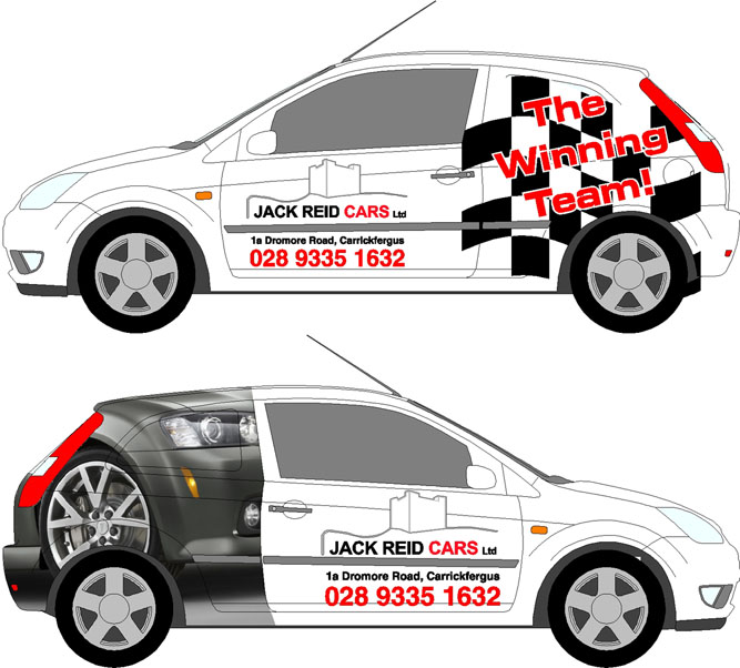
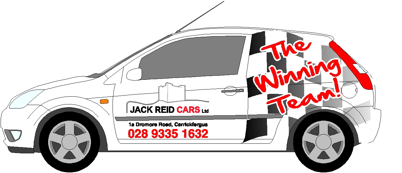
    Hi, I have a customer who is a car dealer, he got a little fiesta van and wants it to look the part which is straight forward enough but this is were i freeze, his logo doesnt lend itself to the back end of this little van, he is a loyal customer and a good friend so i need it to look good, could any of you nice folk help me out 🙂

    ps the top idea was his, i hate it!!

    Cheers
    John


    Attachments:

    John McNickle replied 14 years, 7 months ago 4 Members · 6 Replies
  • 6 Replies
  • John McNickle

    Member
    October 1, 2009 at 7:51 am

    2nd try, doesnt want to upload the jpeg


    Attachments:

  • Jon Marshall

    Member
    October 1, 2009 at 8:32 am

    The bottom one doesn’t really work, particularly as you have the car wheel right above the actual van wheel.

    His design is not terrible, maybe try doing the flag with a gradient fade on it and extending it further?

  • Mike Fear

    Member
    October 1, 2009 at 8:49 am

    I’d agree – bottom one just looks wrong.

    Top one is OK, bearing in mind from the design the customer seems happy with a fairly basic design without full colour print or wrapping on it.

    As mentioned above, try fading out the left side of the flag onto the door, and maybe straighten the text.

    Its always worth remembering that just because you CAN do full colour photo prints and wraps, they arent always the best option. On small vehicles complicated photo prints often look like they have just been put there for the sake of it, when a clean bold design like the top one can often work better and stand out more.

  • Harry Cleary

    Member
    October 1, 2009 at 9:07 am
    quote Mike Fear:

    Its always worth remembering that just because you CAN do full colour photo prints and wraps, they arent always the best option. On small vehicles complicated photo prints often look like they have just been put there for the sake of it, when a clean bold design like the top one can often work better and stand out more.

    Well said Mike…..the amount of vans I am seeing where the text is lost in a morass of unconsidered print is amazing.
    I like the top one too, maybe play with the font choice a bit?

  • John McNickle

    Member
    October 1, 2009 at 10:29 am

    cheers guys as i said i wasnt happy either way on it, didnt even push the print idea i just mocked that up in a few mins, i just had a total blank

    you have gave me food for thought

    Cheers
    John

  • John McNickle

    Member
    October 1, 2009 at 1:20 pm

    i think im getting somewere here, cheers again guys sometimes you cant see the wood for the trees


    Attachments:

Log in to reply.