Activity Feed › Forums › Sign Making Discussions › Graphic Design Help › can anyone help with my van layout please?
-
can anyone help with my van layout please?
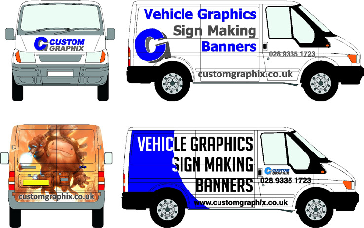
Posted by John McNickle on January 4, 2010 at 2:10 pmhi everyone, happy new year!!
i was wondering would any off you guys and gals have any ideas to help me with my own van, it needs a facelift for the new year but how come when its for yourself it always looks wrong 🙁
Im trying to make it so there is no confusion as to what i do, as some people need it spelt out to them
Many thanks if you can help
John
Attachments:
 Martin Pearson replied 14 years, 3 months ago 8 Members · 18 Replies
 -
18 Replies
-

I think you should make it say "SIGNS" rather than "Sign Making"
Is that stacked CG your logo? I would move the G over and down a bit, maybe interlock the C and G.
I would post up a mockup but I do not have a van pic and I am lazy and grouchy today.
:lol1:
What does the thing on the back have to do with signs?
Just wondering.
I mean it is eye catching but seems rather meaningless on an area that is probably the best spot on that van to put your name/website.
Love….Jill -

i get ya Jill,
I had sign making because that many people still don’t pick up on the fact that i make signs!!
+ when it is all right justified it goes in a better slant… the dude on the back was just a thing i was playing with, if it caught the eye then they would want to know more and read around to see!!thanks
John -

Hi John, for starters I would reduce everything in size around 15% to give the lettering room to breath.
Think about your negative space, it’s as important as the actual lettering.
Also you say people need ‘it spelt out to them’ then you assume they’ll have the foresight to investigate what the meaning of the rear of the van is.
Bit busy at the mo but I’ll try and post something for you later.
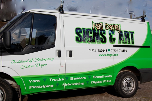
I’ve always gone through many layouts before doing my own vans so I know how you feel.
Here’s my latest van, may help a little.
Attachments:
-
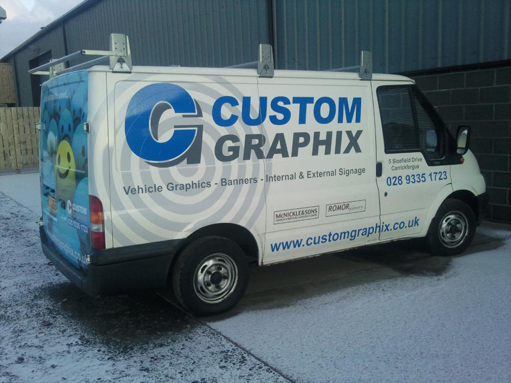
Thanks for your input Neil, i know all about my white space, it is actually better spaced on screen when full size
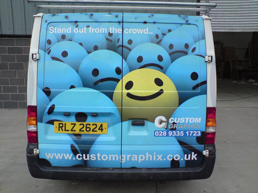
i have an image on the back at the minute with no real writing on it and it has brought me work just as it is, it must be the curiosity i guess
Attachments:
-
I like the picture you already have on the back of your van at the moment.
It sends a great message.
Why don’t you leave the back as it is and just change the sides if you want.
What do the sides look like at the moment?
Liam
-
Cheers Jill, Liam
the sides were done in a fit of madness and ive never been happy with them, as i said the back was just something i was playing with on screen, im happy with the print i have on there, but need the rest of the van a bit snappier
Attachments:
-

John, I would have to agree with Jill and Liam about the back. What you have already looks far better than the new idea. In fact I would go as far as to say that the sides already look far better than the new ideas you are toying with.
Why do you feel you have to change it ? Is it simply because you have never been happy with it and feel you could do better ? Don’t forget it is far harder to design for yourself than design for a customer. -
I like the sides better as they are too.
If it ain’t broke, don’t fix it.
🙂 -
 quote Jillbeans:I like the sides better as they are too.
If it ain’t broke, don’t fix it.
🙂same thinkin
-
cheers again for your opinion guys, i just think i need the main points made bigger as they get a bit lost and i want to smack people in the face with the message of what i do 🙂
-
I Agree with the comments so far that the sides are better as they are than your new ideas. I like the back as it is too.
If anything why not try and redesign or revamp your logo. I guess the ‘C’ is very dominant and the ‘G’ is a little lost behind it.
On the whole I think your van looks fine.
-

back doesn’t go with the sides and the sides are nice but i think could do with a bit of design work.
-
John,
I think the sides look good as they are as well. I don’t think you need to change it!The only thing as others have mentioned is your logo, personaly i would have the g slightly further drop shaddowed than it is from the c. But that’s about it.
I think the van looks good, it’s not boring, but it’s not over the top. A good balance.
Liam
-
i know what you are all saying about the CG it has went through a few changes and its looking better now, you know it is a C and a G now so mabey ill just freshen the logo up
cheers again as you know yourselves when its for yourself your never happy and once its done its like a mechanics car – never looked at again!!
-
John, I don’t think making the size of your services any bigger will attract any more business and I believe you run the risk of having people believe that’s all you do if you make it to big but thats just my opinion.
You could try changing the colour of the services to make them stand out a bit more but as I have already said I like it how it is already.
Log in to reply.
