Activity Feed › Forums › Sign Making Discussions › Graphic Design Help › can anyone help with my own car layout please?
-
can anyone help with my own car layout please?
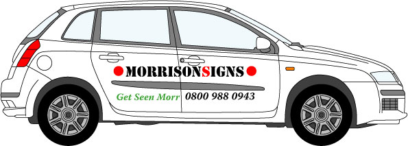
Posted by LeeMorris on March 9, 2007 at 10:53 pmHi
I have now got a new car and need to get some writing on it, but like everyone says you can’t design your own car. I have tried loads of different colours, styles, graphics etc: But its not coming together, I think less is more and don’t want to cover it all over and make it flashy.
Any ideas would be great
Its a 2003 fiat stilo 5 drThanks
Lee
Attachments:
 Dave Martin replied 17 years, 1 month ago 15 Members · 30 Replies
 -
30 Replies
-

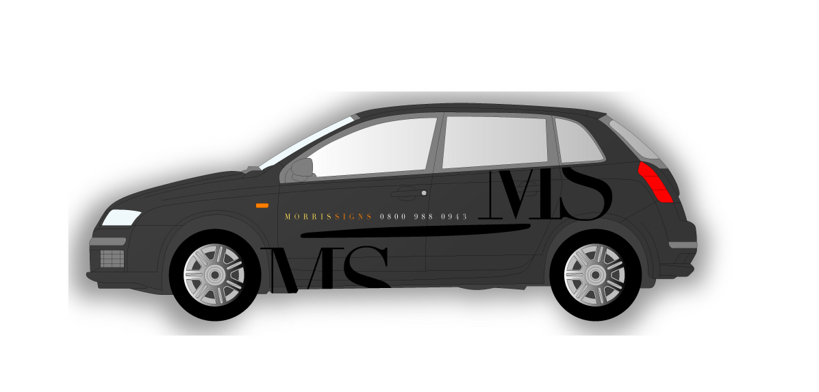
I’m sure lots of people will help you as you’ve made an effort yourself.
Here’s a simple 5 minute take on it.
Cheers
Joe
Attachments:

-

Thanks Joe
I did do something like that with the MS on the rear quarter looks better how you done it.
thanks for taking the time
Cheers
Lee -

I like what Joe has done there. I think car graphics should be simple and stylish. Good one Joe.
-

think you owe Joe a drink thats class might like to change the btm line tho
Chris
-

can you post the template…………like the idea of simple 😀 😀
interested in following this thread (!)
-

Best I can do at this time on a sat morn.
I will be needing some advice myself soon regarding my motor and a company name.
I’m thinking about budweiser signs.
Attachments:
-
 quote James Martin:Best I can do at this time on a sat morn.
I will be needing some advice myself soon regarding my motor and a company name.
I’m thinking about budweiser signs.
get seen morr? not on the budweisers now are ya mate :lol1: :lol1:
-

Hi All,
I like Joe’s effort – looks good.Heres my quick effort, bit basic but stands out.
Cheers John
Attachments:

-
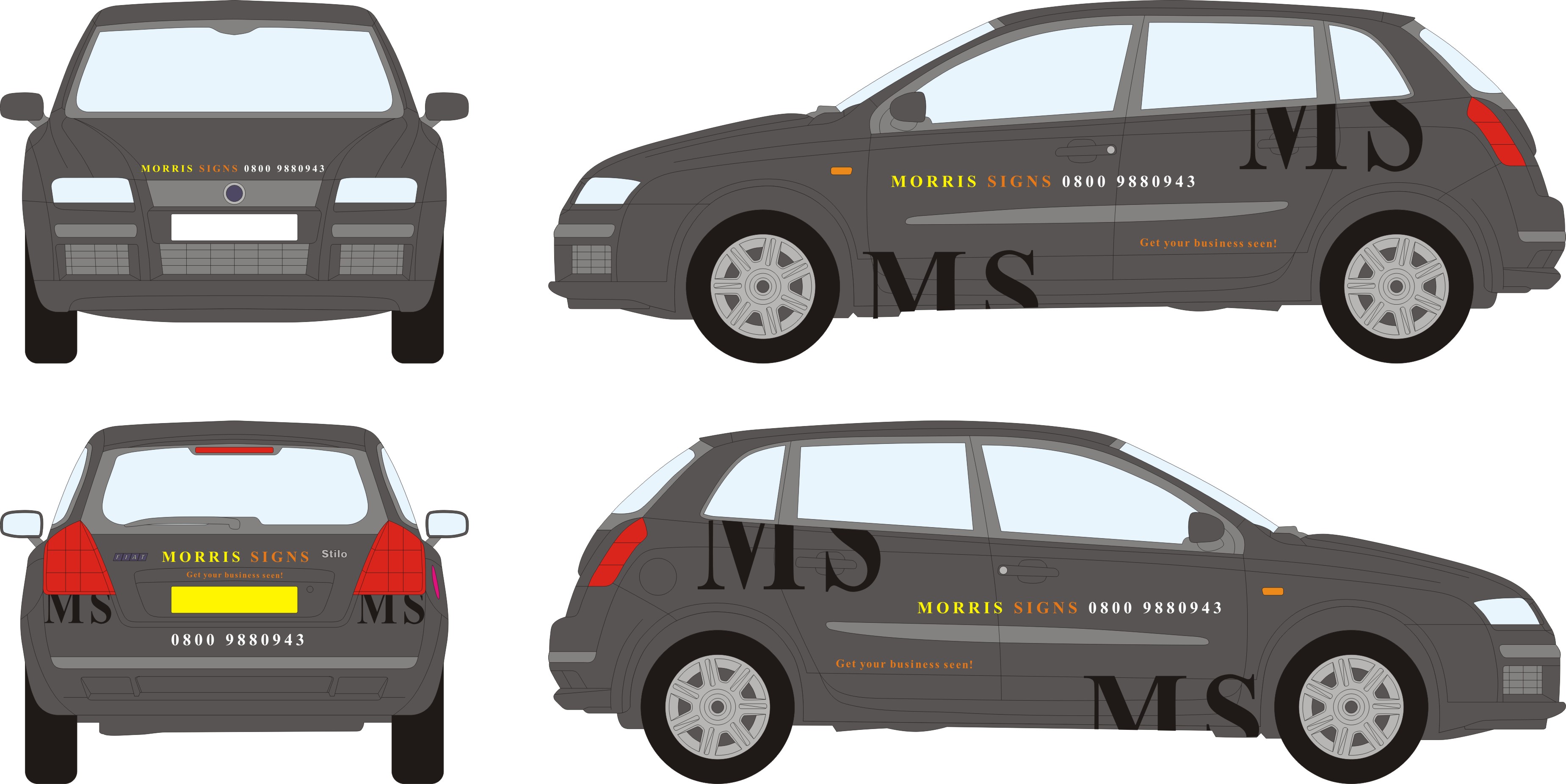
Hi Guy’s
Thanks for the input, I did you Andrews idea on my last car ( thanks to Peter and Lynn showing me how its done).Attached the outline
cheers
Lee -
need to start with the logo first……..I think.
I know this isn’t realistic but 😀
Would be interested to see how your last car turned out.Cheers
Andrew 😀 😀
Attachments:
-

Sorry if i’m hijacking the thread, but I like this kind of style. Me own motor!
-
Andrew
you always come out with such good designs i like it.
got a picture of old car with the grid you designed but not on my computer at moment.Karl
I like your work looks great would like that on my car but no put advertising something i can’t do yet .Cheers
Lee
-

Well you certainly have a bit more choice now Lee, I agree with you about the wrap, if you are not able to do that sort of work yourself then try not to push it to much. Plus you would have to pay another signmaker to apply it for you.
I have a similar problem at the moment, I think I would like to put some graphics on my car and start doing a bit more work again but doing your own design can be a real headache.
-
This is the design that Andrew did
Peter from LP Signs applied the graphicsLee
Attachments:

-
quote Andrew Boyle:7 – 11 my dawg’s dead…………………………
Dead? How? what sort of dog?
Sorry to hear that Andrew 🙁
-

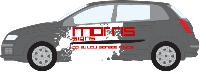
ok so ive never really done this before so please tell me if ive done something abit silly, i know it would be a bit funky to fit but ive allways thought red to be the best colour to go with gray/silver.
Attachments:
-

like your splashes…..but would have changed the font….my constructive crits. its not readable being especially red 😉
nik
-
well as i work as a designer i never really seem to think to much about the application of materials etc (ie everything on paper). Its hard enough designing posters for a target audience of about 5’6 – 5’10 whilst being 6’9! having to think about vinyl textures and indents is a whole new ball game to me.
-
quote boxroom:well as i work as a designer i never really seem to think to much about the application of materials etc (ie everything on paper). Its hard enough designing posters for a target audience of about 5’6 – 5’10 whilst being 6’9! having to think about vinyl textures and indents is a whole new ball game to me.
i know what you mean…..believe it or not i hate designing stuff for the stationary side of things, its all too small, i know that sounds daft, cause i know i can reduce it it all to fit……it just drives me mad 😮
nik
-
yep. it can be helpful mounting pop-ups, but it used to be a pain as i allways used to design stuff for my eye level, getting the POI (points of interest, headlines etc) correct was a bit of a pain when i first stated.

Log in to reply.
