Activity Feed › Forums › Sign Making Discussions › Graphic Design Help › can anyone help with my new logo please?
-
can anyone help with my new logo please?
Posted by Erla K on November 15, 2006 at 2:40 pmHi, I’ve seen a few topics here about logos for our own companys & thought I’d look to you all for a little help.
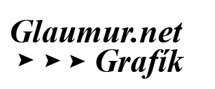
My business is mainly vehicle graphics & my logo has to look good in about 6"-7" wide but not to small to cut. The companys name is "Glaumur.net" & I have this bad logo my brother made for me but I am totally clueless how the new one should look. I think it should be just one color to make it easy.
Would it be cheesy if I just used fonts for the logo like the pic here beneath?Adam McGuire replied 17 years, 6 months ago 6 Members · 19 Replies -
19 Replies
-
Ok here goes , I’m not going to give you specific ideas.
The logo you posted is not readable, that font does it no favours
Your logo should be simple , easy to print , engrave , vinyl cut , laser cut etc,
Glaumer.net means nothing at all in terms of communicating what you do, either use a bye line like "Vehicle graphic specialists" or change the name to something that at least gives the reader some idea of what is is that you do.
make a list of what makes YOU competitive in the field , try identify the key one and try encompass it in your logo.
For example if you offer a cheap and cheerful service , make your log reflect this , if creativity is your bag , then make the logo something creative. If old fashioned service and delivery are your thing , use a nice "Dependable" font , like times roman.
DO NOT use frilly fonts , or funky ones or cartoon characters or cheesy puns or anything tacky unless you want to be thought of as tacky.
Do not use faded drop shadows or fades of any type in your logo , keep it clean and simple and to primary type colours
Do include as simple graphic that can illustrate what you do , like in your case some generic modernish sports type car with dual side stripes clearly being peeled away (as in applying)m would work.A Vinyl cutter seemingly cutting a chequered flag would work too.
The proportions and elements of your logo should follow these rules
Ratio of 3:2 ie a 3" x 2" logo and follow the rule of thirds
http://www.silverlight.co.uk/tutorials/ … hirds.html
for more explanation.
I think you going thru this exercise yourself will be of far more value than me coming up with some arb logo when I don’t know your co and markets and image and approach to business 1/1000th like YOU do .:) -
-
Thanks to both of you, I am going to design something & follow your speculations for my logo. I’ll post it here later
Thanks again! 😀 -
-
I think it’s called Creampuff and it’s a freebie.
http://desktoppub.about.com/library/fon … ampuff.htm
The "swoosh" is a hyphen from a casual script.
Love….Jill -
quote Erla K:Here is one very simple, I added Grafik to it, I am not sure of the font though, its simple Times NR. I would like a bolder font.
mongrel to weed small tho Erla. I’d stay with a font in a more modern block style
cheers
-
-
Is the kerning out on the word ‘grafik’?
Like the middle one, by the way.
-
Yup, you definately need to work on your kerning…on all the examples.
Never just type out words and cut or print without checking their flow.
Love….Jill -
Kerning… are you talking about the space between letters? Is it different from the "glaumur.net" ? I dont see it but I have been sitting with a computer for 8 hours straight now 😕
I did this in Photoshop & didnt measure anything but it should be the same space hmm… 😮What kind of fonts are block fonts, you mean Arial or Courier?
-
quote Erla K:Kerning… are you talking about the space between letters? Is it different from the “glaumur.net” ? I dont see it but I have been sitting with a computer for 8 hours straight now 😕
I did this in Photoshop & didnt measure anything but it should be the same space hmm… 😮What kind of fonts are block fonts, you mean Arial or Courier?
The spacing between the u & m, and the u & r on Glaumur are slightly wide, and in the Grafik the spacings are all over the place.
-
OMG I can see it ! 😳
I will redesign the logo in my cutting program & if it is ok I would like to get "approval" before I start cutting 😛quote Lorraine Clinch:quote Erla K:Kerning… are you talking about the space between letters? Is it different from the “glaumur.net” ? I dont see it but I have been sitting with a computer for 8 hours straight now 😕
I did this in Photoshop & didnt measure anything but it should be the same space hmm… 😮What kind of fonts are block fonts, you mean Arial or Courier?
The spacing between the u & m, and the u & r on Glaumur are slightly wide, and in the Grafik the spacings are all over the place.
-
I like the one titled "gl4.jpg" although as people have said, the kerning is a little wrong.
My problem is, I like my logo, only it’s a pain to weed! I have to apply it whole then sit and weed out the bits I don’t want. I’ll post it if I’m allowed?
Adam
-
I like to use a caps and lower case script over top of an all-caps letterstyle.
This way you have a nice straight bottom edge on the script that can be butted right up against the lower panel. This gives a "grounded" look.
This would not be too hard to read or weed.
I used Bank Gothic in my example but any nice sans-serif font would do.
Love….Jill -
That looks good Jill, I hate designing logos sometimes! Where do you get inspiration from? Some of those ideas people have posted here and on the morris signs thread are really good! I like doing logos when I have ideas, but nothing seems to look good to me if I can’t come up with something basic first!
Adam
-
Thanks Adam.
I am pretty much a one-trick pony.
My brain works really fast and a design will just pop into it.
Then I go to Corel and try to make it look on the page as I see it in my head.
Sometimes it works, sometimes it doesn’t.
I am very creative…to a point.
When it comes to my own stuff I often struggle, because then I am dealing with a "real" client who 9 times out of 10 wants all-caps Brush Script in an arch! Or some "design" their wife did in Word.
If you read Mastering Layout by Mike Stevens, or get your hands on a reprint of an Atkinson or Strong book, and study the layouts, it does help to teach you what basic rules to apply to any design.
Once you have your "bones" so to speak it is easy to build the design onto them.
Things like kerning are very important. As I’ve said earlier, never just type words out without checking their flow. When I’m using a script I always break it apart and rearrange the letters until they look "right" to me.
That’s where hand-lettering skills come into play. When you paint a letter, you learn more about its construction and the way it should look if rendered properly.
Color is important too, as well as contrast.
What looks good on your computer screen might be unreadable on a large sign or a wrap.
I have only got into designing in the last 18 months, before that I always just called myself a sign painter. What’s nice about logo design is that I can sit at my desk and never get my hands dirty!
Sorry for the diatribe folks.
Love….Jill -
Thanks Jill, I’ll have to have a play around with my own logo, maybe create lot’s of different logos. That way, I’m getting practice, and I’m not wasting other peoples time!
Adam
Log in to reply.


