Activity Feed › Forums › Sign Making Discussions › Graphic Design Help › can anyone help with my design for new van please?
-
can anyone help with my design for new van please?
Posted by Matt Hards on September 13, 2006 at 8:16 pmWell just bought my first van two weeks ago, and now its time to think about some graphics. I have come up with this, I like it personally, its not too busy with information but it is very striking i reckon, I want everyone to look at it, remember it, love it or hate it, lol. Let me know what u think.
Attachments:
 Matt Hards replied 17 years, 6 months ago 13 Members · 31 Replies
 -
31 Replies
-

Love the logo Matt, just wouldnt be sure if the font you have chosen for the rest of the info is going to make a big impact. Love it overall, just think it could look more punchy. My tuppence worth anyway.
-

Matt,
I am not going to comment on the design, but I always advise my customers not to put more than one contact number, its not necasary,
and the space can be used for other things.Peter
-

Hi,
I know how hard it is to design your own vehicle… just done mine with a lot of help from folks on here.
At first sight it looks a little like a recovery/service vehicle
having said that I like the way you have tapered themI do not like the font you have chosen though on the sides, only my opinion though.
If you attatch an ai file I am sure a few folks will give you a few ideas.Also if you are doing the roof so people in offices etc can see it you need the phone number up there.
Cheers
Ian -

I’m not sure that I like the font you have used either. All looks a bit too busy for me, but I’m a less is best kinda guy…
I think you have way too much text in truth. That, combined with the ‘safety stripes’ effect is a bit much for me.
I agree with Pete though, you have got so many contact details there. I’d have one phone number (my mobile) and my web address. I assume they can contact you via a link on your web site? You really want them to look at your site anyway, so I’d be directing them to there.
That would be an easy way to de clutter first.
Thanks for sharing
-

Matt
If you like it then thats what matters,
Personally I don’t like it, the colours although striking are as Ian says to recovery vehicle looking.
It lacks continuity, with wording being to large and placed in any available space also I would loose the top layer of chevrons at least!However I like the idea of graphics on the roof, never thought of that.
Just my constsructive crit, I’m sure some people on here would try variations on it for you if you supplied an Ai file, I for one would give it a go.
Martin
-

Thanks for your comments guys, a phone number on roof, will add that, what do you think is the sort of font i should be using then, i just want it to be clear.
My idea was to be very loud and bright, but the text still clear and visible, hence keeping the loud to the bottom half, and text in a more quiet part.I like less is more too, but I dont want my van to blend in with the crowds.
I agree with the contact details, I just dont know whether mobile or landline is better, I think mobile people can always get me, but landline looks more proffessional.
My website isnt up and running yet but there is a link for email on there, so maybe keeping the site would be better.
PS the striping is taken from the idea of the skyline in 2 fast 2 furious.
-

Sorry Matt I am not keen on that font either, I will give some thought to it as the name needs a flow if you know what I mean get back to you on that . but well done for using the roof I have been trying for years to get my customers to use the roof people in offices,flats gazing out of the window 😎 I also don’t like yellow on white 🙄
Lynn
-
Matt, use a landline number , just divert to the phone of your choice when elswhere, That way it dosnt look like you are a one man band (nothing wrong with that) but more people will call, I would not call a firm that gives a mobile as a point of contact,, anyway thats another story.
Are the chevrons going to be reflective?
Peter
-

Don’t take this the wrong way….
but it is busier than a cat trying to cover crap on a marble floor!
With a wooden leg!
The only thing to me that stands out is that it is just soooo busy.
While I love the name of your company, the fonts you’ve chosen look very unprofessional.
I could see using a NICE script for the name.
And something clean and sans-serif for your services.
You could do something so neat using the idea of looking into a kalidoscope (sp?)
You know, the colored shapes they use? Like in a circle.
I don’t have time to demonstrate tonight.
I thought it was an ambulance at first.
Sorry to sound so harsh, but you did ask.
love…Jill -
-

I agree with most things…..
The font used for the text looks dodgy [as if the computer couldn’t find it]…The spacings all over the place…Would probably only work for a logo with a few letter and even then you would have to manually change the kerning.
I would change the typeface….keep the logo….make sure all text was justified and lined up to something….
I like your idea of being bold bright yet not too fussy though…
Cheers
andrew 😀
-
the logo is handwritten by me by the way, its not a font. I have a few different logos i use.
-
I like the hand written logo Matt 😀
apologies I’m talking about the sub text…
-

nice handwritten logo matt 😀
keep it..work on it cause its original….. 😉
nik
-

have to agree with whats been said so far….
if you used a few different logos it can lead to confusion for customers..
you want instant recongition from your van to your card,
get an image or logo that suits and stick with it,its a real pain trying to do your own stuff, i think we all feel like this at some point….
why not post some of your other ideas for logos?
brian
-
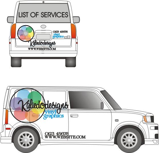
Here’s a suggestion.
Sorry the only template I had was a Scion!
And I spelled Kaleidodesigns wrong.
But this is what I was trying to describe.
If the name is handwritten, maybe just beef it up a bit.
Love….Jill
Attachments:
-
I also have another problem that the middle panel on side of van is a window, so I have to take that into consideration, plus there is a bit of dodgy paintwork to be sorted on the bottom, hence the chevrons idea would cover it up. But maybe a block colour may be better along the bottom?
Jill I like your idea with the kaleidoscope idea. Maybe add that sort of thing to the handwritten name to create a better logo,
maybe as the dot on the i somewhere???? -
Matt you are a sign maker and know the same as all of us you can’t hide dodgy paintwork with vinyl it just shows up more 🙄
Lynn
-
…I always hide the stuff on my vehicles with 1-Shot!
😳
OK, here is one combining the two of ours.
Suggestions on your list:
SIMPLIFY.
You already have "graphics" in your biz name.
I’d stick with 1 email thingy and 1 phone number.
love….Jill
Attachments:

-
now i like that…colours look great on the stripe too..
well done jill, impressive as always
-
thanks jill, that looks really good,
I will put those ideas onto my outline 2moro and have a play, ill post back on here 2moro! -

Jill!
Love that last design with the coloured stripe!
I’m stealing the coloured stripe for my van! :lol1: :lol1:
Cheers
Joe -
As promised an effort from me, while supping on me tea and ham sandwich.
Scraped your font altogether Mark.
But loved Jill’s idea of using colour, so came up with this.
Somethinhg to ponder on maybe 🙄
Martin
Attachments:

-
You’re a talent Martin.. I like yours and Jills a lot. Certainly stands out, but does not look ugly at all. Certainly both designs are food for thought.
-
Thats hugely impressive Martin, I also like Jills 2nd one. A perfect lesson in Impact signage.
-
Thanks for that, that is a really nice logo , i like that. Thanks for all your help. I still have to confess that I like my idea and have played some more today, and toned it down, ie, just blue single line of chevrons etc. changed the fonts etc. I think i have found a happy medium, I will let you know the outcome.
🙂 -

Many good points of advice here mate, so i dont really think i need to add…
my personal view is, im too am not fussed on the overall look/design. i think it needs a focal point. all else can be listed if you really want but should be laid out well. when designing your own vehicle all to often you can create overkill, general information too big and bold etci like jills second logo design and also martins.
i kinda feel there must be more enphisis on the word signs though. i dont mean anything drastic i just mean it needs singled out in some way, not sure exactly how just now.
kaleidosigns as a word is long.
kaleidoSigns same word little tweak?bad example maybe and im beginning to babble… 😳
-
is it not kaleidodesigns 🙄 or did I read it wrong ?
sorry did write it wrong kaleidodesign sorry 😳Lynn
-
quote Shane Drew:You’re a talent Martin..
Bless you Shane….cheques in the post :lol1:
-
hi guys, just thought id put a link up in here, show you what i did in the end, Im pleased with it.
Already had lots of people saying they have seen it around and people always stop to look at it. So hopefully itll do the trick.
cheers matthttps://www.uksignboards.com/viewtopic.p … 009#175009
Log in to reply.
