Activity Feed › Forums › Sign Making Discussions › Graphic Design Help › can anyone help with more layout suggestions please?
-
can anyone help with more layout suggestions please?
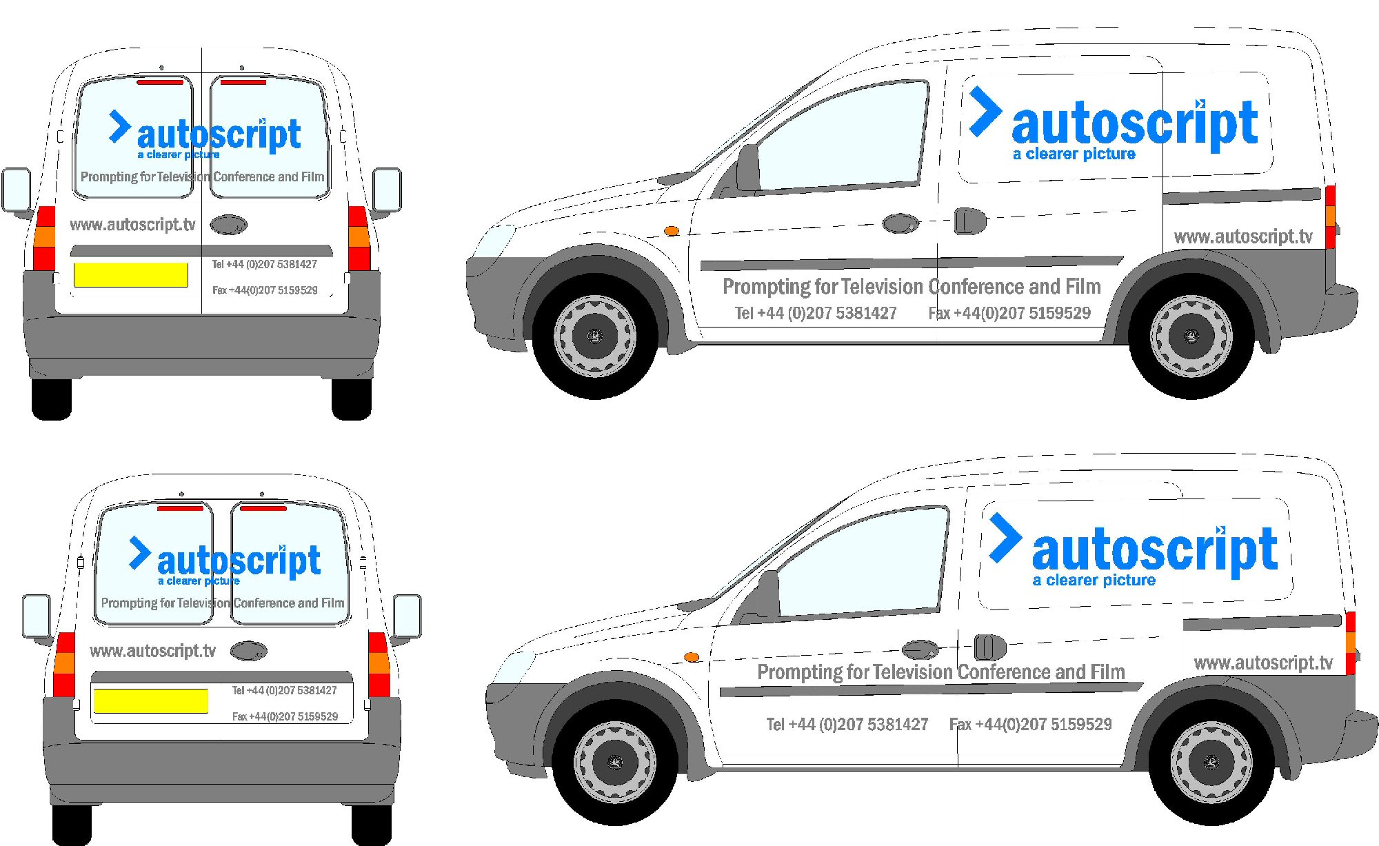
Posted by Richard Urquhart on December 6, 2005 at 3:03 pmhi all can any one help with this i’m not happy with what i have done
any suggetions please thanks rich
Attachments:
 Carrie Brown replied 18 years, 5 months ago 10 Members · 17 Replies
 -
17 Replies
-

Can you pop it up as a vector so we can have a play
paul r
-

paul hi mate cant get the file size low enough any ideas
-

Sorry I havent got much time to reply but the first thing that Im not keen on is the tel nos, do they have to have the “+44 (0)” on them? also Im not too sure about the website not running in line with the other grey text but Im a bit short of ideas as to how to redesign it so that it looks balanced. Its a bit of a tricky van to sign as all the panels are at different angles.
-
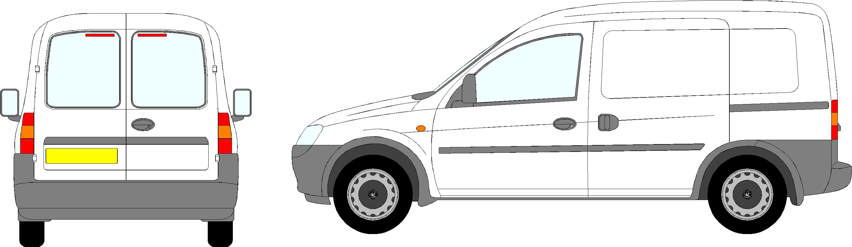
I was just going to ask the same, can you perhaps post just the side as a vector?
-
That’s odd
Vector file sizes tend to be quite small
What if you keep the vehicle as a jpeg then brian shouldn’t get to upset and upload the text as an eps or ai file
paul r
-
-
Can we muck about with the logo or is that set in stone
paul r
-
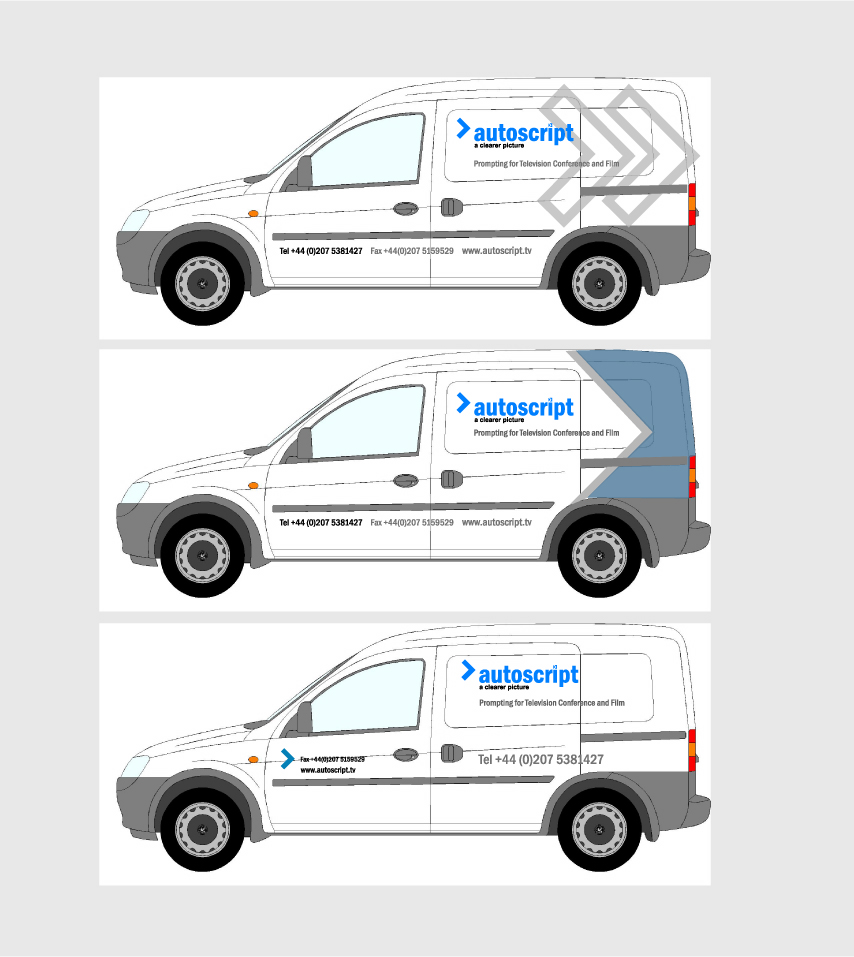
on this one i think its worth a play about
let say i think there is plenty of room to move
thanks rich -

It actually doesn’t look bad. How about using the ‘>’ a bit more? Maybe a large one in a really light shade of grey or blue with current design on top.
-

I did have a look at the web-site earlier. and the logo is as on the van. Sorry, no time for anything else.
Good luck.
-
yes thats right i did vector the logo from a bad j peg but was very easy i guess the logo has to stay the same but could it not have something to tie it all in
thanks rich -

nice andrew 😀
im in a toss-up between one and two…. 😀 your good at grasping the concept and working on it 😀
nik
2 😀
-

im playing catch up here, only got home about 2am this morning… been in london since friday night.
andrew i like middle one best, like 1 too… so im with nik on this, but two gets my vote. i like the colour of blue you have used, something i notice in your designs is the don’t always go for the norm.. which is a good thing in my view.
-

Number 2 looks nice, nice design and catches the eye.
😀
Log in to reply.
