Activity Feed › Forums › Sign Making Discussions › Graphic Design Help › can anyone help with layout suggestions for company van?
-
can anyone help with layout suggestions for company van?
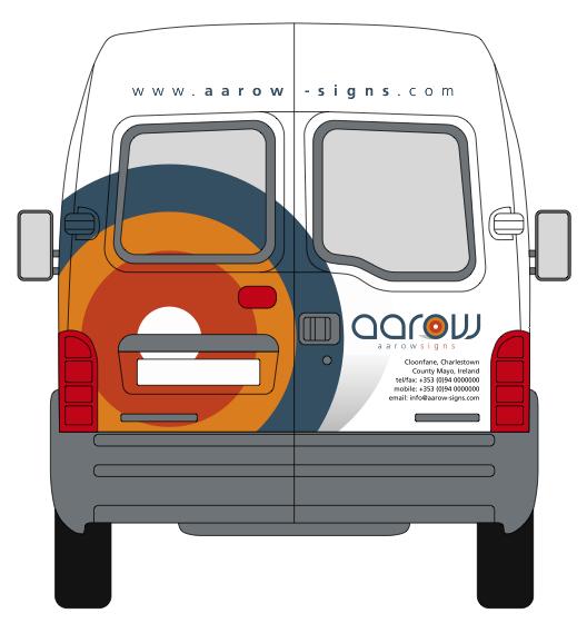
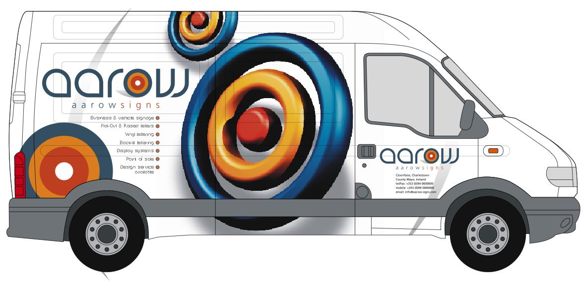
Posted by Russ on July 24, 2005 at 6:56 pmHere’s our van design incorporating our business logo which is based on the idea of company identity. we have not yet carried out the wrap as not sure which media to use and we don’t have a laminater, but we do have a versacamm. The design has been done by a friend of ours all we have to do is rip it. We know some white areas will have a few issues, hopefully we have most of them covered, but keen on using block colour and text.
We have had this design for a while now and need a push, all advice here will be greatly received.Regards Russ
Attachments:
 Keith Nilsen replied 18 years, 10 months ago 12 Members · 21 Replies
 -
21 Replies
-

nice design russ i like it 😛
constructive crits. i would leave out the company name on the front doors as it’s already on the sides, and make the kerning on the www on the back door a bit tighter..looking forward to seeing the van finished 😀
nik
-

van looks great….
I’m not sure you need the [flat logo] bleeding off the bottom left on sides…
I would remove this then reduce logo [left] by about 10% giving it a wee bit more white space and move it left a bit!
also agree with Nik on the kerning [and rest] providing you don’t increase the type size too much on the back
would love to see the van completed it will look great..
Cheers
Andrew
😀 -

Cool looking van…
I’m with Andrew and Nik on this, but i would lose the logo on the back door and replace it with the 3d effect one
Although you haven’t shown it i think the 3d logo over the front would look great too, maybe offset to the right and wrapped round the front wing.
Only critisism i have is the font used for business name, bit hard to read, but that may just be me.
Thanks for sharing
Iain
-

Hi mate, most of what I thought has actually been said already…
Remove flat logo on side
Remove details on side doors
Decrease web address kerning to about 120%
Change rear door flat logo to a 3D one… but…. make it wrap from that corner around onto the side. It’s a much better finish than it just being chopped away.
The 3D logo itself will create great impact, but to give a better finish I would loose the cast shadow of the logo. The reason is, you will print this and it fades out to nothing. When you install it will look great, but a few months down the line you will see a halo of dirt showing were the shadow has blended into nothing. sooo. If you take out the shadow. And contour cut the logo tight to the rings it will avoid this happening further down the line.
Not sure if contour cutting the rings was the idea but ide do it. The white of the vinyl will be much whiter than that of the painted body. Contour cutting will also make your installation easier.A good wrap vinyl? Well because your not laminating, the worlds your oyster… you could go for a purpose made wrap like grafityps wrap, but I think that comes standard as a two part system. Lam and wrap… very good system and great price.
There is mactacs MACfleet which is (IMHO) great permanent wrap, but tricky to use if a beginner.
Or you could use KPMF, but I am never confident with this wrap on sharp or deep recesses.
Oracal has a new digital print wrap which is supposed to be very good, but I have yet to try it.
Avery does a good wrap too, but is very expensive and I really don’t see why other than helps with bubbles, or minimizes bubbles I should say. -

Russ
sorry to be boring but most of the above it’s the back I have a problem with and like Rob says loose the shadow it has no impact on the design 🙄Lynn
-

Ooooooh nice design …. cant wait to see it finished!!! 😀
I agree with everyones constructive comments … so nothing else to add from me 🙄
😀
-

Looove that 3D, ditch the flat.
Looove that 3D
ditch the flat
Looove that 3D
ditch the flat
Looove that 3D
ditch the flat 😀 -
Just me, but i’d leave the shaddow as it give it the floating feel, if its gone it will just look flat to the side.. Also i like the contact details on the doors..
Simon
-
oh, just another thought… :lol1:
i said ditch the text on the door. i you want your details on the door then they are fine… i meant the logo on the door too…
also, just me being picky and just my personal taste but i would justify the text to the right on the side showning and left on other side. so its always justified to the front of the van.if you look at justification on the side of van they are opposite from that on the door.
-
I quite like the flat, especially as it is actually part of your aarow logo.
-

Flat versus 3d…
I like both but would definitely stick with either one or the other. Each has pros and cons across differing media usage, so it really comes down to individual preference I would say.
I wonder which will win through?
-
my preference is judged on what he obviously wants to promote without being blatant or tacky and that’s digital print. (versacamm) the only way to offer/show this is capable is to show true dimension or picture images. i think with the 3d circles he has achieved this, created impact and also the question for the customer to ask, “can i have something like that?”
-

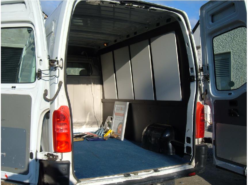
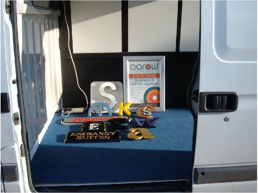
Great to get feed back thanks to all, just a little more info on the van and design. Our business is just me & the wife and we live in a very rural area, the van has been panelled out inside with black foamex walls and white sliding removable display panels, we have also had fitted an inverter which changes the engine power to useable 240 volts ( i might not have that technecally correct but i think it works along those king of lines) inside we will have full displays of most aspects of signage including backlite raised letters, media’s, substrates and samples etc, making this a mobile showroom.
We find that most people that call us for a sign are not sure what they really want or need, often they are in a simular position to ourselfs working a small business and car’nt get away during the day, so they call to us at night which we want to stop doing so we can have our evenings free. I can spend a day or two calling to them with the showroom and killing two birds with one stone. They get to see the products hands on and i can take details and measurements.
On the back window of the van i was thinking of using oneway vision where the design cuts into the glass ( will it work do you think ) here are the front and other side.
Many thanks again Russ
Attachments:


-
Russ,
I would still get rid of the text duplication of the word Aarow, and lose the flat version of the logo still present right at the back of the van sides… but just personal opinion!
-
i know the object of the ‘corporate id’ is too be seen and be recognised…but i truly think it’s all too cluttered…keep just your digital image and wording no flat one… and not repeat the co. name on the doors… cause you want folk to see your van wizzing down the street….and recognise the logo…then the company name… 😀
nik
-

Looks impressive.
My thoughts: Kill the flat target logo and the smaller 3d target. Then make the big logo bigger, all the way to the top. That will fill in some of the white space on the right. I think the other graphics will just compete.
You may want to move the name up a bit then as well so that the center of the target points to it. Not sure if you should eliminate the name on the door, maybe make it less prominent. I think the one large logo will create the impact you are looking for without cluttering up the van.
The kerning of the website doesn’t bother me as much as the separation of the hyphen from the word arrow. Maybe use an extended version of the font and use an en or em dash if you have to span the door opening so it is not lost.
In the end I say go for what you like best. We are all just being picky.
Bryan
-
quote Russ:the van has been panelled out inside with black foamex walls and white sliding removable display panels, we have also had fitted an inverter which changes the engine power to useable 240 volts ( i might not have that technecally correct but i think it works along those king of lines) inside we will have full displays of most aspects of signage including backlite raised letters, media’s, substrates and samples etc, making this a mobile showroom.
Russ …… any chance we can see some piccies of the inside ….. sounds great and would love to see what this all looks like ….. and it might give us a bit more of an idea on how to utilise the inside of our van a bit more ….. instead of everything being slung just in the back ….. as it were …… not customer signs of course …. I mean tools, samples etc.
Pleeeeeeease Russ 😉
😀
-
Hi carrie, hope pic’s are clear, white panels can be changed to any colour and slide within two rails also made from black foamex, top rail has large internal head space so if you lift it up it clears the bottom rail and come out the same as most mirrors in bathroom cabinets. Onto the white panels I will be fixing samples on raised holders, the light box and backlite stainless letter will be fitted to the other side of the van & onto some black areas including wired and acrylic display panels. The inverter thing-a-me-gig is fitted above the drivers seat with a white 4-way power lead coming from it and when all samples are fitted all wires will be hidden. Most of the floor area will be open allowing customers to browse, I wish to keep the inside clean so will be using a trailer for carring tools and fitting work, will be fitting the samples when the outside is done I need to get my finger out.
Regards Russ
Attachments:
-
Looks nice and tidy Russ… good job, and a very good idea!
Log in to reply.
