Activity Feed › Forums › Sign Making Discussions › Graphic Design Help › can anyone help with layout on transit window please?
-
can anyone help with layout on transit window please?
Posted by Hugh Potter on September 1, 2008 at 5:23 pmhi all,
been working on this for a while now, and I’m now ready to finalise the artwork with the customer,
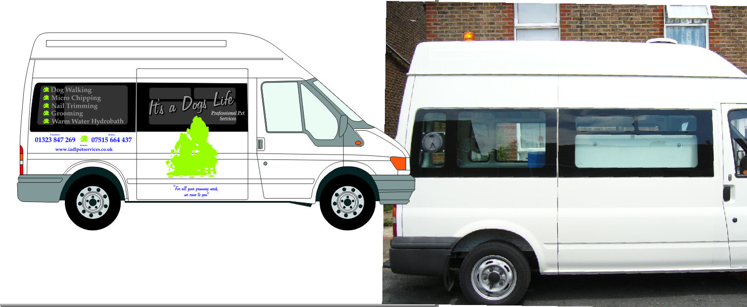
the problem is that the transit has windows which aren’t tinted out, so the best layout option (in my opinion), which i was working towards is now almost redundant.
will i need to suggest he has the windows tinted, or is it possible to use black contravision on the windows and apply vinyl over the top? i guess it would need laminating before application of the decals?
the customer needs to see out of the van as it’s a mobile grooming parlour, so blacking them out totally is not an option.
on the other side of the van is a sliding door, so rather than have the runner carve the logo in half I’ve kept the logo and name at the front of the van on that side too.
i guess the other option is to try another layout, but i think this one works ok.
any ideas please?
thanks
HUgh
ps, colours are irrelevent at this stage, just the layout help or advice on coping with the windows please!!
Hugh Potter replied 15 years, 8 months ago 6 Members · 15 Replies -
15 Replies
-

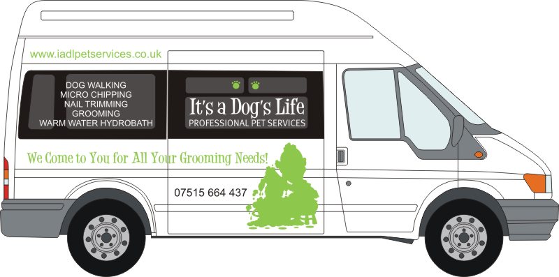
I think the fonts you’ve chosen lack "oomph".
(the ones I chose aren’t much better)
If lettering a window straight white is usually your best bet.
No need for outlines or drop shadows really, the window provides the shadow.
Is it "It’s a Dogs Life" or "It’s a Dog’s Life"?
Maybe check the spelling.
I would only use one phone number (mobile so they can get the calls on the road maybe) and I re-arranged the tagline.
Just trying to avoid my own work!
Love…..Jill -

i really like that layout Jill,
thanks! the one problem i have is that there is some white equipment visible through the front windows, so i need to try and address that too,
re fonts, i had a look around letterheads, signdna and another that escapes me at present, but wasn’t sure what to go with, it’s hard to imagine which works well untill you put it in the design!
i’ll have another look maybe.
you’ve moved away from script, i guess you’re thinking something more cartoony? not sure he wants that, but i’ll whack it together as an option for him.
re dogs vs dog’s. will check, hadn’t thought about it!
thanks again Jill.
HUgh
-

Hugh, this should get the grey matter going.
Looks like it could be "It’s a Dogs’ Life".
-
good point! clearly the service is for more than one dog, meaning it should be dogs’ life. However, when we’re thinking of that phrase, do we think of one dog, or many? i personally think of one dog, which would means it’s a dog’s life.
hmmm, food for thought!
anyways, what am i gonna do with these windows then?
HUgh 😀 😀
-

Hugh
as regards fonts, check out http://www.dafont.com thousands of free fonts with no hassle no pop ups or diversions. Its the business.K
-
hi Keiran,
I already use dafont on occasion, thank you though 😀 to be honest, my biggest proble here is the windows and what to do with them, i thought they were tinted, but as you can see from the photo, only the edges are, i need a way to make the text stand out on the glass, regardless of font!thanks.
Hugh -
Just a thought,
block the entire window section (including opening bits) in question out in white and put the text on in colour. The white vinyl will still leave plenty of light in, it will be very similiar in colour to the van and gives you a big white blank canvas to work with.K
-

Couldn’t you contour the lettering in black? or am I missing something?
-
quote Harry Cleary:Couldn’t you contour the lettering in black? or am I missing something?
Conas a tá to Harry
You’d still be able to see that piece of equipment in the background. Just think it would detract from the look.
K
-

Hiya Hugh,
Why not use contravision or similar and have it all printed. I don’t know if applying vinyl over contravision is a good idea because of the perforations. Two other options are window tint as you said or Hexis do a transparent coloured vinyl, they do a dark grey but not a black. Guess the end result would be similar to window tint. Myself I think I would use printed contravision. Just thought though why not make up the vinyl yourself. Get some black vinyl cut out the dogs life bit from it slightly bigger than you want the letters, slice into strips using Robs tutorial on making your own one way vision vinyl and weed, apply its a dogs life to it and app tape up.Steve
-
quote Kieran Browne:Conas a tá to Harry K
Tá me go maith Ciáran. 😀
-
thanks guys, been having a play with it, based more on Jill’s layout, just rying a different font or two though. seems to be coming together now.
i guess i could black out the window where the name goes, leaving the top windows clear,
the rest of the text in white, would look ok i think, but as you say, maybe outline in black.
re the contravision idea, i would have laminated the contravision prior to applying any vinyl, though i’m not sure this is a necessary expense now. i guess he can always get the windows tinted if he wishes.
Hugh
Attachments:

-
😉
I like that, Hugh!
hahaha
The black outline on the name might help, but even a light blue pinline outline would make it pop off the glass.
Love….Jill
PS
The font I used is a Dafont freebie, Desigers (I think) -
ooh that looks good! i best have you on commission for this job eh!!
i’ll have a look see how it works. i can do what i want to a degree, so i may well have the name printed too, i can add whatever shadows etc i feel work then.
for once i have a customer who is prepared to spend out, rather than cut corners everywhere, so nice to be able to just get on and not worry about the price, within reason!!
Log in to reply.
