Activity Feed › Forums › Sign Making Discussions › Graphic Design Help › can anyone help with layout on this van please?
-
can anyone help with layout on this van please?
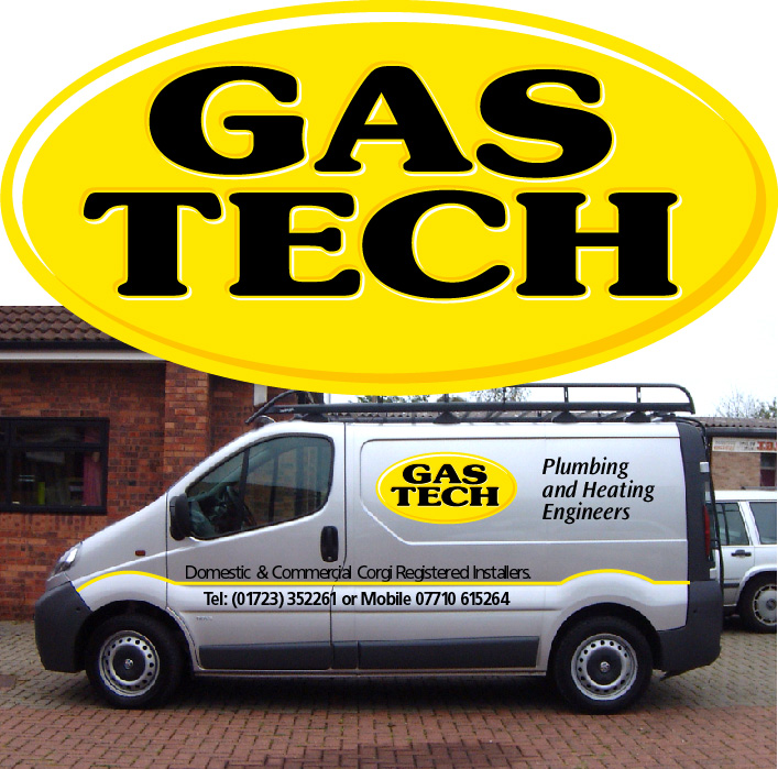
Posted by Tim Shaw on September 23, 2002 at 4:36 pmThis is the first Vivaro we have worked on.
Is it an ugly van?
Attachments:
 Martin Pearson replied 21 years, 10 months ago 8 Members · 12 Replies
 -
12 Replies
-

i take it this picture is of what the van will look like tim…
as it looks as if it has been made up on the comp…anyway i like the vinyl effects on the main logo and the side panels look nice and easy read.
however the coster of text above and below the coachline needs altering i think…move it away from the coachline a little… both lines of text & give those letters some space to breath.
open the kerning more and maybe drop the hight a little. this should make the details far more legible.as for the van i think its fine… nice panels to work on and it loks a bit differnt from the norm.. just my opion i guess. not everyones cup of tea… 🙄
-

You are right Rob, the extra kerning makes does help with the readability
Reduced the CH as well.
Attachments:

-
What a lovely piece of work!…
That logo’s a real beaut – relatively simple but very very sweet.
I agree with spacing the secondary text etc. – works much better and, ya’ know, I’m not sure I wouldn’t give that logoa little bit more size?…not sure…just musing…
I like the way you’ve picked out that humpy feature line along the body and, again, I wondered whether the unusual shape of the upper side panel itself could be somehow emphasized too?…I’m not making suggestions, just musing again…it’s just that these weird Viv’Vans throw up so many possibilites… 😉
great looker!
more please…
-
The font and the colours of black and yellow were what the guy wanted and has on his business cards etc
Not my choices.Thanks for the kind words, Mike.
-

How dare you call it an ugly van – it’s the same as my Renault Trafic (just rebadged) – I feel like I’ve just been told my children are ugly (hot)
Apart from that I think the oval design is great. It is sort of 3 dimensional (a bit like a Mike Brown design) which I like very much.
Still feeling hurt about the van though (sniff)

Here’s my van by the way – isn’t she beautiful 😀 -

take no notice phill, i think your van looks fantastic, wish i could have one,
maybee some day? 🙂 -
yep much better tim. im a great beleaver in giving letters the space they need.
when we design vans it is very easy to clutter it because we are working on screen. small text looks very small on the screen so we are teased to drag and over size it. we forget in real life this small text maybe 3-4 inches in hight….i hate responding to great designs like the one you have done. only to bring up my droan about kerning and space.. i feel like its the only thing i have to say… i guess its because everyone even me makes this mistake every now and again..
nice work tim 😉
-

I don’t like the big sign on the roof at all, makes the van look top heavy. The rest of it looks great, especially now you have opened up the text as Robert suggested.
-

Very Neat and tidy!
Can I just ask a quick question though, how would you do that pinstripe over the arches on the wing. Surely you cannot cut that accurate??
Gavin
-
gavin i reckon tim will just cut the line straight and bend it round the arch.
shouldnt be too dificult…. 🙄 -

Grey, leave martin alone, there is a reason he dosnt have his picture up … and it all started with that faulty sunbed
👿 👿
👿 only joking 😀
-
Thanks Gray, that was a compliment wasn’t it ?
Kev, who told you about the accident ?
Log in to reply.