Activity Feed › Forums › Sign Making Discussions › Graphic Design Help › can anyone help with layout on this midi van please?
-
can anyone help with layout on this midi van please?
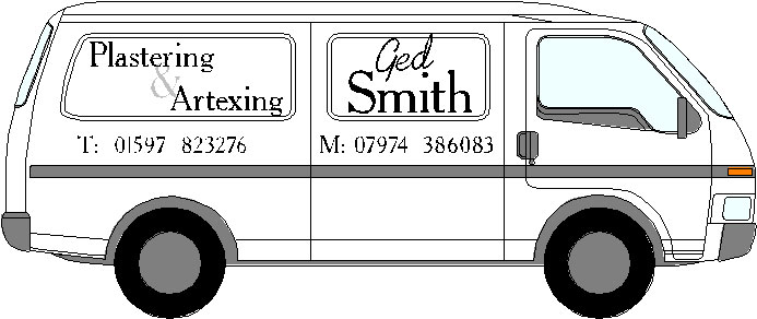
Posted by Timmy Mallet on October 30, 2002 at 10:06 pmHi,
Just done up a basic design as the cutomer wants, can you guys put a different touch on it using same colours and font ( Gloucester MT Extra Condensed) he also wants the Ged bit arched…..

Timmy…….. 🙄
Robert Lambie replied 21 years, 9 months ago 6 Members · 11 Replies -
11 Replies
-

Tim – when you say ‘the same colours’ – you do know this is showing as black and white? – just checking 😉
more soon
-
Yes it is a white van with black lettering required……
Bloody quick reply Mr Interactive Brown (:)
Timmy
-

Timmy,
It ain’t much m8 but something else you can show to your customer if it helps 😀
If nothing else, Mike & Rob can point out where I have made mistakes & us 2 can learn from them 😮 😮
Attachments:
-

ok here is a quickie… ive just used some clipart and a couple of fonts…
im guilty of not using the fonts you requested tim sorry mate i couldnt find them and my signlab disk seems to be scratched or somthing.. the drive wont read it… i thought this would at least let you give the guy another option… but hey! remember & charge more.. the text is alot larger 😉most customers say they know what they want. this is drilled into there head over the few days prior to coming to see you. they only have one vision of how it should look.. try giving him a few and he’ll quickly change his mind.. most of the times anyway 😀
i know ged smith is the most promonant feature. this means nothing to a starnger, so why make it big… well i reckon the logo should do the talking here… and right under the name is the discription of what they do… only
2 lines of text to take in. with a huge logo shoving it under there nose.
if they are still interested they will look and find the contact numbers on the door… if not you where just confusing them with extra info 😆 😆 😆
Attachments:

-
Thanks Steve, Sparky and Rob.
The customer called in today and I had the chance to show him four different peoples ideas, went real well 😀
He’s gone away to ponder and knowing my luck he’ll come up with sumut different 😮 but it was nice not to just to have one design to show him…..
Timmy…………
-
nice one gray i actualy prefer the simplicity of the logo you have used to the one i picked.. 😉
thanks for sharing your time mate -
Nice one gray,
Thanks for taking the time to help me out, I have got a couple of other building theme van’s to do so I got another idea to put into practice.Timmy……
-

Nice design Gray, looks really good. When I am doing plastering (which isnt very often) none of the words you have used come to mind !!!!!!
-
Just done the job and here is the photo …….

Nothing flash likes Phils work at the moment, but does as the customer wanted
Thanks again guys for all your input……
Timmy………..
-
tim! i like that mate 😉
ok ok i hear you say why… well its right up my street.. honest.
im not saying i would have done the exact same… but other than the logo i like it. i think the logo should be that bit more.. that way the rest looks second to it. but its very neat, easy read and the kerning is spot on for the size of font in those areas. i know what you mean by pleasing the customer but it is, in my veiw a massive step in the right direction from stuff i have seen of yours in the past.
phills work is excellent.. i know. its very fancy and grabs your attention straight away. but what you need to realise is that this kind of design is the total opposite of his and is some peoples taste. so with that in mind, you have done well.
constrctive critisism is just the logo… it needs somthing but unsure what..

Log in to reply.