Activity Feed Forums Sign Making Discussions Graphic Design Help can anyone help with layout of van please?

  • can anyone help with layout of van please?

    Posted by Danny McGregor on November 10, 2005 at 10:43 am

    We’ve had our Toyota Hiace Powervan for a few months now, and fortunately we’ve been pretty busy since we got it, so we haven’t got round to doing the livery properly. We have got some general cut vinyl on the sides (name, phone number etc,) but we want to do a real job on it including a partial wrap.

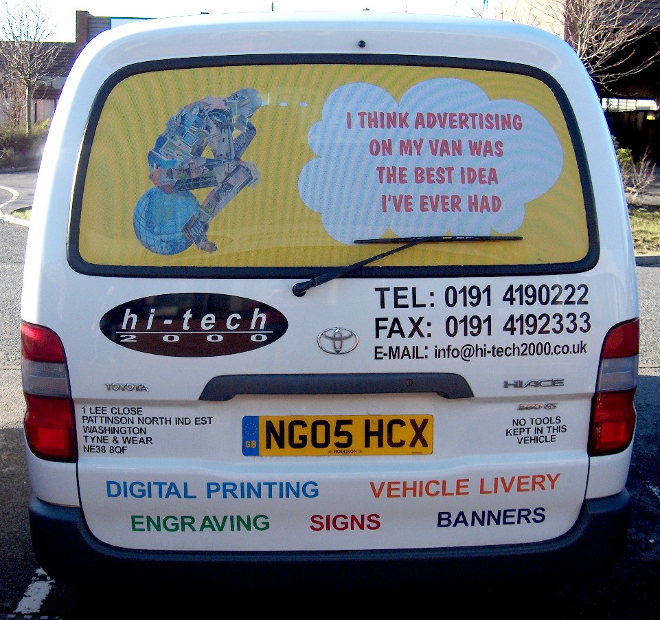
    As the picture shows, we’ve done the tailgate with perforated vinyl on the window and cut vinyl everywhere else – too much I hear you say, but constructive criticism is welcome.

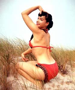
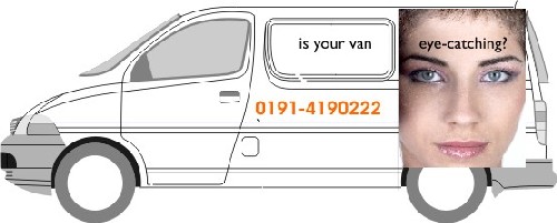
    Looking through other postings we particularly like the roll-back and torn effects as shown in earlier postings, and the lady posing “MADE YOU LOOK” is perhaps a bit OTT, but it does get noticed, and we want our van to be a rolling advertisement for what we do. Anyway, we’ve played around with various pictures, and as has been mentioned by others, it’s difficult to know what to use as none of them are actually show what we do. Is the general opinion that any good picture that grabs the attention is OK? Finally, on that note, is it possible to get good prints from digital photos or scans, as the only pictures we can get good quality prints from (on our Roland Resolve) are the very large files we got from our supplier (we were told that they were scanned on a drum scanner).

    Any advice or suggestions would be greatly appreciated.

    Danny


    Attachments:

    autosign replied 18 years, 5 months ago 5 Members · 8 Replies
  • 8 Replies
  • Shane Drew

    Member
    November 10, 2005 at 12:08 pm

    Digital Photos from http://www.istockphoto.com are very good, especially those from the extra large collection.

    A drum scanned image is better than a desktop scanner by a long way.

    You don’t need a picture as such, why not do a background type image. Perhaps a carbon fibre look or a metalic background.

    Just a thought…..

  • Jill Marie Welsh

    Member
    November 10, 2005 at 12:51 pm

    Ok, for one thing, there are other fonts besides Helvetica.
    You are putting waaaayyyy too much copy on there.
    I see the dreaded “TEL” and even a “FAX”….who pray tell is gonna fax you from their car when they’re behind you in traffic?
    Less is best sometimes.
    With that in mind, a good old high-rez stock pic of Bettie Page might be eye-catching.
    Sorry for the nagging, it is well-intentioned.
    To me, nothing screams out that you make SIGNS.

    Added another idea, since you have “ace” in your vehicle name.
    There is a good cheap high-rez piccy site:
    http://www.istockphoto.com
    They have a few cool card shots.
    Love…..Jill


    Attachments:

  • Danny McGregor

    Member
    November 11, 2005 at 8:54 am

    Thanks Shane,

    I’ve checked out istockphoto – looks pretty good, and there may be some stuff we can use.

    Also thanks to Jill for her constructive criticism, but in mitigation…

    a) I’m sure I read years ago that Helvetica is the most easily legible font, but I’d be grateful if anyone could suggest alternatives that are also easy to read at distance

    b) We already knew that we had too much stuff – fair comment

    c) “dreaded TEL & FAX” – I don’t know where you live, but the van stands stationary in traffic most days on the commute to and from work, sometimes for so long that the person behind could call in an order and we could have it ready before things get moving again! (just kidding)

    d) I’m not familiar with Betty Paige, but we had thought of Betty Boop!

    e) Fair point about the lack of “SIGNS”, and thanks for linking the “ace” to cards. Interesting, but I’m still thinking.

    Thanks again. Further comments and suggestions welcome.

    Danny

  • Shane Drew

    Member
    November 11, 2005 at 10:34 am

    You are right Danny, Helvetica and Arial or Avante Garde are easy to read, but that is not to say they are the most creative in terms of signage.

    Jill often suggests the Letterheads font site, and it is a good example of what is available in a creative sense, giving you style and legability. The secret is how you use the font I suppose.

    So many of us try to stay with what we have on our computer, I have been guilty of that myself over the years, or we have a favourite that we beat to death until we find another favourite.

    I guess helvetica could imply a lack of creativity in the minds of the viewer. A different choice of font style, that says the same thing, can change peoples perception almost instantly.

    Look at signs that were done in the early days of computer cut, and they were basically helvetica bold, condensed etc.

    Just my 2c’s

  • Jill Marie Welsh

    Member
    November 11, 2005 at 12:30 pm

    Helvetica may be legible but it screams computer/boring to me.
    How I dreaded drawing that in art school.
    One very nice alternative to Hellvetica (that’s what I call it)
    is Chesham Sans ( a LHF font) or even Gill Sans.
    I used Arial on my mock-up.
    Shoulda used “deal with a winner” as the bi-line too.
    Didn’t mean to come across too harshly,
    I have just been trained for the past 20 years that less is more.
    Some Letterheads I know don’t even have a phone number on their signs/vehicles!
    They want the client to approach them in person.
    Just my 2¢.
    Happy designing.
    Love……Jill

  • Andrew Boyle

    Member
    November 12, 2005 at 1:11 am

    Myriad Pro, FF Meta, Foundry Journal [Foundry Journal SC] are all beautiful fonts… when you don’t want to use helvetica 🙂


    Attachments:

  • Danny McGregor

    Member
    November 15, 2005 at 5:03 pm

    Hi again, and more thanks for the suggestions. Andrew, I’ll have a look at the fonts you suggest before we go ahead.

    Took Shane’s advice and downloaded a picture from istockphotos to produce the (very) rough draft below of the sort of thing we’re aiming for.

    All comments welcome.

    Danny


    Attachments:

  • autosign

    Member
    November 15, 2005 at 7:08 pm

    I agree with Andrew, and the fonts he suggested are all really nice alternatives. Look at magazines, websites, adverts – you’ll see a lot of modern, clean fonts.

Log in to reply.