Activity Feed › Forums › Sign Making Discussions › Graphic Design Help › can anyone help with layout for this van?
-
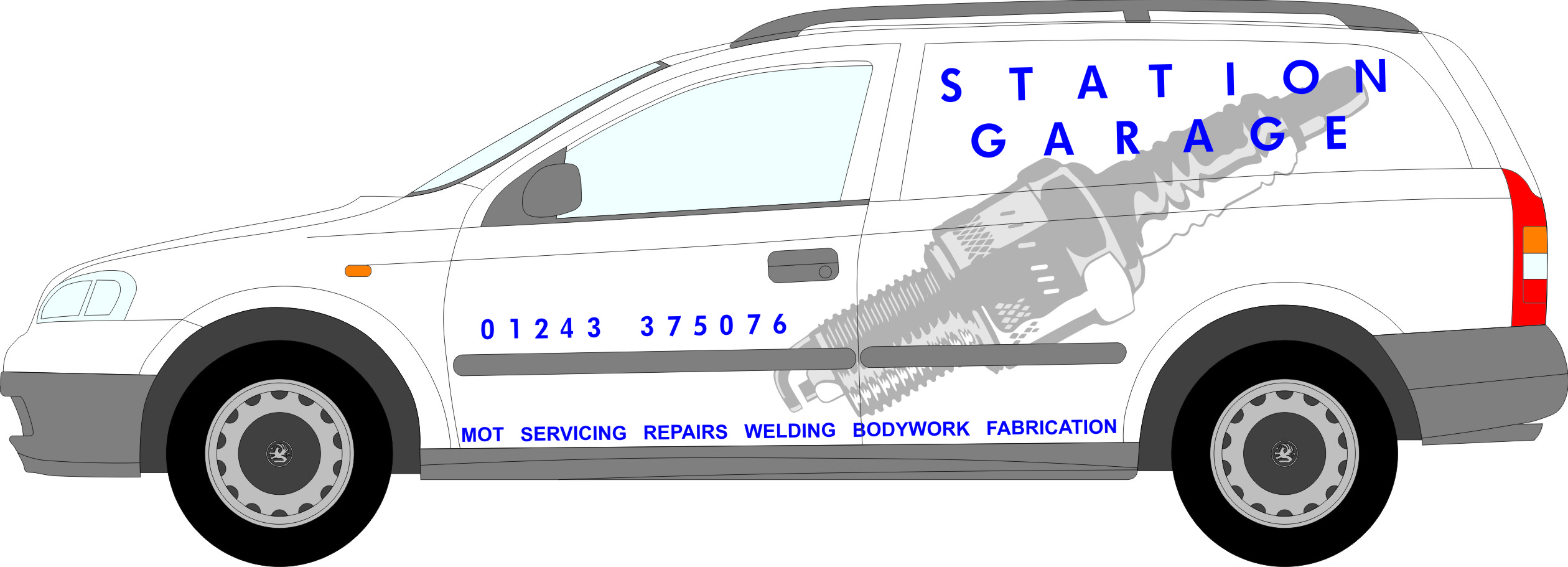
can anyone help with layout for this van?
Posted by Peter Munday on September 14, 2006 at 8:20 pmJill Marie Welsh replied 17 years, 7 months ago 6 Members · 8 Replies -
8 Replies
-

first thought, make the spark plug ( if thats what it is) smaller nicer font for name just initial thoughts I’ll think some more
Lynn
-

quick reply, kerning on name etc too far apart mate.
ill reply again later, im just in middle of something 😀
-

Spark plug is way too big in my humble opinion.
Tighten the kerning on the Garage name, make it bigger, and add a light grey drop shadow.
Phone number needs to be a little bit bigger.
Could you have the spark plug about 300mm high and add a wrench etc (garage type images) in an icon fashion, maybe 4 images on the back wing above the rear wheel.
I hope this makes some sense!
If I have time tomorrow, I’ll re-do it and post what I mean.
Also, what’s the budget?
Cheers
Joe -

I don’t mind the spark plg but I would flip it over the other way and make it a lighter grey.
It looks too "yuppie" for a garage.
The layout needs some balls.
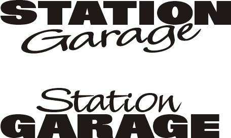
I would make STATION all-caps, tougher font,
and Garage in a loose cool script.
It is a clean layout and nicer than lots that I’ve seen.
I like the phone number placement and spacing.
love….Jill
Attachments:
-
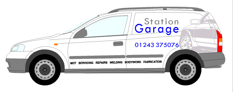
Five minute play…
A different idea from my first..These astras are a pain – I know – I have one!
Attachments:
-
That’s a Mike Stevens font…Big Red I think.
Love….Jill
Log in to reply.
