Activity Feed › Forums › Sign Making Discussions › Graphic Design Help › can anyone help with layout for company van please?
-
can anyone help with layout for company van please?
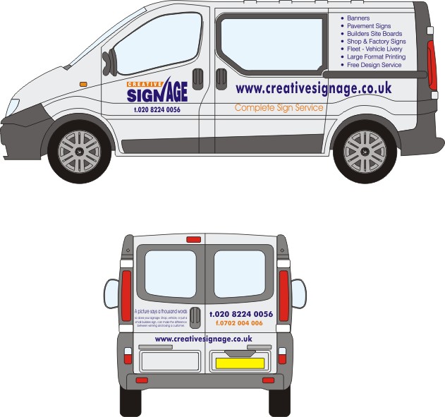
Posted by Simon Clayton on March 16, 2005 at 12:22 pmGetting my new van soon, been trying to put some ideas down, tried adding high lights, outlines, shadow, but just doesn’t look right,
logo has to stay the same but can have highlight etc, but everything else can change. I find designing thinks for myself really hard, so All help much appreciated, been on it for weeks and getting fed up.Toyed with the idea of prints but not much room.
thanks
Simon
Attachments:
 Simon Clayton replied 19 years ago 18 Members · 40 Replies
 -
40 Replies
-

-
well for a start Simon bin this bit “Free design service” :shake:
-

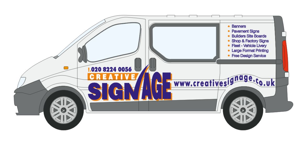
Here ya go, Simon.
I think that simplicity might be the way to go.
You really don’t need all that copy on your van.
That is best saved for a biz card.
Lettering I used was Eras.
Love…..Jill
(I had to laugh when your Corel file came up as metric!) -
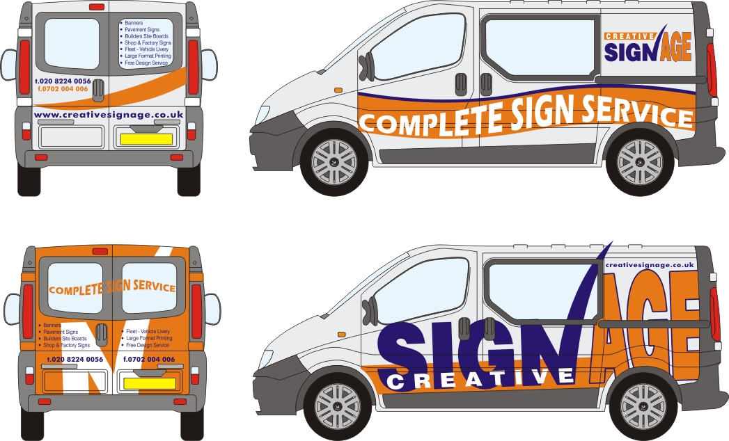
couldn’t resist a play with your logo either……
-

too much time on your hands Jillbeans….lol
Tim.
Attachments:
-
Jill there really great… thanks, so food for thought there.
I’m ambidextrous what ever you call it, can work in old and new money 😉One problem I’ve got is their are windows in the back and side doors that i can’t cover them up.
But i know what you mean about all the text…I’ve just got a mental block on…
Steve free design bit is a no go ant got a clue why i thought i should put that….off it will goSimon
-
….if it’s legal, just cover the windows with white vinyl…
or just stick the stickers over ’em as if they were plain panels.
(If you put a white outline around the logo
and nix the drop shadow, it would work)
Remember that in traffic, there is little time to read things.
Big & bold gets more attention than tons of copy.
Love…..Jill -

I had a go at it too.
Changed/added something to your logo for the heck of it :lol1:
I have to say I agree with Jill; you really don’t need all that copy on the van, personally I think it just clutters it up.nothing has been trimmed away etc.
just a quicky -

Just a very quick play with your van!
Time is money!! 😉
Attachments:
-
I really like that Ovrcafnatd…..thanks, will start having a fiddle and see what i bits i can use etc… Must admit plain is the way to go….i like plain
thanks for all the time and effort you have all put in..
Simon
-
 quote :plain is the way to go….i like plain
absolutely…why not
Simon
I reckon you’re going to go back to the beginning..just a couple of small changes to original……?
Cheers
Andrew 😀
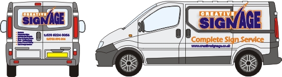
Attachments:
-

just my thoughts could you use the side back windows with contravision making a montage of work, still be able to see out of the glass….
Attachments:
-
Wow thanks all, some fantastic ideas, I will have to sit down and have a good look through,
Britchenko I like the idea of covering the back in orange with the “N” shape, and Adrians web address in two colours,
Andrew your right, i think i may just go that way, maybe with the back doors covered as Britchenko’s designthanks again everyone, i can’t wait to get started, i will of course show the finished design/Van, just got to wait another 4 weeks for it to come
Simon
-

Bet your heads spinning with all these brilliant layouts to choose from Simon
Why have you gone for a crew cab anyway? 😀
John 😀
-
As John has said John..too many kids. 😕 😉
Don’t have the money for a van and family car, my wife rides a 650 suzuki everyday to work so we opted for this.
I don’t do much fitting, (have a really good sign fitter guy) Its mainly vinyl, and i can sign it up and hopefully get noticed around where i live..
The vans coming with roof rack so anything up to about 3m will fit on top and it has everything on it.. elec heated mirrors & windows , PAS, AC, reverseing sensors, CL, Airbags, solar reflective front screen, rear heated windows with wash & wipers, alarm, dead locks and 6 speed gear box..so it’s really more car than van, can’t wait its the first vehicle i’ve every bought newSimon
-
Might as well throw in a few vinyl handprints as a gimmick
to hide the ones that will be all over the van from the kids.
Love….Jill -

i tell you what guys you are all really talented. ever you ever considered becoming sign makers hehehehehe ! :lol1:
-
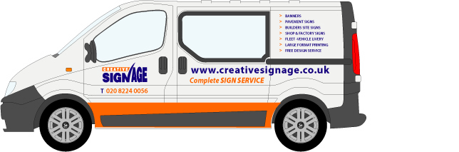
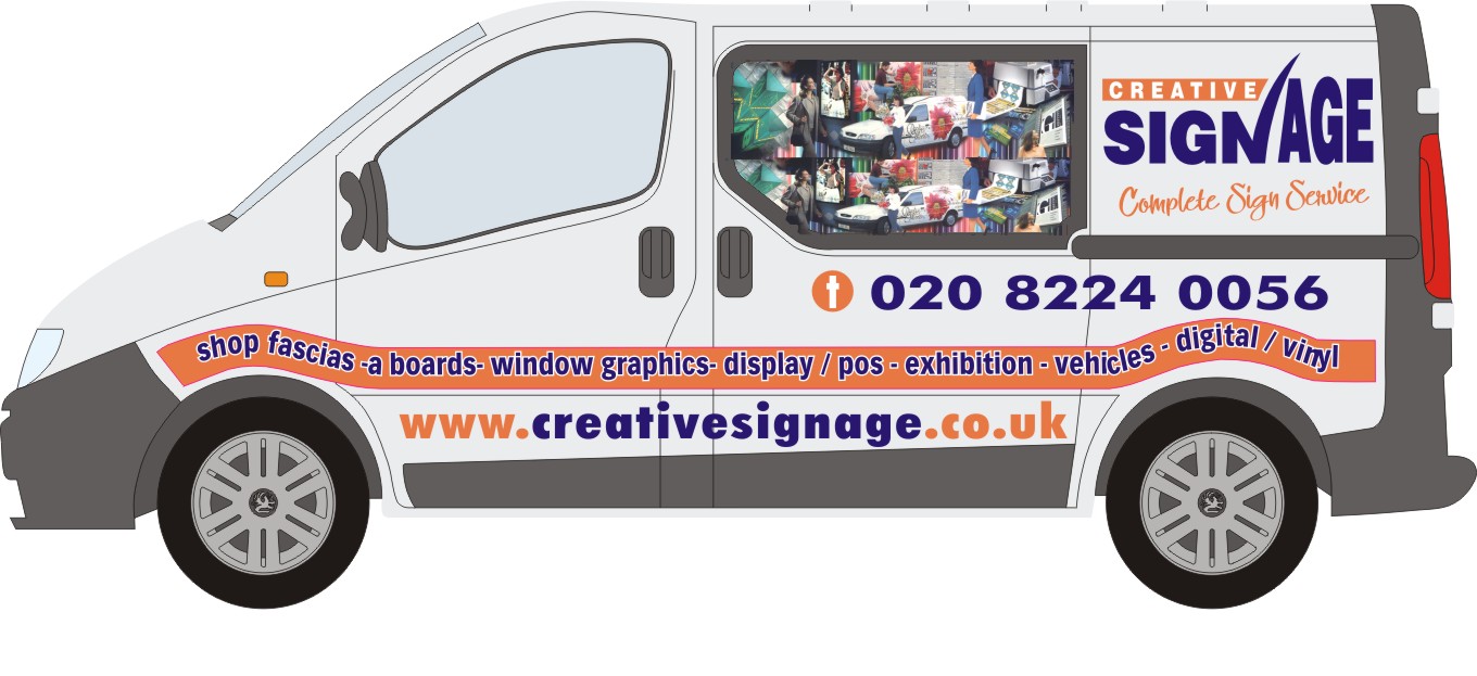
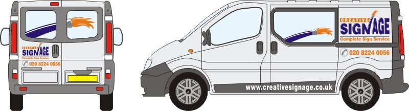
Thanks all for your in put everyone.. finally did it today, kept it plain and simple, quite an awkward one this, because of the crew cab bit..
A couple of things ive noticed but happy overall, main thing was some of the colours have changed to make it look less stark (dark grey instead of black etc).Simon
Attachments:
-

Looks good Simon,
My only comment, why bother with a fax No. antiquated bit of equipment nowadays,
Peter -

I think the finished result looks great Simon, job well done 😀
-
Very true Peter, its one of them fax to e-mail thingys, I got rid of my fax line about two years ago because i only got three faxes in one year, Its Just in case people need to send a fax, (its all free as long as i get one fax a year)
Simon
-
Looks good Simon!
I too have one of those e-fax type things….I can’t fax out, but I can receive.
In any condition…..nice job on the van 😀 -

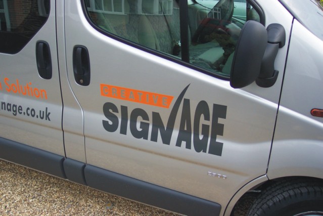
Looks good simon but i can`t help thinking the orange vinyl is totally ineffective on the silver background.
Does it look any better “in the flesh”?
Might benefit from a dark outline.?
Thats the one line people need to read clearly.
-
Thanks all,
I have an old fax machine that i use to fax out when i need too.. ( hardly ever used) somre companies i deal with still don’t have e-mail… 😮McRod, it looks better in the flesh, the orange ain’t too bad a bit flat looking even thought its gloss, was looking for metallic orange but couldn’t find anywhere.
Simon
-
Nice one m8
Btw, i love the look of your Van, expecially the crew cab part.
Impressive looking and very professional.
-
It looks good but I agree with Rowdy Roddy,
Can you give the orange an outline?
Love….Jill -
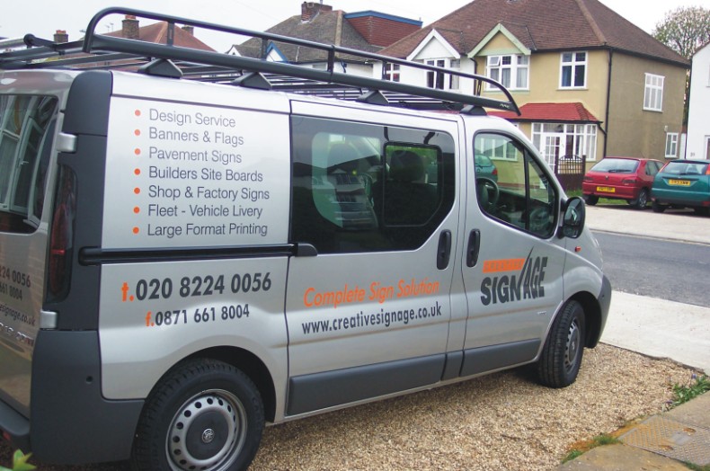
The orange don’t look to bad in real life….really LOL, stands out quite well.
Heres another picky.. that shows it a bit better.
I will also have a look at putting on an outline??Simon
Attachments:
-

Well done mate, not a huge fan of orange without a keyline either, but if it looks better in the flesh, then that is good.
The creative is a bit lost in the picture, may benefit from black text in that situation.
Well done anyway. Always a fan of KISS signage. People more likely to read it.
Cheers
Shane -
Stand 200 – 300 yards up the street m8 and see if you can read that orange text.
If you can, then np`s. If your struggling, so will a customer.
-
quote McRod:Stand 200 – 300 yards up the street m8 and see if you can read that orange text.
If you can, then np`s. If your struggling, so will a customer.
good advice too 😕
a reflective orange may be a better option, with a keyline of course
-
200-300 yards… i’d be lucky to see the van from there.. 😉
Whats Kiss signage Shane?? like the sound of that, is it like word of mouth lol
some good points there..Simon
-
quote Simon C:Whats Kiss signage Shane?? like the sound of that, is it like word of mouth lol Simon
(k)eep (i)t (s)imple (s)tupid – a very common phrase here in OZ. Sorry mate 😳
-
We use that phrase too….
I call it the KISS principle.
Love & Kisses…..Jill -
Van looks superb Simon, really professional but something a bit different about it at the same time 😀
What type of van is that? It looks cool!
Cheers, Dewi
-

I am also huge fan of the oranges ,yellow for that matter any bright in your face colors.I did a silver race trailer used the orange grey and blue to outline the orange,try just a single word outlined in blue and see that orange realy come to life 😉
But think you did a great job….
Paul
-
Dewi, it a Vauxhal Vivaro swb double cab… couldn’t afford a van and a car, and it was cheaper than a people carrier.
Most of the signs i fit are not too big and the roof rack will take 3m X 2m i think it is.
I’ve got some really good sign fitters that do most of my fitting, which saves me running around getting dirty, plus it’s now a good advert (hopefully)
I did try some blue ( my logo colours are light blue, midnight blue and orange) but because there is so much dark grey/black on the van, it looked out of place hence the greys used.Simon
Log in to reply.
